Clover
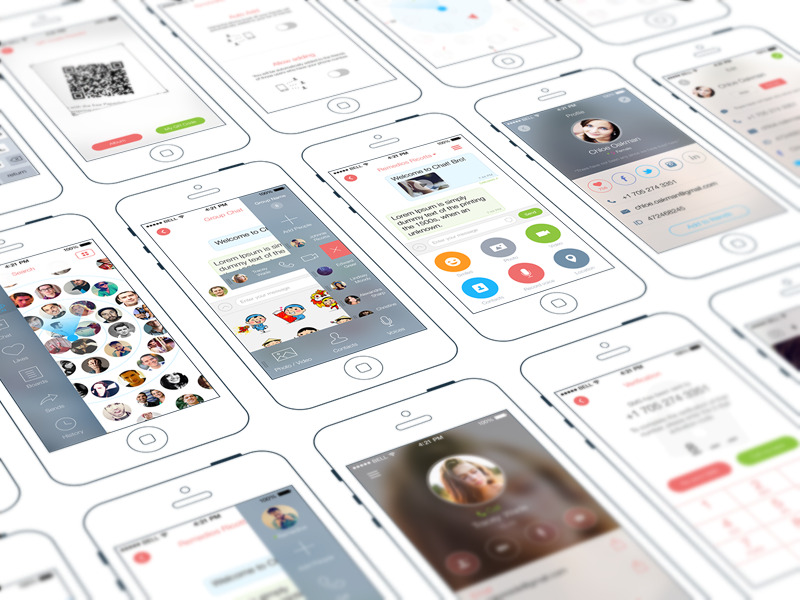
Use Clover for fast and rapid mobile chatting. With lots of various transitions and flexible design assets, users will enjoy their time with Clover.
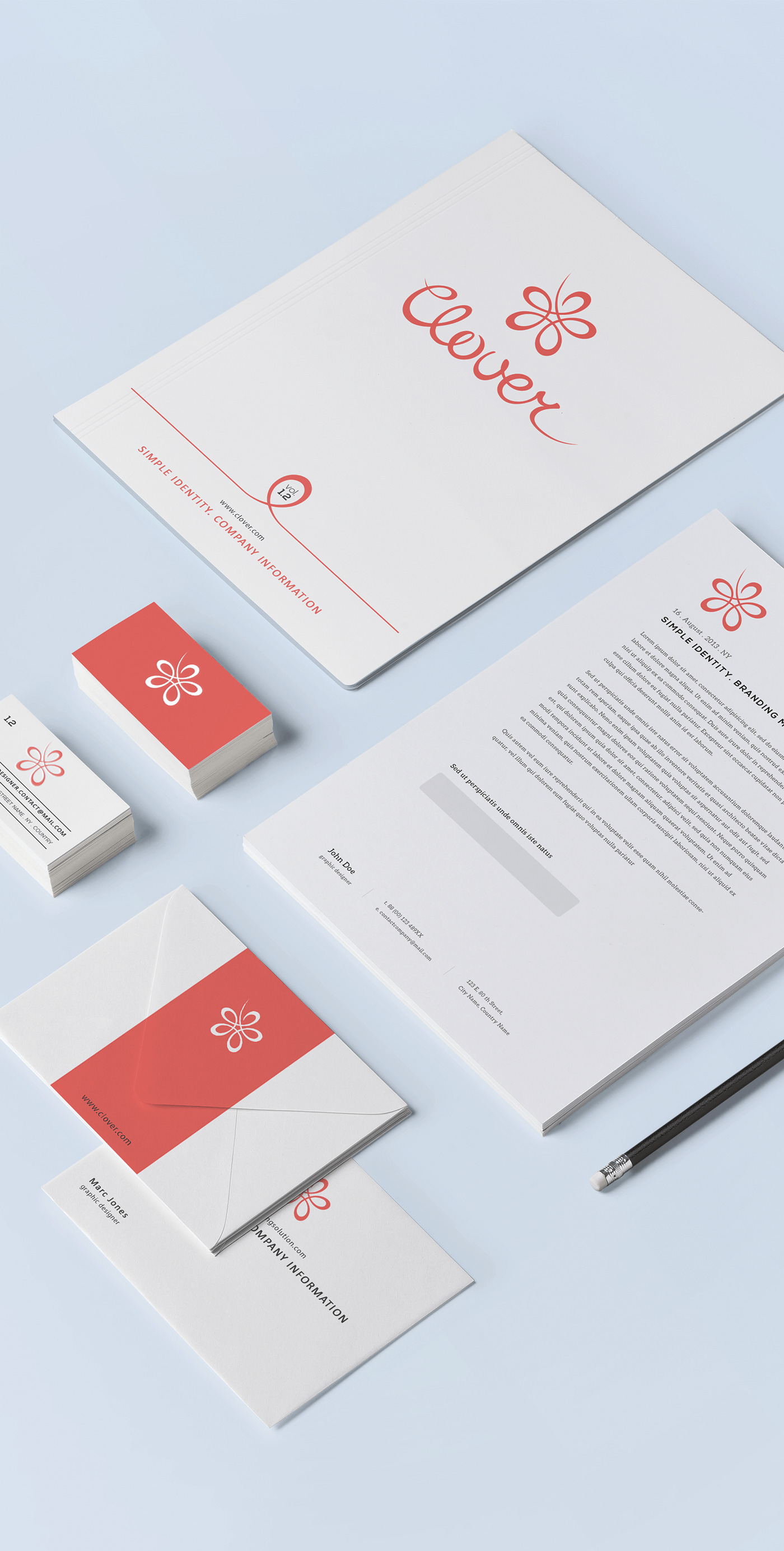
Clover is a mobile chatting application focused on light, easy, and flexible messaging processes between your friends or family. Together with the Clover team, our UX agency San Francisco experts refreshed their current branding and implemented flexible and convenient UX for mobile applications.
One of our key goals was to create an intuitive user interface while establishing a practical, exceptional user experience on iPad and iPhone. Thus, to enhance Clover’s user experience, our team built a flexible and user-friendly UI/UX design layout. In addition, we separated each key functionality separately, making it easier and convenient for users to identify essential interaction areas of the Clover mobile application.
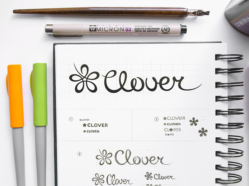
During the “design funnel,” our branding agency SF Bay Area team started with the preliminary investigation on different interconnected concepts, constructing moodboards and low-fidelity sketches. That allowed additional exploration of various brand identity approaches while discussing the advantages and disadvantages of each option.
All in all, our team invested a lot of time and effort into the Clover mobile app branding, intending to develop a precise exposure of their product and outline the company’s positioning. As a result, both our and Clover teams were incredibly thrilled to collaborate and design stunning assets for their mobile application.


Read also:
– Applause
– Scooter App