Travel Website
The travel website design concept combines aesthetically pleasing visuals with functional design to inspire and facilitate travel planning. Created by our experienced web designers, it emphasizes user experience with easy navigation and informative content layout.
Functionality
This travel website design concept is an online platform showcasing various travel tours, mainly focusing on winter destinations.
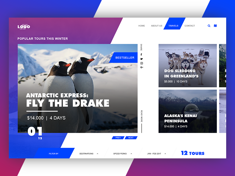
The main functionality allows users to browse through featured tours, such as an Antarctic expedition and dog sledding in Greenland. There's also a navigation system for filtering options, a calendar for date selection, and social media integration for sharing purposes.

Design Essence and Elements
- Bold Typography: The design employs bold, prominent typography to draw attention to the tour names and prices. The use of large fonts for the tour details and the page numbers suggests a clear information hierarchy, guiding the viewer's attention to the essential elements.
- Vibrant Color Scheme: The color palette combines blues and purples, traditionally associated with winter and cool climates. This choice reinforces the tour's theme and helps create a cohesive visual experience.
- High-Quality Images: The images are a central design element, providing a window into the experiences. They are likely chosen for their ability to evoke emotion and a sense of place, encouraging users to imagine themselves on the tours.
- Clear Navigation: The top menu bar is streamlined and straightforward, with clearly labeled sections for the home page, about us, travel options, and contact information. This allows users to navigate the site easily and find the necessary information without confusion.
- Social Proof: The 'Bestseller' badge on one of the tours is an example of social proof, suggesting that the tour is popular and well-regarded by other travelers. This can be a powerful motivator for users deciding which tour to book.
- Card Design: Each tour is presented within its own 'card,' a design approach that organizes information into digestible chunks. This makes it easy for users to scan the options and compare different tours.
- Interactive Elements: The presence of buttons like 'Prev' and 'Next,' as well as the pagination at the bottom, indicate that the user can interact with the tour carousel, suggesting a dynamic way to explore the offerings.
- Filtering Options: A 'Filter by' dropdown menu implies that users can sort tours according to various criteria, such as destinations or specific perks. This customization enhances users' ability to find tours that fit their preferences.
- Date Selection: A calendar for selecting the time frame ('Jan - Feb 2017') is included, which implies functionality for users to search for tours available during specific dates, making planning more convenient.
- Branding Consistency: The presence of a logo at the top left corner, consistent use of fonts, and a color scheme that matches the brand's identity all contribute to a cohesive brand experience across the website.
- User Engagement: The social media icons suggest that the site encourages users to engage with the content on different platforms, increasing the reach and community around the travel experiences.
Likely Benefits
The design likely benefits users by providing a visually engaging and user-friendly interface that simplifies the decision-making process for booking tours.
High-quality images and social proof elements like 'bestseller' tags can inspire trust and excitement, encouraging users to book tours. Additionally, clear pricing and duration details help plan and budget for trips.
Application by the User
Users would interact with this design by browsing the tours on offer and using the navigation bar to select different types of trips or destinations. They could use the search bar to find specific tours and filter results according to various preferences. Choosing a tour leads to more details and the booking process.
In nutshell, the design concept is applied to create an immersive and intuitive user experience that showcases travel opportunities. The high-quality visuals paired with minimalistic design elements like the card layout and clear typography guide the user's eye and make information accessible.
Integrating social media and bestseller tags also leverages community validation, which can influence user decisions.