Transcend
About
Transcend is the data center company that gives control over personal data for various brand companies. They provide a delightful experience for users while embracing modern privacy.
Reach
1.2B+Users served
Website
transcend.ioTranscend is a San Francisco-based tech company that provides private and secure data centers to other companies with complete control of their data. They want to make an easy data management process and put secured boundaries over the data you own. Furthermore, Transcend seeks to educate end-users and bring data rights into the world by making a digital revolution. That’s what their mission is all about.
Enter into Transcend
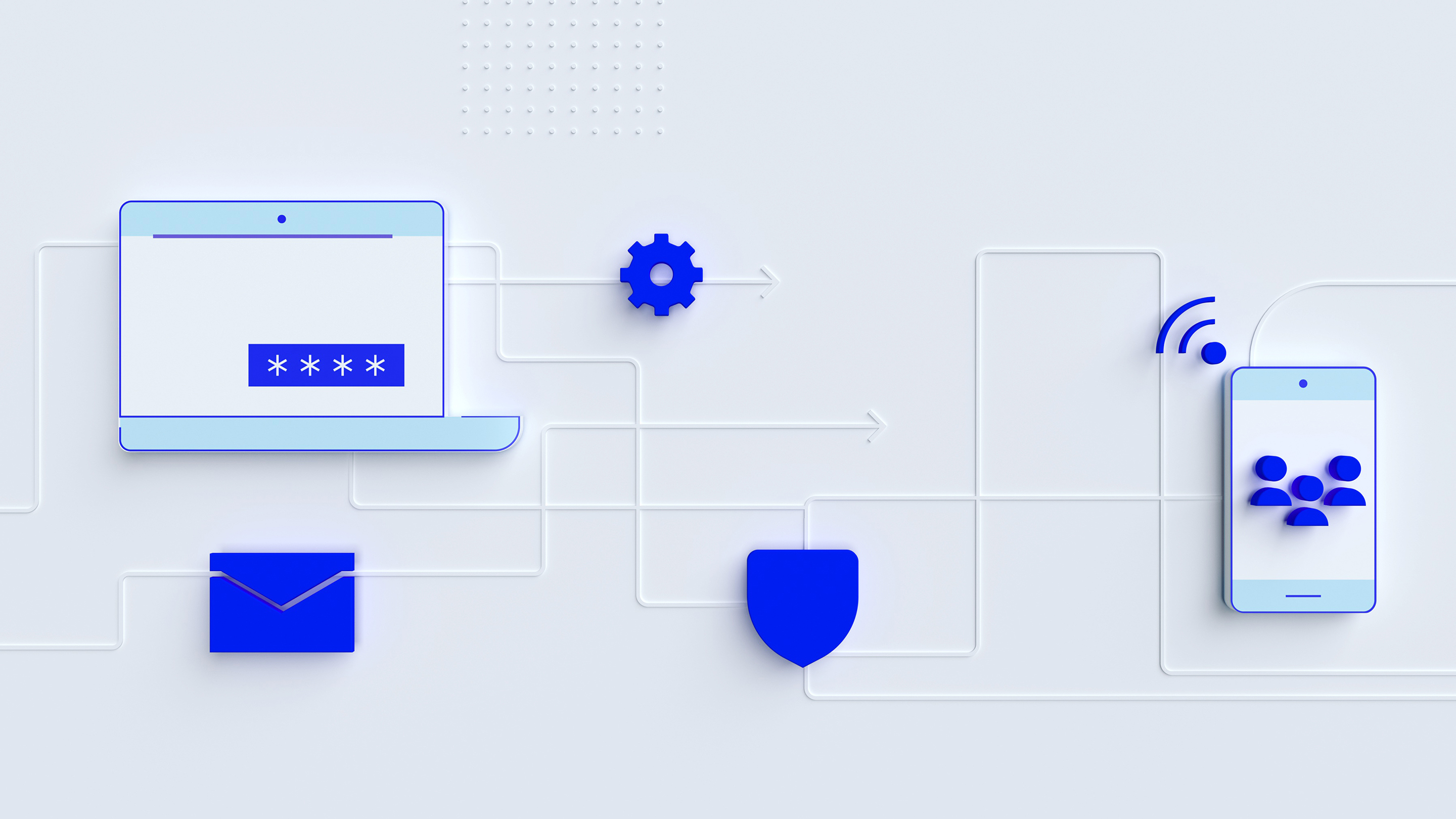
The idea and concept behind the Transcend brand are revolving around their data privacy center. One single entity, accessed from other network nodes through the Internet.
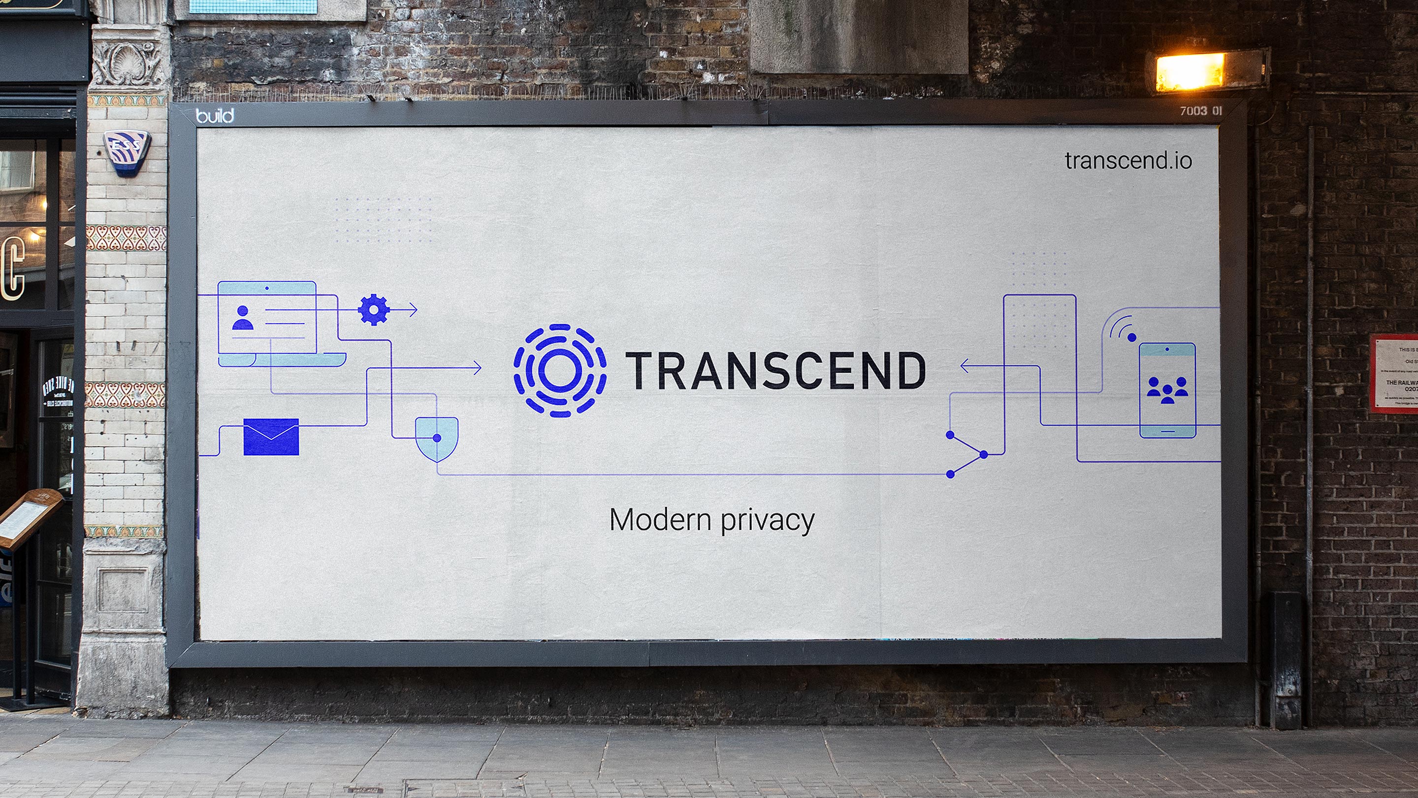
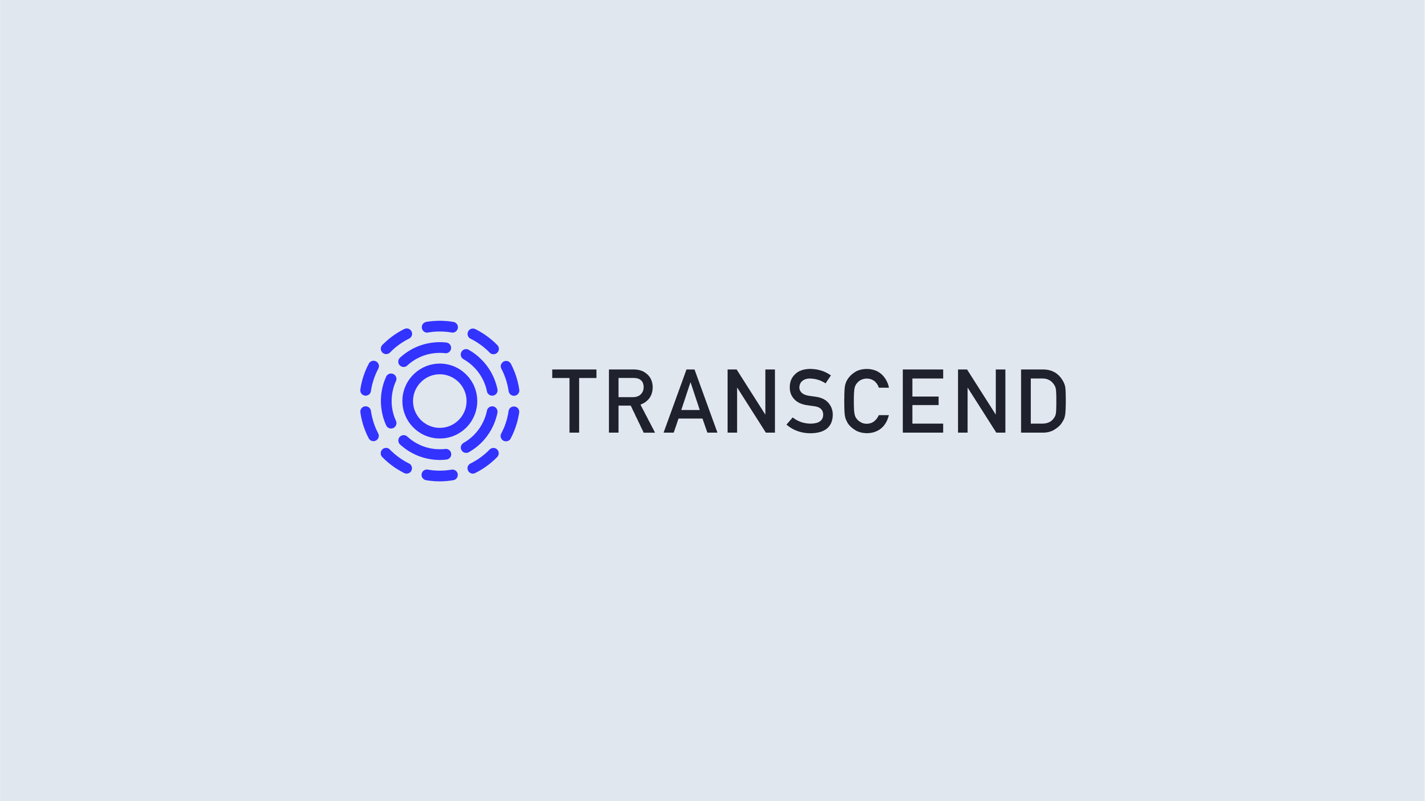
Both the brand identity and the illustrations followed the same analogy and consisted of various circle elements. Everything that goes off the circle boundaries (whether it is the users or companies interacting over the Internet) will eventually connect with a Transcend data center. That is the core metaphor of their brand logo.
Breaking down the logo
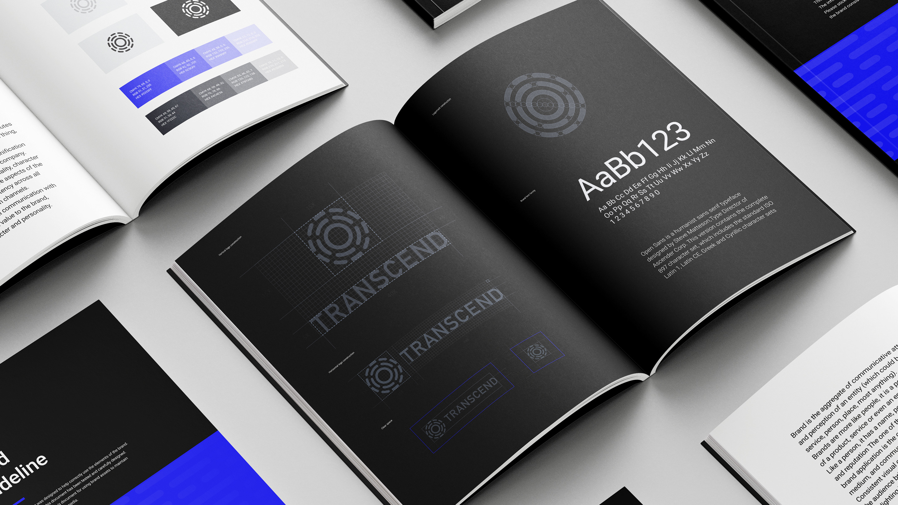
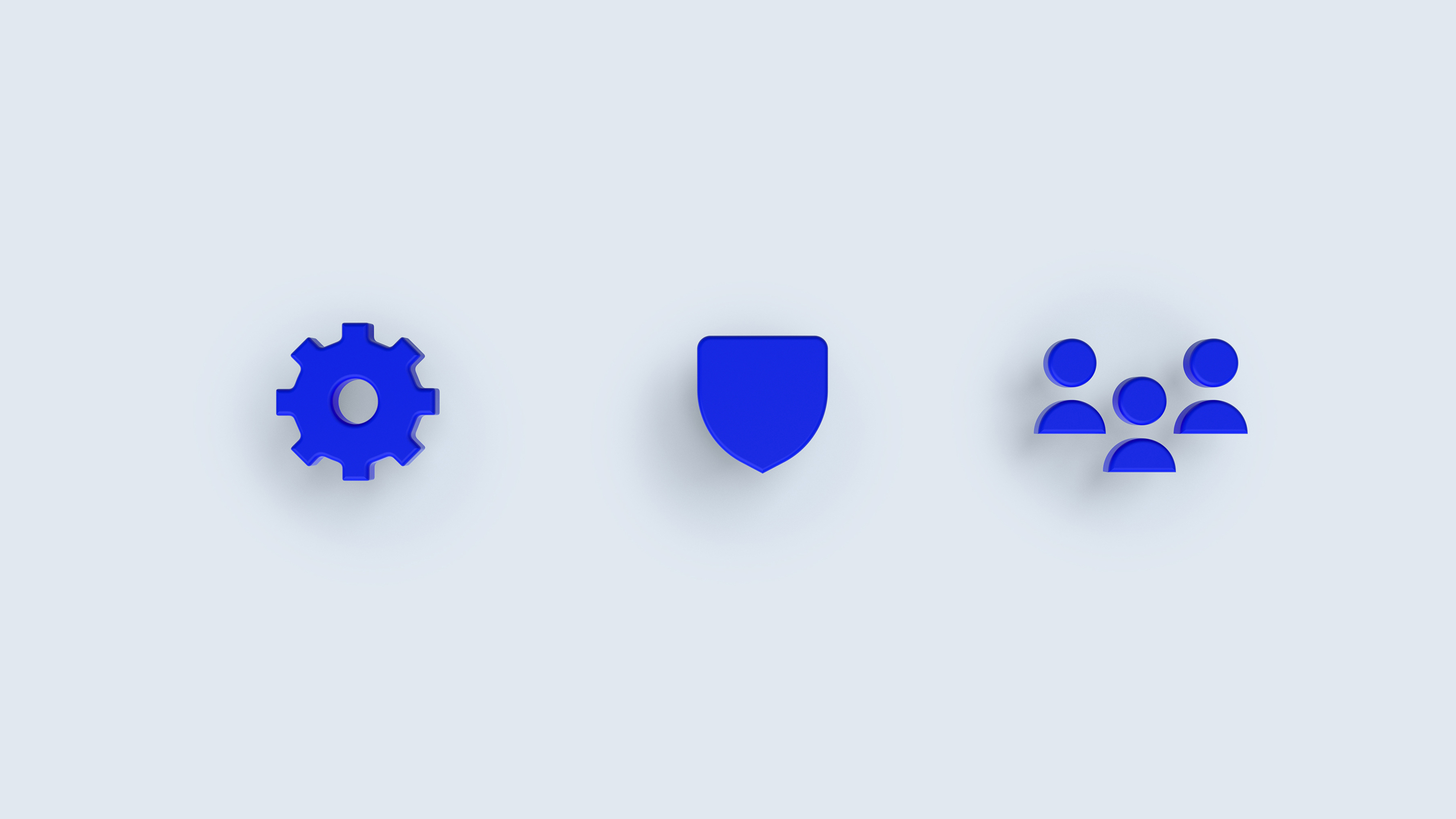
Initially, during brand identity design, we broke down their concept into four key nouns. All of them directly represented Transcend operations: Time-saving, Trust (Insurance), Private (Confidential), Data Management (Control).
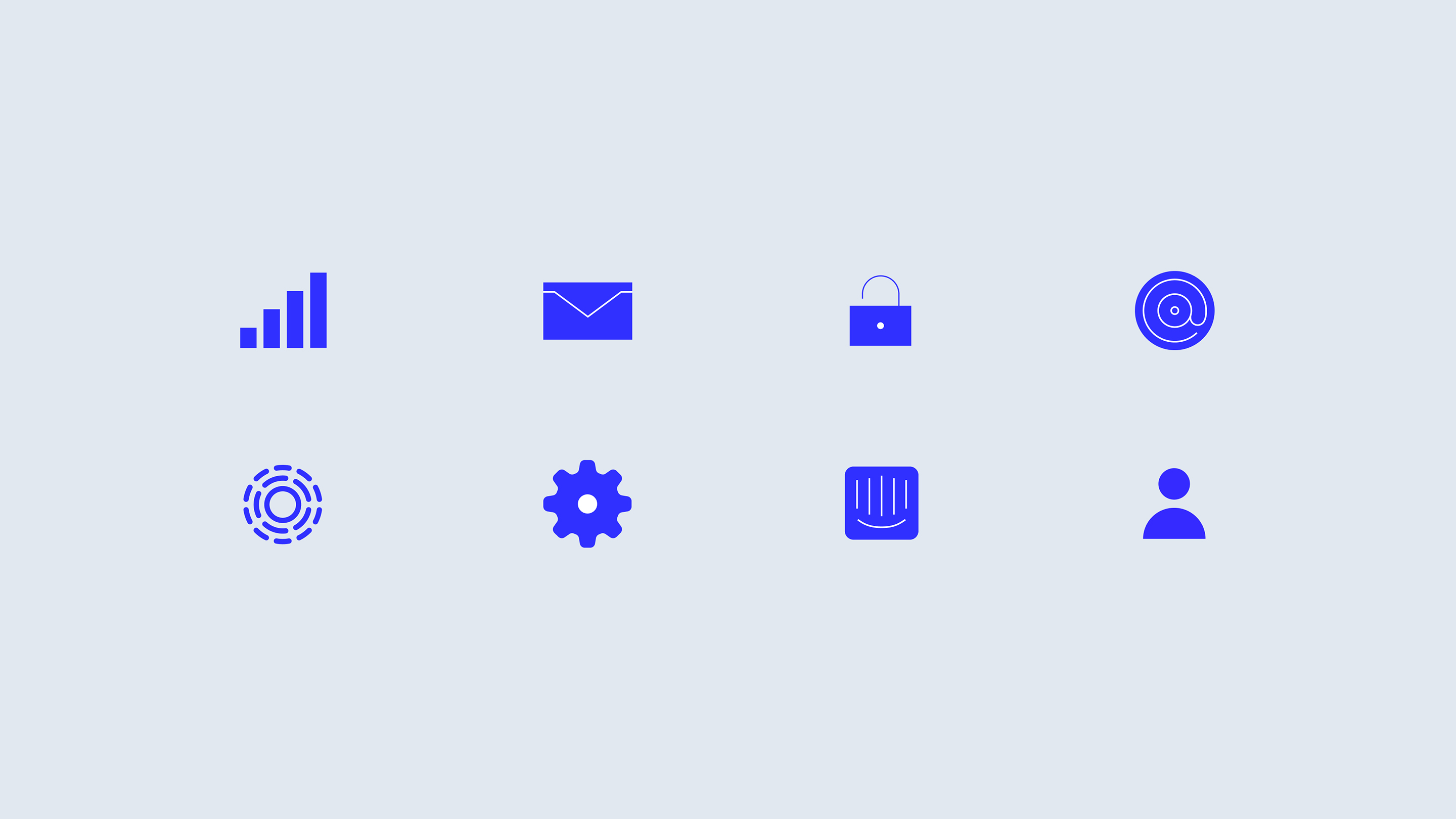
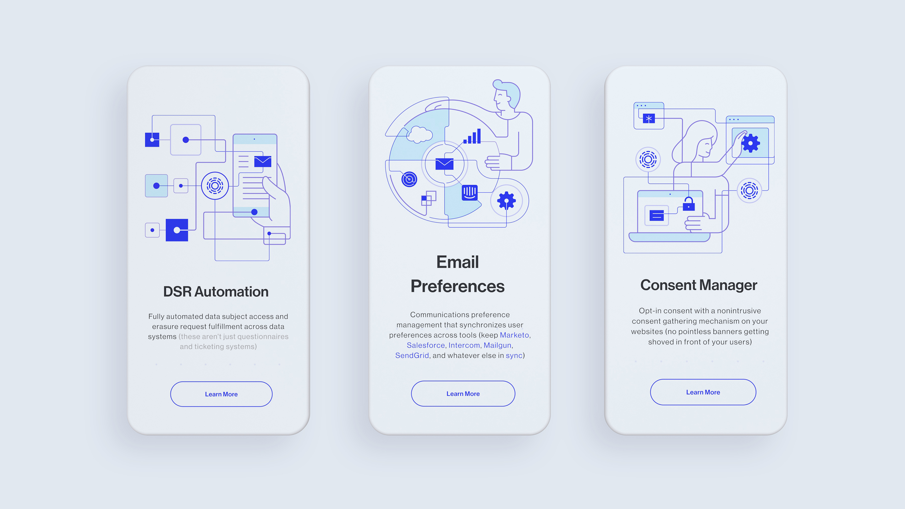
Based on these directions, we compiled a set of keywords that allowed us to implement the shape of the future brand concept. Knot, Shield, Cipher, Puzzle, Dots are just several nouns we took into consideration. Later, based on them our branding agency team developed icons, illustrations, and other visual asset development that eventually made its way into the Transcend website design.
Constructing a web layout
When our website design agency studio partnered up with our friends at Transcend, we found out that their initial website was kind of old school and radiated the energy of a big corporation. However, they wanted to get rid of this aged image and produce a new and modern look.
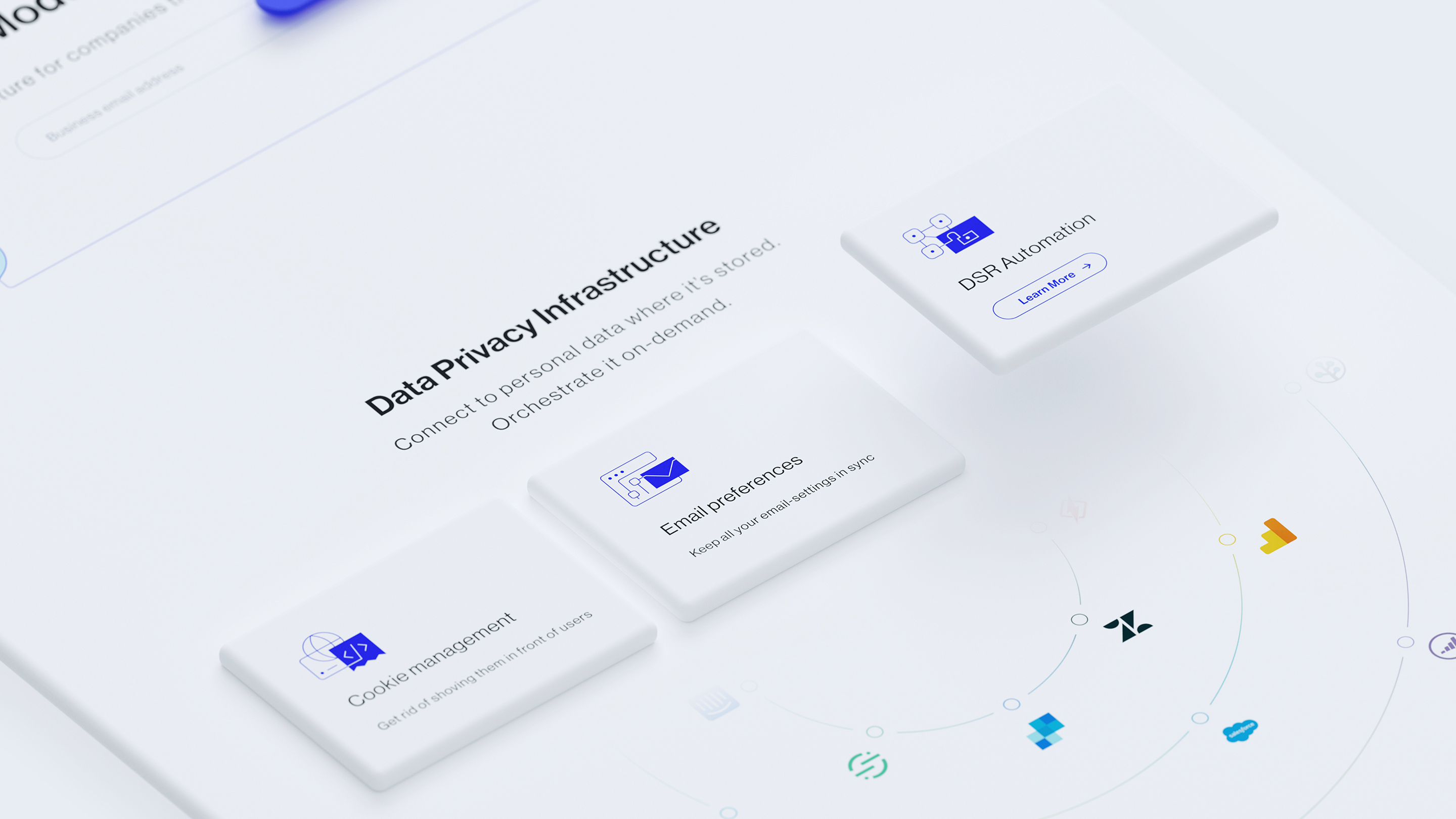
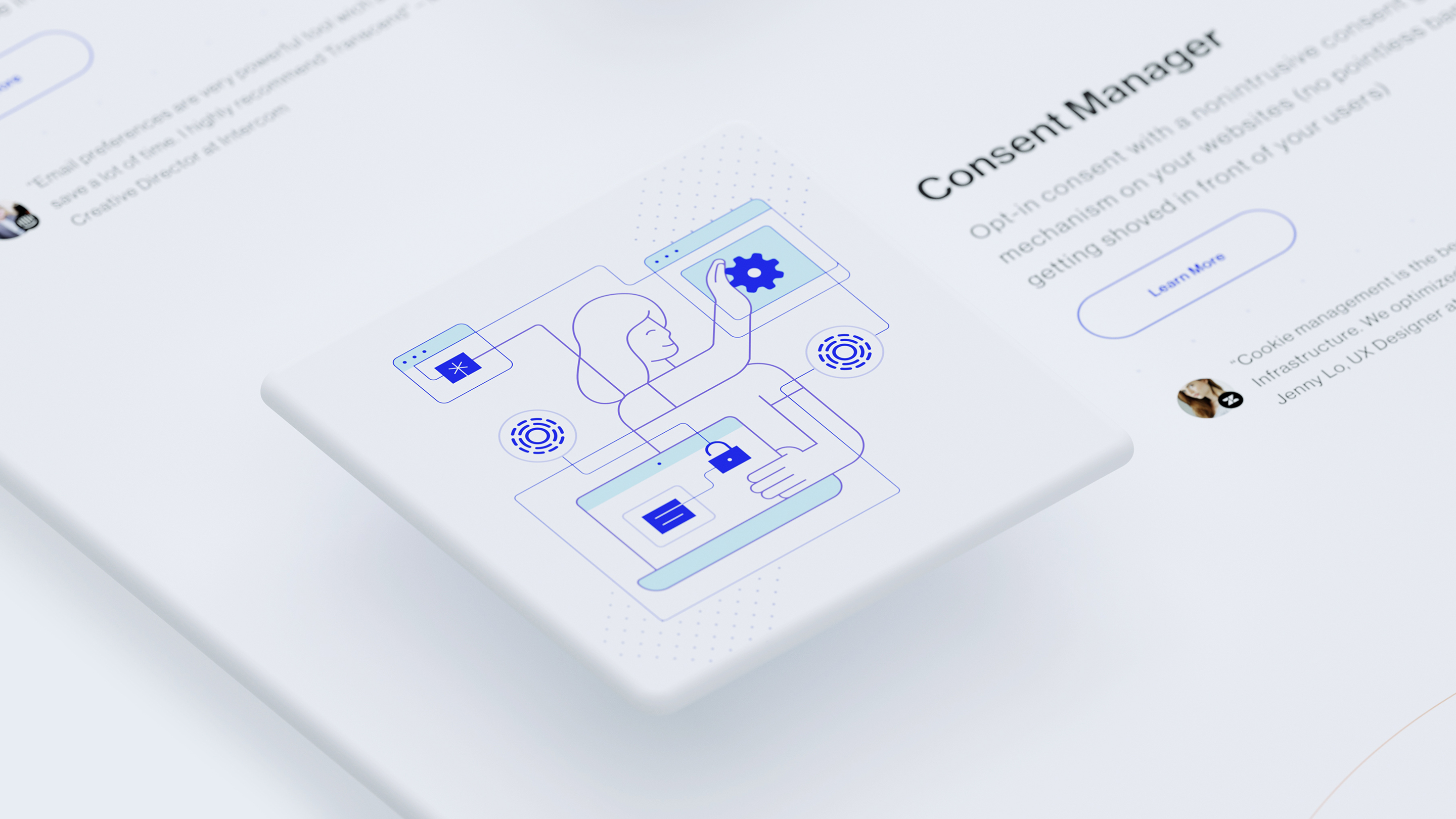
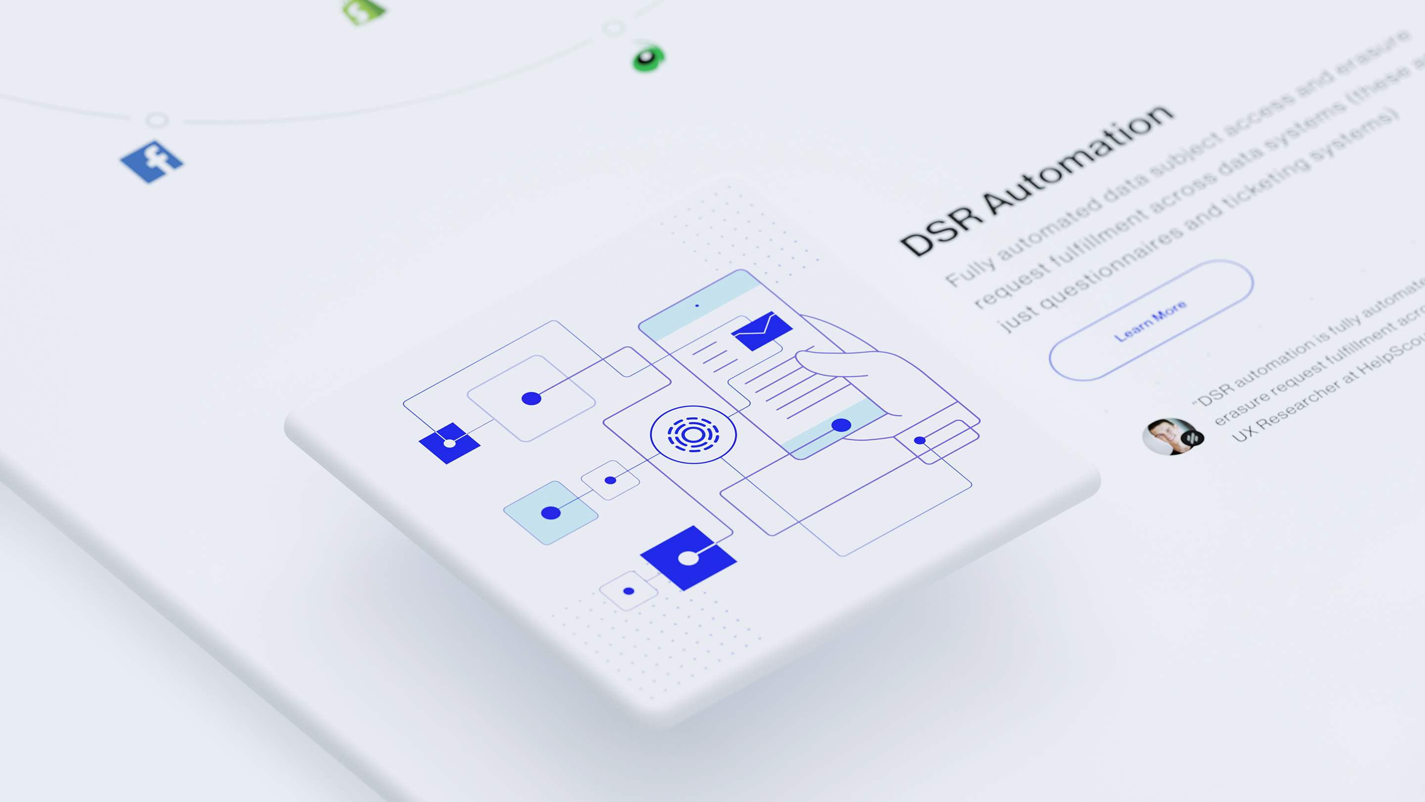
During the brand identity development, we’ve produced several design elements and assets, which were later on added to the website to have a private and trustworthy look. We have even implemented the animation of the data privacy centers located at different brand companies. Our team wanted to highlight how they incorporate the Transcend data centers and put them at the center of their operations.
In regards to the technical specifications, our team applied a Jamstack approach. DatoCMS was used on the back-end, while GatsbyJS was used on the front-end part accordingly. With the combination of both technologies, we produced stable, sustainable, and easily editable web content due to the headless CMS. Along with the layout that was clear, white, and bright with a neat pack of various guidelines.
Everything begins with a dot
After numerous iterations with various brand logo directions, our client chose to stick with the circle sign, as it was closer to the initial concept he wanted to develop. We started to dive deeper into the research process by designing and outlining the chosen option into different shapes and sizes. To be more specific, we started to revolutionize the brand identity image.
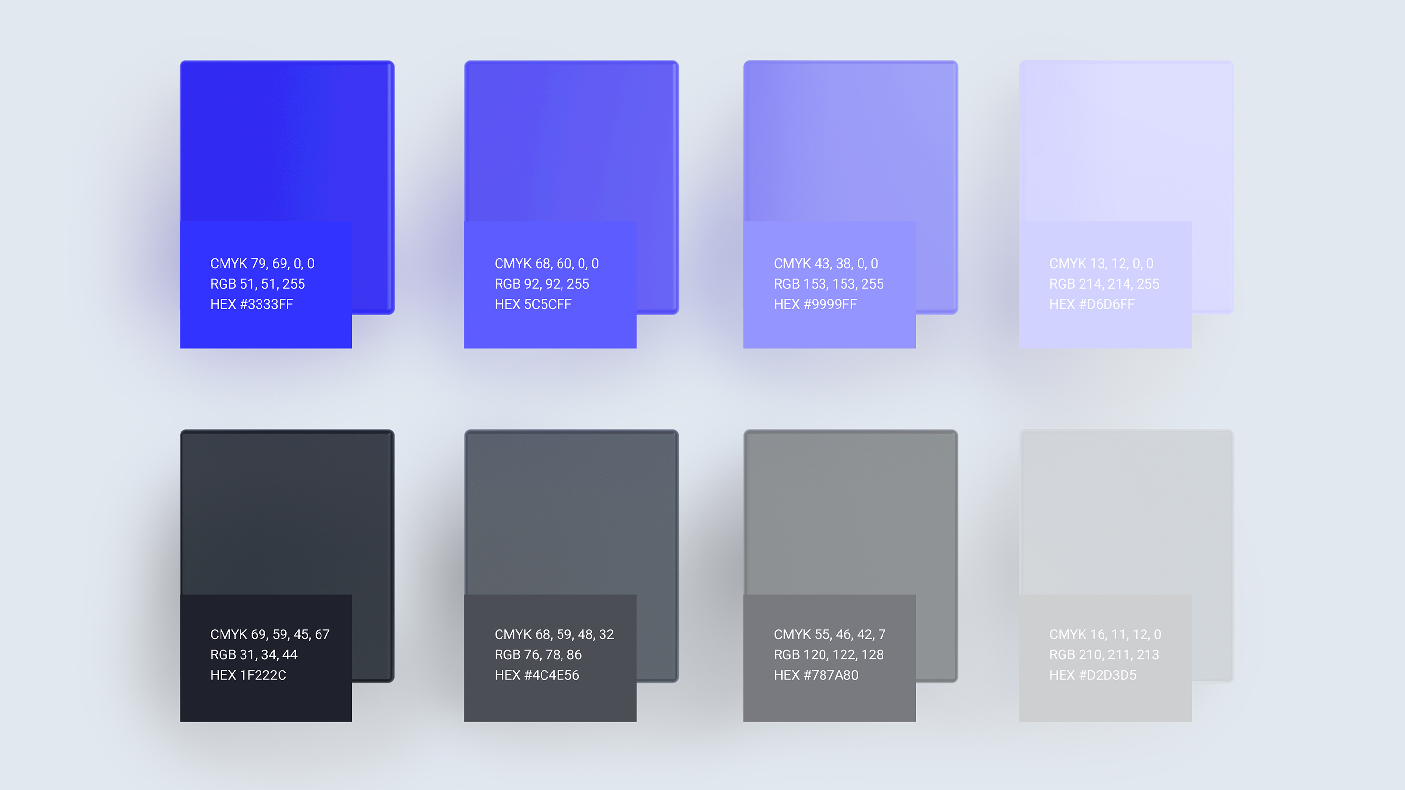
We tried different variations and approaches for the chosen logo, experimenting with the numbers of lines, their thickness, and colors. But in the end, we came up with the current brand logo filled with a Neon Blue color as it has greatly inspired and encouraged both teams.
A fragment of the digital world
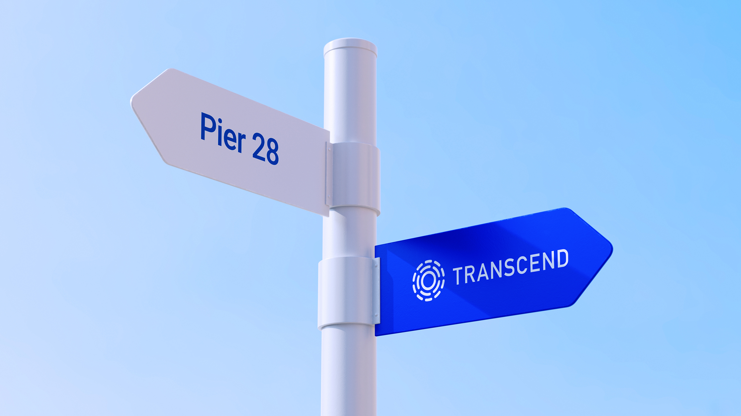
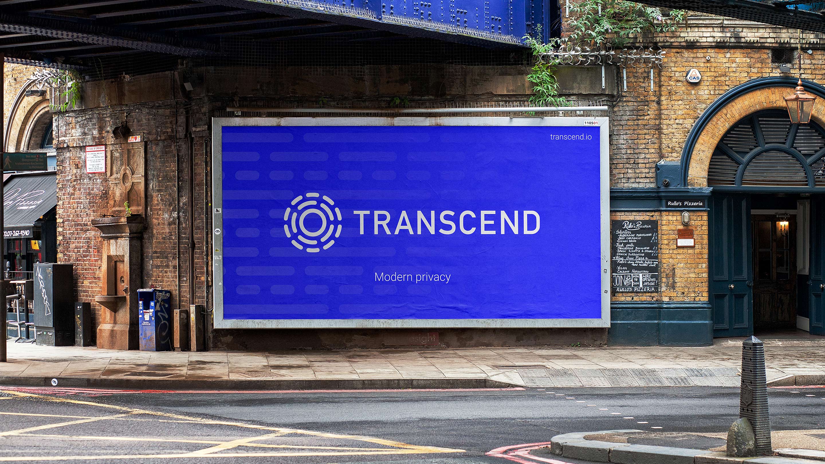
As the last stroke, we rendered the Transcend logo and placed it on various physical and digital formats. That way, our team wanted to demonstrate how the visual brand identity may evolve with time.
Most of them have a variety of dots and circle elements interconnected with each other. That supports the idea that every online action happening inside the Internet space will eventually connect to the roots of Transcend data privacy center. Closed, private, and secure.
