Turo
About
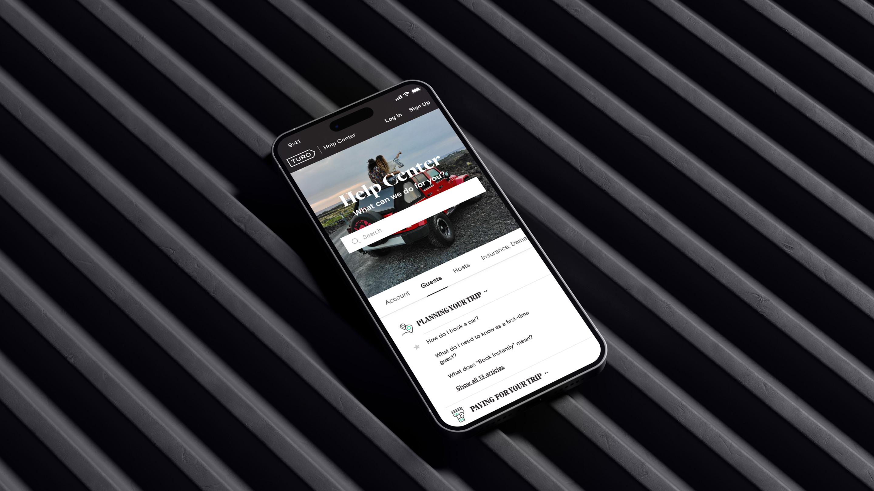
Turo is a peer-to-peer carsharing company based in San Francisco, CA. It has 4 million registered users and 170,000 owned cars available for rental. The company allows private car owners to rent out their vehicles via a web and mobile interface. Turo reached out to us to help redesign their customer support experience. This offered us a unique opportunity to define the look and feel of a 5-star, custom branded support experience.
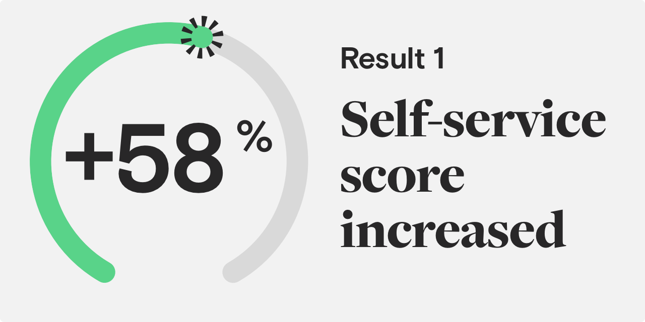
Self-service score
+58%Increase in support efficiency
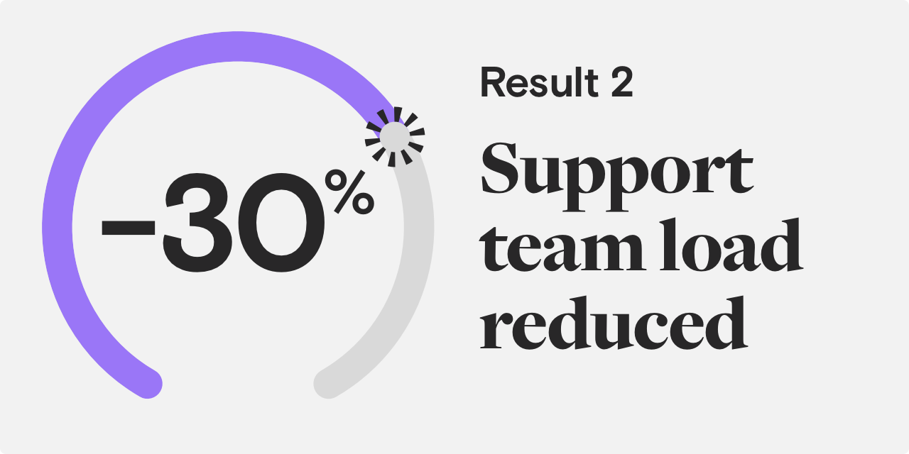
Team load
-30%Time spent on new requests
Usage
3.5MActive guests
Findability challenge
Turo faced UX and UI challenges regarding their customer support portal. Users struggled to find the information they needed and thus had to create ticket requests. It’s vital for support teams to address those tickets as soon as possible, but the influx of tickets overloaded the team and they began to fall behind. This is what formed our goals, which were twofold. First, our UI/UX design agency needed to increase the “self-service” score. Second, we needed to design a fresh, Turo-branded look for the support portal.
Problem statement
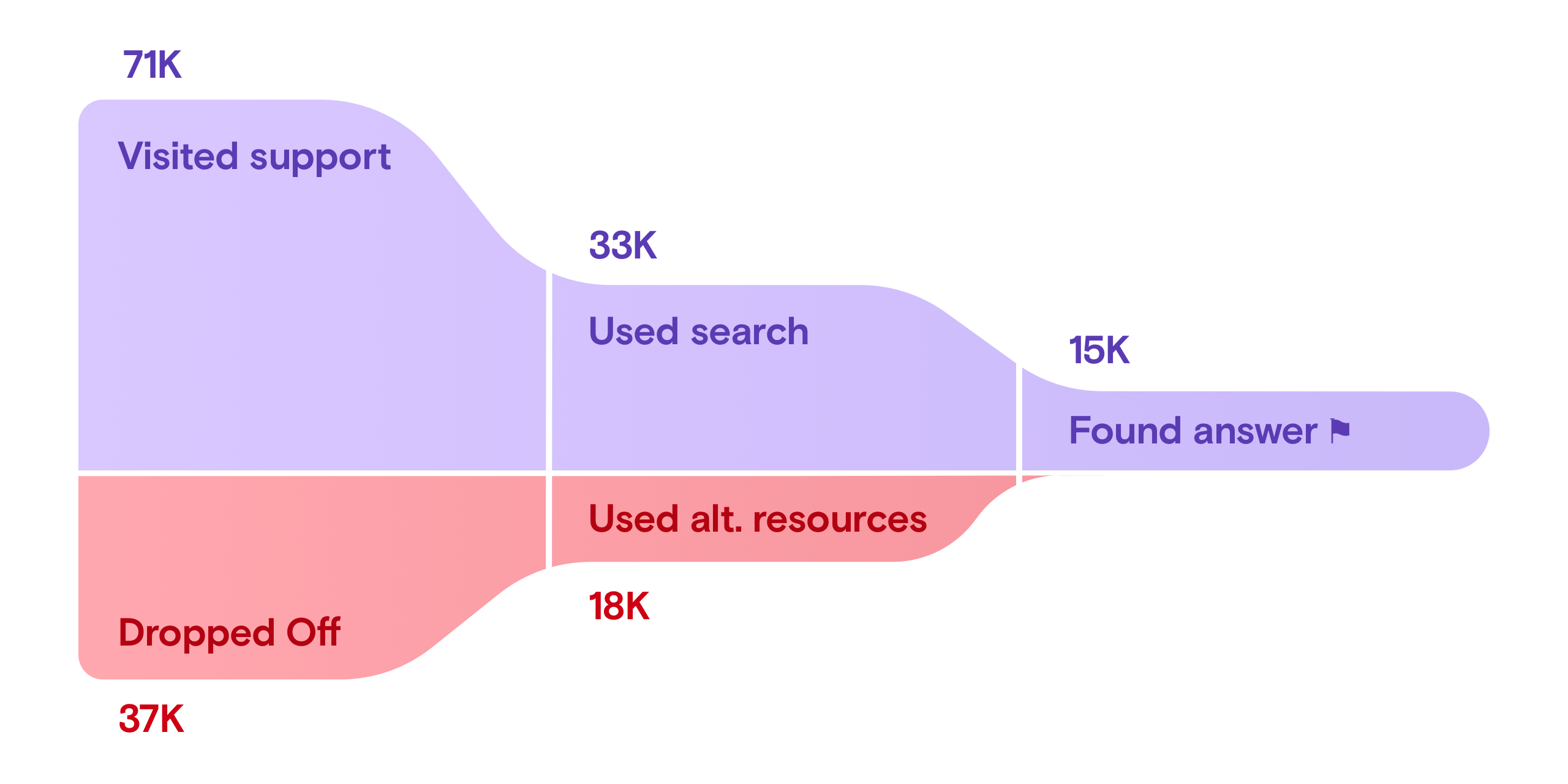
We began the collaboration by examining the most up-to-date analytics for Turo’s support center. At project kick-off, we understood their user behavior to be the following: 53% of users left the support center at the home page, 26% utilized alternative resources, and only 21% could find what they were looking for.
Self-service goals
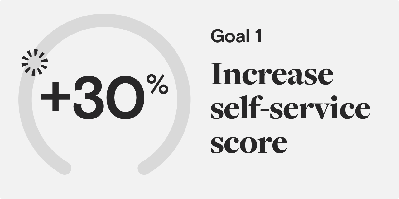
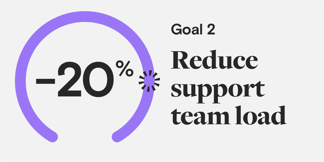
We discussed these results with Turo’s team, defined their main areas of improvement needs and set our goals. The main initiative was to improve the “self-service” score by 30% and as a result, reduce the number of tickets created.
Design consistency
The support portal is a major part of a brand’s image. Its purpose is to inform users passively and to assist directly when they face issues that cannot be solved alone. To do this effectively support messaging should be empathetic. The support portal itself should also have a welcoming and friendly vibe. To evoke such feelings, brands should maintain consistency across their styles. When customers see a brand, they should be able to immediately recognize and remember them. This helps to build trust. During the redesign, our branding agency experts extended Turo's brand language across all of their design components to help achieve easy recognition.
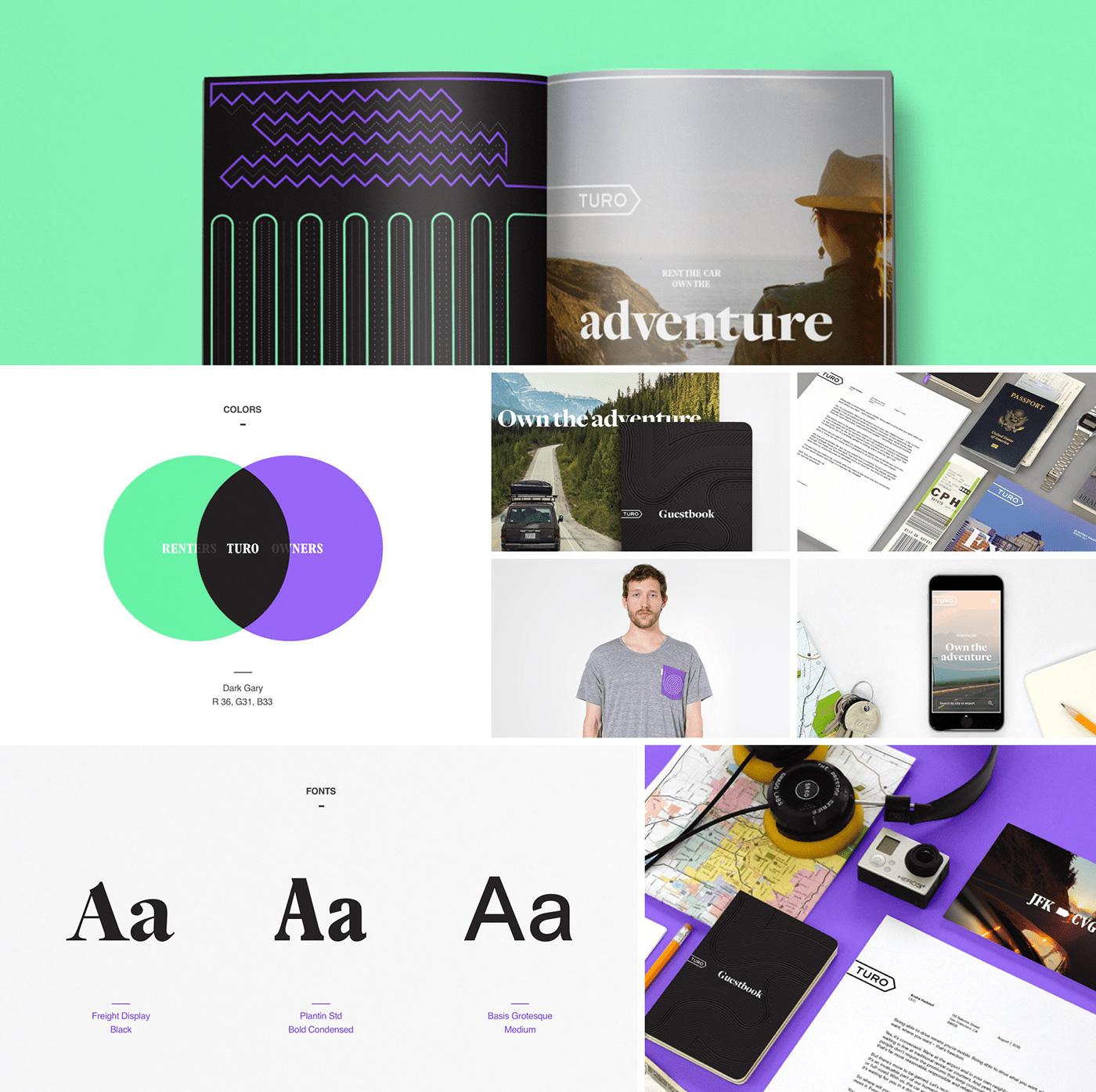
Extending the visual identity
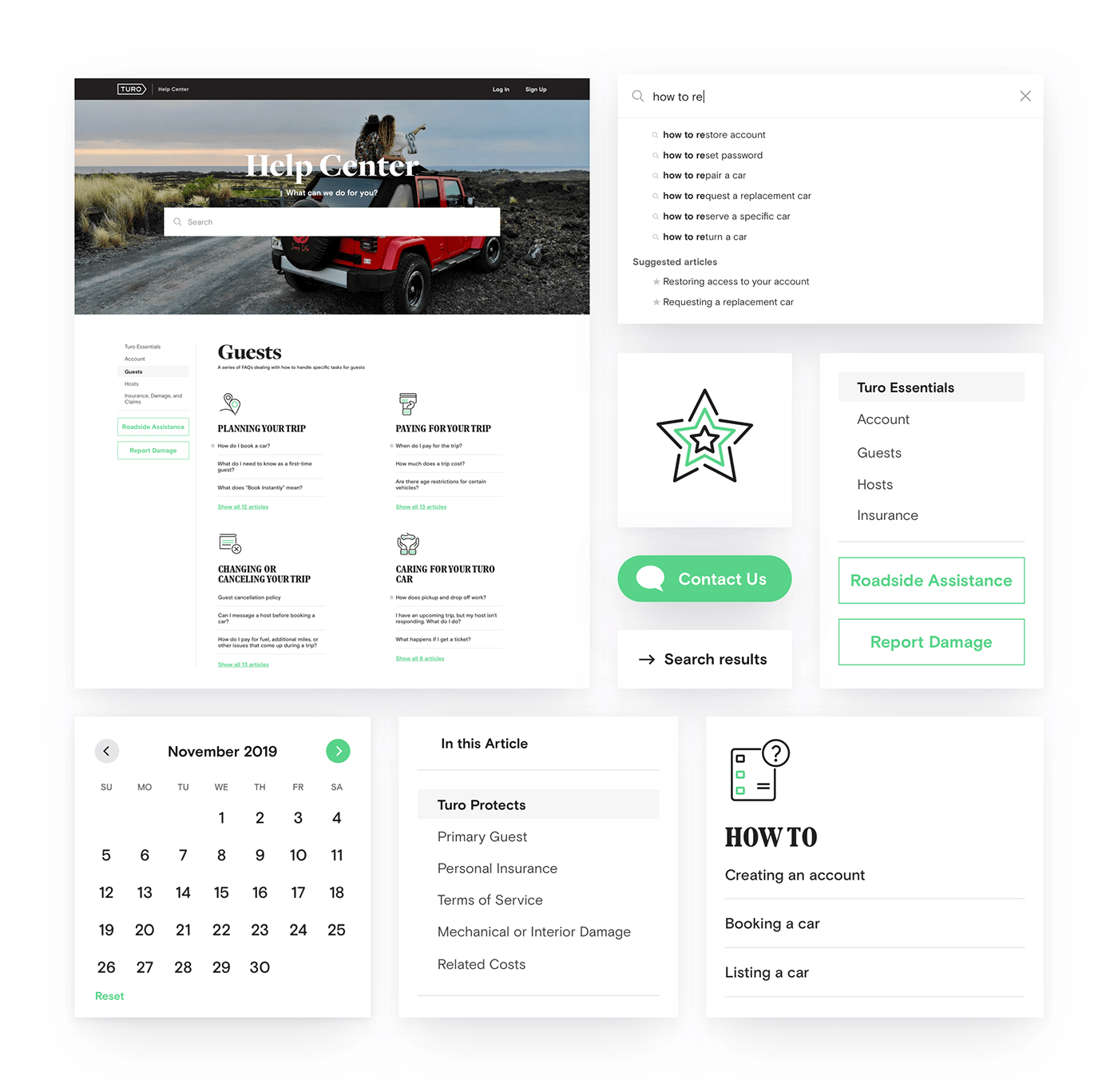
Human beings process and understand visuals much faster and easier than words. Because of this, recognizable navigation design is elemental to UX and UI success. To help customers find their way, we've improved the iconography for Turo’s support portal categories. We've made categories look more distinguishable so that customers can easily perceive their purpose. This augmented our work to make the support portal more approachable and friendly.
Turo provides an easy way to rent any type of car for any occasion. To better illustrate that concept, we’ve designed footer illustrations as an extra visual element.
User experience and visual layout
We started from the most obvious, highest priority pain points and worked our way down the list.
We've enhanced the main search box on the support landing page. Also our website agency studio redesigned the structure of the pages and categorized the main sections and visitor types. Lastly, we improved the navigation within each article and supplied the most viewed ones with supportive icons.
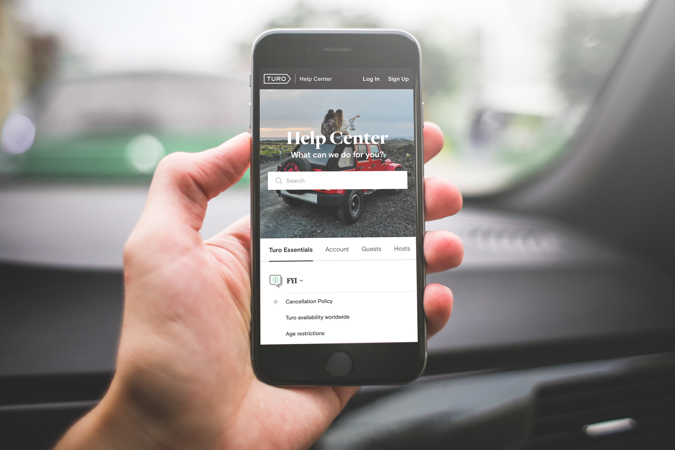
Results: self-service increased by 58%, support overflow decreased by 30%
The redesign resulted in improved experiences for both navigation and support usability. The “self-service” score increased by 58% — an incredible outcome. The updated search box and articles layout increased the content readability by 4X. All this helped to off-load the support team’s overflow by 30% and help them get back on track.
