Social media web app
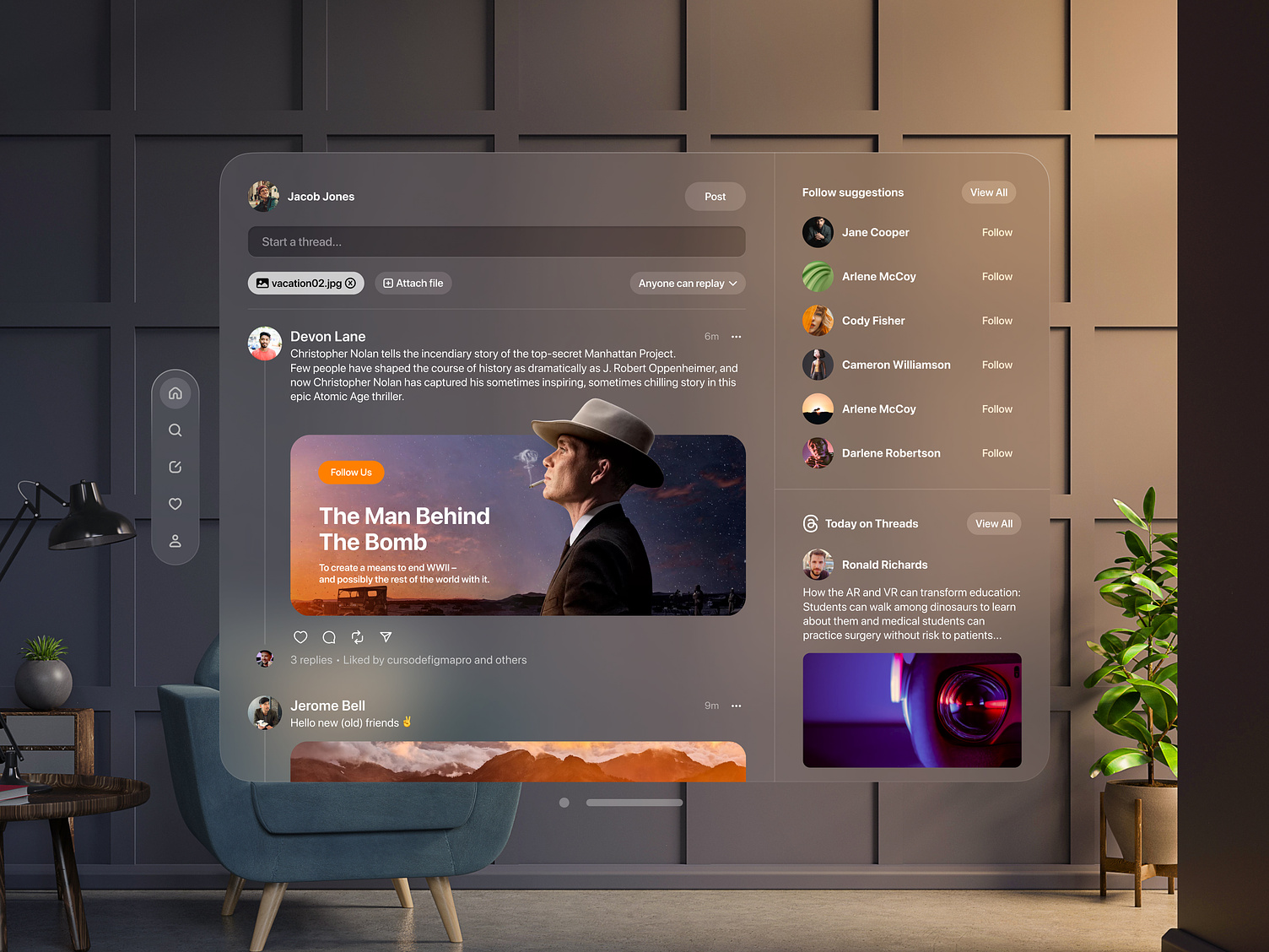
The web design concept presents a sleek, modern social media dashboard interface with a dark color palette that emphasizes visual content through high-quality images and a card-based layout.
Functionality
It is created by our UX design team and geared towards enhancing user engagement and personalization, with intuitive navigation and interactive features that encourage social connectivity and content discovery.

Design Essence and Elements:
- Modern Aesthetic: The design follows a contemporary style with a clean, minimalist layout, employing a muted color palette that suggests a professional and sleek user experience.
- Hierarchy and Layout: There's a clear visual hierarchy, with the main content area centralized. The layout uses cards or panels to separate different pieces of content, which aids in readability and organization.
- Navigation: A vertical navigation bar on the left side provides quick access to various platform sections, a typical pattern in web design for ease of use.
- Typography and Iconography: The typography is consistent and legible, with a mix of serif for titles and sans-serif for body text, which can improve readability. The use of icons following text elements aids visual recognition and navigation.
- Imagery and Graphics: Using large, engaging images within content previews is prominent, drawing the user's attention and improving engagement.
- Interactive Elements: There are interactive elements, such as buttons for following and post-interaction, which are clearly demarcated with icons and contrasting colors for better user interaction.
Likely Benefits:
- User Engagement: The prominent imagery and clear call-to-action buttons enhance user engagement.
- Ease of Navigation: The clear layout and navigation bar makes it easy for users to navigate the platform.
- Visual Appeal: The modern design aesthetic can increase the platform's appeal to users who prefer a clean and organized interface.
- Scalability: The card-based design is adaptable and can easily be scaled with additional content or different device screens.
Application by the User:
- Content Interaction: Users can interact with content through likes, comments, and shares, as indicated by the icons under the post.
- Content Discovery: Users can discover new content and suggestions on the sidebar, which appears to recommend connections and threads.
- Personal Expression: The ability to post new content, as indicated by the "Start a thread..." box, allows for personal expression and sharing.
- Information Consumption: The design facilitates easy information consumption, focusing on visual media, headlines, and short descriptions.
Overall, the design concept is focused on providing a streamlined and visually engaging platform for content sharing and networking, emphasizing ease of use and modern web design principles.