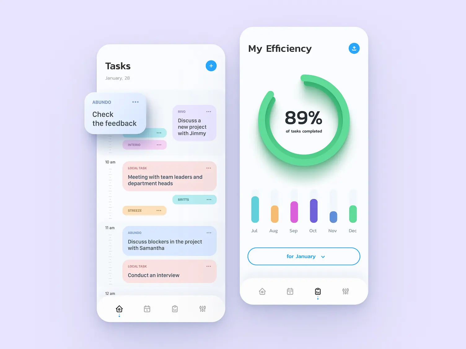
Productivity tracker app
This productivity tracker app UX design concept represents the pinnacle of user-centric design, tailored by our UX design agency to deliver a seamless experience in managing tasks and monitoring efficiency.
Functionality
The concept focuses on providing users with a clear overview of daily tasks and their progress with an efficiency metric. It's a holistic approach that allows for detailed planning, tracking, and analysis of task completion rates, offering micro and macro insights into productivity levels.

Design Elements
- Task List View: The task list view is clean and segmented by time, offering an at-a-glance summary of your day. The use of color-coded tags helps in prioritizing and categorizing tasks, making it easier to navigate your daily agenda.
- Efficiency Gauge: A prominent, circular efficiency gauge visually represents task completion rates, offering immediate feedback on your productivity. The gauge's design is aesthetically pleasing and functional, encouraging users to strive for higher efficiency.
- Monthly Progress Bar: The monthly progress bars are minimalistic yet informative, displaying your performance over time. This visual representation helps spot trends and evaluate your productivity for continuous improvement.
- Interactive Elements: User interaction is facilitated through easy-to-locate buttons for adding tasks and adjusting settings, which ensures that managing your workload is just a tap away.
- Date and Task Filter: The date filter at the bottom provides a simple mechanism to navigate through different timelines, while the task filter allows for quick sorting of tasks based on various parameters like project or priority.
- Visual Hierarchy: The design employs a well-thought-out visual hierarchy, making distinguishing between different types of functions and actions effortless. Critical information stands out, reducing cognitive load and enhancing usability.
- Aesthetic Consistency: The consistent color scheme and typography throughout the design make it visually appealing and aid in the app's intuitive use, reinforcing brand identity and user recall.
Likely Benefits
Implementing this design concept could significantly enhance user engagement and satisfaction by providing a satisfying and intuitive user experience. The emphasis on visualization of productivity and task management assists in better planning and time management, ultimately leading to increased productivity.
Application of the Design Concept
As a user, applying this design concept transforms the mundane task of daily planning into a pleasurable experience. The interface is tailored to offer you a sense of control and accomplishment as you interact with your tasks and track your progress.
The daily task list is your starting point each morning, where you can quickly assess your agenda and prioritize as needed. The efficiency gauge provides a gratifying visual cue as it edges closer to full completion, offering a sense of achievement with each task checked off.
Meanwhile, the monthly progress bars reflect your long-term productivity, encouraging continuous personal or professional growth.The interactive elements are not just functional; they are a joy to use, with responsive feedback that makes task management feel effortless. This design concept is not just about productivity; it's about creating a fulfilling user journey through daily hustle.
Overall, our UX design agency's productivity tracker app UX design concept aims to merge functionality with pleasure. It's a holistic system that understands the nuances of your workflow, adapting to offer a personalized and efficient task management experience. By incorporating this concept into your routine, you're not just checking off tasks—you're optimizing your life for peak performance and satisfaction.