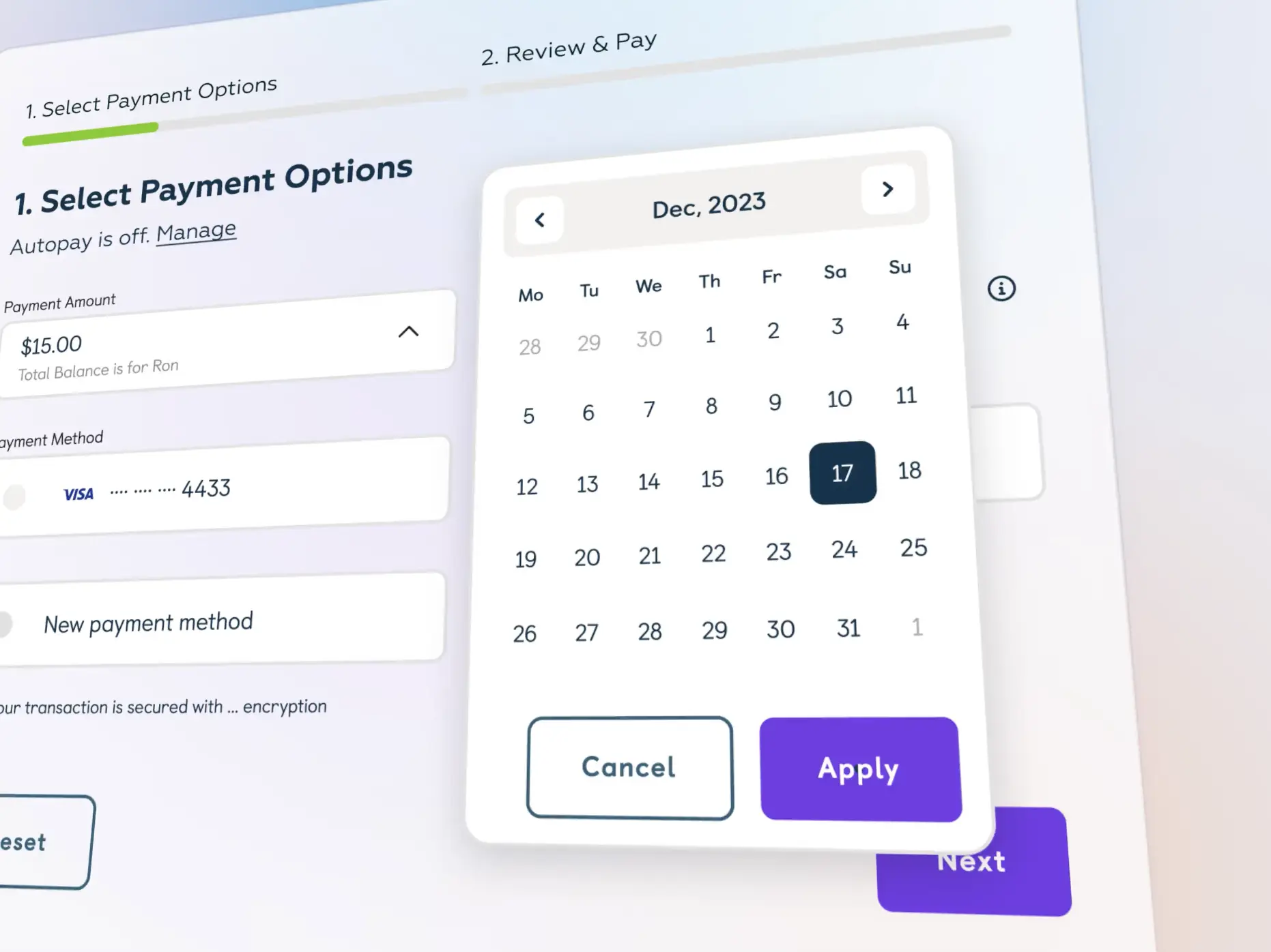
Payment flow web app
Our agency for web application design has crafted a payment flow that is aesthetically pleasing and functionally superior. This design concept promises to streamline the payment process for users.
Functionality
The payment flow web application design concept is structured to guide users through a simple four-step process: selecting payment options, reviewing and confirming payment details, executing the transaction, and receiving confirmation of scheduled payments. This sequence ensures clarity and efficiency from start to finish.

Design Elements
- Payment Selection Interface: The design features a clean, card-based interface for selecting payment options, making it straightforward for users to enter and review their payment details. The visuals could be more precise, promoting a focused and user-friendly experience.
- Calendar Integration: A built-in calendar for selecting payment dates adds convenience, allowing users to schedule payments with ease and precision, enhancing the overall usability of the payment system.
- Security Assurance: Emphasis on security is evident with the inclusion of encryption badges, reassuring users that their transactions are protected. This small yet critical design element builds trust and confidence in the payment system.
- Confirmation Screens: The confirmation steps are marked and provide users with all the necessary details, including the amount, payment method, and scheduling. This transparency is essential for building a reliable user interface.
- Autopay Prompt: The final screen allows users to set up autopay, a functional element that adds to the convenience of allowing for automatic recurring payments. The prompt is designed to be informative yet unobtrusive.
Likely Benefits
Integrating this design concept into a web application could significantly enhance user satisfaction by minimizing the time and effort required to make payments. The intuitive layout and reassuring security features will likely reduce errors and increase users' adoption of online payment methods.
Application of the Design Concept
When users interact with this payment flow, they will find the process to be intuitive and guided. The straightforward layout reduces cognitive load, making it accessible even for those who are not tech-savvy. Users can confidently manage their payments without assistance, fostering independence and satisfaction with the web application.
The emphasis on clear visual cues and step-by-step progression makes the payment process less daunting and more engaging. The calendar feature, for instance, allows users to plan easily, while the final confirmation screen serves as a reassuring checkpoint before the payment is processed.
Overall, the design concept is a testament to the agency's commitment to delivering high-quality web application designs that prioritize user experience, security, and efficiency. It exemplifies a harmonious blend of form and function that could set a new standard for online payment systems.