Online Banking Website
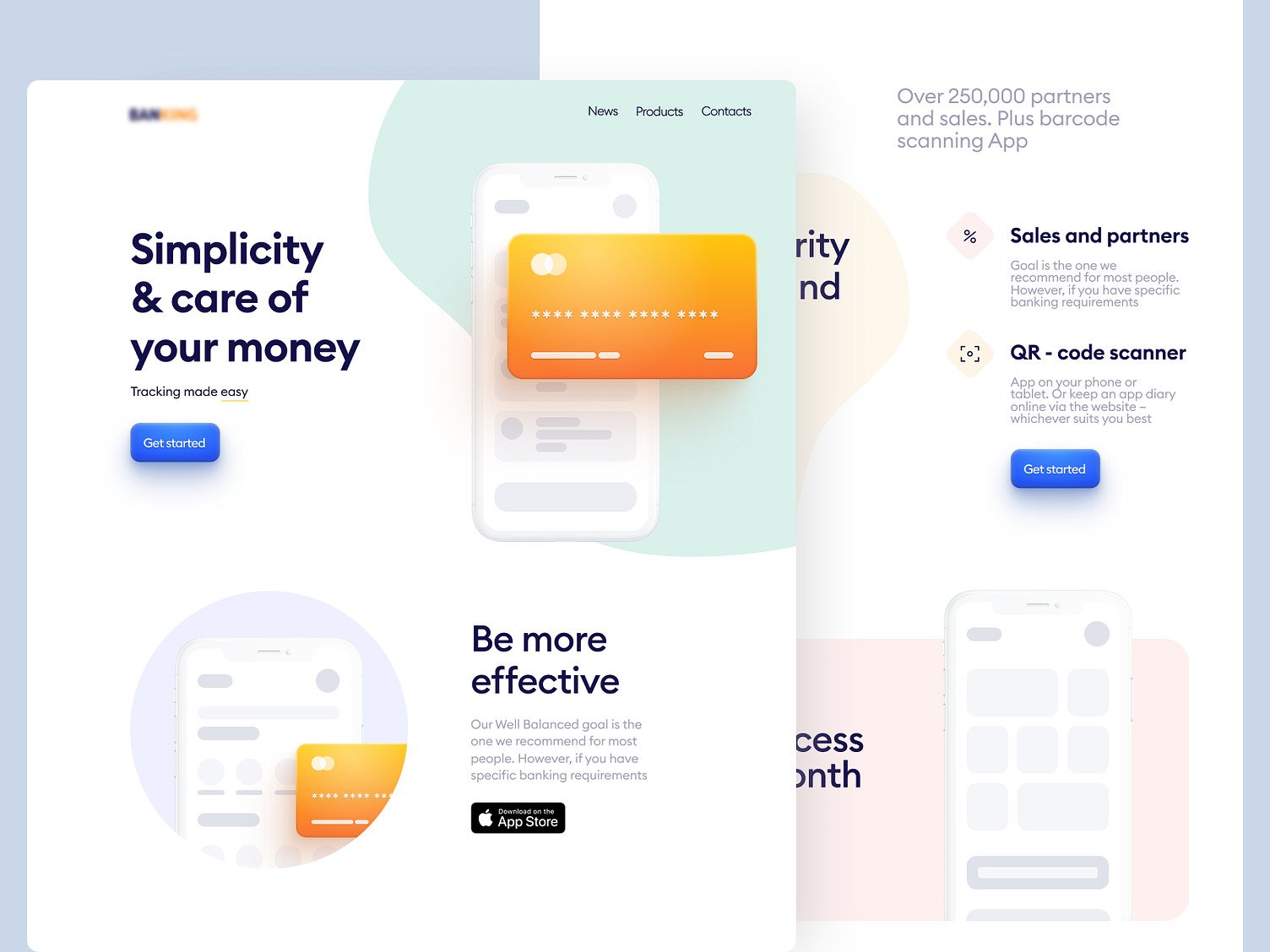
Seasoned website designers craft this online banking website design concept to deliver a seamless financial management experience focusing on user engagement and simplicity.
Functionality
The concept focuses on simplifying financial management for users through an online platform.
It includes transaction tracking, partner and sales information, and a QR code scanner for easy app access.
The design suggests a user-friendly interface to enhance the experience of managing finances, encouraging continuous engagement with the financial tools provided.

Design Essence and Elements
- Color Palette: The design employs a soft, pastel-based color scheme that creates a sense of calm and trustworthiness, which is crucial for financial services. Using orange for highlights and call-to-action buttons adds a pop of color that draws the user's attention to essential actions they can take.
- Typography: A modern, sans-serif font is used throughout the design, contributing to the site's contemporary feel. The font sizes are varied strategically to establish a hierarchy of information, with larger headings and smaller body text sizes, ensuring that users can quickly identify critical information.
- Imagery: Illustrations are used rather than photographs, which gives the site a friendly and approachable look. The smartphone illustrations that showcase the app's interface are simplified, avoiding unnecessary complexity and focusing the user's attention on the app's functionality.
- Layout: The content is organized in a grid-like asymmetrical layout, which guides the user's eye across the page in a natural flow. This layout divides the website into distinct sections for different functionalities, making it easier for users to find what they need without feeling overwhelmed.
- Iconography: The icons are designed with simplicity in mind, using outline-based graphics that are easily recognizable. This minimalist approach to icons ensures that users can understand the features at a glance without needing to read lengthy descriptions.
- Call-to-Action Buttons: The buttons are designed to stand out, using contrasting colors and a size that makes them easy to find and click on. They are placed strategically next to the corresponding service offerings to prompt immediate user action.
- User Interface Components: Interactive elements like dropdown menus, input fields, and toggles are styled consistently with the rest of the design. They feature rounded corners and soft shadows that add depth while maintaining the minimalist aesthetic.
- Whitespace: The design makes excellent use of whitespace, or negative space, to prevent the interface from becoming too busy or cluttered. This space allows each design element to breathe, making the interface more relaxed and easier to navigate.
- Responsive Design: While not explicitly shown in the static image, the arrangement of elements suggests a responsiveness to different screen sizes. This would ensure the design retains its usability and aesthetic appeal across various devices, from desktops to mobile phones.
Likely Benefits
The design will likely attract users with its clear, uncluttered layout and engaging visuals that make online banking more manageable.
Integrating essential services in one platform could streamline banking tasks, saving time and reducing the complexity of financial management. This can improve user satisfaction and retention.
Application by the User
Users can interact with the concept by utilizing the various features outlined on the website, such as tracking finances, scanning QR codes to download the app, and finding information on partners and sales.
The straightforward calls to action suggest that users are guided towards engagement with the services, likely through a step-by-step process that starts with downloading the app.
The design concept is applied through a digital interface that prioritizes ease of navigation and clarity of information. An experienced design team has likely considered the user journey meticulously, ensuring that each step a user takes is intuitive.
The end application is a comprehensive online banking solution aiming to fulfill all banking needs efficiently.