Ninox
About
Ninox is a company that created a digital product that automates various business processes, which makes it easier for every manager to manage their services.
Conversion
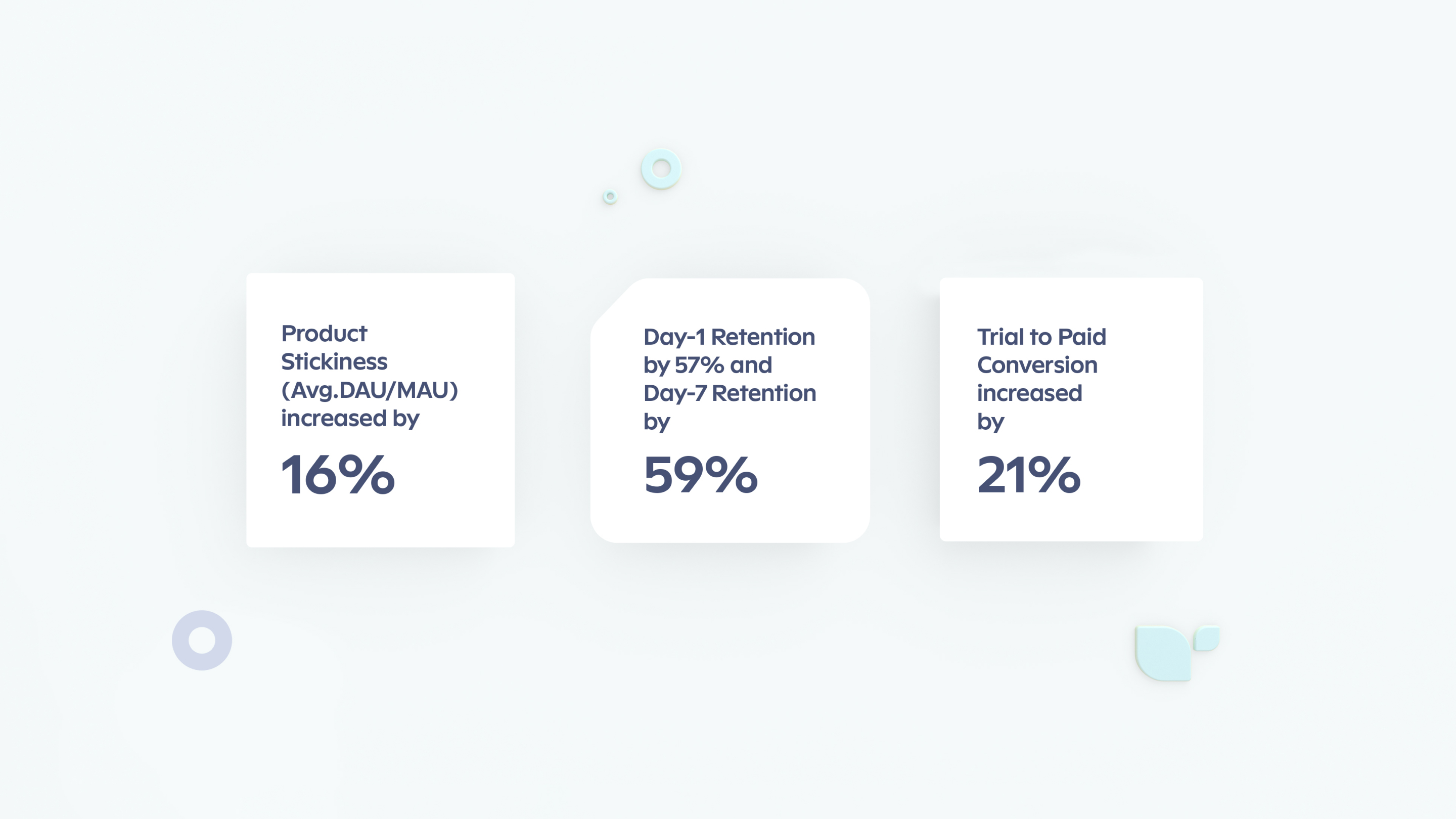
30%Increase in trial-to-paid users
Website
ninox.comNinox is a unique company that has produced and is constantly enhancing its digital automation product for every business process. Now it has become more convenient to plan and structure business tasks according to the enterprise requirements. During our cooperation, we worked on different assignments that have significantly increased various product metrics. Let’s start our journey right from the beginning.
First steps
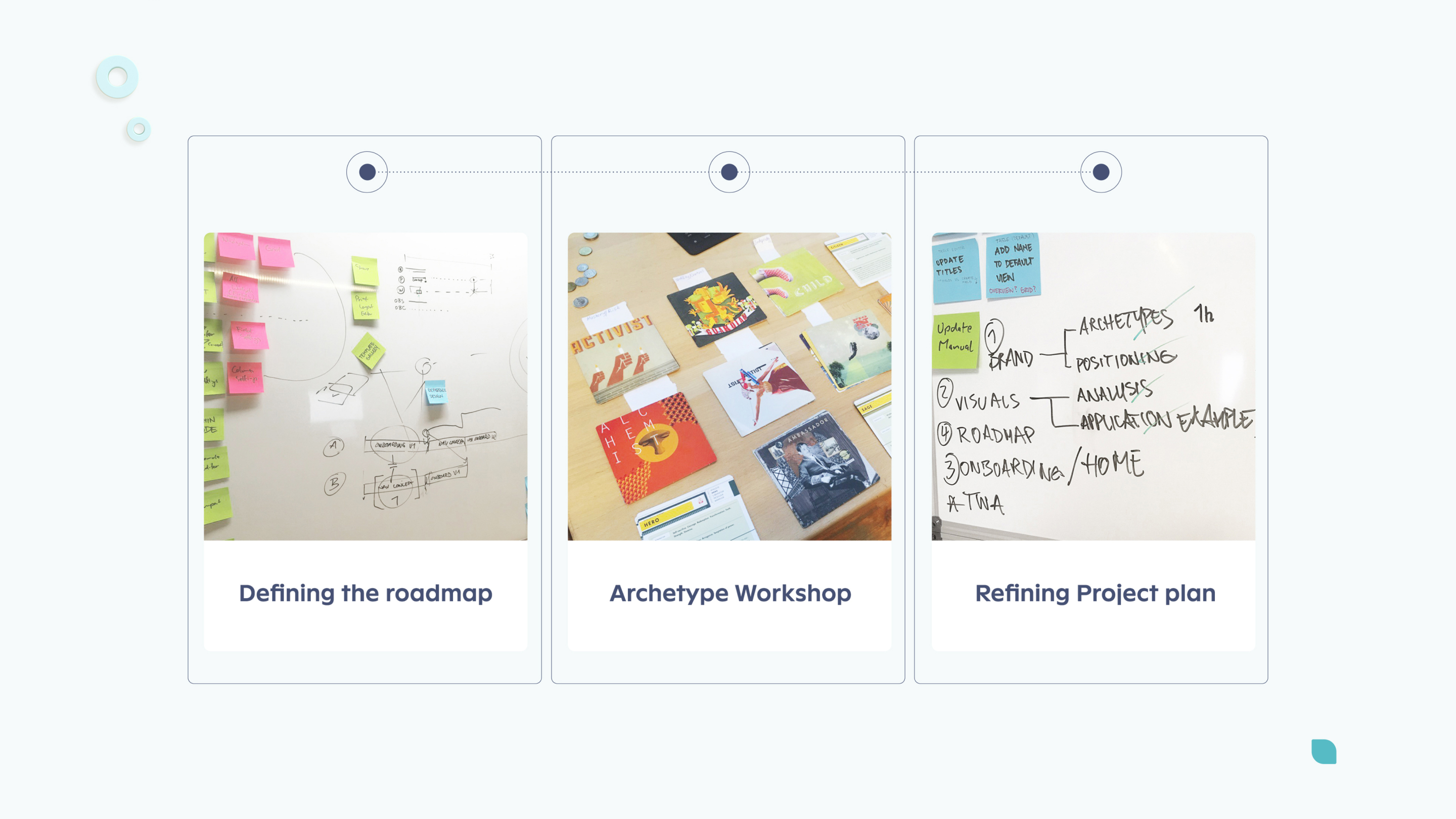
The first meeting was attended in person alongside the Ninox team. Together, we started to establish a business roadmap to define the company's action plan and corrections in the project plan accordingly. Another core emphasis focused on the 12 archetypes analysis, where our team has analyzed Ninox company, and identified characteristics close to only one relevant archetype. This fact allowed our team to correctly establish consistency among all branding elements while understanding how the company's image can evolve. We did not make the Ninox brand from scratch. Our branding company has slightly refreshed the previous Ninox concept and applied the chosen archetype traits to every digital carrier, such as their marketing website, digital product, illustrations, and visual brand identity. The result below is an outstanding achievement that both Ninox and our teams are proud of.
Polishing layouts
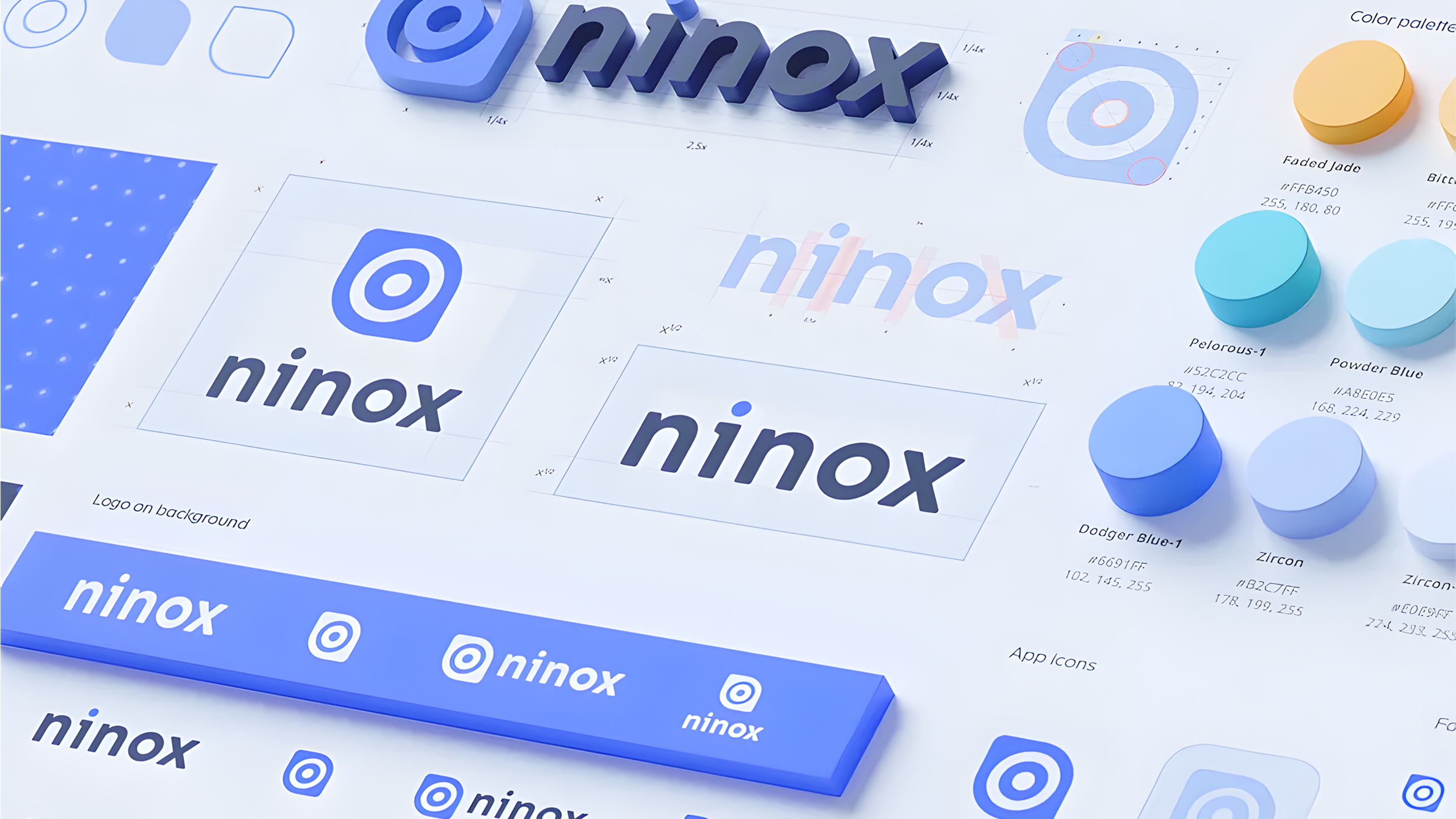
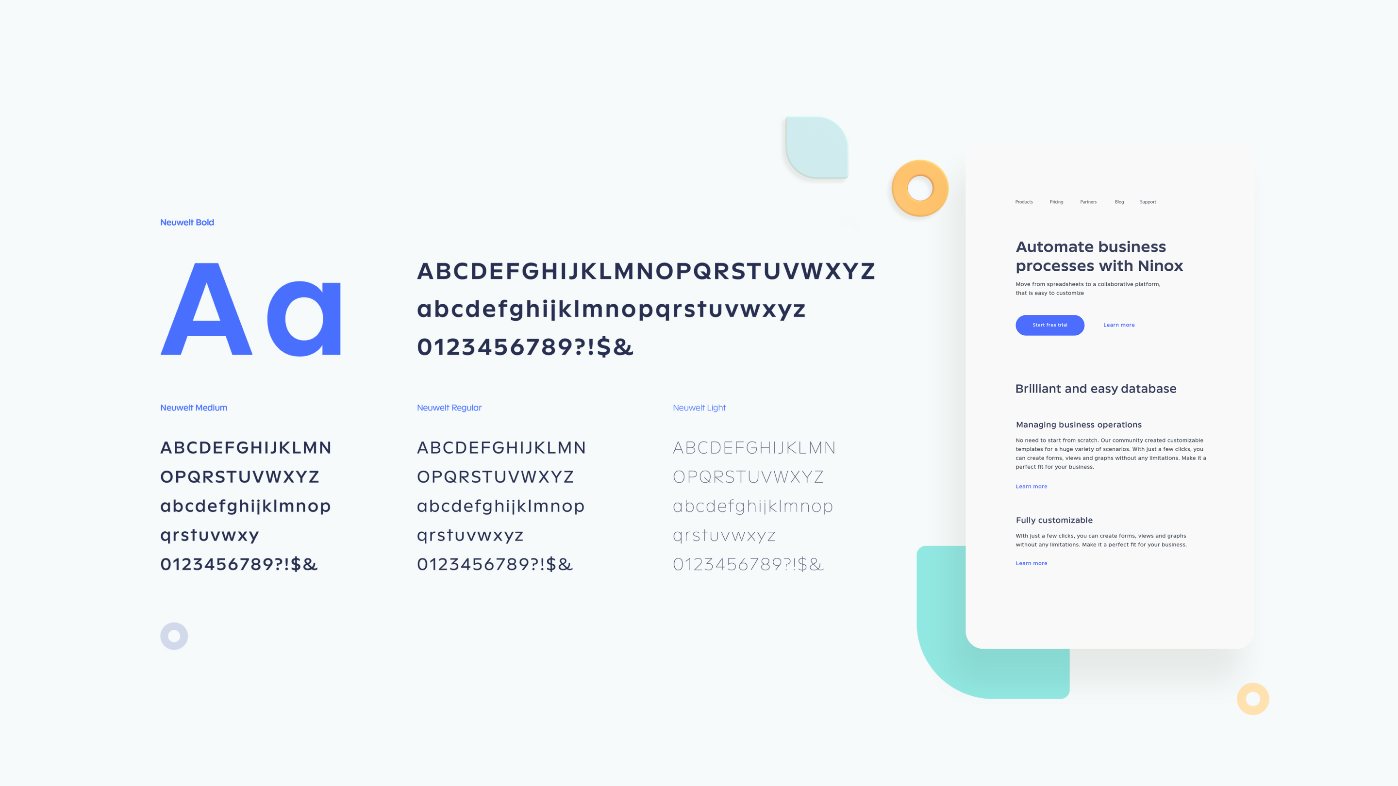
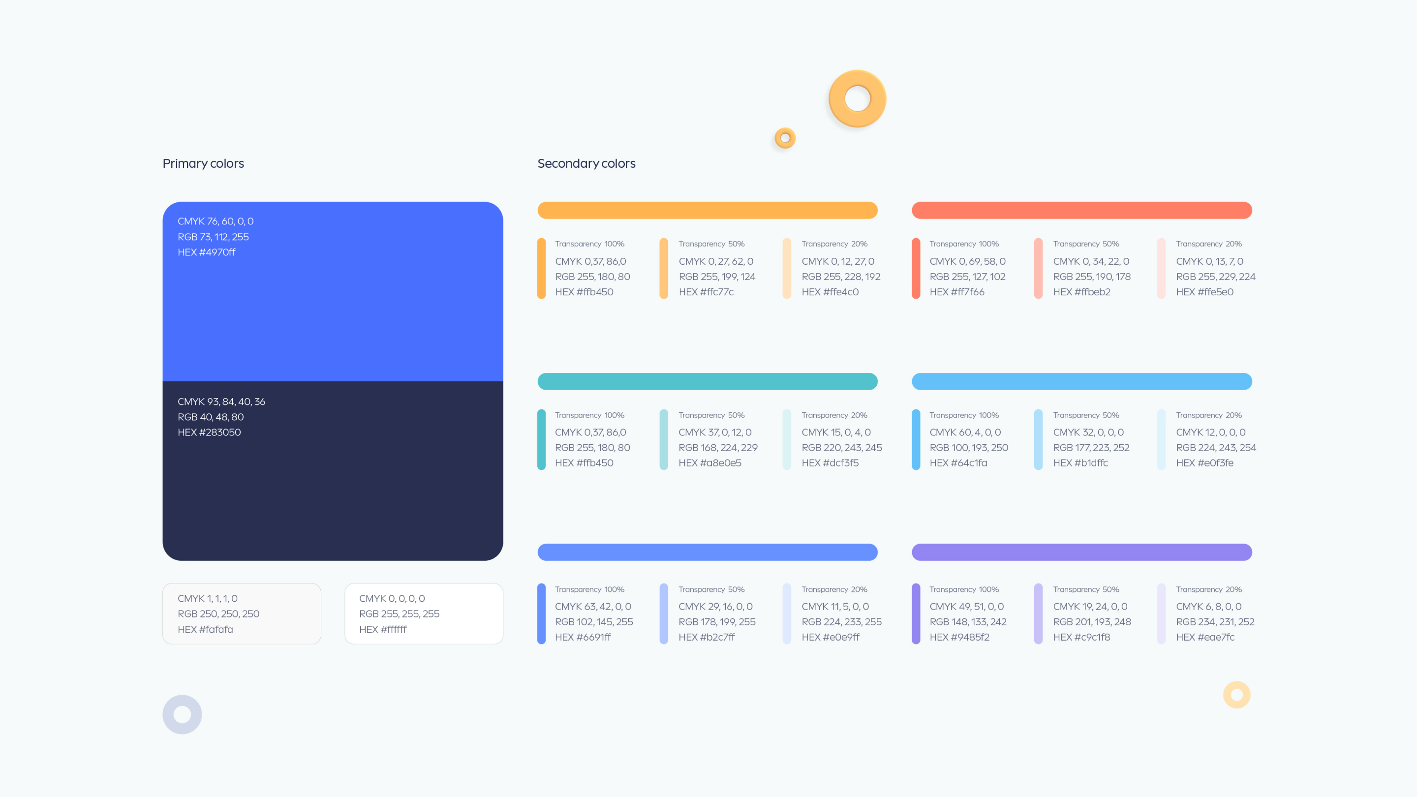
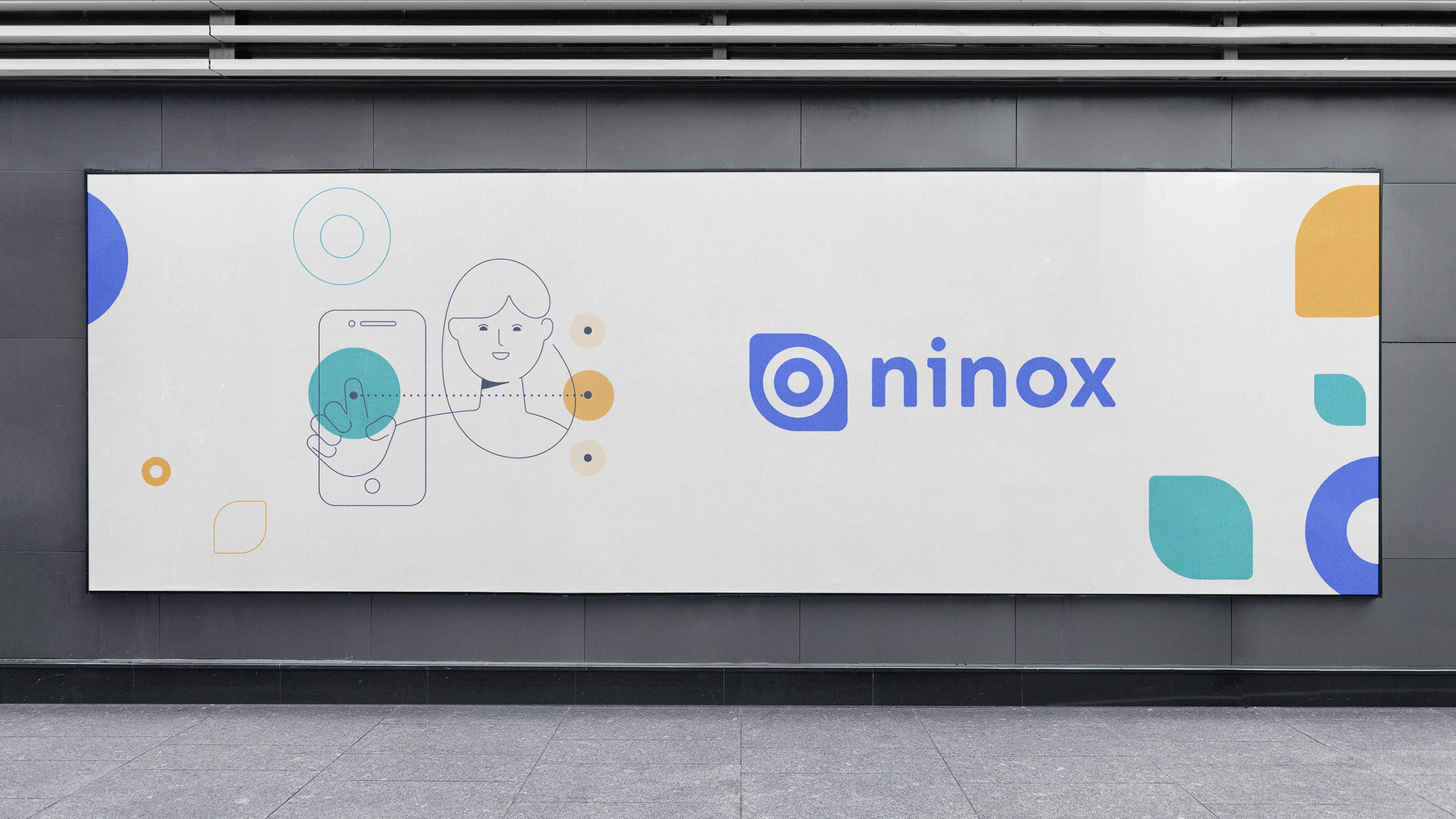
After establishing a solid baseline, our team actively started to form new visual assets. Below are the final design assets that applied to their marketing website. Colors, fonts, and brand existence on external formats are minor adjustments to the already existing brand image.
Refreshing the user experience
A lot of work our team invested into the constant revisions and tests for the user experience. The product was constantly tested by a separate specialist from our UI/UX design firm. He was working exclusively on user experience analysis.
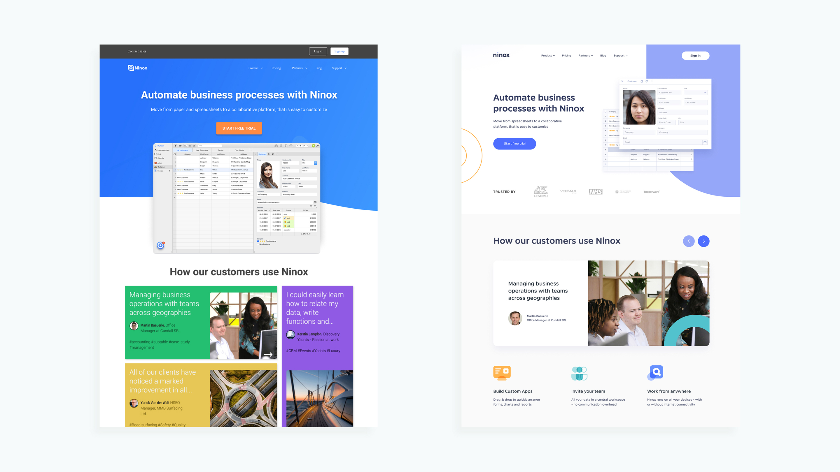
The product screens were constantly changing, and with the assistance of UsabilityHub, we measured various data connected with the product interfaces and other product metrics. But it wasn’t conducted on baseless assumptions, as it wouldn’t be possible without the involvement of a Ninox target audience testing, which gave us direct feedback. According to that, our web design agency was implementing specific changes to the design. Ergo, the constructed theories and hypotheses were getting proved with these minor user interface changes. Below are a few comparison images before and after our team made adjustments to the Ninox website and digital product.


Creating an illustration style guide
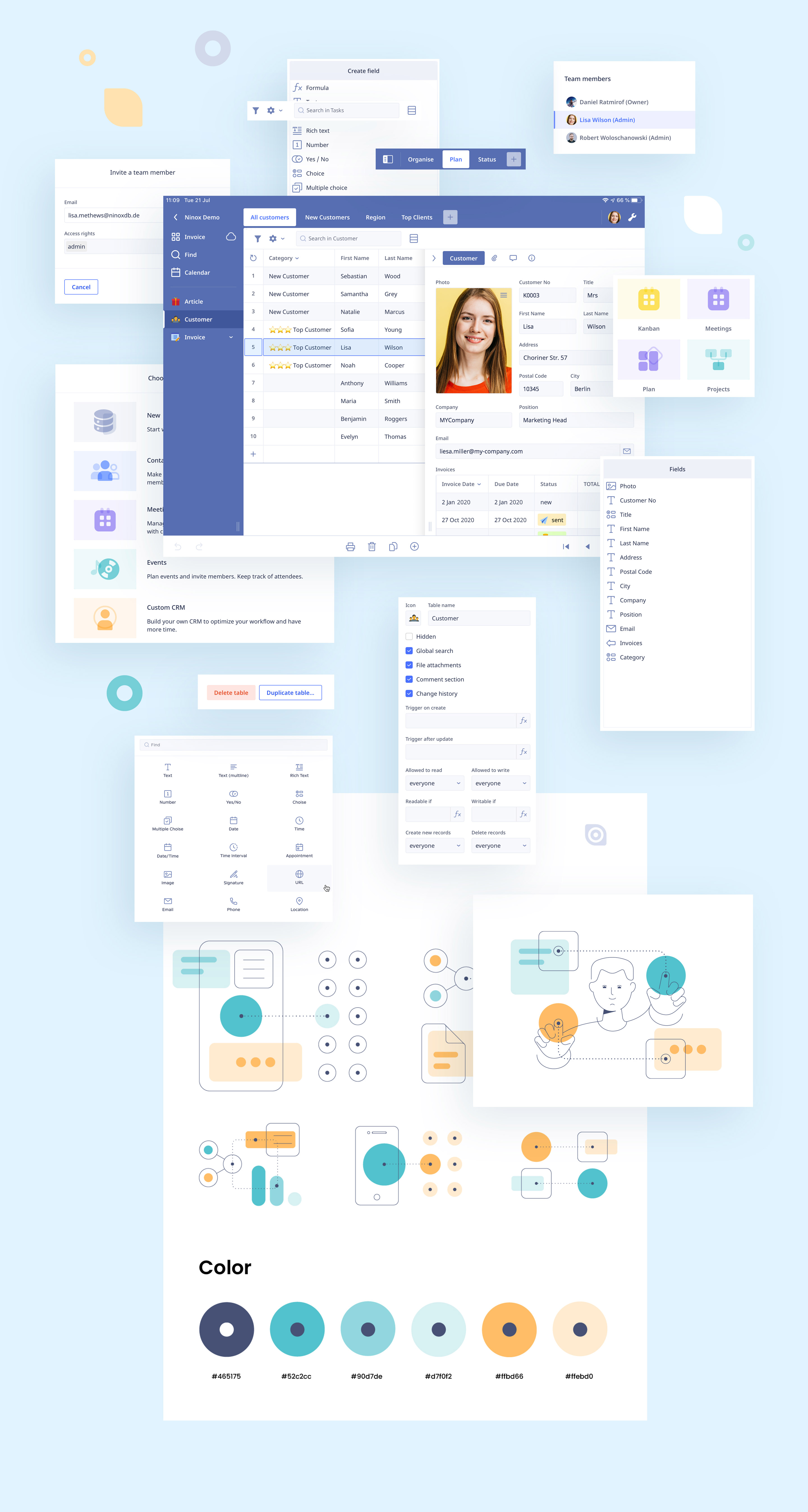
As the brand identity and the user experience were all constantly updated, a lot of effort was invested in the production of an illustration style guide. Based on the new brand attributes and the defined archetype, our team produced the guide with abstract elements and user-friendly objects. It was used to create unique styling elements, some of which got added to their marketing website.
