Osmo

About
Brands need to carry their identity across their products. Maintaining a common identity which binds your products together and separates them from competitors is vital. Successful companies like Apple maintain a family-like identity across all their products, ranging from watches and phones to desktop workstations.
Exit
$120MAcquisition by BYJU's
Services
BrandingWebsite
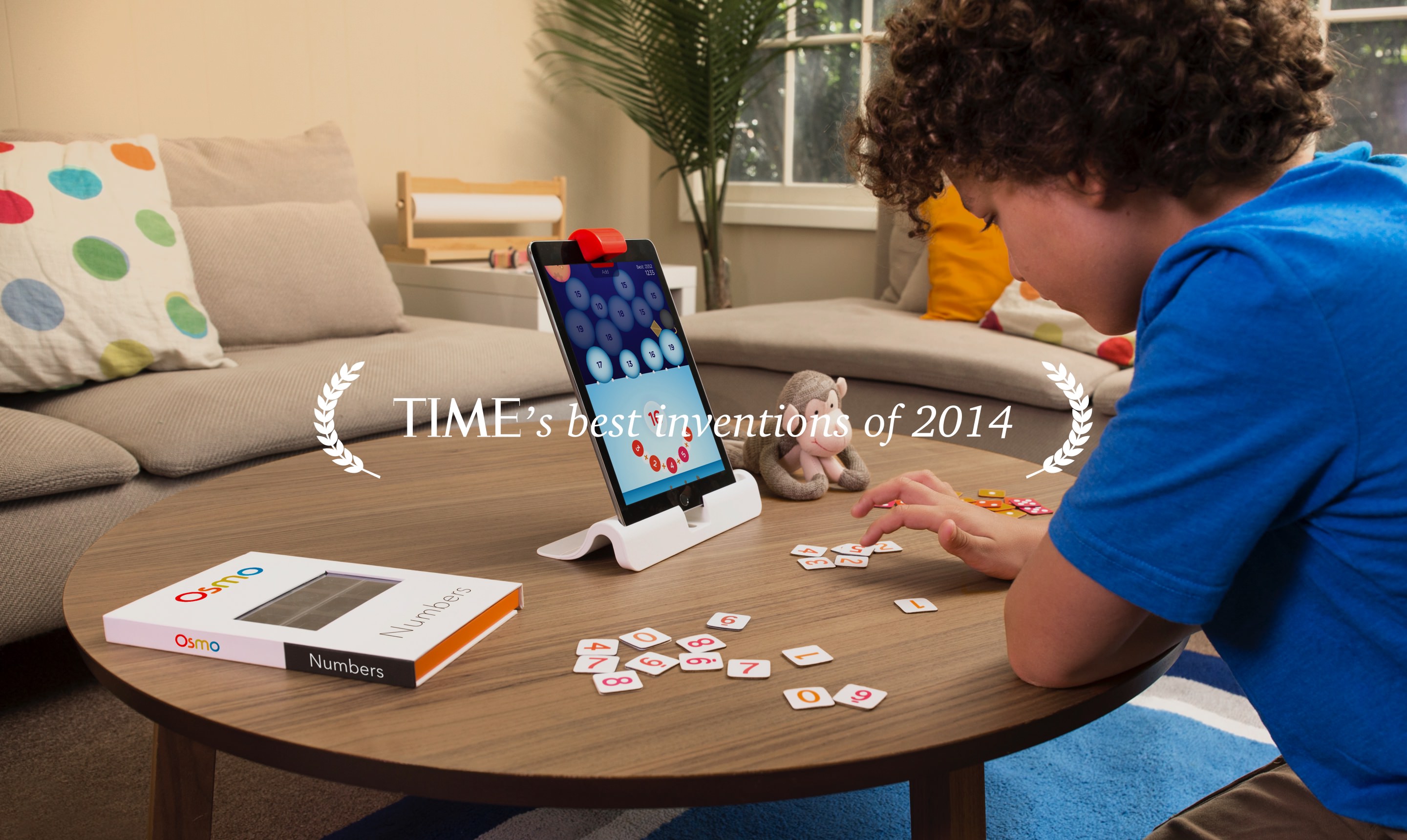
playosmo.comOsmo was invented by young parents out of Stanford and Google in San Francisco, CA. It is a unique game system that changes the way children interact with the iPad by opening it up to hands-on play. Their team approached our San Francisco branding company to design a visual system for a line of games and create a few app icons using that design style.

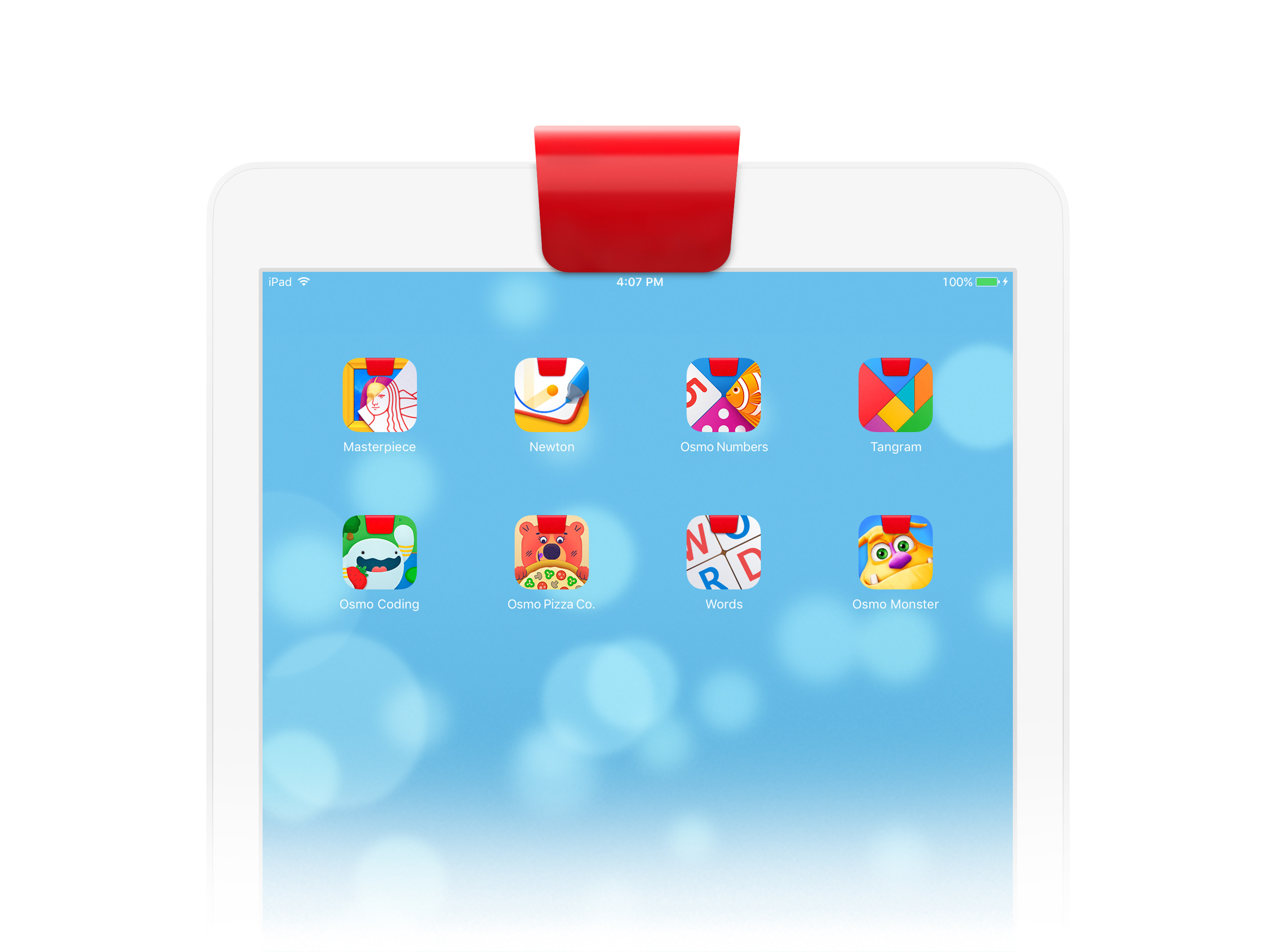
During the design research and iterations of sketching in different directions, we came up with the simple idea of incorporating the red cap from the physical device as a part of each future app icon.

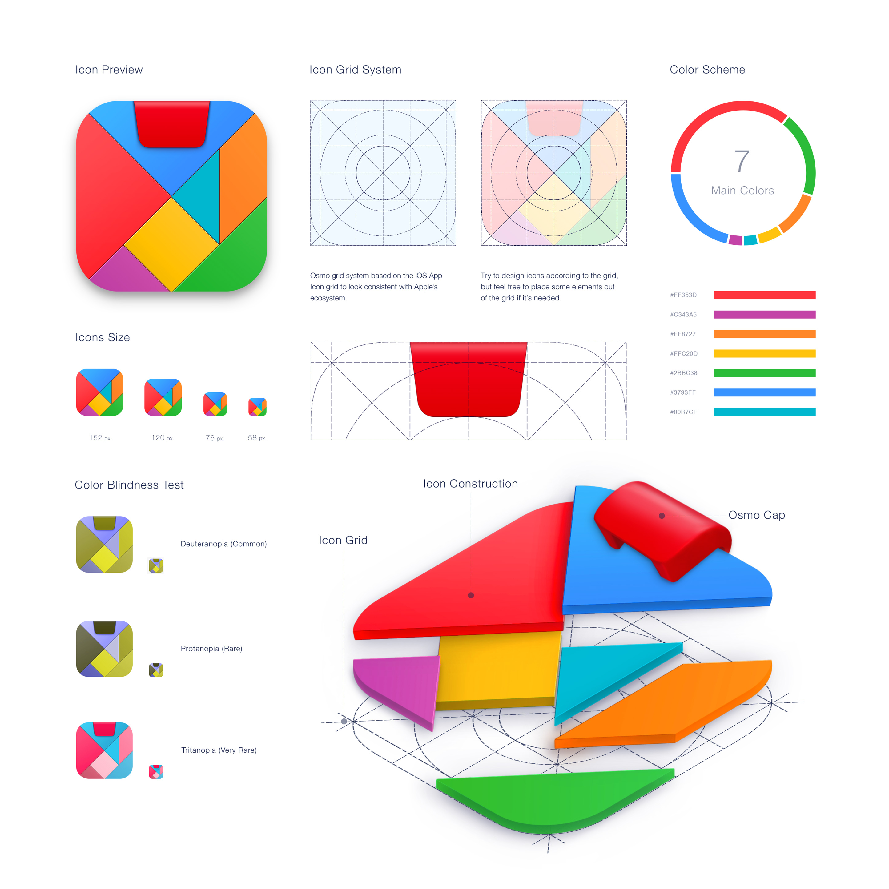
Our branding company design each system around a visual core. Everything radiates from this design. Tangram was the core for building Osmo’s brand visuals. It demonstrates the philosophy of the Osmo family and introduces their entire color pallet in its icon.

We used a front-facing position of an imaginary camera, a vibrant color scheme that can perfectly position the games for children, and of course a part of the gameplay process depicted on each app icon in a very simple way.

Thank to the new visual system, Osmo now has a unique look and feel that helps them stand out on the market and enables them continue releasing new innovative educational games that are visually consistent with the whole brand. The game system became TIME’s Best Invention of 2014 and currently distributes through Apple stores worldwide.
