Healthcare icons
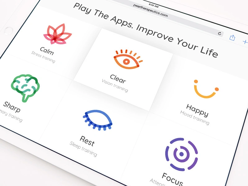
Crafting a healthcare icons website brand design concept by a leading brand design agency encapsulates the essence of healthcare services through intuitive and accessible graphics. This approach ensures that the visuals are engaging and serve a practical purpose in guiding users seamlessly through their online healthcare journey.
Functionality
This design concept prioritizes functionality by using clear, recognizable icons that instantly communicate their respective actions or services. The icons are designed with the user in mind, ensuring they are easy to understand and interact with, facilitating a more efficient and intuitive user experience.

Design Elements
- Calm (Stress Training): The lotus-inspired icon symbolizes tranquility and relaxation, essential elements in stress training. Its simple lines and soothing colors are intended to invoke a sense of peace in users before they even begin the stress-relief process.
- Clear (Vision Training): The eye icon is direct and self-explanatory, reflecting the clarity of vision. A warm color gradient suggests a welcoming and gentle approach to vision training, making the task less daunting.
- Sharp (Memory Training): The brain icon is anatomically representative and implies mental sharpness. The vibrant green color represents growth and mental expansion, encouraging users to engage in memory-enhancing activities.
- Rest (Sleep Training): The crescent moon icon, a universal symbol of sleep and rest, is depicted with a soft blue shade often associated with calmness and serenity, essential for practical sleep training.
- Happy (Mood Training): The smiling icon is straightforward and universally understood, representing the goal of mood training. A cheerful color promotes a positive atmosphere, fundamental to mood improvement exercises.
- Focus (Attention Training): The concentric circles represent focus and concentration. A dynamic purple hue symbolizes creativity and wisdom, aiming to motivate users to develop their attention span.
Likely Benefits
Utilizing these carefully crafted icons can significantly enhance user engagement and comprehension. The intuitive design facilitates more straightforward navigation and understanding of the services offered, potentially leading to increased satisfaction and a higher likelihood of users returning to the platform.
Application of the Design Concept
Incorporating this design concept means presenting users with an interface that speaks directly to their health and wellness needs. The icons serve as quick reference points that lead users to the required services without confusion.
They focus on the emotional connection these icons create, establishing trust and comfort, which are crucial in healthcare services.
As an overall conclusion, this design concept by a leading brand design agency is a testament to the power of combining visual appeal with practical utility. It successfully marries the aesthetics of iconography with the intricacies of healthcare, providing a user experience that is both delightful and functional.