Health insurance app
Discover how the leading UX design agency revolutionized the health insurance industry with a crisp, user-friendly design concept. This innovative approach enhances user interaction, ensuring a smooth and responsive journey through the complexities of health insurance coverage.
Functionality
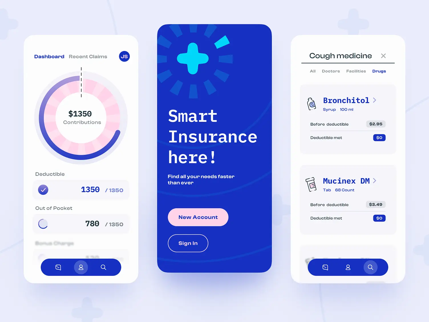
The concept focuses on streamlining users' interaction with their health insurance details. It integrates financial tracking of deductibles and out-of-pocket expenses alongside a simplified process for exploring and managing healthcare needs, such as finding doctors and comparing medication costs.

Design Elements
- Dashboard Visualization: The dashboard features a circular graph that visually represents contributions, deductibles, and out-of-pocket expenses, making it easy to grasp one's financial status at a glance.
- Navigation Ease: The bottom navigation bar is intuitively designed, with clear icons that ensure users can effortlessly switch between the app's main features.
- Interactive Elements: Call-to-action buttons like 'Sign In' and 'New Account' are prominently placed and colored to prompt user interaction, optimizing the user journey within the app.
- Information Hierarchy: The layout prioritizes essential information, like deductible status and drug costs, using size and contrast to guide the user's eye to the most relevant details.
- Color Scheme: Using a consistent and calming color palette reinforces the brand identity and creates a stress-free user experience.
- Typography: Clean and modern typography is used to ensure readability and create a hierarchical information structure.
- Responsive Filters: The drugs filter allows users to swiftly toggle between categories such as doctors, facilities, and drugs, streamlining the search process.
Likely Benefits
The design will likely increase user engagement by providing a frictionless experience managing health insurance tasks. It could reduce users' time on administrative tasks, leading to a more positive relationship with their insurance provider.
Application of the Design Concept
Users can benefit from the app by having a clear and immediate understanding of their financial health insurance status, which is often confusing. The easy navigation and straightforward presentation of information make it suitable for a wide range of users, regardless of their familiarity with technology.
In practical applications, users first interact with the dashboard to check their deductible status before moving to the drug section to compare prices. This ensures they are making informed decisions about their healthcare spending.
Overall, the concept reflects a deep understanding of the challenges faced by health insurance users and provides a tailored solution that makes the experience more manageable and less daunting.