Wyre
About
Wyre, San Francisco-based fintech startup, wanted a full rebrand from top to bottom. After collaborating with our branding agency they have one of the most well-respected brands in the space.
Milestone
M&AWith RockWallet
User trust is top priority
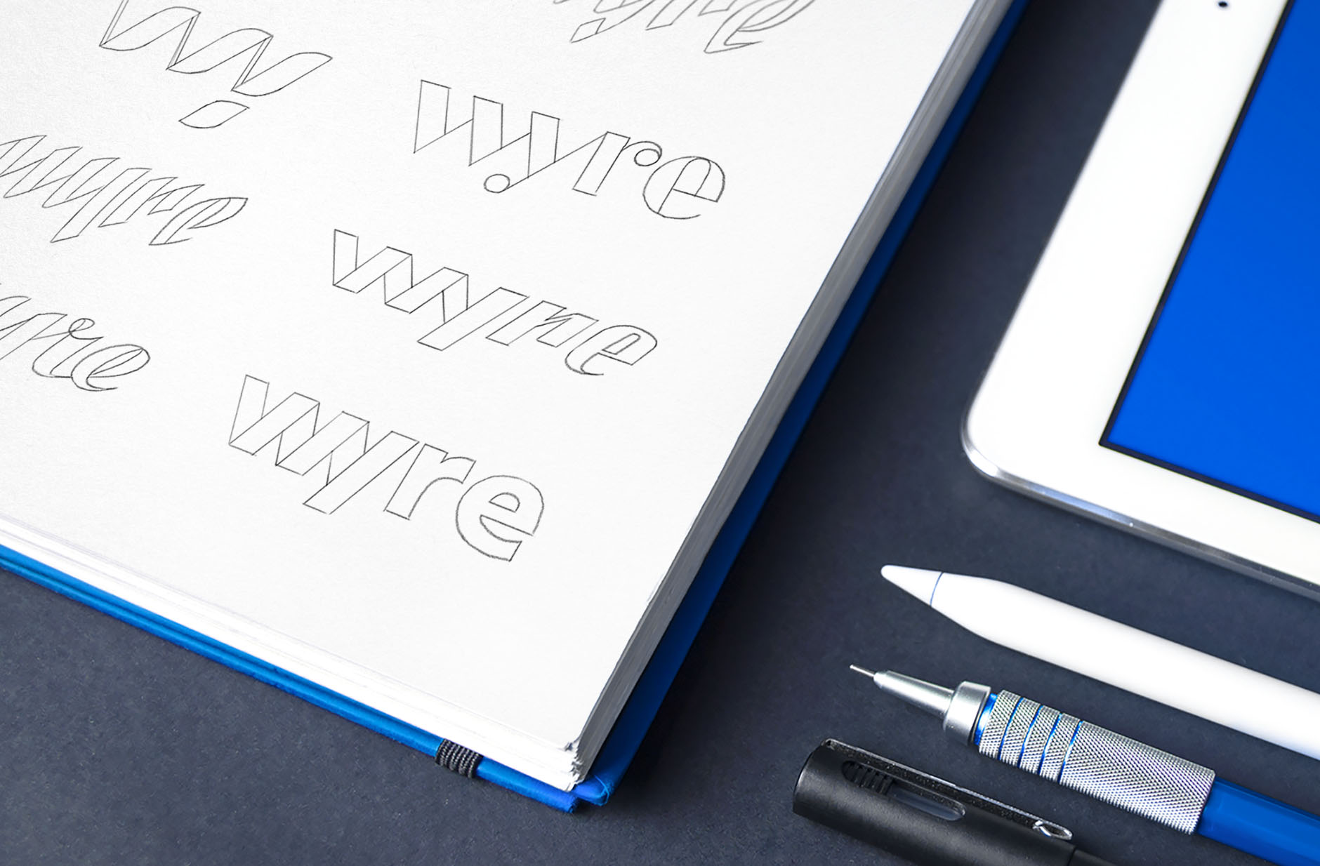
First you judge “how nice,” then you judge “how wise”. Especially when it comes to new users who know nothing about the service. They depend on visual attributes that reflect brand’s values, approach, and consistency. It’s the brand’s apparel.
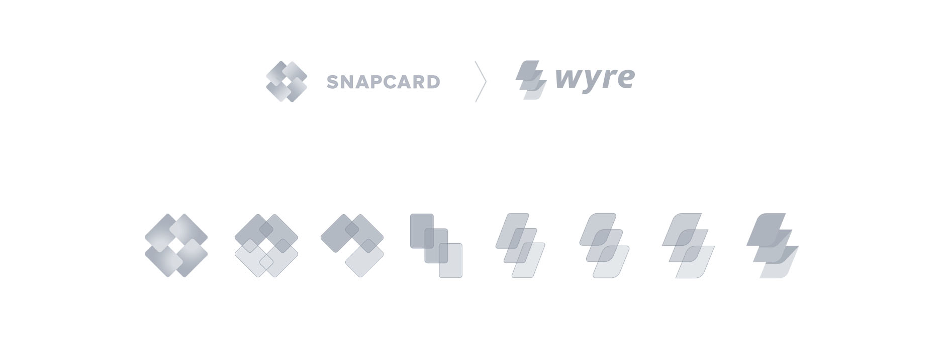
Eventually, a brand must grow out of its old hipster clothes. To mature, it needs a new suit tailored its identity. This was the case with Wyre (at the time, Snapcard).
We were asked to rebrand this San Francisco-based fintech startup to craft public perception of the company. Snapcard had previously pivoted several times before finding a hit product and experiencing massive growth in this product line.
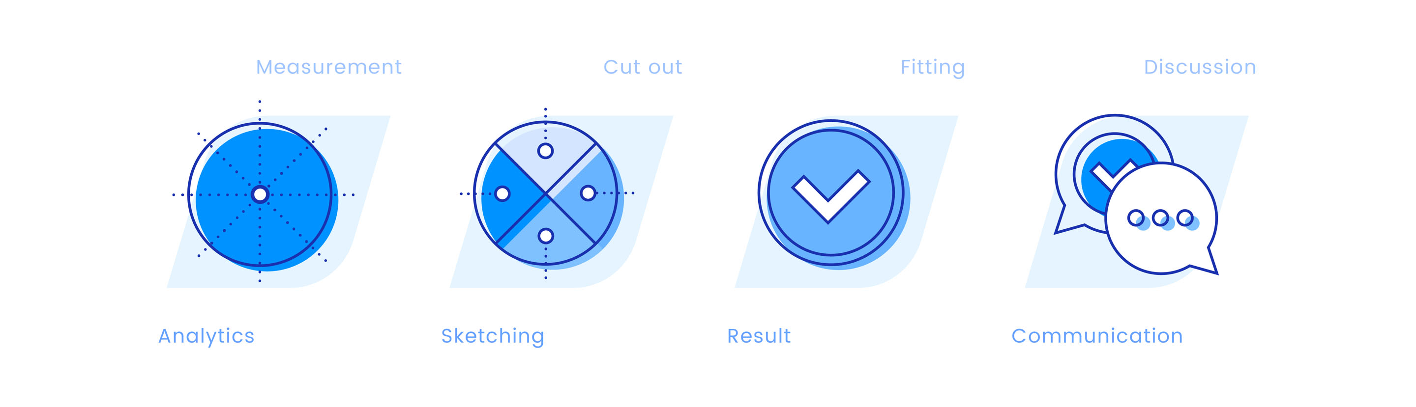
Ramotion is a digital stylist
To sew a perfect “branding suit,” we need to measure the client first, to know more about his tastes and lifestyle. During the working process, we perform regular fitting with the client because he is the only person who can feel whether a new suit fits or not.
Fortunately, the Wyre team was fully involved in the working process, shared their thoughts and expectations, yet allowing us the freedom to design efficiently. They trusted our design specialists, and that makes us even more motivated to deliver the best results we can.
Feedback
We had a goal of a full rebrand top to bottom, and we went to Ramotion for it. Their taste was perfect, and we've now got one of the most well respected brands in the space. Couldn't be happier! Thanks team.

Michael Dunworth
CEO of WyreBrand legacy
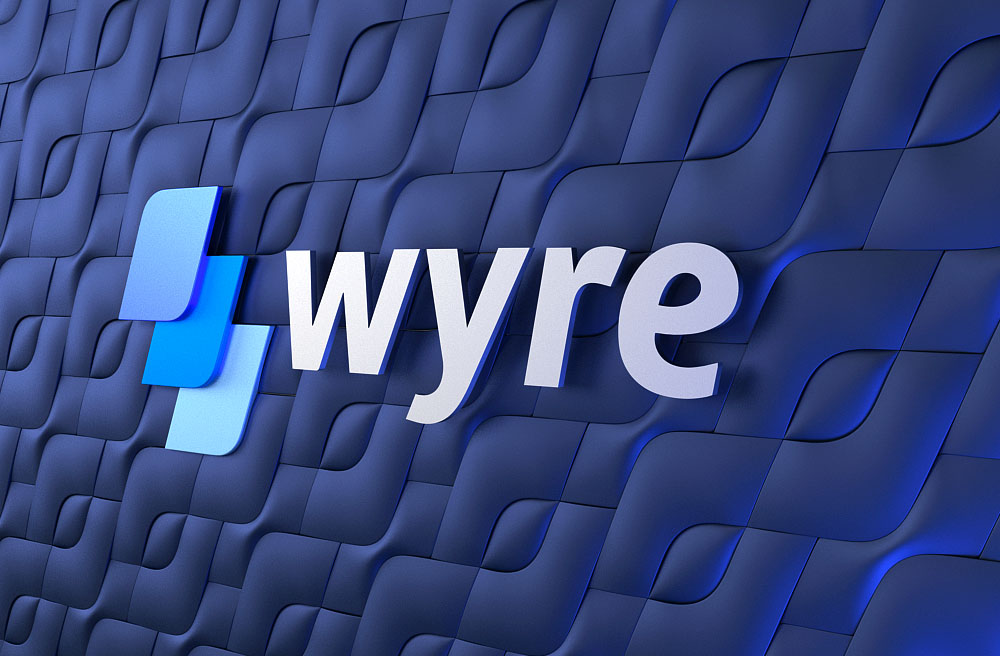
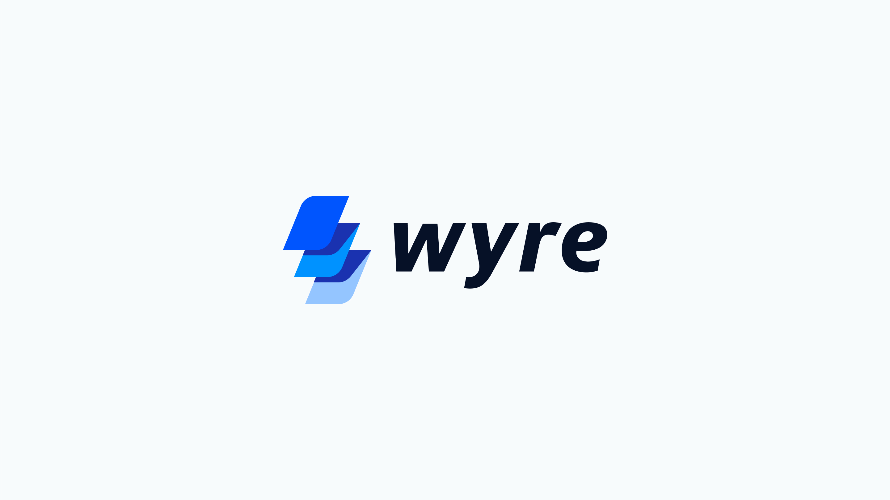
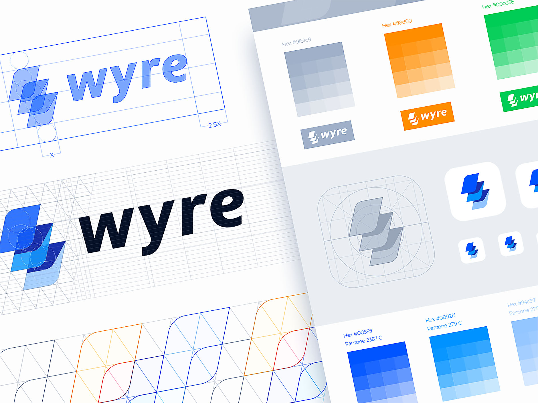
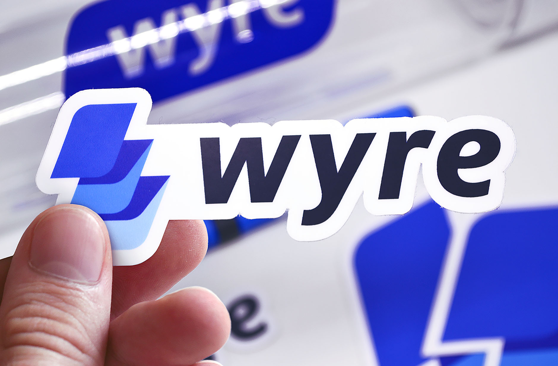
To maintain uniqueness, the brand needs to maintain consistency with its history. We decided to keep Snapcard’s card metaphor. However, we added new dynamic and hidden metaphors as lightning and layers. After a couple of experiments, we found the best shape and colors. The logo appeared friendly and unique, yet trustworthy.
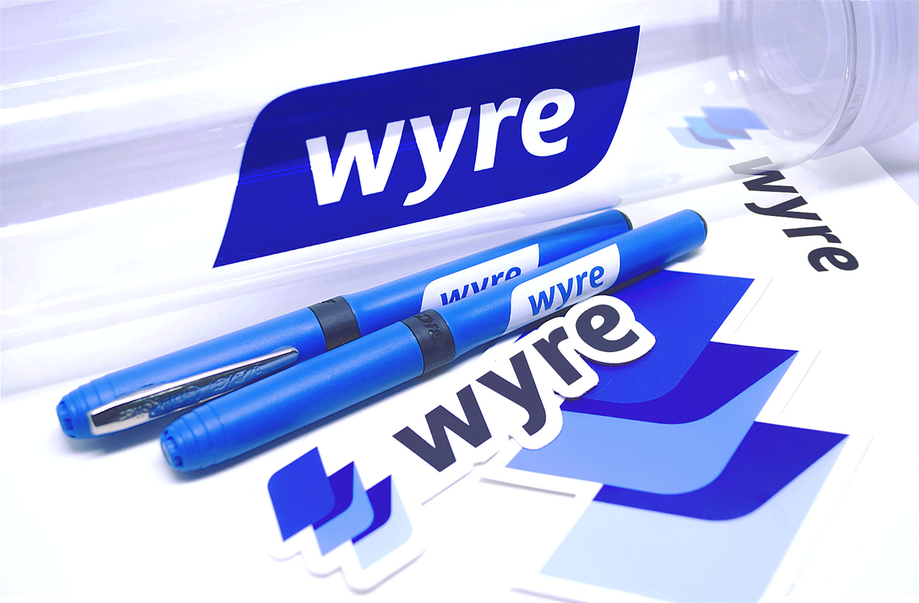
Consistency is king
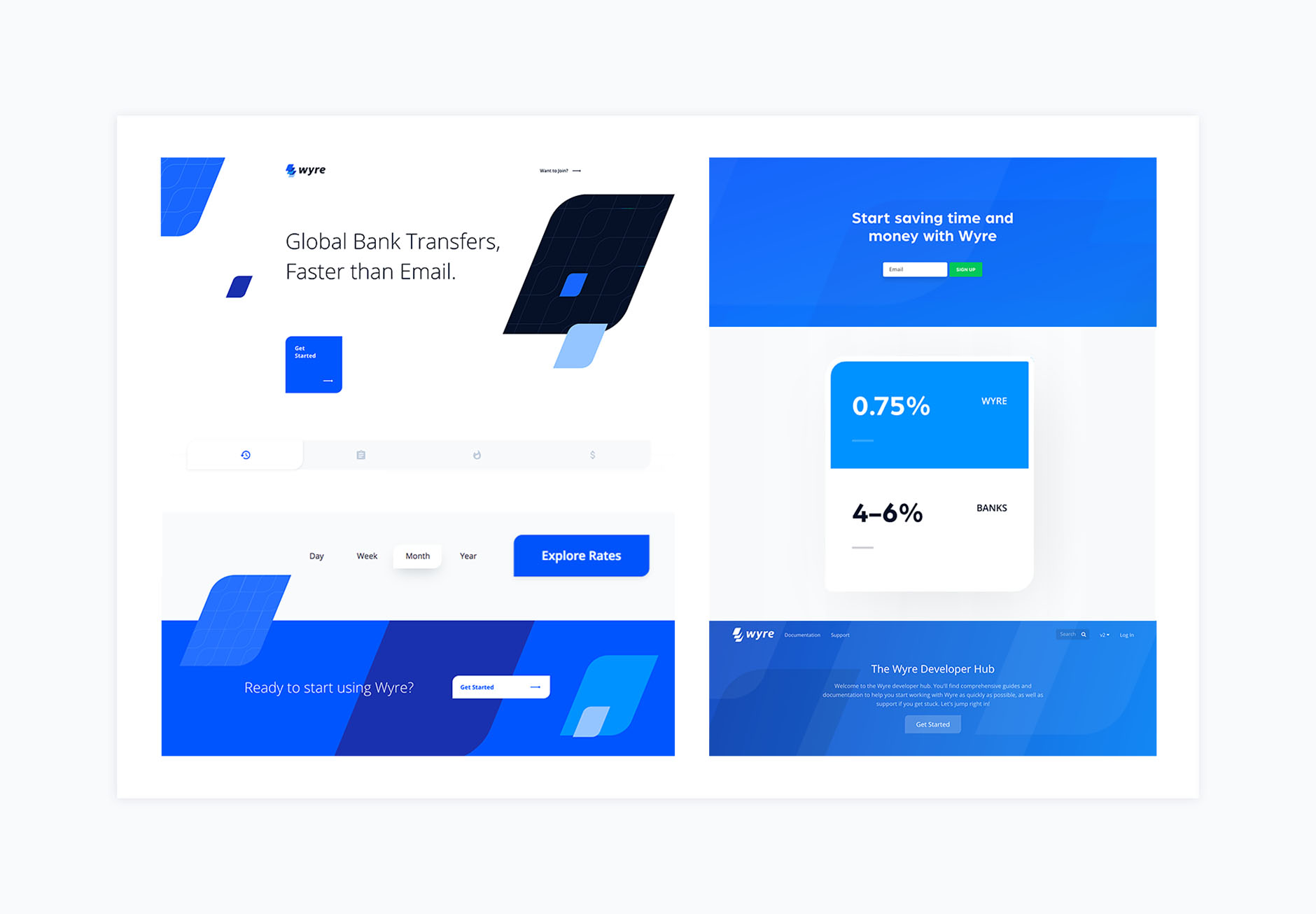
The culmination of our work is when our clients are able to use the design guidelines from our brandbook and apply them successfully to their products. We were excited to recieve stickers, pens, backpacks and other stuff from the Wyre team and finding consistent use of brand elements in the web design our web design agency helped to inspire.
Results
WorldFirst acquired Wyre in August 2018.
Feedback
From a hand-drawn sketch to a dynamic re-brand, see how @ramotion goes from idea to execution: https://adobe.ly/2xU0DAa
Adobe