EMI Health

About
Optimizing UX for 300,000+ members to boost sales, reduce service calls, and gain broker endorsements.
Members
300K+With enhanced UX
Tech stack
Bootstrap, Xamarin
Website
emihealth.com (US only)EMI Health is Utah based health insurance provider, operating since 1976 with a mission to provide members with helpful resources and personalized support. Providing health benefits and processing a variety of insurance-related activities, the company uses a complex system to interact and work with. Lack of usability, loading speed, and appearance were causing frustration among members. EMI Health needed a well-established design partner to update the platform and enhance its user experience.
Challenge
In 2020, EMI Health started a collaboration with our team to update its existing product — an outdated and complex user interface — to give members a smoother experience of interacting with their data. A critical problem was the system's need for usability and intuitive navigation since it didn't have any significant improvement because it was developed several years ago. Furthermore, the task assigned by our partners was to increase individual and group sales and enhance the user experience, which would reduce the number of lost groups. Additionally, there was a need to minimize the number of customer service calls and involve brokers to promote EMI Health as a service with a great UX.
Solution
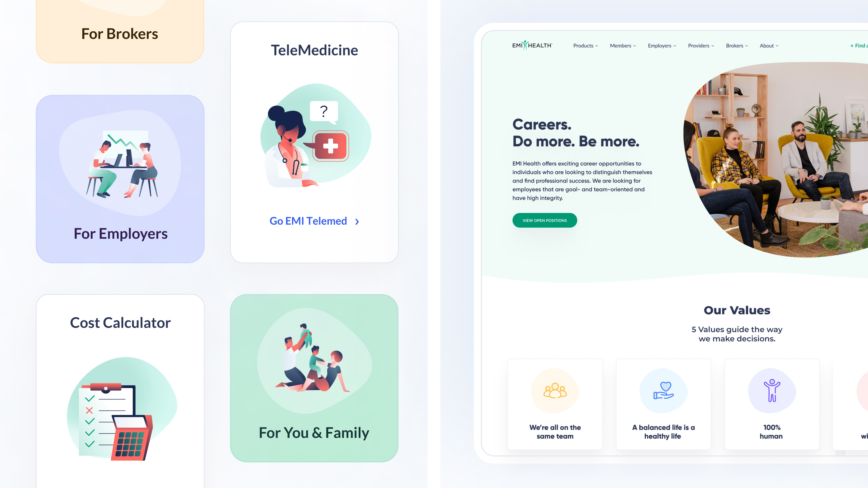
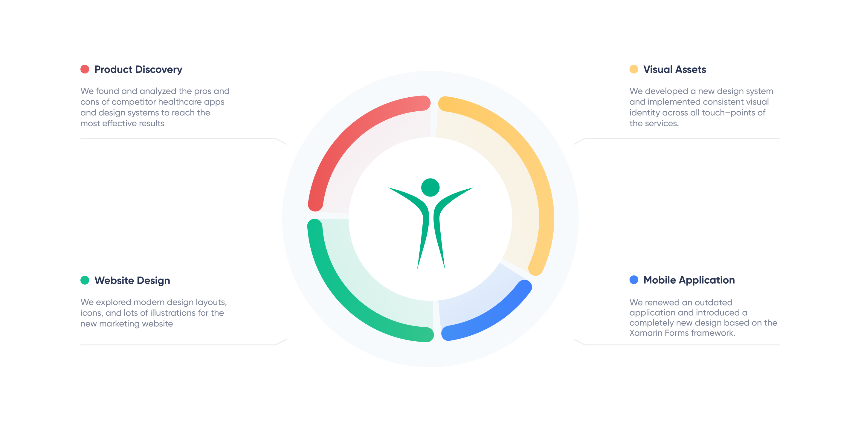
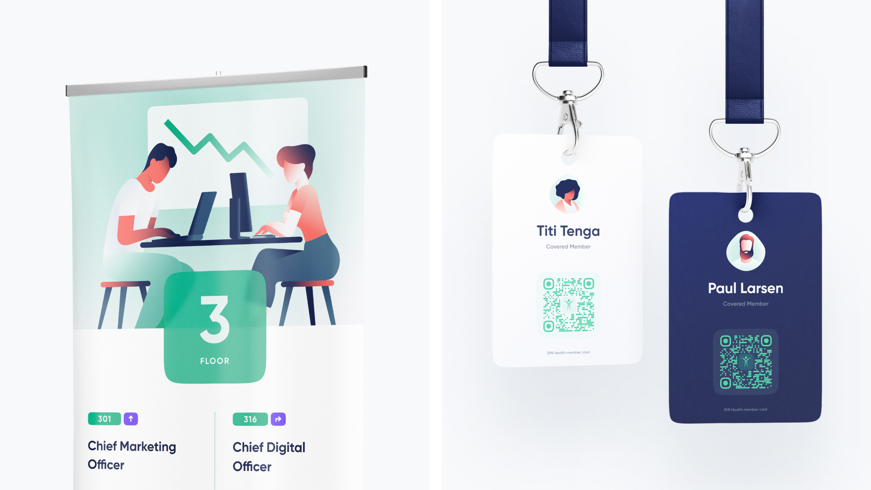
Using different branding design services, our experienced team collected and analyzed a large quantity of data to improve the overall user experience, leading to a significant increase in individual product and group sales. When designing onboarding for the application, it was important for our UX design experts to choose an illustrative series that tell the user how to interact with the EMI Health product.
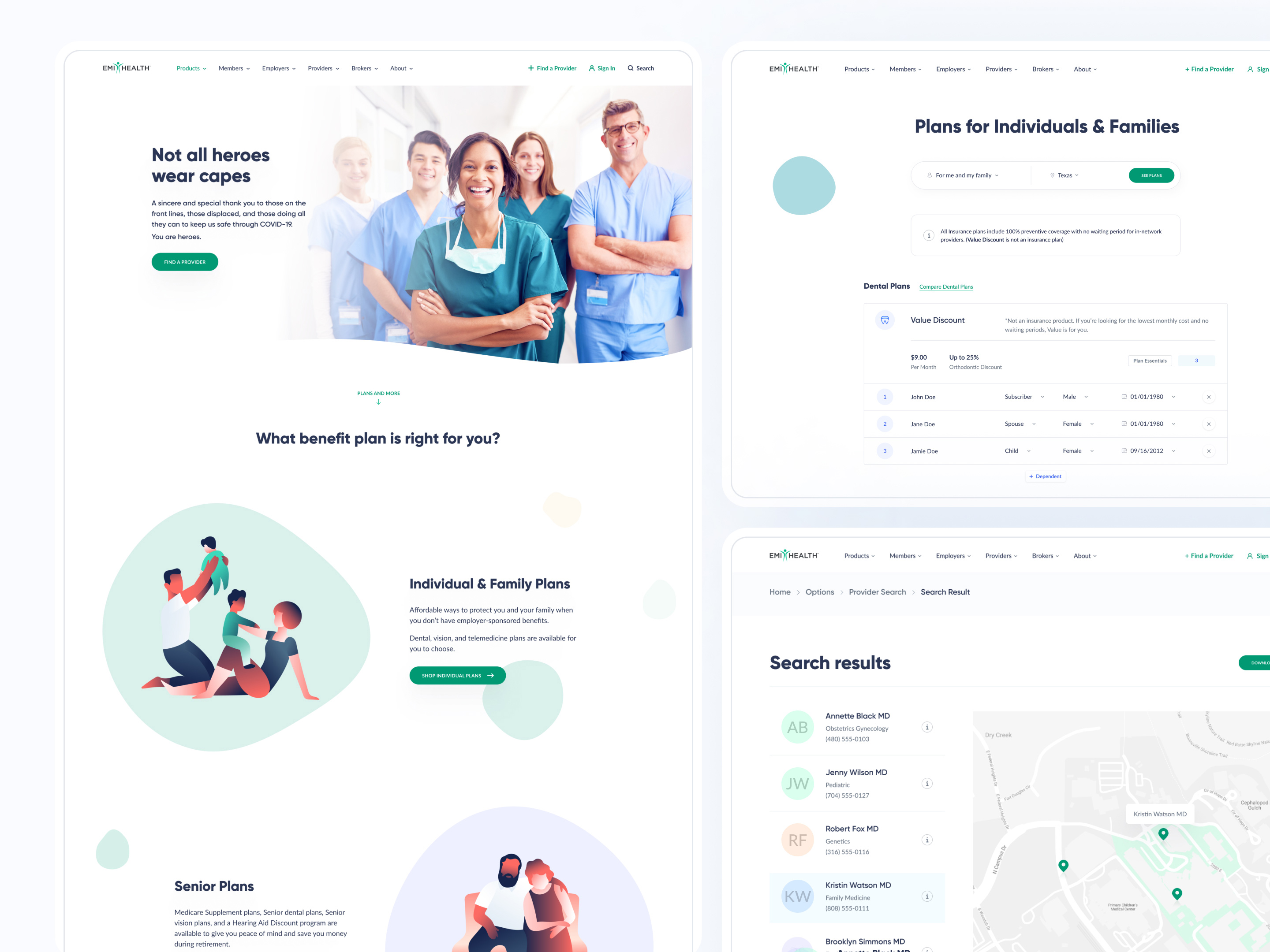
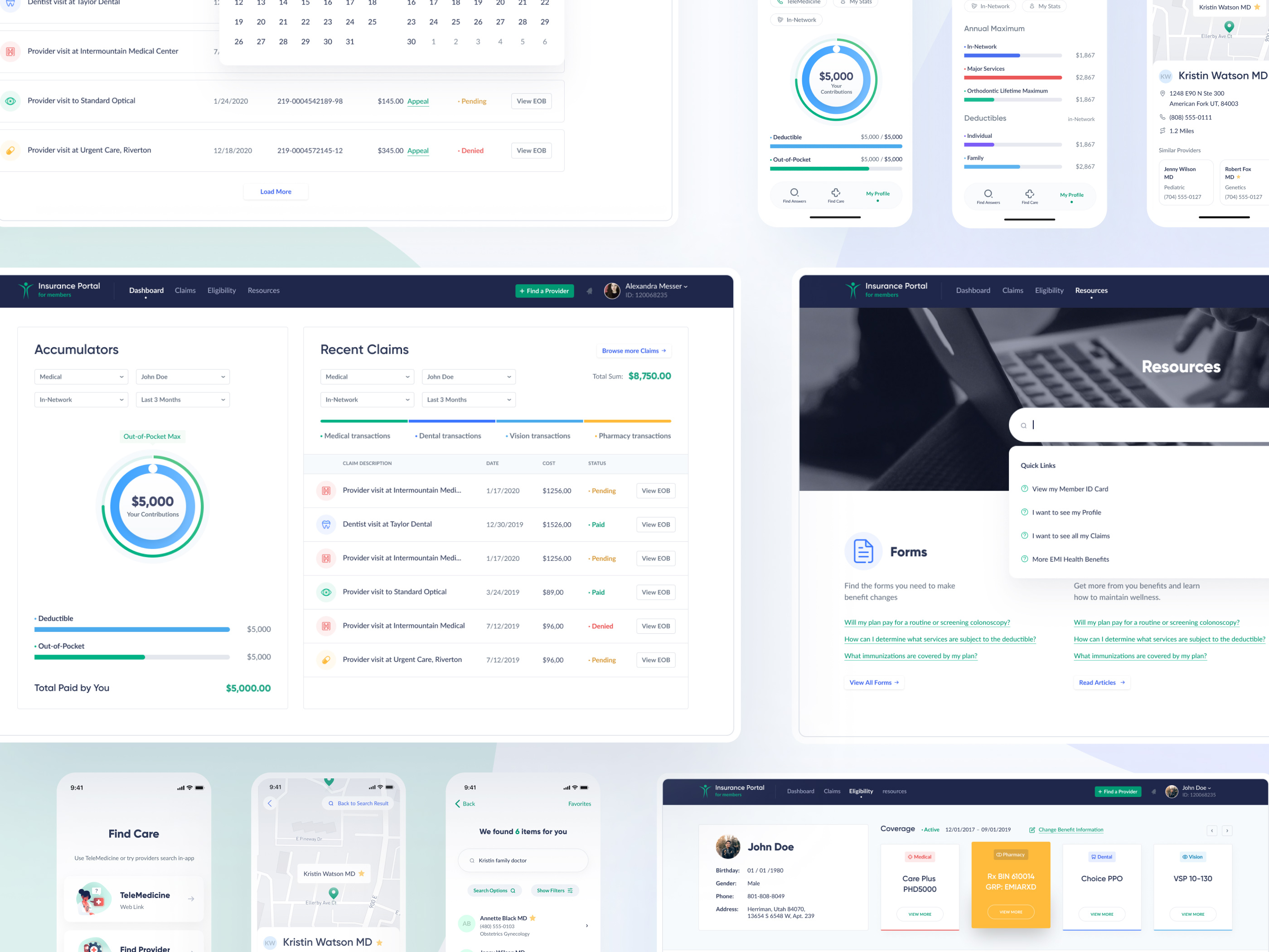
While providing website design services for EMI Health, we established the primary user flows through the "Jobs to be done" technique and created low-fidelity wireframes and interaction maps. Further, our designers applied the brand's existing visual language to the wireframes while modernizing the user interface and improving its look and feel.
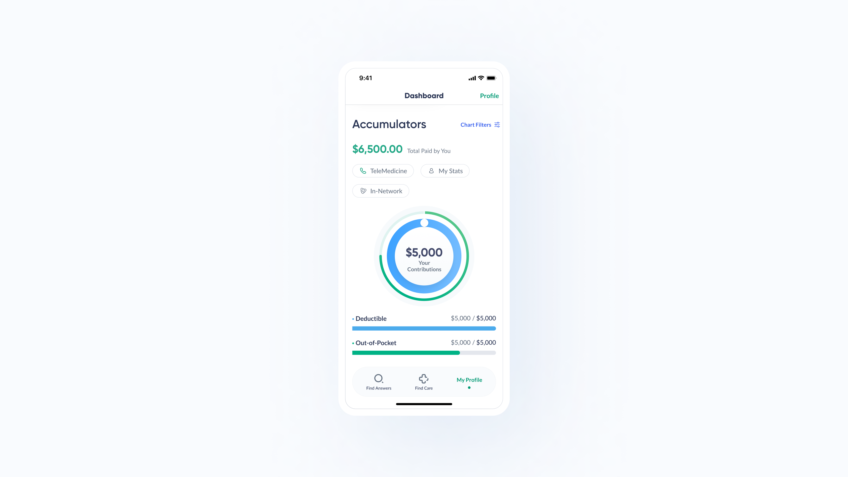
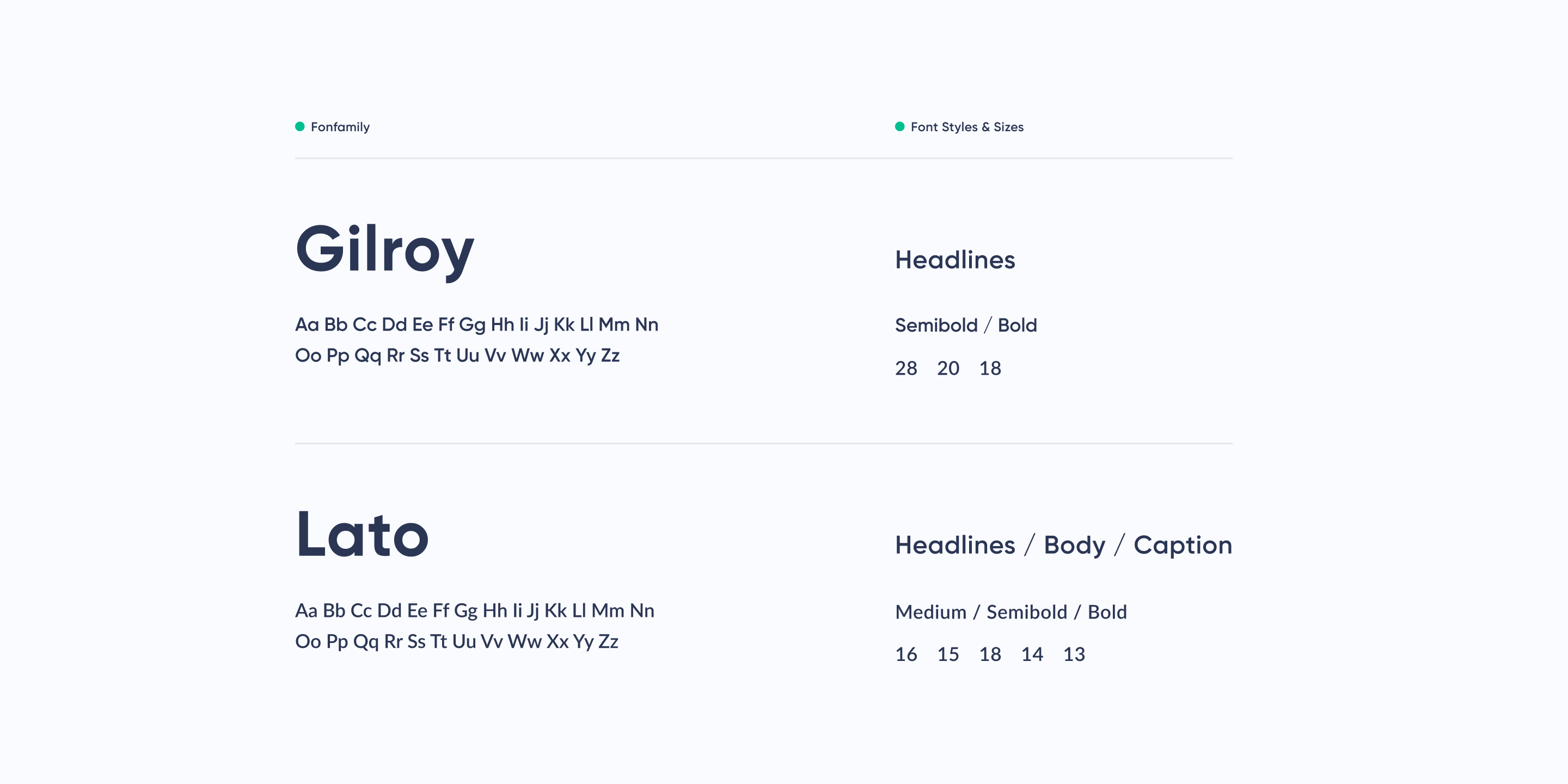
Enhanced navigational patterns and overall flow reflected on EMI Health's marketing website, product UI kit, and mobile app have established a strong brand identity. Close work with our partner and our commitment to user experience has improved the product offerings, attracting new customers and increasing sales.
Outcome
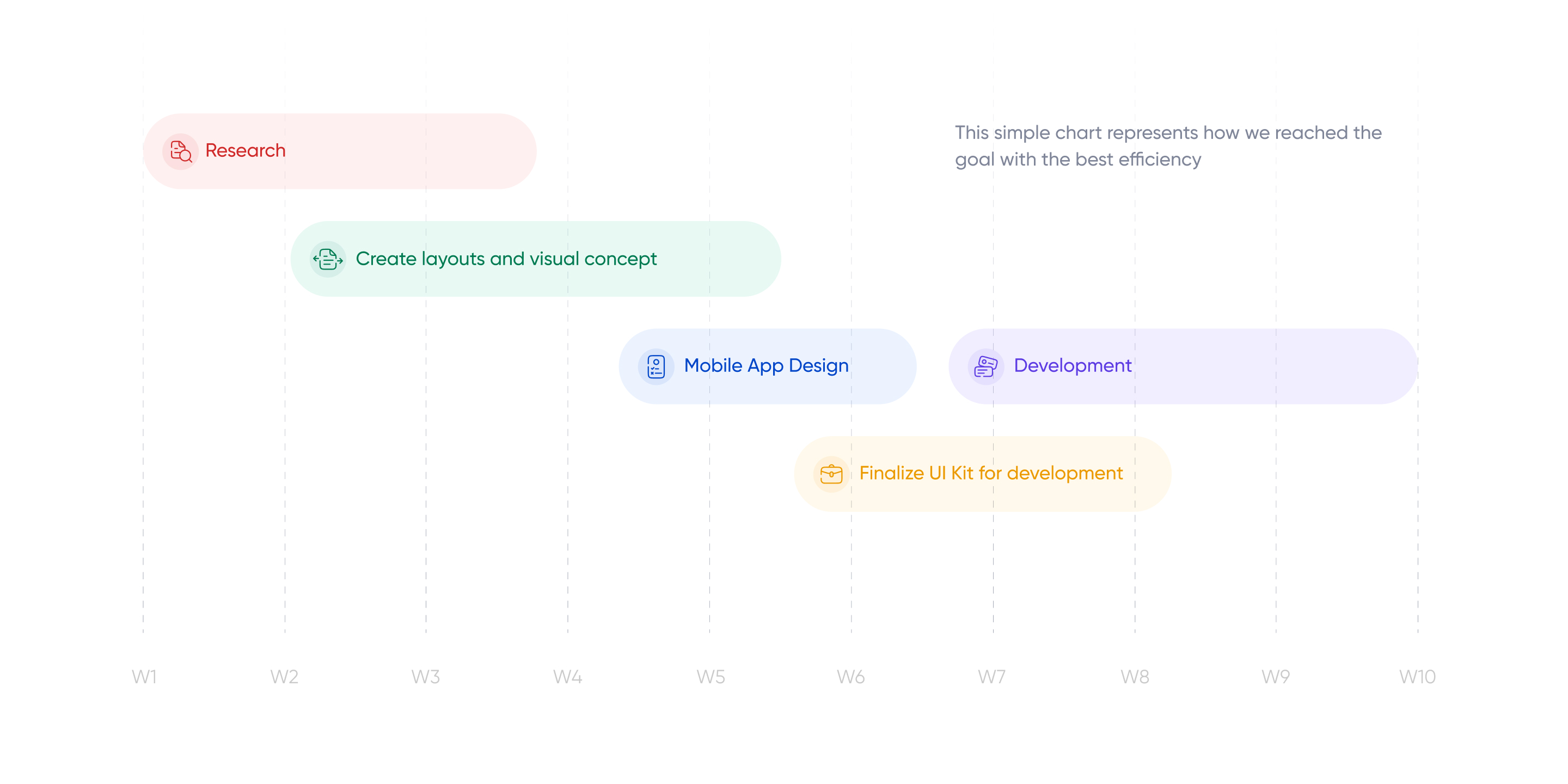
The collaboration between our company and EMI Health resulted in a user-friendly, intuitive platform that helps members interact with their data smoothly and efficiently. Thanks to improved user interface and navigational patterns, clients can easily access their plans and interact with the platform features. Having a well-defined plan, we accomplished the tasks assigned by the EMI Health company. As a result, EMI Health experienced better user engagement and received positive user feedback.
