Clearbit

About
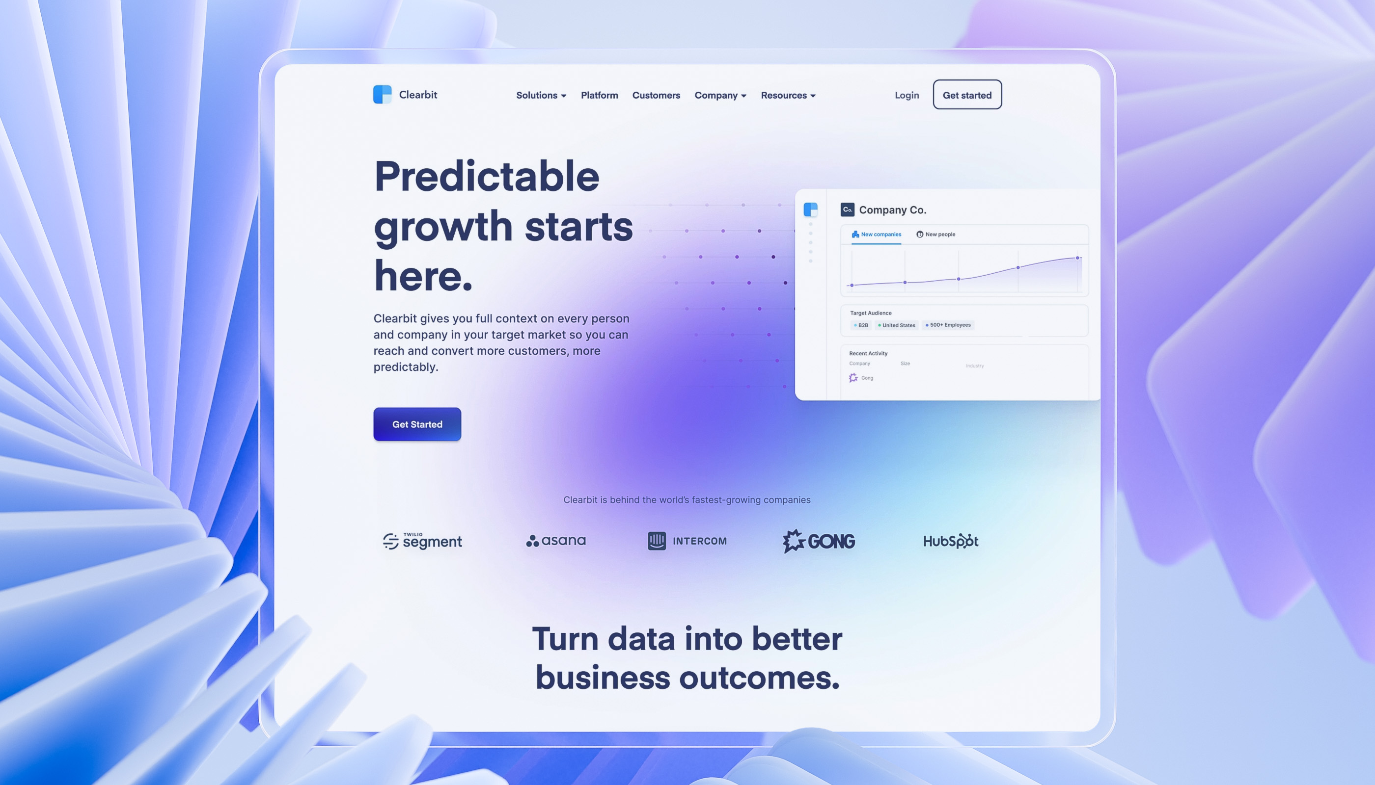
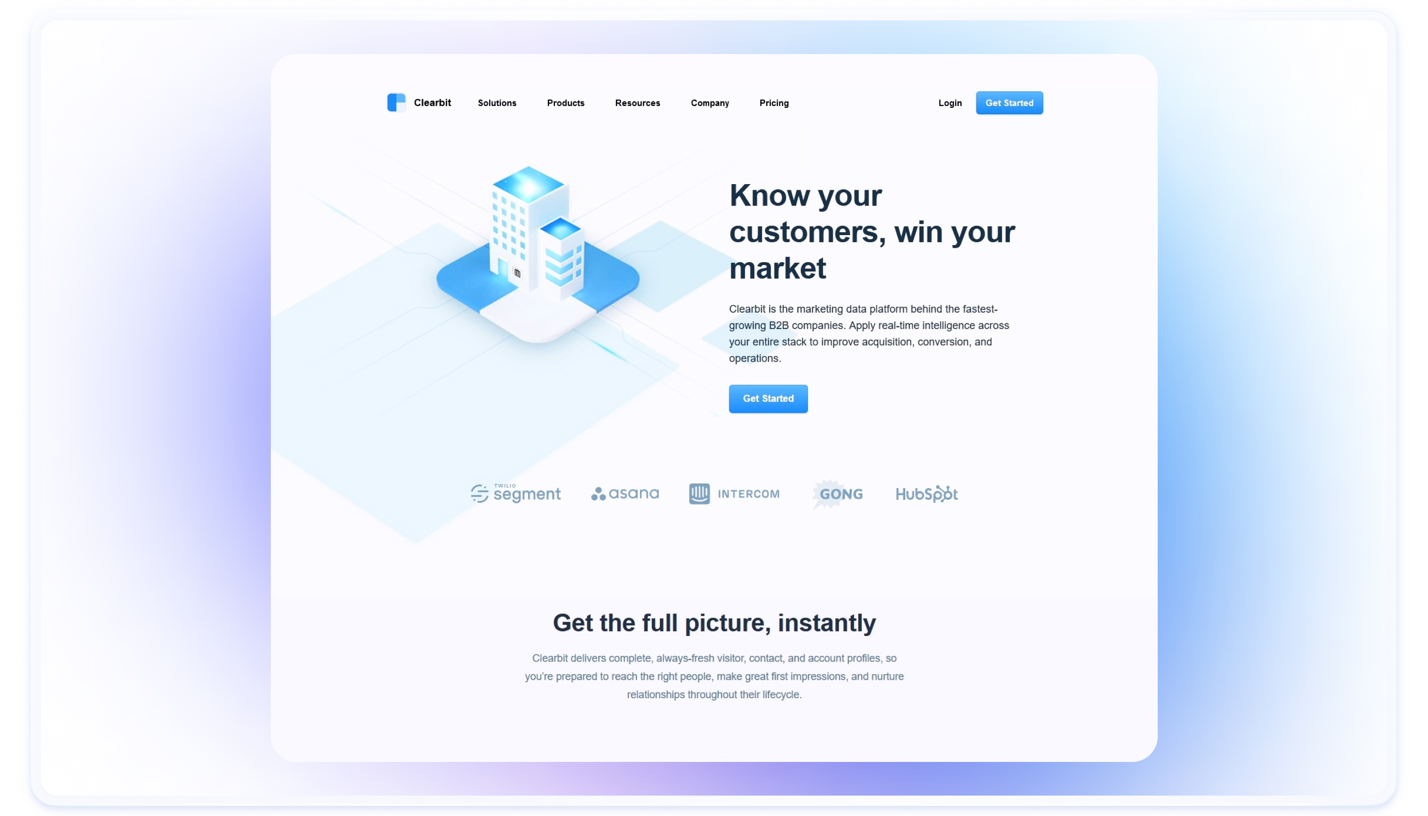
Clearbit, a business intelligence platform, engaged us to enhance its digital presence. We revamped their website to better reflect their brand evolution, improving visuals and user experience. This redesign resulted in clearer messaging, a stronger brand image and increased conversion rates.
Exit
$150MAcquisition by Hubspot
B2B Data
50MCompany records
Usage
1500Business customers
Services
Web designTech stack
Next.js, Tailwind CSS, Chart.js, Contentful
Industry
B2B
Website
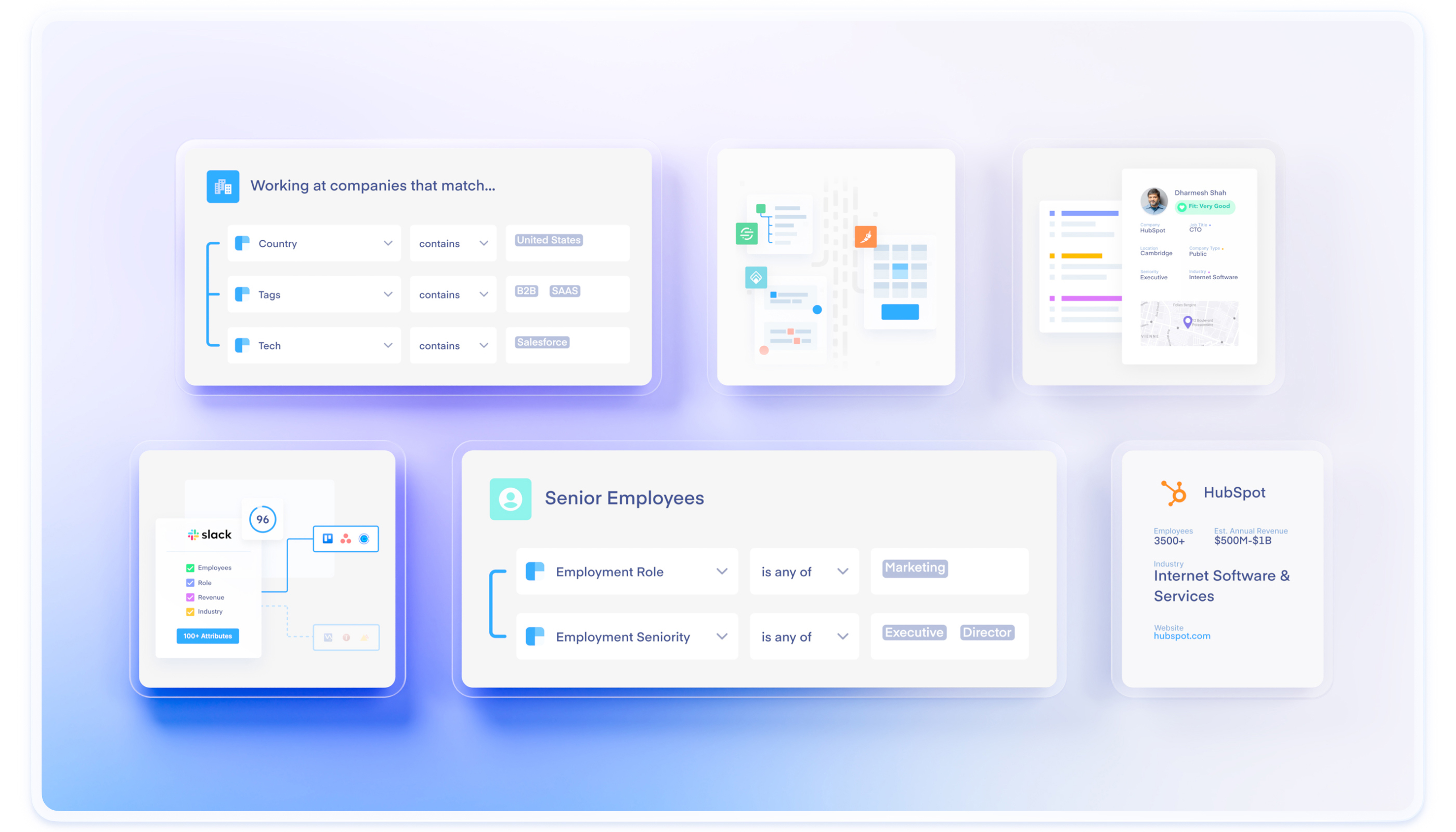
clearbit.comClearbit develops business intelligence application program interface tools designed to help companies find information about their customers. Their tools provide the right data for customer analytics, geolocation, fraud detection and prevention, background checks, address verification, and salesforce records.
They enable organizations to increase sales and reduce fraud. Clearbit was founded in 2015 and has over 1,500 business customers and 400K+ users.
Challenge
When Clearbit’s team approached us, the website was very well-received, especially by marketing-oriented visitors. Still, it was several years old and didn’t reflect the new positioning of the brand and product. The messaging positioned Clearbit as a “data provider” with a collection of data-related tools/products.
The new site should’ve put an integrated “data platform” front and center and clarified what Clearbit does, its value, and the outcomes users can expect. As part of these goals, we needed to freshen up the look and turn a few new heads.

Solution
While the idea of redesigning their logo was being considered, ultimately, it was determined that the current logo was the best representation of the brand. So, it was decided to channel all efforts into refining the website's design, forging a seamless partnership with Clearbit's marketing team. This cohesive approach streamlined our workflow, resulting in improved visuals, enhanced information architecture, and a smooth transition to development.
Adhering to the Kanban process, our team methodically progressed through tasks, fostering collaboration between design and development. This approach not only elevated aesthetics but also optimized the website's performance.
Outcome
The redesign has delivered meaningful outcomes: Visitors promptly grasp Clearbit's offerings. Performance has risen with improved conversion rates, lower bounce rates, and enhanced page speed, fostering better user engagement. The revamped design also aligns effectively with Clearbit's market position, reflecting an elevated brand image.
Overall, the redesign has enriched Clearbit's digital presence through enhanced clarity, performance, and brand representation.
Subsequently, after some time following the redesign, Clearbit was acquired by HubSpot, marking a significant milestone in their journey.
Our collaborative efforts with Clearbit exemplify the impact of strategic alignment, innovative approaches, and synchronized execution in achieving a holistic digital transformation that propelled Clearbit to a successful merger with HubSpot.

