Truebill
About
The story behind brand evolution and initial product design for Truebill, a fin-tech company that started as a product dedicated to managing subscriptions, further scaled to a cohesive financial platform, and was acquired by Rocket Companies.
Users
10,000Within a month
Exit
$1.275BAcquisition by Rocket Companies
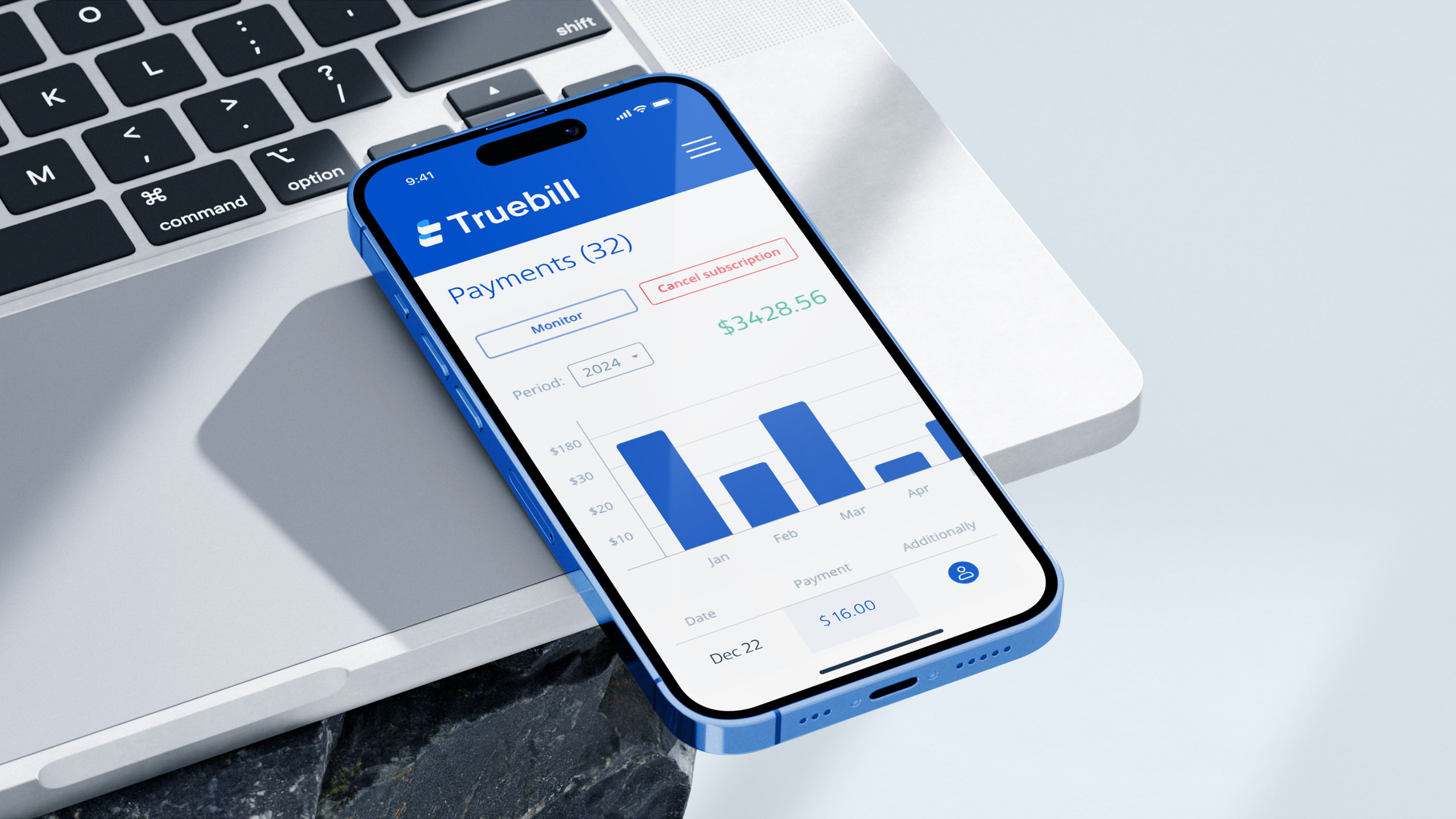
Manage your finances like never before
There are a lot of users who have heard of a company named Truebill. What particularly stood out is that there are quite a bunch of people who ask: “What is the Truebill app?”, “Is Truebill safe?”, “Is Truebill legit?”, etc. So let’s break down this wall of misunderstandings.
Truebill is a subscription-based fintech company explicitly designed for managing all of the crucial daily recurring bills and financial life. They have developed an app that could easily manage your financial health or track down overdraft fees that you’ve spent on important events.
Initially, Yahya Mokhtarzada, the company CEO, approached us with a request to evoke trust in their customer base, since the users were reluctant to enter their financial information, which was necessary to use the service. At that time, their company (formerly known as Billninja), was managing only the unwanted subscriptions of their users.
Feedback
We had a site that was thrown together by amateurs and a name that was more playful than professional. We needed design and branding that inspired trust.

Yahya Mokhtarzada
Co-founder of BillninjaThe company understood this issue and needed to completely change their image and the Truebill company message that they are actively promoting. Below, you can find the results of our first collaboration. It has delivered substantial brand loyalty and awareness for its customer base.
Feedback
Ramotion experimented until they settled on a mixture that felt unique yet familiar enough to be trustworthy.

Entrepreneur Magazine
March 2016Starting a second round of the brand refreshment
After some time has passed, our client has approached us once again, but this time with a different scenario. As their company has significantly grown, it was now managing every single bill and practically the entire financial life of its users. And since our branding agency has already worked with them, we understood what their request was. Essentially, the reason why they approached us, was to make a brand refreshment as their current one wasn’t precisely representing the state of their product and company.
At the very beginning, our brand development team has examined the value, the message, and the mission of their new brand. Our team went through multiple revisions and research steps to construct one for our partners. We took several iterations to analyze and research their digital project, as with each step, we were getting closer to developing essential brand guidelines for the Truebill company.
Our San Francisco branding studio began producing sketches with different fidelity levels. Each held a unique concept, and each was a potential candidate for the future brand identity.
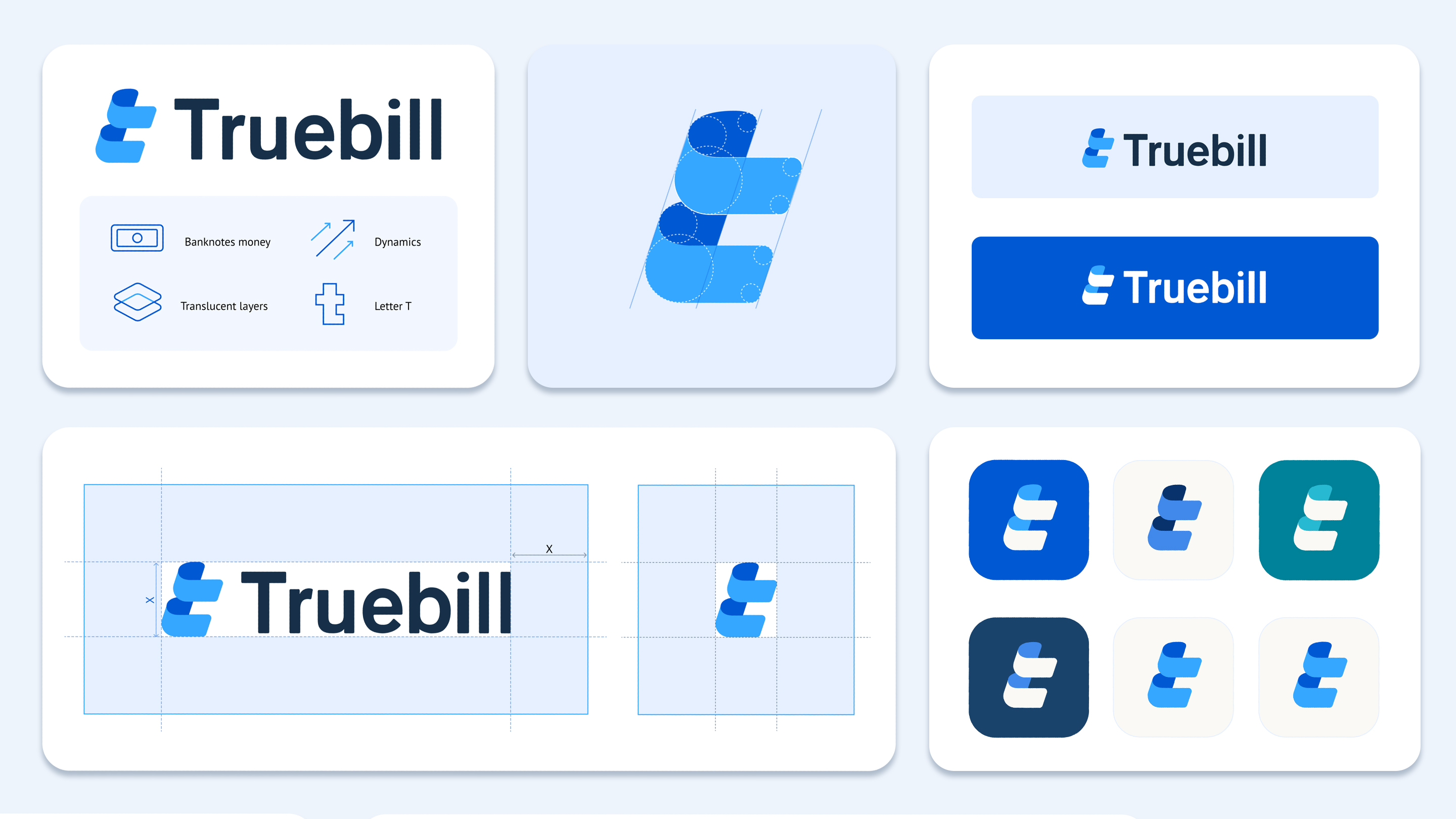
After our clients took the initial results, they were satisfied with the series of potential Truebill logos that our team developed in several different directions, along with some of the core brand guidelines. Each logo resembles the shape of a banknote and other concepts connected with bills and finance.
After our clients took the initial results, they were satisfied with the series of potential Truebill logos that our team developed in several different directions, along with some of the core brand guidelines.
More improvements are on the way
Our client saw a direct evolution in their brand image. However, they felt like something was missing. Thus, they tried to analyze what they wanted to see as the final image. What were they after, and what kind of expectations did they want from their users? Looking at the joint work, we’ve come through. They finally understood what they wanted to achieve.
At first, they highlighted what they liked the most about the new brand image: the capital “T” letter, the super simple shapes, and the resemblance of a banknote.
On the flip side, they addressed some of the other points they wanted to see. The first suggestion was that the edges and curves of the Truebill logo should be more smooth. Secondly, our client felt that the entire logo should have a more widespread font and screen space. It is supported by the fact that users should be “embraced” with the brand image once they start using their personal finance app. And lastly, they wanted to accentuate the shape of the "T" letter. All of these suggestions were tightly connected with the concept of financial management and the concept of money.
Thus, to wrap it all up, the client wanted to perfect the new logo and push it past the finish line. All while underlining that the collaboration should be executed in shorter iteration cycles. Therefore, with all the suggestions, our team began breaking down the entire concept of the new logotype once more. We started polishing the current logo, adding suggestions, and experimenting with the metaphor that our client and our team have developed so far.
Pushing the brand towards its success
Due to our close collaboration, our team has produced the Truebill logo that suits their business needs while reflecting the core principle of their brand. Almost every physical and digital asset of their company has already featured the new Truebill logotype.
As a result, after several years, the Truebill company was acquired by another fintech company for quite a hefty amount of money. All thanks to the cooperation we have had from the very beginning till the very end, we assisted our partners in reaching and achieving success in their field.