Raven
Raven mobile app enhances and brings your experience to a new level. You don’t need to wait for feed or your cheque; Raven handles all of that at once.
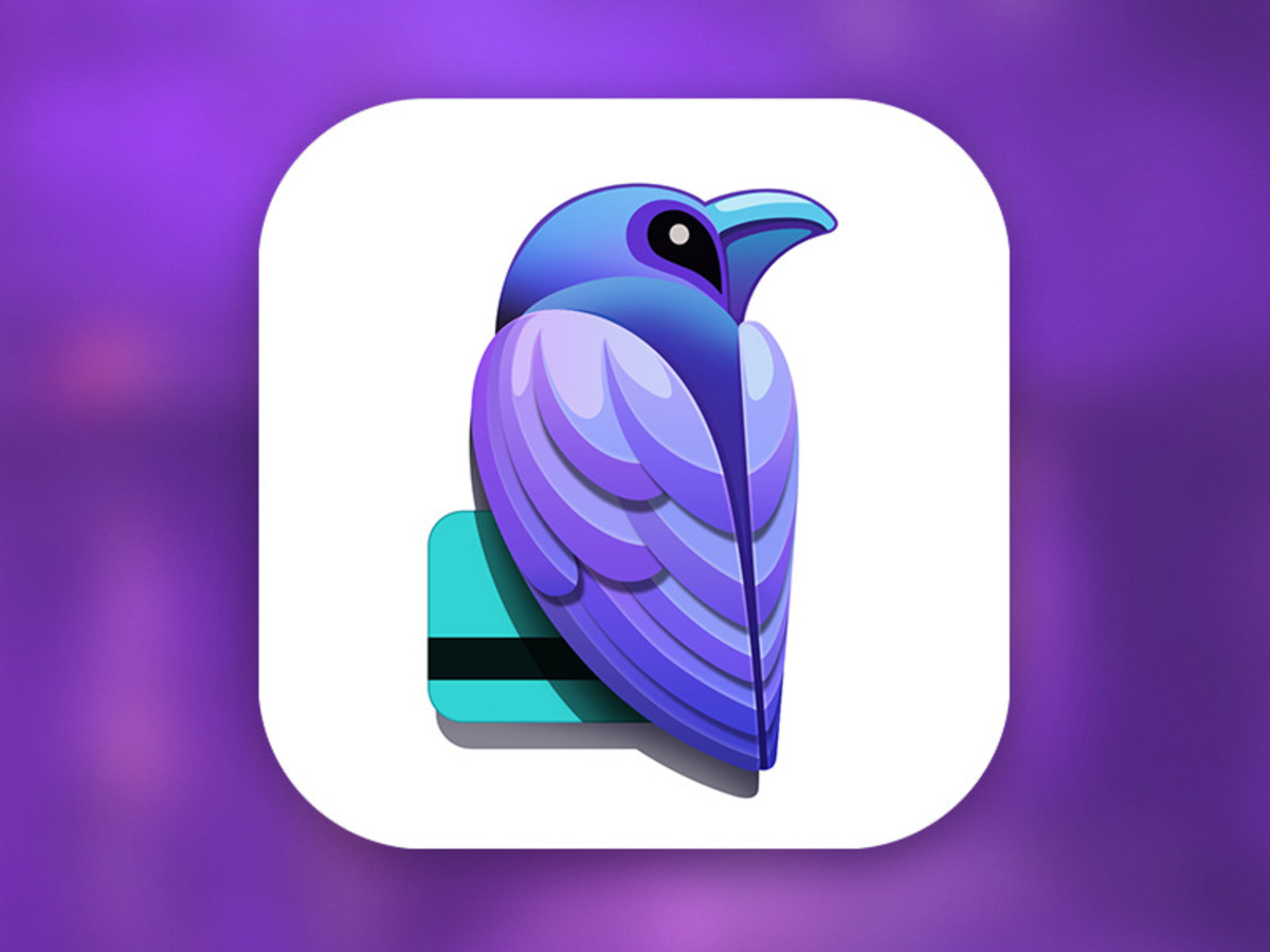
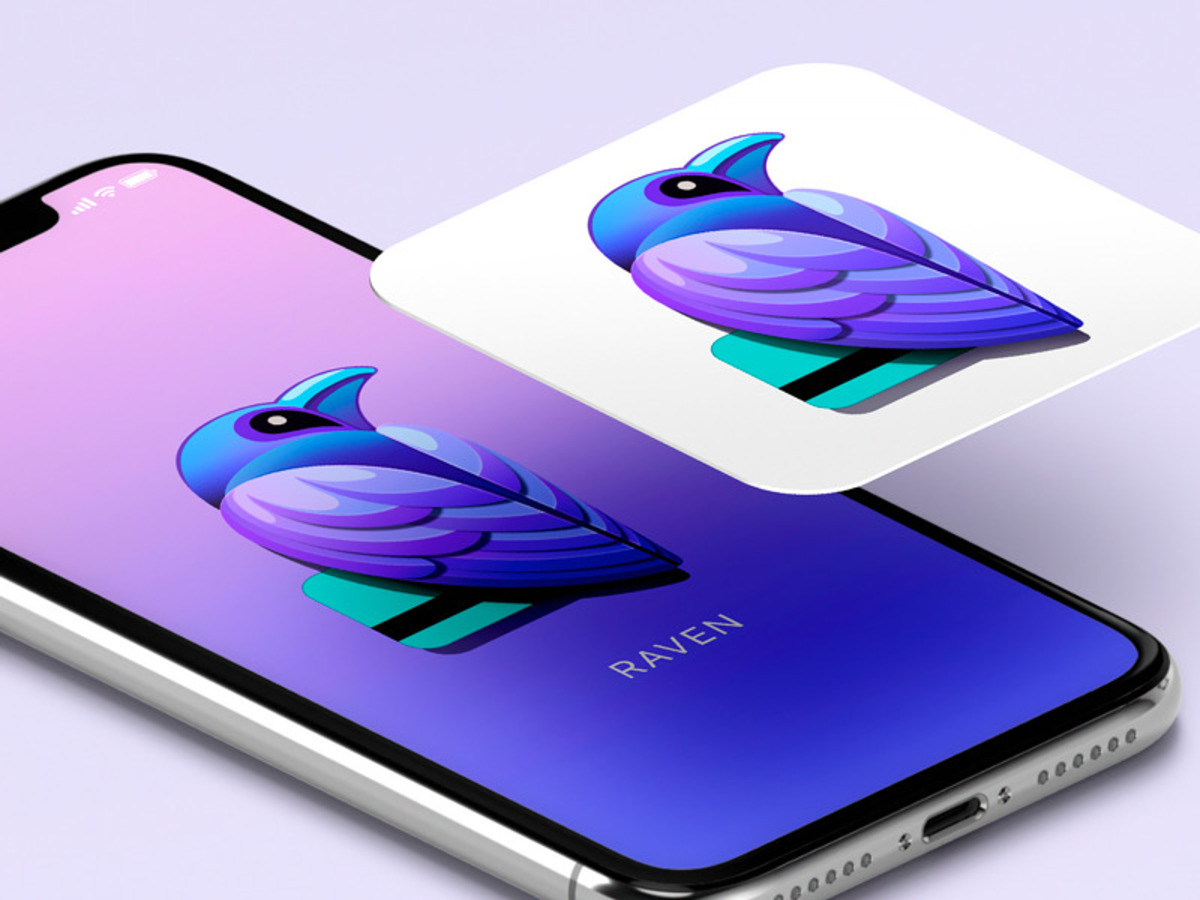
Raven is a mobile application that connects and manages your restaurant experience on a high priority level. Once you arrive at the restaurant, it secures your app: you only need to tell your name to the server, and you can have all of your food as you usually would. The payment is done via a mobile app and does not require you to use physical money. Together with our branding agency New York studio, we were tasked with the brand identity and development of a new icon design for Raven.
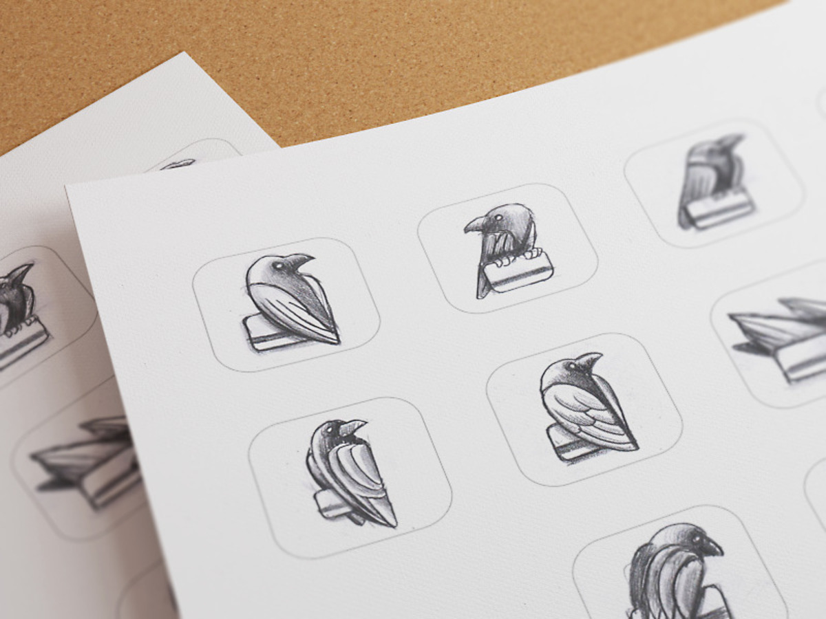
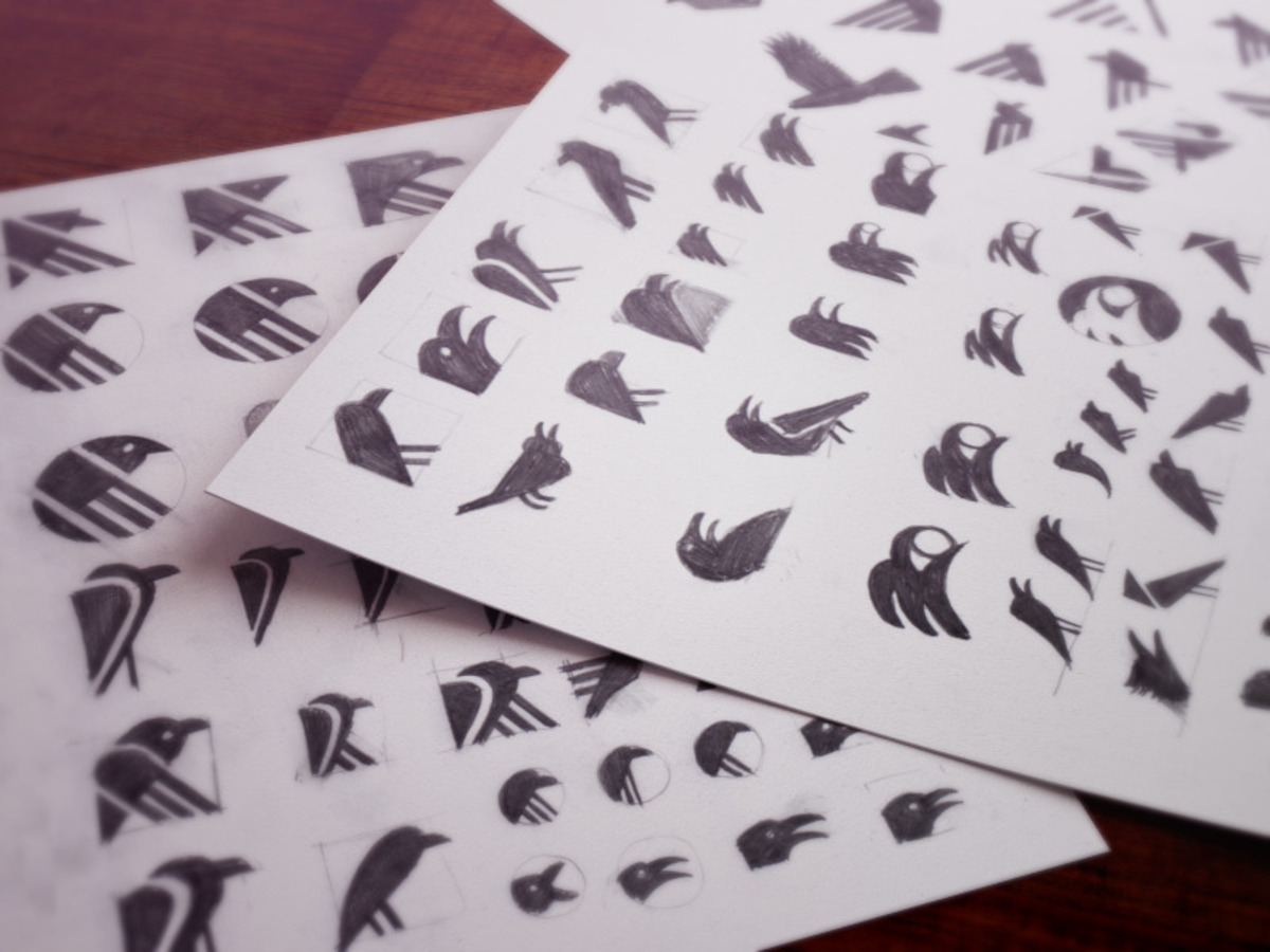
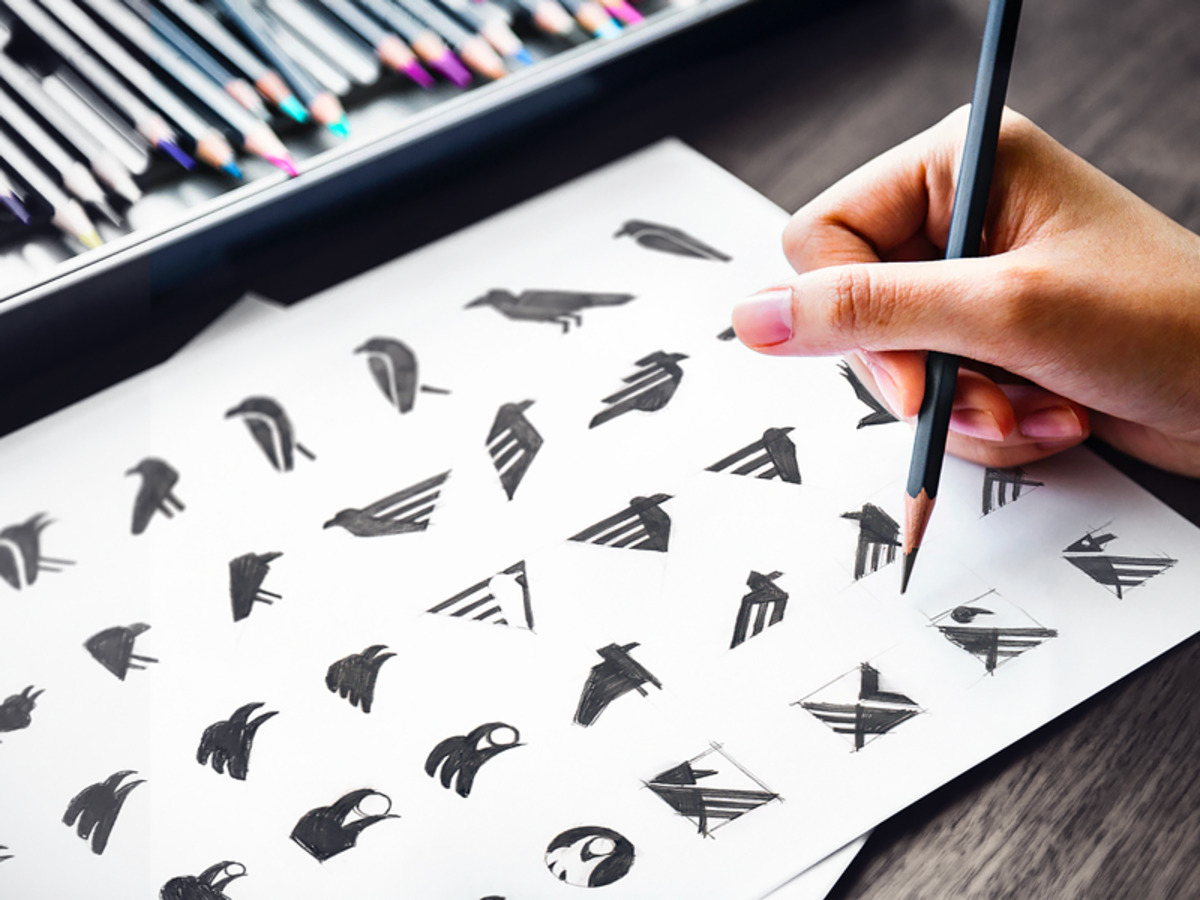
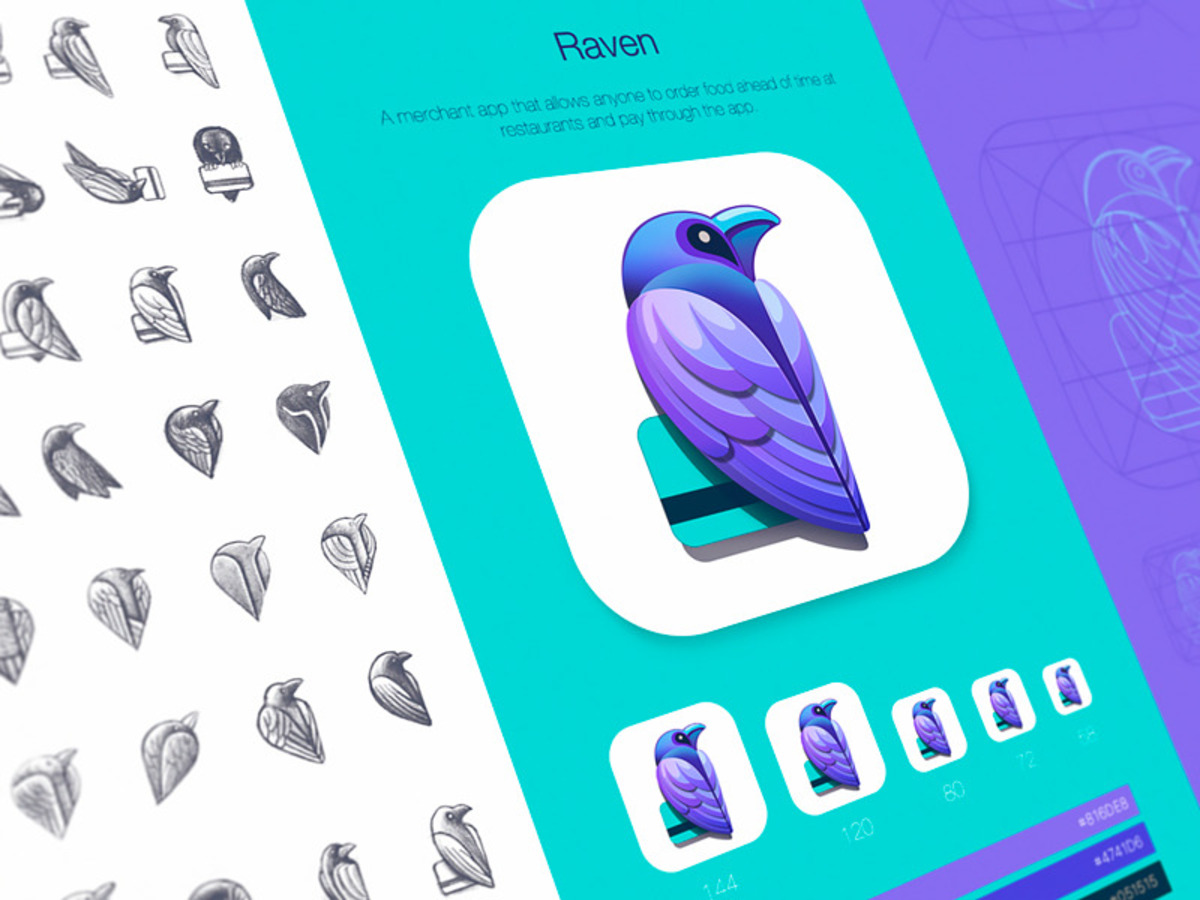
As a first step, our team started with moodboards: we tried to analyze the product itself to identify the right feelings, shapes, and emotions it evokes. As a result, we generated a few brand logo shapes but stopped on the raven sign, which showed the product value: an exclusivity that you can experience while safely holding money in your pocket. The grid of the brand logo follows the Golden Ratio rule, making the image aesthetic and yet dynamic.
Both our and Raven teams were incredibly thrilled to collaborate and design stunning icons and refresh their brand. We enjoyed our efficient collaboration and are very proud of the results we were able to produce.
Read also:
– VNPay
– Mozilla Labs