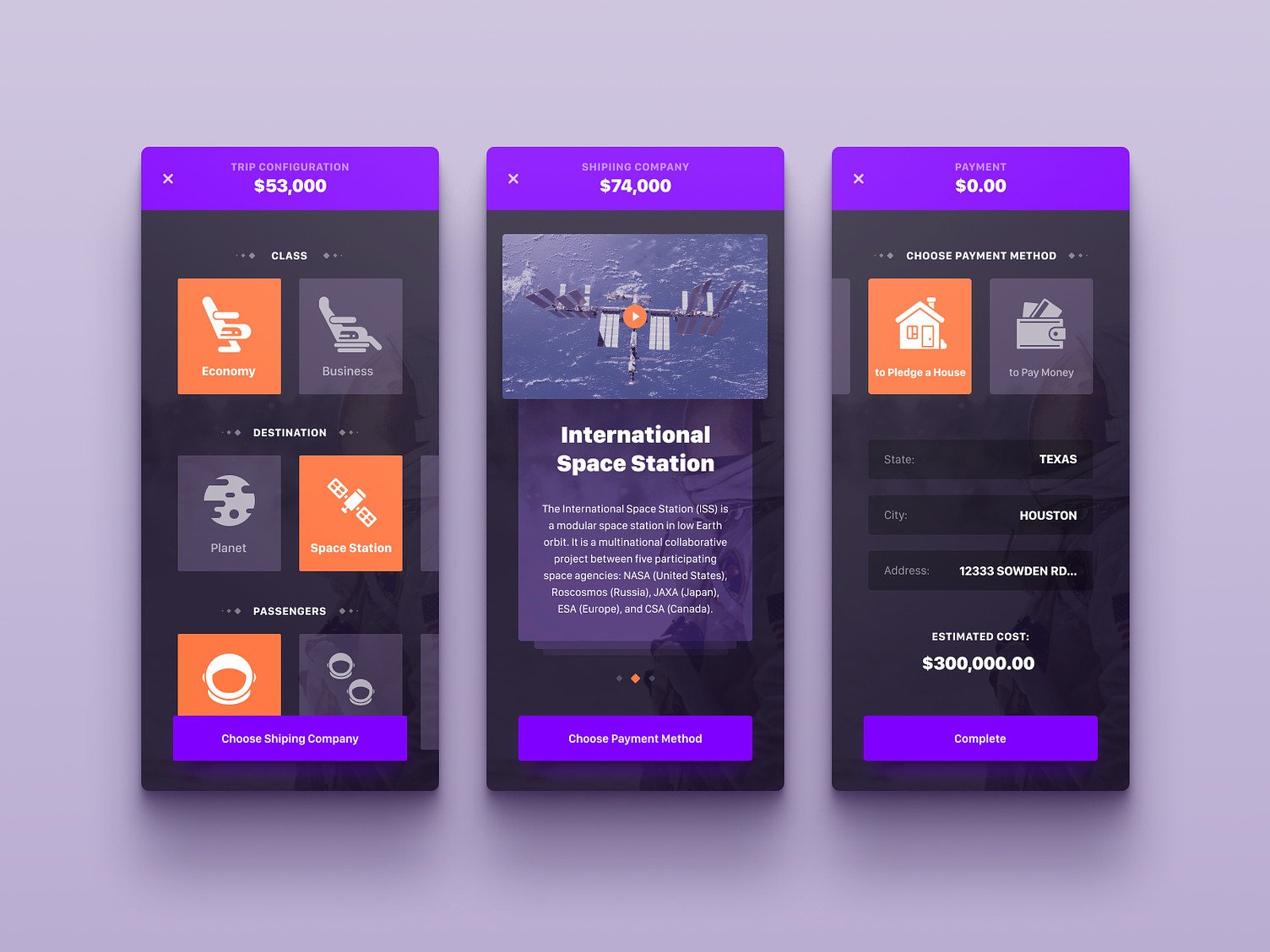
Space trip booking app
This mobile app design concept, designed by mobile UI/UX experts, revolutionizes how we think about space travel by turning it into a consumer-friendly service, akin to booking an airline ticket, but for the cosmos.
Functionality
The app allows users to configure a trip, including class selection (Economy or Business), destination (Planet or Space Station), and number of passengers. It also includes a feature to select a shipping company for sending goods and a payment method section offering unconventional options like pledging a house or paying money.

Design Essence and Elements
The design uses a dark theme with a vibrant purple accent for a futuristic and high-tech feel. Iconography is simple and bold, ensuring user-friendliness. There's a clear visual hierarchy with large headers, a price indicator at the top, and a linear flow from top to bottom, guiding the user through the booking process.
Likely Benefits
The app would make booking a space trip as simple as booking a traditional flight, with a straightforward step-by-step process. It could democratize access to space travel and potentially streamline the logistics of space tourism and shipping.
Application by the User
Users would interact with the app by selecting their desired trip options, choosing a shipping company if needed, and proceeding with the payment using the method that suits them best. The process is designed for ease of use, with the option to swipe through different screens.
Overall, the design concept is applied to emphasize simplicity and ease of use, which is crucial for an app offering such novel services. The focus is on making the user's journey through the app intuitive, with touchpoints familiar to mobile users, such as selection icons and swipeable screens.