According to the World Health Organization (2020), there’s about a billion people (15% of the global population) who suffer from some type of disability. A significant number of them aren't able to perceive all the kinds of content on the Internet. That’s why the World Wide Web accessibility is essential for all users despite their physical or cognitive abilities. So, how do we achieve it regardless of some certain limitations?
What is WCAG?
The Web Content Accessibility Guidelines (WCAG) were created by the World Wide Web Consortium (W3C) of the Web Accessibility Initiative (WAI) to make digital content in a web page or application more accessible to people in different conditions and situations.
What are WCAG versions?
WCAG 2.0 was published on Dec 11, 2008.
WCAG 2.1 was updated on Jun 5, 2018.
WCAG 2.2 Draft is planned to be published in September 2022.
What are WCAG Conformance Levels A, AA, and AAA?
- Level A is the lowest level with 25 criteria.
- Level AA includes 37 criteria from both Levels A and AA.
- Level AAA numbers 60 criteria in total.
Each new level is built by adding new criteria to the previous one. So, Level AA conformance includes all requirements from Level A. And all requirements from Levels A and AA are included in Level AAA.
If you’re wondering how many people your website appeals to, it’s best to trust accessibility experts with checking your site’s WCAG compliance. They will provide you with guidance on what steps to take when designing digital experiences.
Who does WCAG support?
- Users with visual impairments.
- Users with hearing disorder.
- Users with speech and language disability.
- Users with intellectual disabilities.
- All users in general.
What are WCAG principles?
- Perceivable. Various ways to perceive information should be available to users on the page.For any audio or video content there should be text alternatives. If there’s text content, audio alternatives should be present as well. You can also use any other alternatives, i.g. screen readers that will assist your users.
- Operable. Navigating your site should be easy. Users with disabilities often use a keyboard and character key shortcuts while surfing the net. Make sure that your site always suggests fixing or revoking their misclicks and mistakes, as well as validating information.
- Understandable. In order to perceive the content on your site, make it understandable. Present the content in a clear and informative way.
- Robust. Make your site or application accessible from any browser or device. The professional web development team always takes proper care of your code and functionality of the site.
Let’s study each level more thoroughly.
WCAG Level A
Adapting Level A success criteria will help your site achieve the most fundamental accessibility. Just make sure you satisfy all of the 25 WCAG requirements by accepting the basic accessibility guidelines and techniques. However, this compliance level will unavoidably leave some accessibility barriers.
Let’s take such a success criterion as "Use of Color" (1.4.1). The criterion notes that color shouldn’t be “used as the only visual means of conveying information, indicating an action, prompting a response, or distinguishing a visual element.” So, if the text on a website is black and hyperlinks are blue, it doesn’t meet the requirements of the success criterion. The problem can be solved by adding another distinguishing feature to the hyperlinks, such as an underline.
WCAG Level AA
Level AA success criteria make digital accessibility even better compared to the user experience with Level A. This level is also considered a global standard and most of the website strive to achieve it.
One of the examples of Level AA requirements is creating color contrast for low vision users. It falls under Success Criterion 1.4.1. Contrast (Minimum). If the background color of your site is light blue and the color of your hyperlinks is blue, the contrast between these two shades of the same color should be at least 4.5 to 1. If not, some of the users will simply not be able to distinguish the text of the hyperlinks from the background.
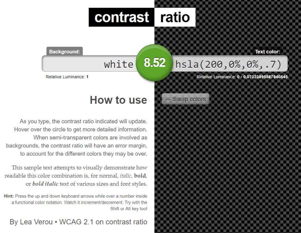
Majority of websites struggle meeting the given criterion as the whole site needs to be reviewed and sometimes you even have to sacrifice your brand colors (but not the logos, you can breathe out). Using a contrast ratio tool helps you check for the vision issues.

WCAG Level AAA
Level AAA conformance is the highest in WCAG and it includes the highest standard of accessibility as the web page and content satisfy all Levels A, AA, and AAA.
Success criterion 1.4.6, Contrast (Enhanced), has higher requirements than compared to the same Criterion for Level AA. Now, the contrast between regular text and the background must be at least 7 to 1. It’s required for users who have severe vision loss (around 20/80 vision or lower). Such users don’t need to use assistive technology to perceive the web content.
It should be mentioned that Level AAA success criteria aren’t all applicable to every kind of content.
Examples of WCAG Level AAA Websites
Here are some examples of WCAG level AAA websites according to the Tool Tester’s research
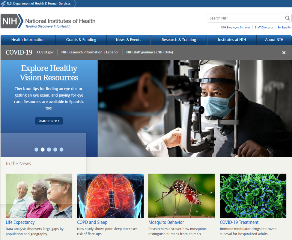
1. The National Institute of Health
The National Institute of Health is the most telling example of accessible websites. Only 0.18% of the site is inaccessible, the rest helps people navigate the site and look for any useful information. The bag was found in the coding that led to “invalid language specified” issue.

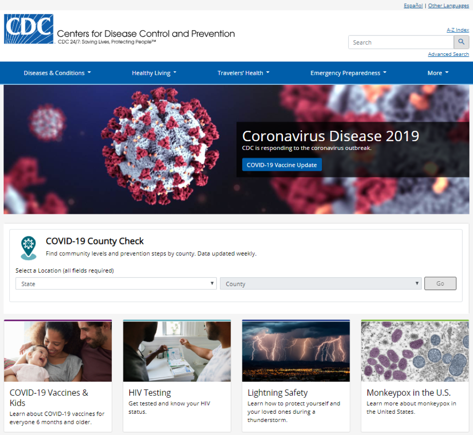
2. The Centre for Disease Control and Prevention
The second accessible site belongs to The Centre for Disease Control and Prevention. Just 0.18% of the website is inaccessible, which makes it understandable for all its users. But some people would find it difficult to find links in the titles.

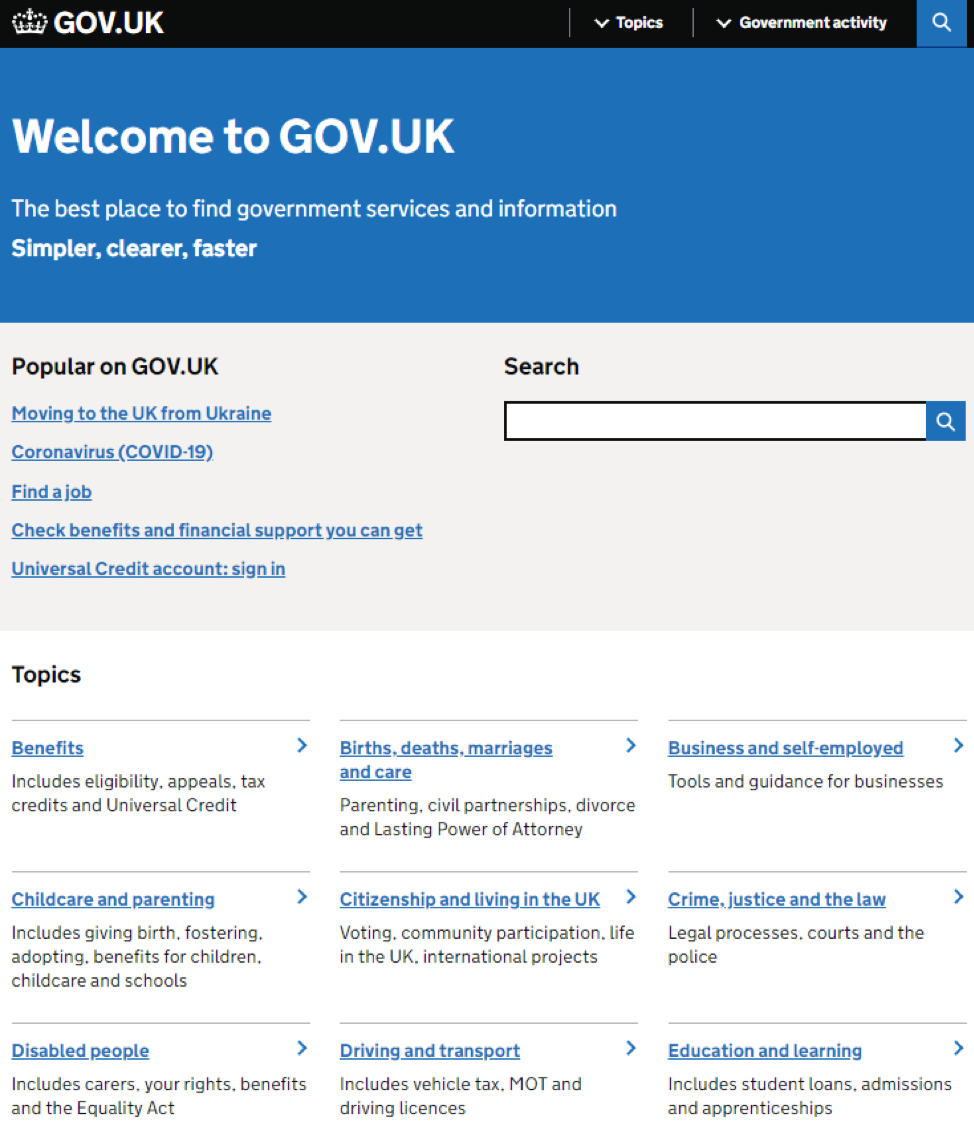
3. The UK government
The third place takes The UK government website. 0.20% of its features aren’t web accessible, the rest of the content is very easy to find and understand.

What Level Should You Aim For?
Among the three levels of WCAG standards, the global standard is Level AA, which is enough for optimal accessibility for most users. Certain sites legally require this level and people often refer to it in terms of a good example of an accessible website. However, if you have a site that you’d like to make accessible, try achieving the Level A criteria first. And after that you can proceed to Level AA.
The choice between Levels AA and AAA depends on the size or type of the company, the type and purpose of the content, and the users. However Level AAA isn’t a common requirement among sites, so make sure that the Level you choose fits your site and content.
Conclusion
It’s hard to imagine being able to make entire sites accessible to any person on the planet, however we can strive to make it easier to perceive the content by adjusting it as much as we can. The number of accessibility issues can be minimized without the help of assistive technology. Your desire to benefit more users will undoubtedly be rewarded!
Jun 29, 2022
