Introduction
With a billion users online, it is no surprise that every brick-and-mortar store wants to establish itself online. A website is an effective way to promote yourself, sell products, and communicate with clients. Even if you do not have commercial intentions and want to share your thoughts or express your unique personality, this digital avenue can become a perfect tool.
Whether you invest in your company's future or yourself, you need a good website. It should be visually pleasing, engaging, modern, well-balanced, immersive, readable, accessible, and branded. It should provide information but not confuse; it should navigate visitors through your story but not overwhelm them.
All of this could be achieved with a professional web design. Working with a professional web design agency helps transform ideas, values, and personality into a usable digital experience that feels intentional, consistent, and trustworthy to your audience.
What is web design? How does it benefit you? What principles, key elements, and functionalities does it involve? We are going to answer these questions here.
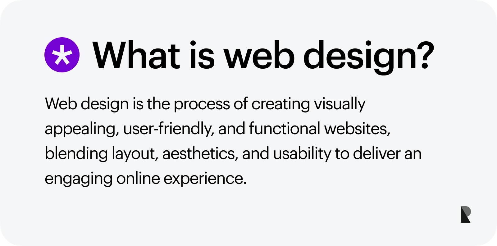
Web designing is one of the most popular types of digital design. On the surface, it determines colors, fonts, graphics, icons, backgrounds, supporting visual material, etc. However, it goes much deeper into website creation.
It is responsible for layout, textual and visual content presentation, usability, user and reading experience, aesthetics, and overall impression. It is a cornerstone of a web platform that affects all its core elements, such as functionality, responsiveness, mobile-friendliness, and accessibility.
Web design becomes more complex and advanced as the website design sphere grows and evolves. Today, it relies on traditional design principles and knowledge from adjacent spheres like SEO optimization, web development, and usability to meet new standards, market demands, and expectations.
What Is Adaptive Web Design?
Adaptive web design is an approach to creating a web user interface that adjusts to visitors' screen sizes. It rearranges blocks or removes them from the flow to comfortably accommodate all crucial visual elements, content, and functionality and provide visitors with an optimal user and reading experience.
From the technical side, adaptive web design employs fixed layouts. It detects the screen size and chooses the appropriate layout and arrangement from pre-made solutions.
As a rule, it covers only the most popular options, including mobile phones, tablets, laptops, and huge monitors. However, some companies may include unique options to meet their target audience's preferences.
Adaptive design is closely related to responsive design, a gold website creation standard. Responsive web design is a dynamic approach to adjusting the web user interface to the device on which it is viewed. It does not have a range of predefined layouts.
Instead, it uses CSS, HTML, and JavaScript features to fit the content to the screen size. It may shrink or enlarge blocks and rearrange them to react to the user's behavior and environment.
Both approaches are vital to providing users with an optimal user experience and presenting the brand coherently regardless of the device.
Why Is Good Web Design Useful?
Web design's importance lies in how it benefits businesses, users, and the overall digital arena. First of all, it underlies an optimal user experience. When well done, it provides enjoyable reading and visual experience for users on any device and environment.
Second, it impacts a brand's image, reputation, and positioning in the market. A web design perfectly tailored to a brand's mission and vision resonates with the target audience and contributes to the brand's growth and success.
Third, it generates much-needed traffic. Google has ranked responsive web designs higher than static ones for almost ten years. With a mobile-friendly web UI, you may occupy the top position in the search, thereby overtaking competitors and seizing organic traffic.
Fourth, it builds trust and generates revenue. The first impression matters, much like the general one. Hand-crafted, regularly updated branded website design inspires trust and increases a company's credibility. It stands against competition and gives consumers a good reason to choose you over others.
Finally, it pushes the digital arena forward. As it evolves to benefit from new technical aspects and meet the target audience's demands, it establishes new digital communication and self-presentation standards, improving user experience on the Internet.
Web Design vs. Web Development
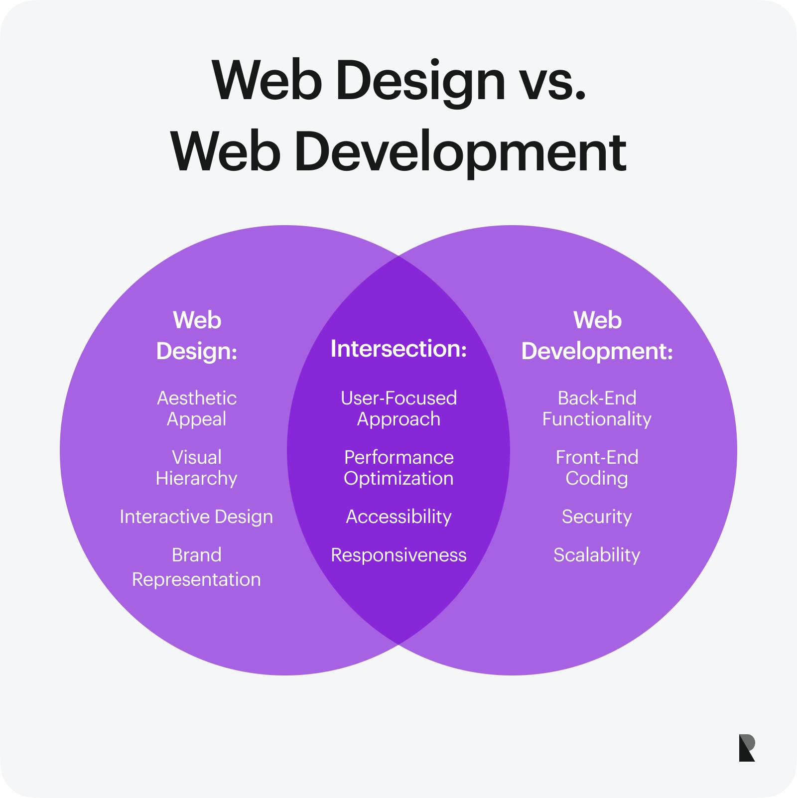
Web design and web development are two adjacent niches that perfectly co-exist together. Consider their roles and interactions in website creation.
| Web design | Web development |
|---|---|
| Shape the vision of a website through graphics, visuals, images, and branding elements. | Shape the vision of a website through a full stack of functional blocks. |
| Create a visual aesthetic. | Create functionality and back-end. |
| Create user experience. | Develop user experience. |
| Responsible for layout, alignment, information, and visual hierarchy | Responsible for CMS, database, and server-related functionality. |
| Create visual content. | Develop functions, interactions, and dynamic features. |
| Work with color, typography, shapes, mockups, contrast | Work with scripts, navigation, sliders, framework, tabbed areas, etc. |
| Create accompanying material to support security and privacy on the front. | Realize security, privacy, and authentication protocols on the back. |
| Create visual assets, mockups, icons, and multimedia. | Develop scripts and layouts to support visual assets. |
| Draws up responsive and mobile-friendly layouts. | Develop responsive and mobile-friendly behavior. |
| Introduce accessibility through contrast, spacing, size, and scaling. | Introduce accessibility through HTML, CSS, and scripts. |
| Use prototyping and design software like Photoshop and Figma. | Use professional software and code in JavaScript, PHP, and MySQL. |
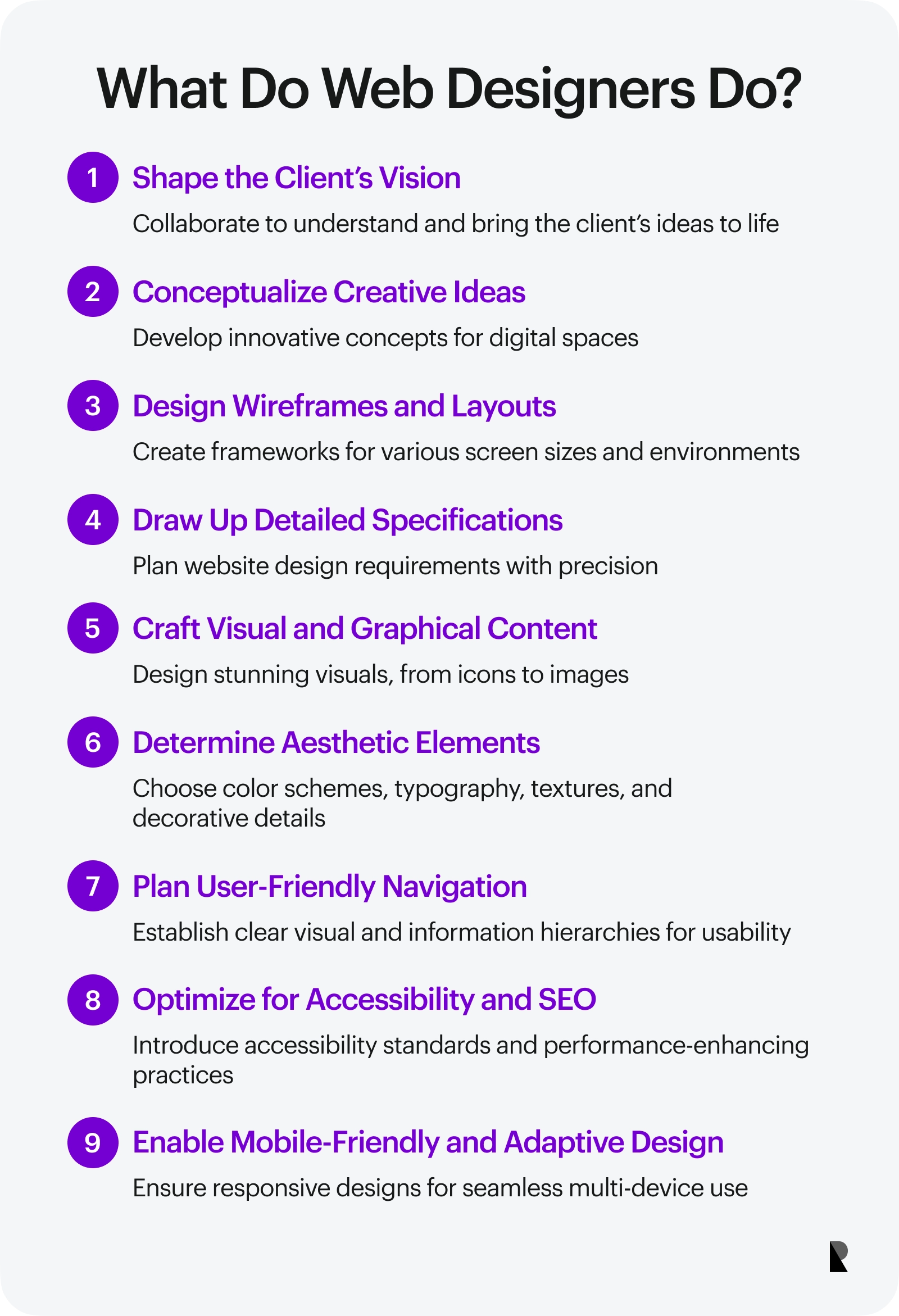
What Do Web Designers Do?
Web designer are craftsmen of the sphere. They shape visions and bring them to life using digital graphic software. They are responsible for creating the overall layout and aesthetic. These are their main responsibilities:
- Shaping client's vision;
- Conceptualizing ideas;
- Creating wireframes and layouts for various screen sizes and environments;
- Drawing up detailed website design specifications;
- Designing graphical and visual content;
- Determining color schemes, typography, textures, patterns, backgrounds, and decorative details;
- Establishing information and visual hierarchies;
- Editing media assets;
- Thinking-through navigation and usability;
- Realizing responsive or adaptive design;
- Creating assets for mobile-friendly behavior;
- Introducing accessibility principles;
- Creating supporting visual material for functionalities.
To handle these tasks, web designers have various design skills beyond drawing graphics. Whether they are pros or only just started in web, they should have basic knowledge of web standards, including accessibility, usability, SEO, and even partial web development, to understand how to deliver visually appealing and performance-optimized websites.
History of Web Design
From the pristine text-only interfaces of the '80s to the mind-blowing fully gamified websites of 2024, web design has come a long way. The last thirty years were a true ride for it with many exciting iterations.
The term "World Wide Web" dates back to the 1940s. However, only in 1989 did Tim Berner-Lee, the widely acknowledged forefather of the Web, invent the first web page using hypertext markup.
It was launched on August 6, 1991. Devoid of visual elements, it contained only text. That was one small step for man but one giant leap for mankind in the Internet.
Some call this era the "Dark Ages of the Internet" because web developers mostly worked on black screens with pixels. Nevertheless, from then on, the web design sphere started to shape itself with the help of digital inventors, nomads, and pioneers.
The key events in the history of web design are:
- 1990 – Adobe released the first version of Photoshop.
- 1992 - The first image appeared on the Internet.
- 1994 - The first banner ad was introduced on a web page.
- 1994 – Geocities, the first web hosting service, was invented, allowing users to create homepages.
- 1994 – W3C was established.
- 1995 – Invention of JavaScript.
- 1995 – The term "user experience" first appeared in public.
- 1995 - Adobe PageMill 1.0 was introduced.
- 1996 – Rise of Adobe Flash and partially animated web pages that encourage every professional web design agency to create interactive experiences.
- 1997 – Launch of Dreamweaver 1.0.
- 1998 – Invention of CSS.
- 2000 – Designers started creating multiple website versions to accommodate different browsers.
- 2003 – The year WordPress blogging started on the Web.
- 2007 – The beginning of the mobile era and highly realistic web designs with shadows, textures, color gradients, flashy animated gifs, and imitation of 3D effects.
- 2009 – The first mention of the "Mobile First" approach.
- 2010 – Rise of responsive design.
- 2010 – Shift to flat design instead of skeuomorphic.
- 2017 – Comprehensive browser support for WebGL and web-based 3D visualizations.
- 2020-2024 – Modern design with exceptional web experiences and high-end technologies.
Principles of Web Design
With a 30-year history, web design has a range of principles for creating a professional website. From balancing content and visuals to ensuring an optimal contrast for a great reading experience, there is much to consider during the process. However, with user-centric designs coming to the fore, some are highly prioritized now. Let's consider eight fundamental principles.
Balance
Balance describes the distribution and visual weight of elements in a composition. It determines how elements are weighted against each other to create visual harmony and avoid confusion, intimidation, and visual overload.
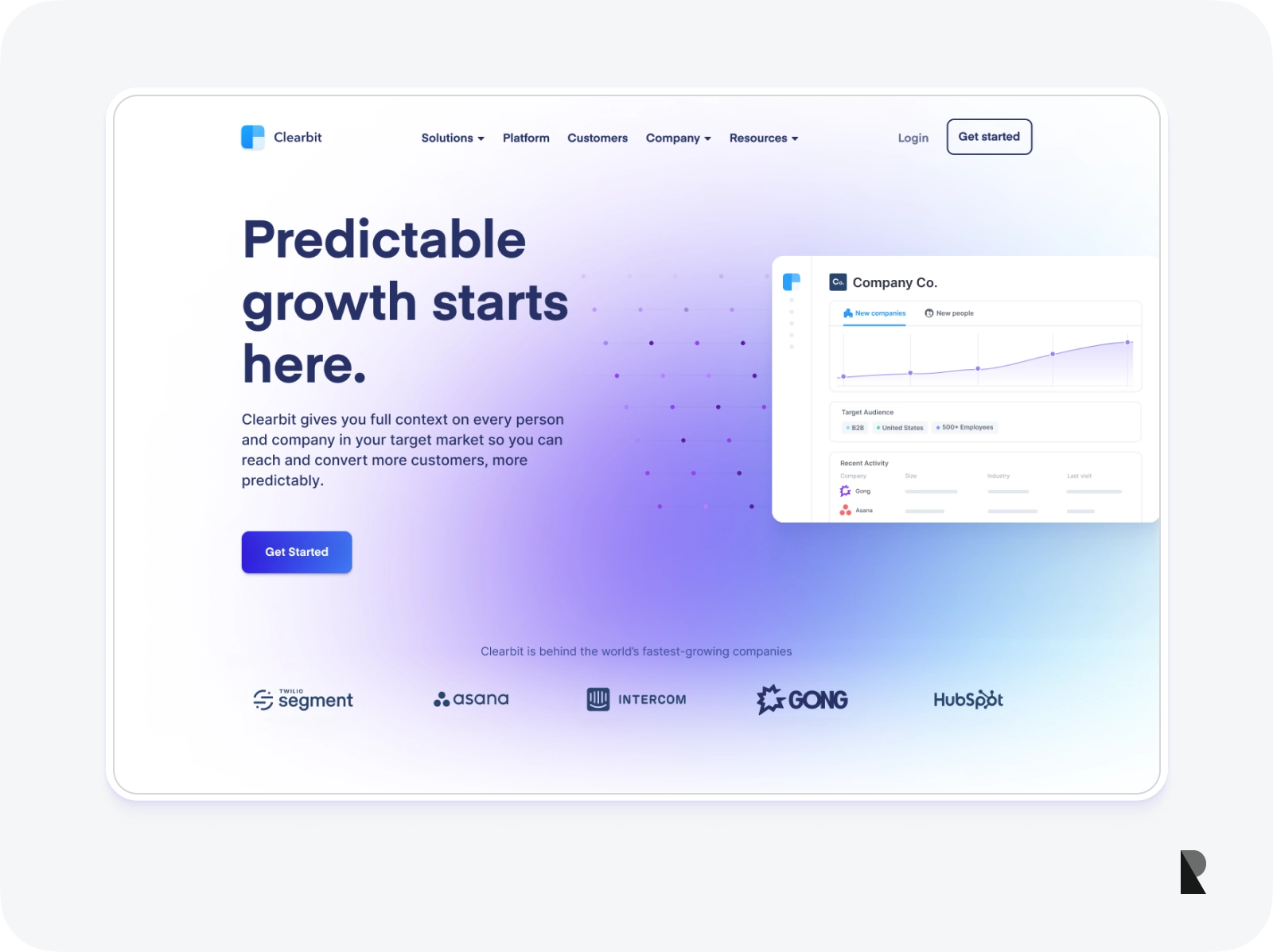
Balance considers elements in various dimensions and directions, including vertically, horizontally, and diagonally. It stabilizes the background and foreground and is measured symmetrically, asymmetrically, and radially.
Creating a sense of balance is crucial to achieving cohesiveness, completion, and satisfaction in user experience, overall aesthetics, and general impression.
Contrast
Contrast differentiates elements from each other. It refers to the juxtaposition of two visually different elements. It is established by manipulating the basic properties of the element, such as color, size, position, alignment, texture, borders, and others. It can also be achieved through typography, repetition, and other aspects.
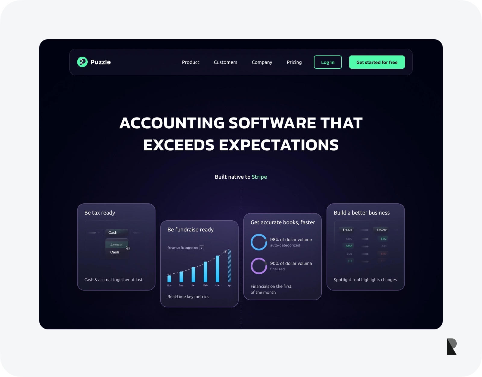
The main goal of contrast is to create information and visual hierarchy, thereby making it easy for visitors to locate crucial information.
Contrast has many applications: it may get the message across, lay a reading path, draw the eye to key details, and create an eye-pleasing environment. It also plays a vital role in introducing accessibility to web projects.
Emphasis
Emphasis directs the viewer's attention to a particular area or object. It usually highlights a link, call-to-action button, image, offer, or key brand message.
Emphasis is crucial because online visitors prefer to scan pages rather than read. It provides them with focal points so they can move around the website comfortably and get the project's message.
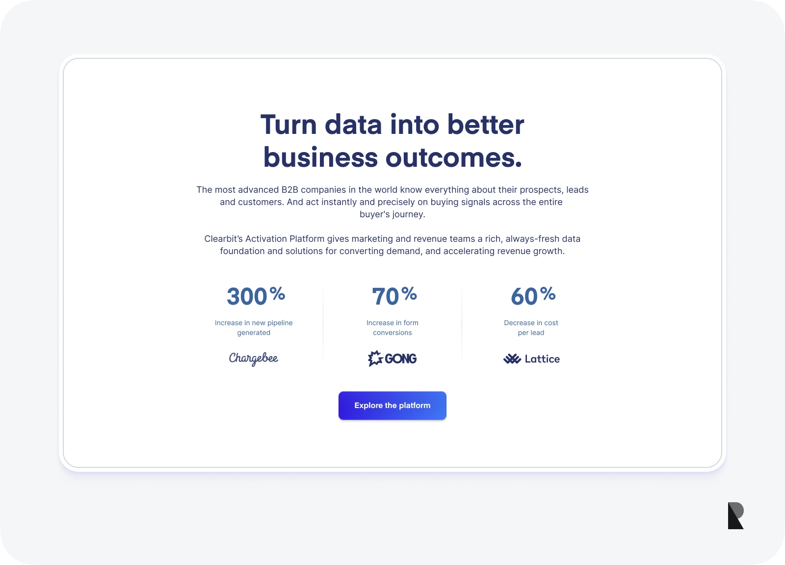
Using lines, shapes, colors, textures, size, and other graphical means, a web designer creates emphasis and uses it in reading flow and marketing and advertising campaigns.
Animations
Animations refer to a dynamic form of visual storytelling. They come in all shapes and sizes, from cinemographs to small clips. Web designers use motion and even sound to bring objects to life and enrich interaction with static elements.
Animations have become fundamental after Google developed the Material Design language in 2014 and encouraged web designers to add meaningfulness to websites through dynamics and transition effects.
Rhythms
Rhythm describes the repetition of visual elements in web design. It determines the pattern and relationships between elements to create a sense of close harmony. It guides the eye from one point to another, creating a smooth path for exploration.
There are five standard types of rhythm: regular, alternating, progressive, flowing, and random. They use shape, color, tone, texture, accents, and direction to unite, direct, highlight, or organize elements and structures of web design.
They may affect any set of elements. You might often see the rhythm of tints and hues, the rhythm of shapes, the rhythm of lines, and even the rhythm of scaling in a web design.
Structure and Hierarchy
Hierarchy describes the arrangement of elements to show their order of importance. Based on Gestalt psychology, it influences how the human eye perceives what it sees in website design.
Hierarchy comes in two general types: information and visual. A web designer creates it using color, size, typography, scale, contrast, alignment, repetition, proximity, texture, style, or white space.
The structure came to web design from the engineering field. It characterizes the foundation of the website design. In a nutshell, it is a raw wireframe on which visual elements are applied. It is also considered an organizational order of sections, blocks, and components. It describes the page and connects all pages of the project.
Space
Space or whitespace is any blank or empty area in website design. It may surround elements, be between or inside blocks, or even be a negative element. It can also be active when highlighting certain elements or passive when supporting hierarchy or balance.
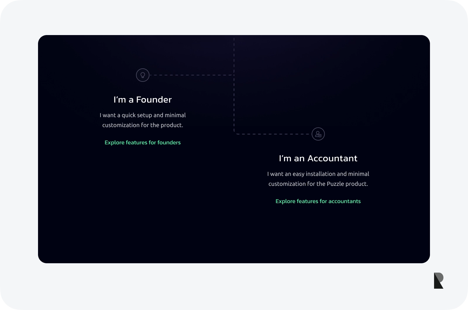
The importance of whitespace is hard to underestimate. It structures and organizes content, increases text legibility, improves readability, amplifies user interactions, establishes hierarchy, and creates the organizational order necessary for a harmonious experience.
Unity
Unity is a sense of agreement, conformity, and cooperation when different elements and visual aspects are combined. Web designers use various tools to achieve it, from establishing visual hierarchy to exercising simplicity to promoting proximity and continuation.
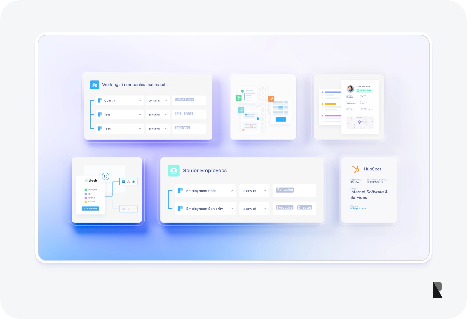
Unity is crucial for creating a pleasant visual experience. It removes discordant elements and avoids confusion caused by poor contrast. It also aids comprehension, highlights key messages, creates balance, and promotes the brand's identity.
Key Elements of Web Design
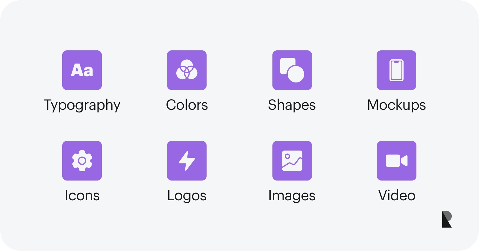
Key elements of web design
Effective, impressive, and high-converting website design combines meticulously created key elements for every vital aspect, from readability to visual aesthetics. Let's consider these fundamental blocks.
Typography
Typography is a collection of fonts used to display text to users. It refers not only to the selection of letterforms but also to placement, sizing, weight, line spacing, styling, alignment, and whitespace.
Every project uses a combination of typefaces to demonstrate headlines, basic content areas, inscriptions, navigation elements, buttons, and other elements. They are well-matched to create harmony in aesthetics.
The main roles of the fonts are to establish an information hierarchy, deliver the message, and provide an optimal reading experience across devices. They directly affect how users perceive the content on a website and contribute to the marketing side of the project by highlighting key details.
Colors
Color is so important in website design that it can easily ruin everything or, on the contrary, take the project to the next level due to its ability to generate emotions and influence customers' decisions.
In commercial web projects, the brand's visual identity lies at the core of coloring, whereas personal web platforms like blogs have coloring aligned with the owner's personality or niche. Whatever the case, coloring in website design consists of several tones perfectly matched together using color theory.
Color plays a huge role in a website, from creating a pleasant user experience to setting accents and generating emotions that influence decision-making.
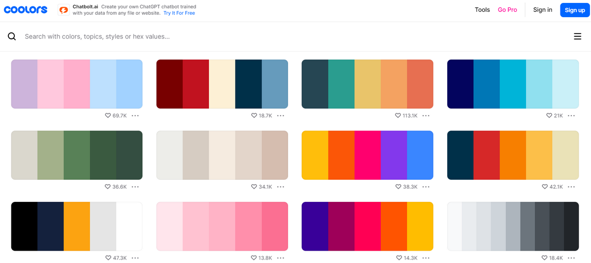
Coolors – color scheme generator
Shapes
Shapes in website design are geometric, organic, and abstract. They could be traditional squares, circles, triangles, or modern options like hearts, leaves, and stars.
These small yet vital graphical elements support design and content. They accompany navigating elements and enrich the visual experience, making it more understandable.
Mockups
Originally, mockups visualized and finalized the key design aspects of a website. However, most recently, they have become integral to the website's aesthetics and user experience by improving overall appearance and functionality.
For instance, web designers use cell phone and tablet mockups to demonstrate product features or promote applications in a native environment. They simplify tricky or complex concepts and make web services intuitive and relatable.
Icons
Icons add visual cues to the reading flow and clarify vital processes. They are of huge importance in website design. Despite being incredibly small, they support an optimal user experience and underlie navigation. From menus to play buttons in sliders, they can be seen everywhere.
Icons fall into different categories and play different roles. They are simple and small yet meaningful, unobtrusive, functional, and helpful. They grab the user's attention and allow the targeted action without much effort.
Logos
Logos are an integral part of brand identity. They have unique public identification and recognition on a commercial website or a personal blog.
Logos have their place. As a rule, they are positioned right at the top of the page to be the first one to greet visitors. Some web designers duplicate and place them at the bottom of the page to leave a lasting impression and make the project even more brand-related.
Images
Images represent multimedia material. They could be static and dynamic and come in all shapes and sizes. They could even be AI-generated today.
In website design, images perform several crucial roles apart from making your website attractive. First of all, they are powerful forms of communicating information. Second, they underlie a comfortable user experience. Third, they elicit an emotional response. Finally, they amplify marketing efforts.
Video
Videos have a unique power to drive engagement, naturally grab attention, and, most importantly, keep users on a website for longer. They add personality to the website and amplify the value of the content. Therefore, they quite often occupy the hero area.
Unlike images that overpopulate websites, videos are used carefully and scarcely because they may drastically overload the project and slow the loading time.
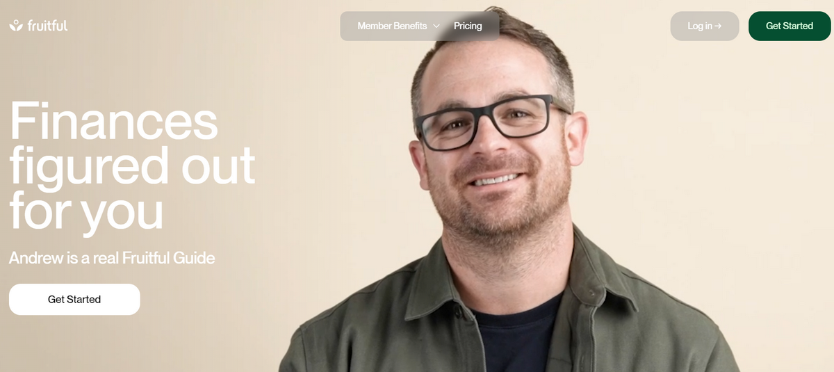
Fruitful – Web design with a video hero area
Functional Elements of Web Design
Web designers are no longer regular artists who create pictures; they are design engineers. They work closely with web developers to create complex and advanced designs that pleasantly bring inner functionality to the surface and assist the back end in all its endeavors. Let's consider four functional elements of modern web design.
UX
UX stands for user experience. It permeates all parts of web design, from the wireframe to slider transition effects. It relies on usability, usefulness, and desirability principles to harmoniously and systematically present all website components and functionalities. It aims to provide meaningful and relevant experiences to users across touchpoints and interactions.
UX is important because it helps to meet the target audience's needs, requirements, and expectations. It adds value to the website that can be used for successful branding, marketing, and advertising.
Speed
While speed may seem like a technical aspect of a website that should not concern an artist, it is directly related to the mastery process. All modern websites should meet speed standards because the faster a web page loads, the better it is for visitor engagement and search engine rankings.
That means web designers should not overload websites with multimedia and decorations. They should prioritize lightweight solutions and avoid content-heavy elements.
SEO
Search engine optimization is the foundation for a site's good ranking on the Web. It generates targeted organic traffic, increases exposure, and improves user experience.
SEO affects differently. For instance, SEO specialists may dictate what content should be prioritized and revealed first, influencing the main structure and hierarchy. They may also ask to limit images, animations, or decorative elements to improve the loading time.
Whatever the case is, web designers should be able to adjust their creations according to these recommendations without ruining everything.
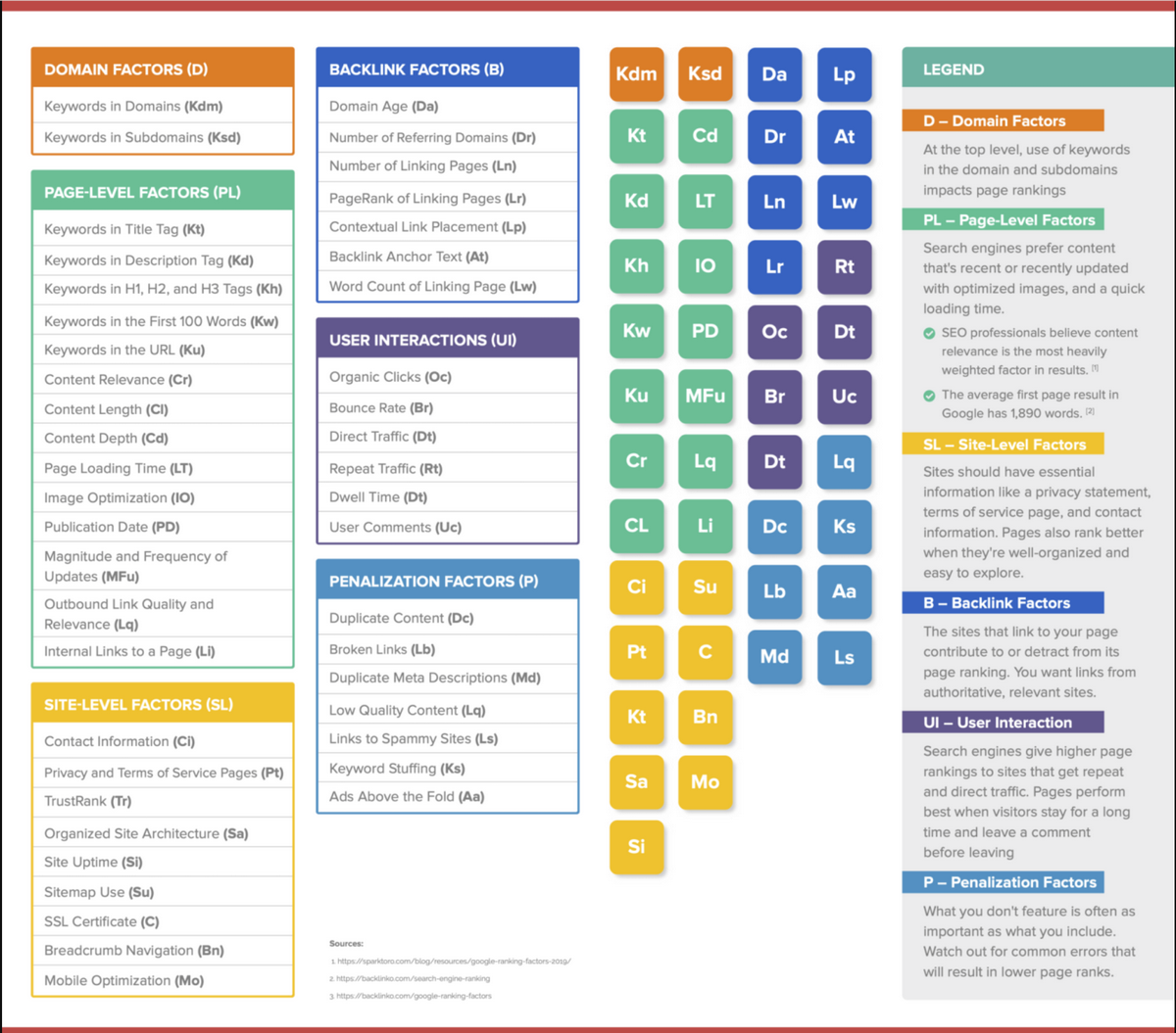
SEO ranking factors (infographic by The Daily MBA)
Navigation
Navigation is an umbrella term that combines different elements of web design created to guide users across web interfaces and help them find what they need quickly and efficiently. These elements include an interactive menu, list, links, buttons, and copies.
Navigation underlies optimal user experience and contributes to critical design aspects like hierarchy, structure, balance, and SEO.
Finding Inspiration for Web Designers
With billions of websites, developing something unique is a true challenge. Web designers need inspiration to generate ideas, take fresh views, and develop new solutions and approaches. Where can you find one? Well, many platforms boost a web designer's creativity.
For instance, any web designer may explore the regularly updated collection of websites in Awwwards or dive headlong into Behance and Dribbble, which teem with user interface concepts. Online graphic and vector marketplaces and social media platforms like Pinterest can also be good places to get ideas.
Different Web Design Tools
Web designers have a lot on their plate, from planning a wireframe to creating information and visual hierarchy to implementing SEO and accessibility principles. It is impossible to do everything manually. Therefore, the web design sphere is regularly replenished with tools that assist digital artists in their tasks. The most essential, popular, and reliable tools and platforms are:
- Adobe Photoshop
- Adobe Illustrator
- Adobe XD
- Affinity Designer
- Sketch
- Figma
- Canva
- Google Web Designer
- Invision, Mockplus
- Vectr
- Wix
Trends and Future of Web Design
The future of web design is pretty exciting. Artificial Intelligence and Machine Learning algorithms are gaining momentum. We have already seen designs generated by DALL·E 3 and Midjourney and content created by ChatGPT.
So, expect web designers to embrace emerging technologies, bring sophisticated visual material to projects, and create customized content and layouts.
In addition, responsive design 2.0, WebAssembly, sustainability, WebGL, and user-centric approaches are here to stay. They open new opportunities for web designers to drive innovation and transformation and create a more interactive, engaging, and accessible web.
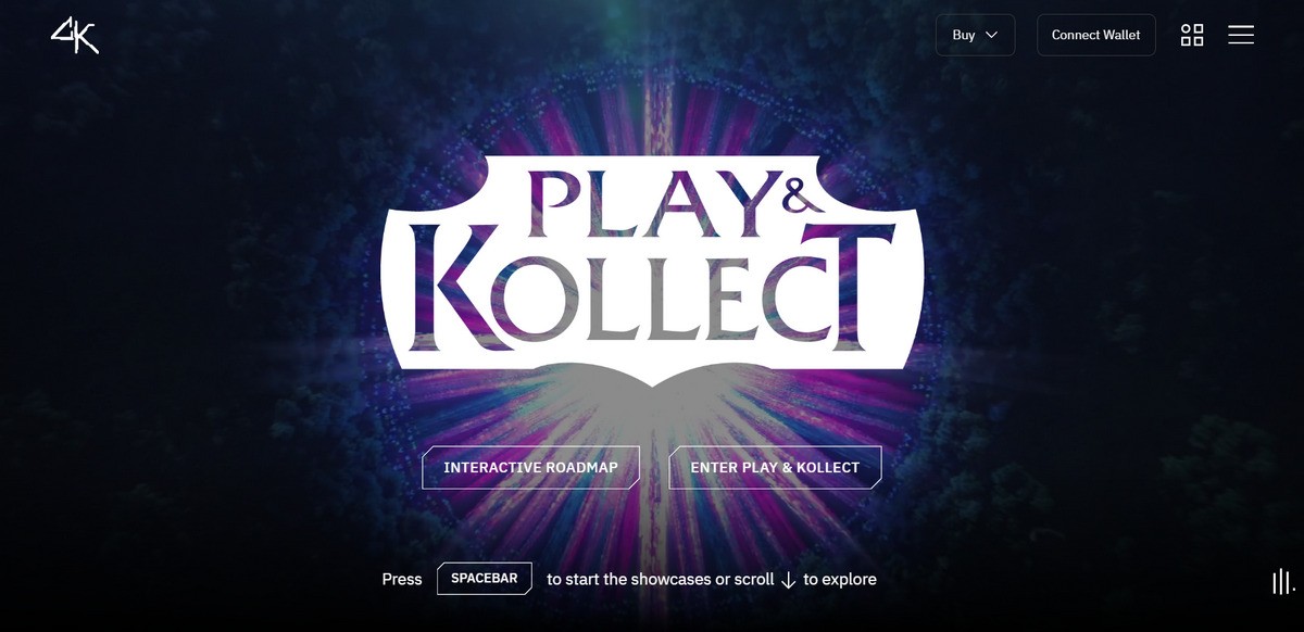
Cyber Kongz - fully interactive gamified web design
Conclusion
Web design shapes the vision of a client's online presence and offers a reliable, branded, and engaging way to speak to the audience through content and visual cues. Its duty is broad.
From tiny icons that assist navigation to huge hero banners that make the first impression to information hierarchy and structure, it covers every detail necessary to pull off a harmonious front end with optimal readability, impressive visibility, and comfortable user experience.
Web designers always stay on top of their niche, trends, and mainstreams. They collaborate tightly with web developers, SEO specialists, UX experts, marketing teams, and branding agencies. They push forward the digital arena and make it a better place by creating modern, standard-compliant web interfaces.
FAQs
Who benefits from hiring web designers?
Anyone who needs a professionally-looking, eye-catching, modern, engaging, responsive, mobile-friendly, accessible, and high-converting website benefits from a web designer.
How does web design impact SEO?
Web design may ruin SEO by making websites too slow and inaccessible; on the contrary, it may improve search engine ranking by introducing SEO recommendations.
How does web design affect mobile user experience?
Web design directly affects mobile user experience by creating a responsive layout that accommodates content to provide optimal readability, visibility, and usability across small devices.
What are common mistakes to avoid in web design?
The common mistakes to avoid are: visual overload, poor information hierarchy, unclear navigation, bad readability, fixed or non-adaptive layout, and lack of accessibility.
May 24, 2024
