Defining Landing Page
A website is a great platform to present your brand offerings. But sometimes, it can be overwhelming that visitors are less likely to move forward in their journey. Creating a landing page is the way to go if you want your customers to take the desired action.
This article will discuss the many benefits of a landing page, its different types, and a complete how-to guide to get started.
Landing pages are highly converting compared to other digital pages because they only have one primary CTA. This makes it easier for users to decide and take the next step. Whether you're aiming for lead generation, web traffic, purchase, etc., you can customize landing pages to fit your goals.
Home Page vs Landing Page: What’s the Difference?
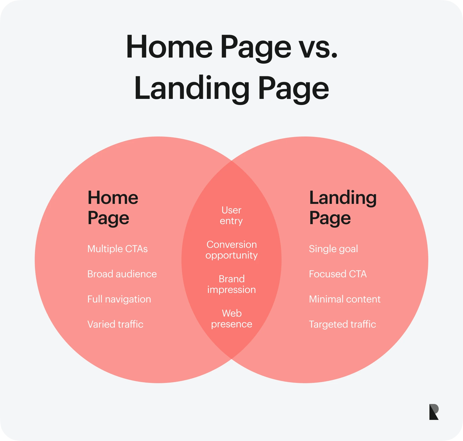
A home page has a broader scope and more web elements, like menus, multiple CTAs, and other content. It serves as an introduction to a website, leading users to other specific pages within the platform. It also entices users to browse further.
On the other hand, many landing pages have a sole purpose, focusing on one CTA. They also have minimal content to avoid swaying customers' attention elsewhere.
Check out the table below for an overview of their differences.
| Landing Pages | Home Pages | |
|---|---|---|
| Goal | One single goal or CTA like conversion optimization | Multiple CTAs |
| Target Audience | One audience segment per landing page | Broad target |
| Navigation | Not applicable as it is a single-page | Necessary |
| Traffic Sources | Paid ads and other marketing campaigns | Varied |
Benefits of a Landing Page
Do landing pages work?
Yes. According to research, businesses with over 10 landing pages increased their conversion rate by 55 percent. That percentage increases as you add more landing pages.
Here are its other benefits.
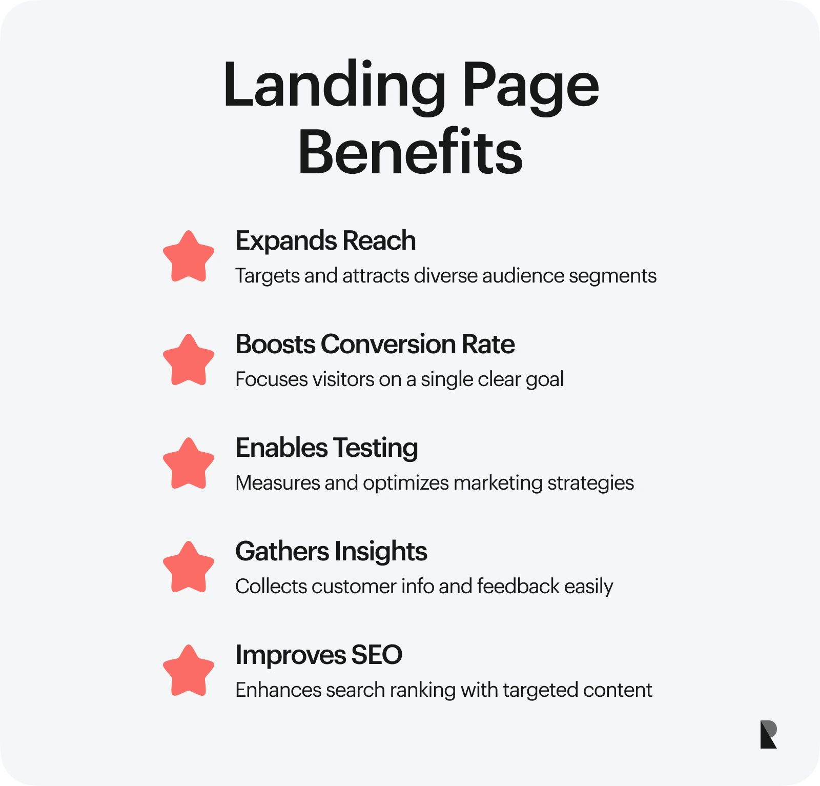
1. Expands Audience Reach
One feature that businesses love about landing pages is their flexibility. You can personalize them to reach various audience segments, allowing you to tap more people. With an engaging headline and compelling content, you can draw the attention of your potential customers to your website.
2. Increases Conversion Rate
A landing page is an effective tool for cutting through the noise. Users are less likely to be distracted because a landing page only focuses on enticing them to complete a single clear goal.
Consequently, landing pages increase conversion rates. Whether email signups, starting a free trial, downloading a free ebook, or ordering products, you can optimize your landing page to convince users to engage.
3. Tests and Measures Effectiveness of Marketing Strategies
A landing page is perfect for testing marketing strategies.
Say you want to conduct an A/B test on which product would be more attractive to customers. You can create multiple landing pages, highlighting different products and their features, and see which ones pique the interest of your potential customers. You can also test different types of content—text only vs text-and-video—to figure out which performs better.
With landing pages, you can be as creative as you want. They are rife with quantitative and qualitative data you can use to analyze and measure strategy effectiveness.
4. Helps in Gathering Customer Information and Insights
Sometimes, instructing customers to visit the website and fill out a form may be ineffective. You can cut to the chase by creating a landing page to collect customer information. All your customers need to do is “land” on your page and provide information.
That said, ensure your information form is as short as possible, gathering only necessary data. You can also leverage landing pages to ask for feedback about their brand experience.
5. Boosts SEO Ranking
Adding strategic and relevant keywords to your landing page content makes your website more visible to search engines. It also helps to build backlinks and weave in high-quality on-brand content. An SEO-friendly landing page increases your ranking on search engines.
12 Main Types of Landing Pages
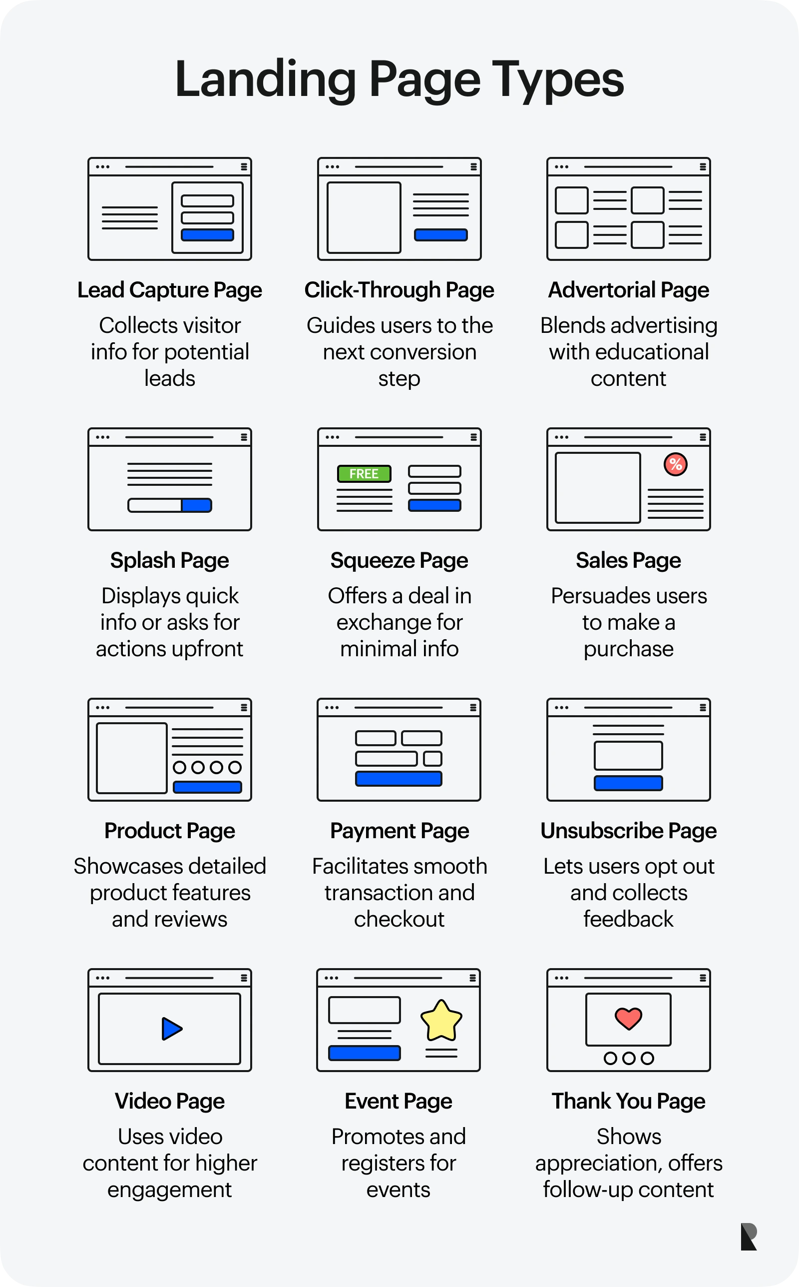
You can make a landing page for just about anything! Browse the following types to learn which landing page to use in your next marketing campaign.
Lead Capture Page
As the name suggests, lead-capture landing pages generate top-of-the-funnel potential customers. They aim to entice customers by highlighting relevant features and gathering information like name, contact information, job title, etc.
A lead capture page is great for increasing your reach and knowing more about your audience.
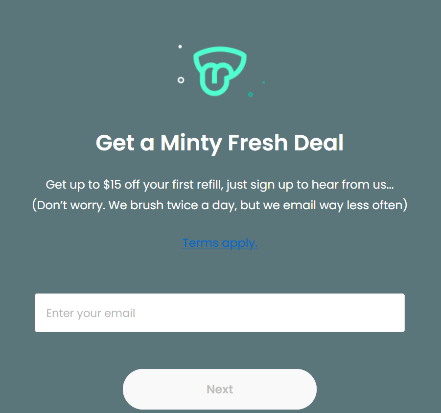
Lead capture page. Image via Quip
Click-Through Page
A click-through landing page serves as a gateway to a conversion event. It encourages users to ‘click’ on a call-to-action button, taking them to another page.
Note that this page needs attention-grabbing with a persuasive copy to convert potential customers. For example, click-through landing pages can convince users to take a look and test your products, like a 30-day free trial!
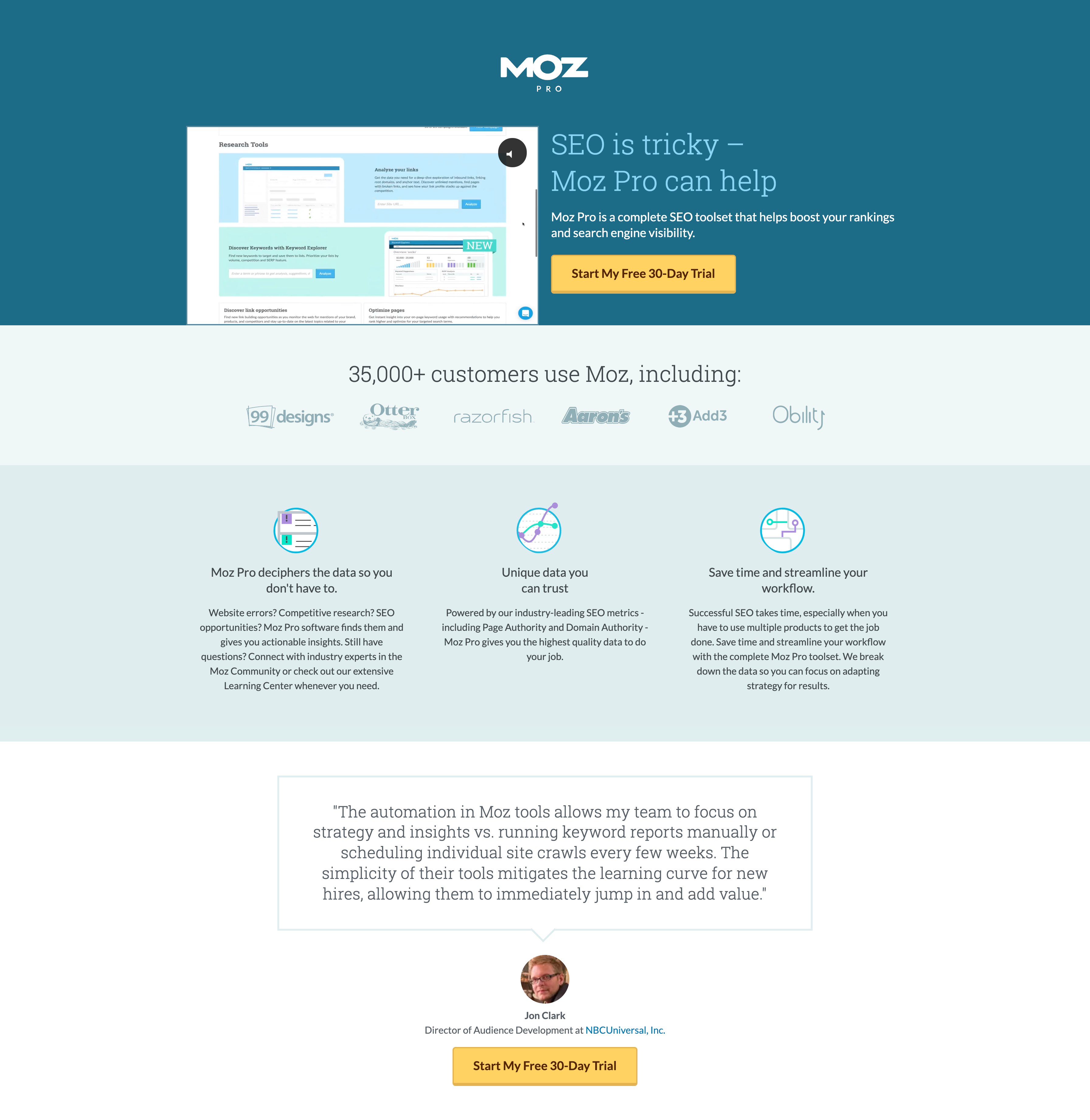
Click-through page. Image via Klientboost
Advertorial Page
An advertorial landing page contains paid content that looks like an organic article or blog about a product or service. It is mostly educational, piquing users' interest but with an irresistible offer.
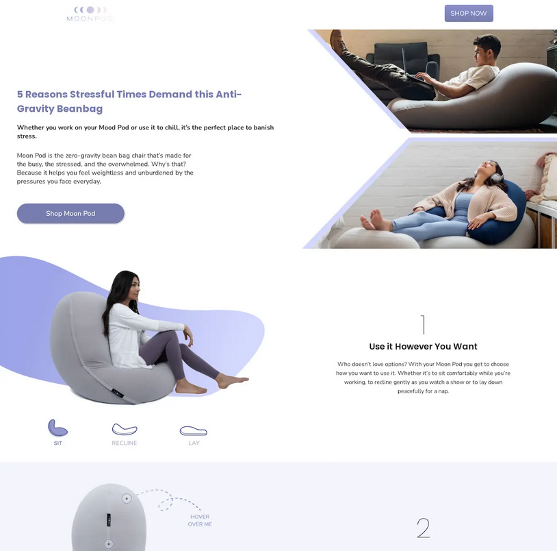
The advertorial landing page. Via Convertflow
Leverage brand stories or customer testimonials—in video or text format—to add an oomph to your advertorial and motivate your customers to take action.
Splash Page
A splash page is a page that appears when you open a website. It is often used to promote upcoming events, verify the age of users, announce new products, and collect user information before you browse through the website.
It only takes a few seconds before they close a splash page, which can be intrusive. That said, splash landing pages are often designed to be short and minimal, allowing customers to process the information at a glance.
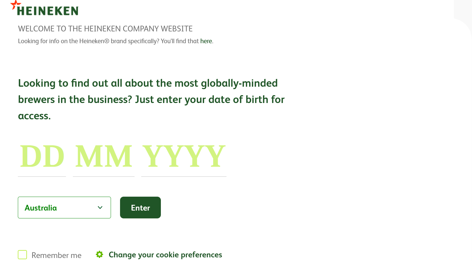
Splash page. Via Heineken
Squeeze Page
A squeeze page contains a special deal in exchange for information. For example, you can offer a 10 percent discount or a free trial if users give their email addresses.
A squeeze page is short and straightforward, with one or two form fields for lead generation. It is also often placed before the user explores a page further.
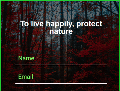
Squeeze page. Image via Dribbble
Sales Page
Do you want to entice customers to try a new product? You may opt for a sales page.
A sales page contains vital information about a product or service you want to promote, convincing them to purchase now. By highlighting key benefits, adding a headline that attracts, and making it an irresistible deal, it can be hard for customers to refuse your offer!
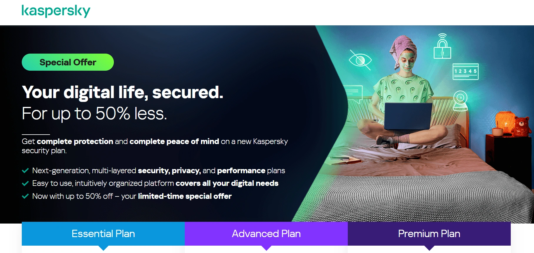
Sales page via Kaspersky
Product Page
A product page is more information-rich than a sales page. It allows you to explain in full detail the uses and benefits of your product that your customers may want to know. A product landing page is also a perfect format for adding customer testimonials and feedback.
While sales landing pages are designed to be robust, they should also be succinct so as not to lose users' attention.
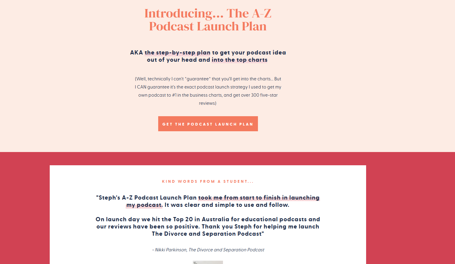
Product page via Steph Taylor
Payment Page
A payment page is for when customers want to complete a purchase.
Instead of redirecting them to a different in-web page, a separate landing page pops up to facilitate the payment. With a smooth transition from placing orders to making payments, customers are more likely to complete transactions.
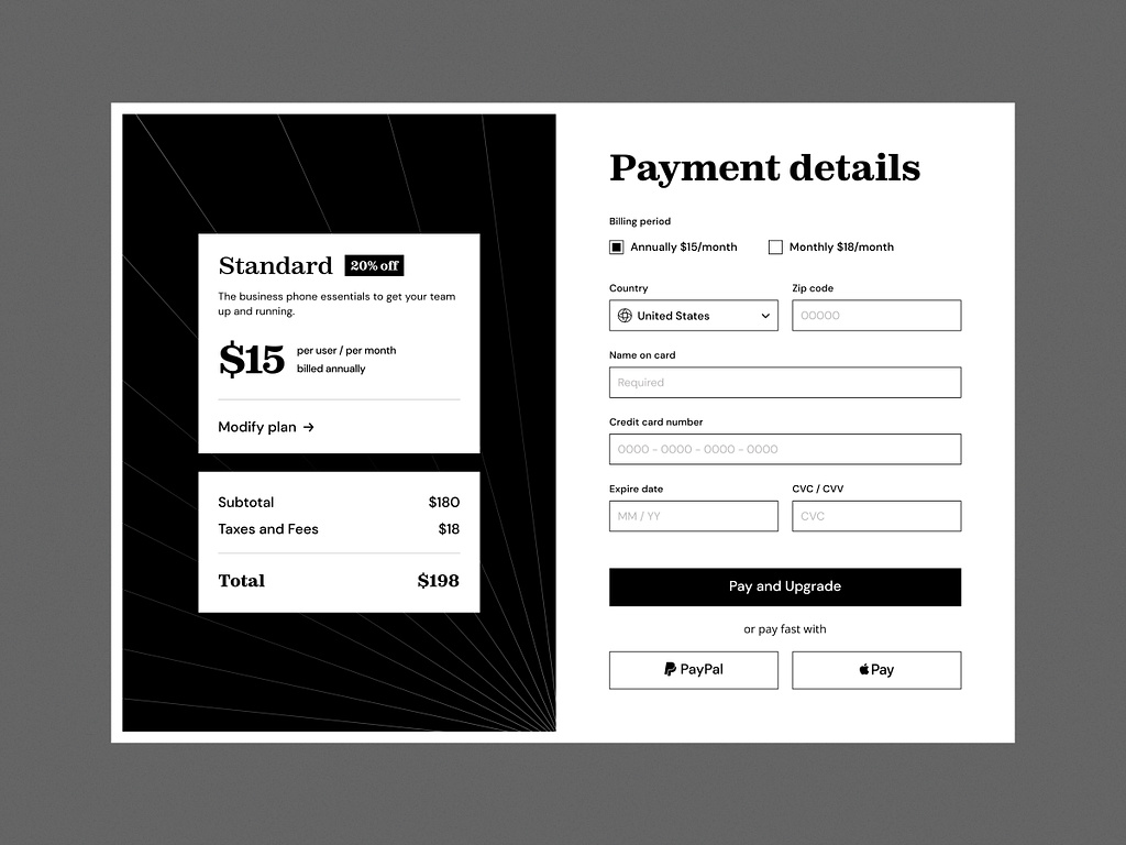
Payment page via Dribbble
Unsubscribe Page
An unsubscribe page is a dedicated landing page where customers can cancel their subscriptions from branded email campaigns, invites, etc. It is often placed at the footer of an email and should be easy to find.
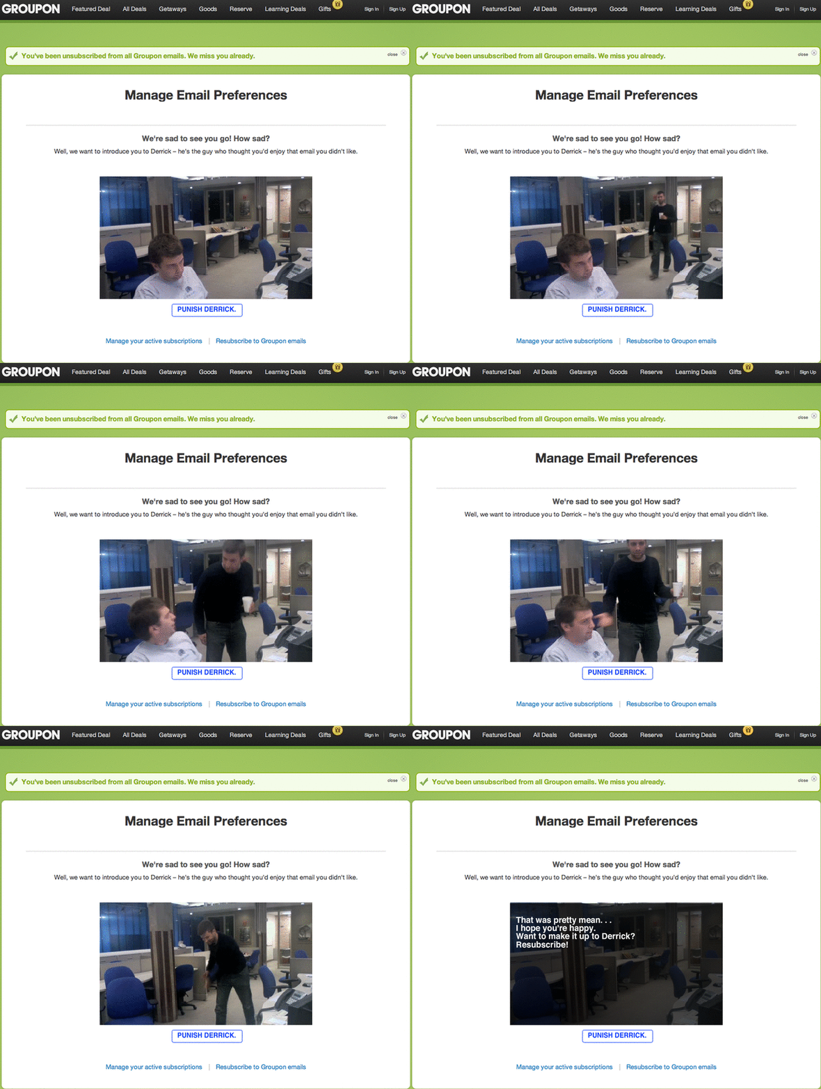
Unsubscribe page via Imgur
Aside from being mandatory in many countries as part of consumer protection legislation, adding this to your digital marketing strategy is a great way to weed out customers with low conversion potential. You can also leverage unsubscribe landing pages to gather feedback about what made customers opt-out, which helps optimize the user experience.
Video Page
Consider a video landing page if you are looking for long-form content that is engaging and effective in converting customers.
With the rise of demand for video content, you can create how-to videos, product reviews, an inspiring brand story, and more. Over 30 percent of the surveyed marketers revealed that integrating video content in their landing pages strongly impacted their conversion rates.
Event Page
Do you have an upcoming event? Use an event landing page to invite site visitors and convert them into attendees.
A successful event landing page should include vital information, like the event type, date, location, details about the host, the event's purpose, and clear instructions on how to participate.
Remember to include one or two CTAs. For instance, add CTAs like “Buy a Ticket Now” or “Reserve a Spot.” You can also add a share button so others can send event details to interested parties.
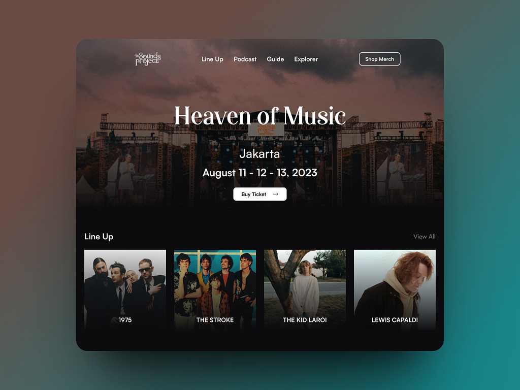
Event page via Dribbble
Thank You Page
Score some brownie points from your customers by showing gratitude through the ‘Thank You’ landing pages.
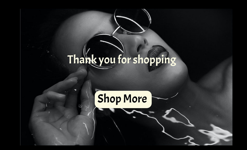
Thank You page via Dribbble
The Thank You page is located at the end of a customer’s journey. In addition to expressing thanks, you can use it to link related information that customers can explore. If you’re collaborating with an external team to build these post-conversion touchpoints, scanning a curated list of best website design companies can help you shortlist partners with a proven track record in conversion-focused UX. You can also ask them to check out and connect to your social media pages for the latest updates.
Say a customer bought a new camera. You can use the Thank You page to link them to blogs and tutorials about the product. This can keep your customers engaged and encourage repeat visits to your website.
Six Steps to Creating the Perfect Landing Page
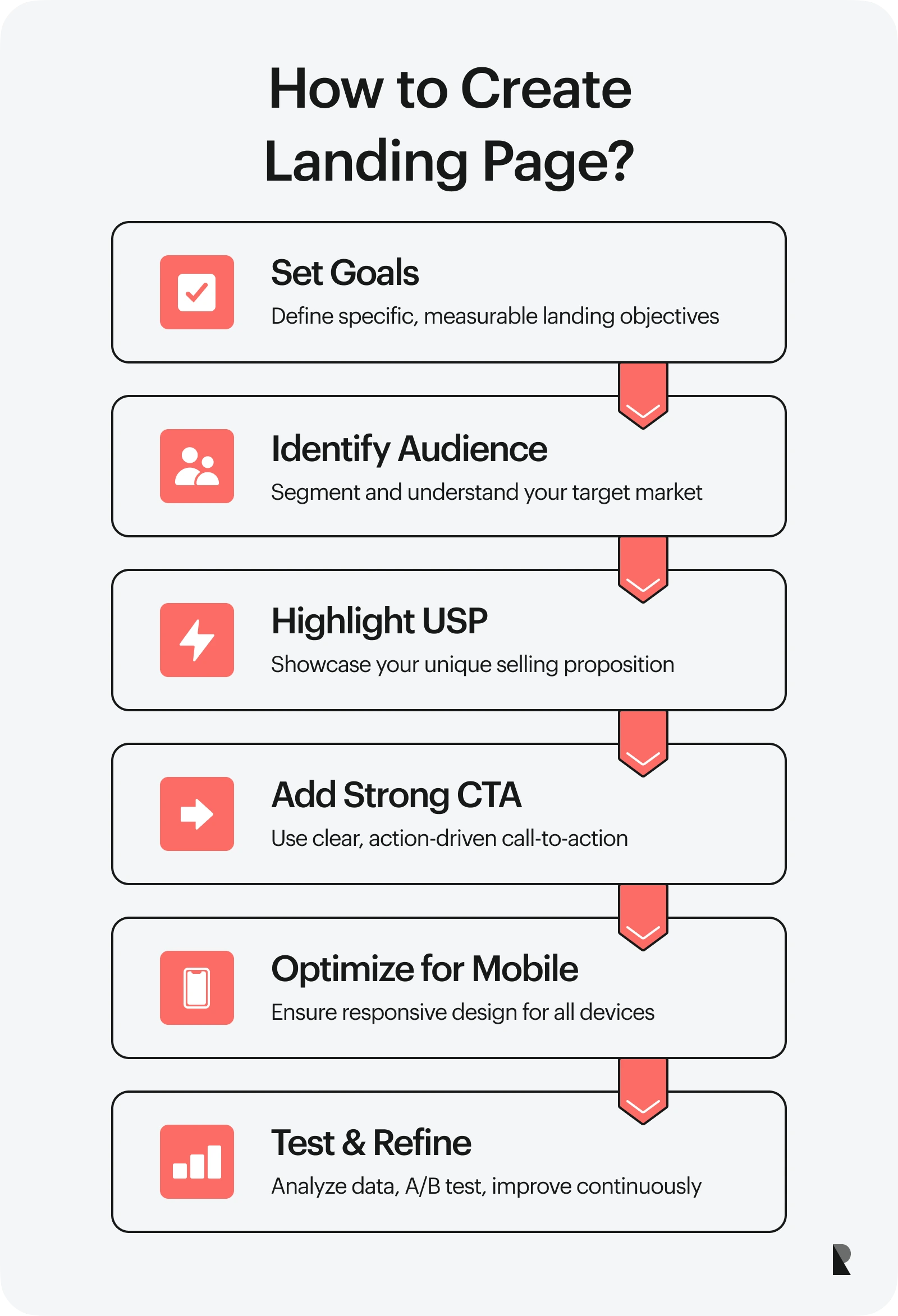
There are many ways to build a landing page. You can work with a professional website design company or an online website builder. Here are six easy steps to launch the perfect landing page for your next marketing strategy.
Step 1: Set Your Goals
The first step to creating a landing page is to set your goals by determining your priorities.
Start by listing your brand's goals and categorize them into short-term and long-term goals. Next, narrow down what needs to be accomplished soon. Refine your goals and make sure they are specific, measurable, attainable, relevant, and time-bound.
For example, instead of stating you want to increase sales, you can rewrite it as “increase signups for product X in Q1 by 10 percent with free trials.” This gives you a solid framework for crafting your landing page, from the headline and offers to the CTA button.
Step 2: Identify Your Target Market
A landing page must have a specific target market to be effective. That said, identify your demographic and psychographic reach and split it into multiple categories.
You can then create different audience segments based on this information. Include their preferences, pain points, online behavior, personality traits, etc.
For instance, you can personalize a landing page separate from the older ones for a younger audience. How about a landing page directed toward existing customers and another for potential customers?
It is knowing who to talk to results in a landing page that works.
Step 3: Include Unique Selling Proposition
A unique selling proposition (USP) is your single competitive edge. Think of it as a culmination of what the customer wants and what your brand excels at. It spotlights your brand's unique strengths.
Your value proposition could be product-based, focusing on features; service-based, highlighting excellent customer care; and price-based, boasting competitive pricing.
For example, Saddleback Leather’s USP is, “They’ll fight over it when you’re dead.” It encapsulates the high-quality craftsmanship that the brand embodies when creating its products.
Step 4: Add a Strong Call to Action
Your call to action should match the intent of your landing page. If you wish customers to reach out for more information, add a “Learn more” or “Contact us.” If you want to entice loyal customers to promote your brand, end your landing page with a “Become a brand ambassador” button. You get the gist.
Finding the right CTA takes multiple trial and error. So, implement A/B testing and see which works best!
Step 5: Optimize for Mobile Devices
Many of us reach for our phones whenever we want to search online or check our socials. Designing a mobile-responsive landing page that adapts to multiple device screens is a good idea.
With a mobile-friendly landing page, you increase accessibility to your brand offers, boost web traffic, and improve the overall user experience. It can also optimize your search visibility to stay on the search list!
Step 6: Test, Analyze, and Refine
A landing page is a work in progress. You may get some things right the first time. But it’s part of the process.
That said, implement tests like A/B testing. Monitor and analyze data like reach, opens, bounce rates, etc. Don’t be afraid to make changes as needed.
The Different Elements of a Landing Page
What makes a landing page successful? It all boils down to balancing the following elements: headline, body copy, visuals, social proof, and the CTA button.
Refer to the table below, which enumerates some best practices you can implement in bullet points.
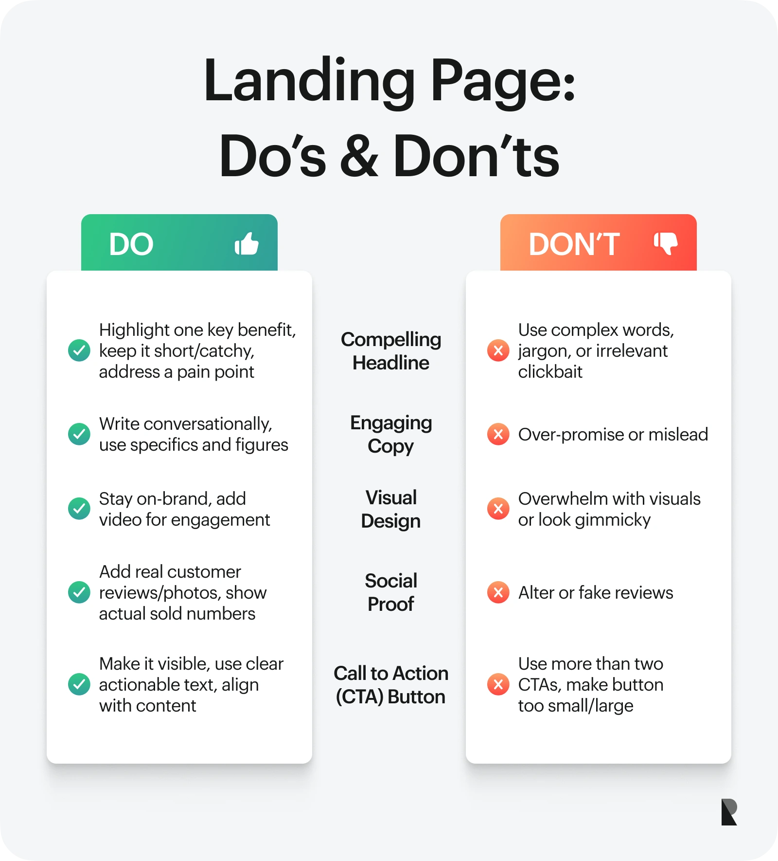
Remember that how you utilize landing page elements differs depending on the type of landing page you choose and the goals you want to achieve.
More High-Converting Landing Page Examples
Let’s explore more examples of landing pages and why we love them!
Muzzle: Create a Landing Page that is Funny and Memorable
App company Muzzle took a hilarious approach to demonstrating how its silencing notification works! As you get to the landing page, embarrassing notifications start popping up on the side of your screen. On the other side is a huge ‘Download’ button with a witty and straightforward copy above explaining the purpose of the app.
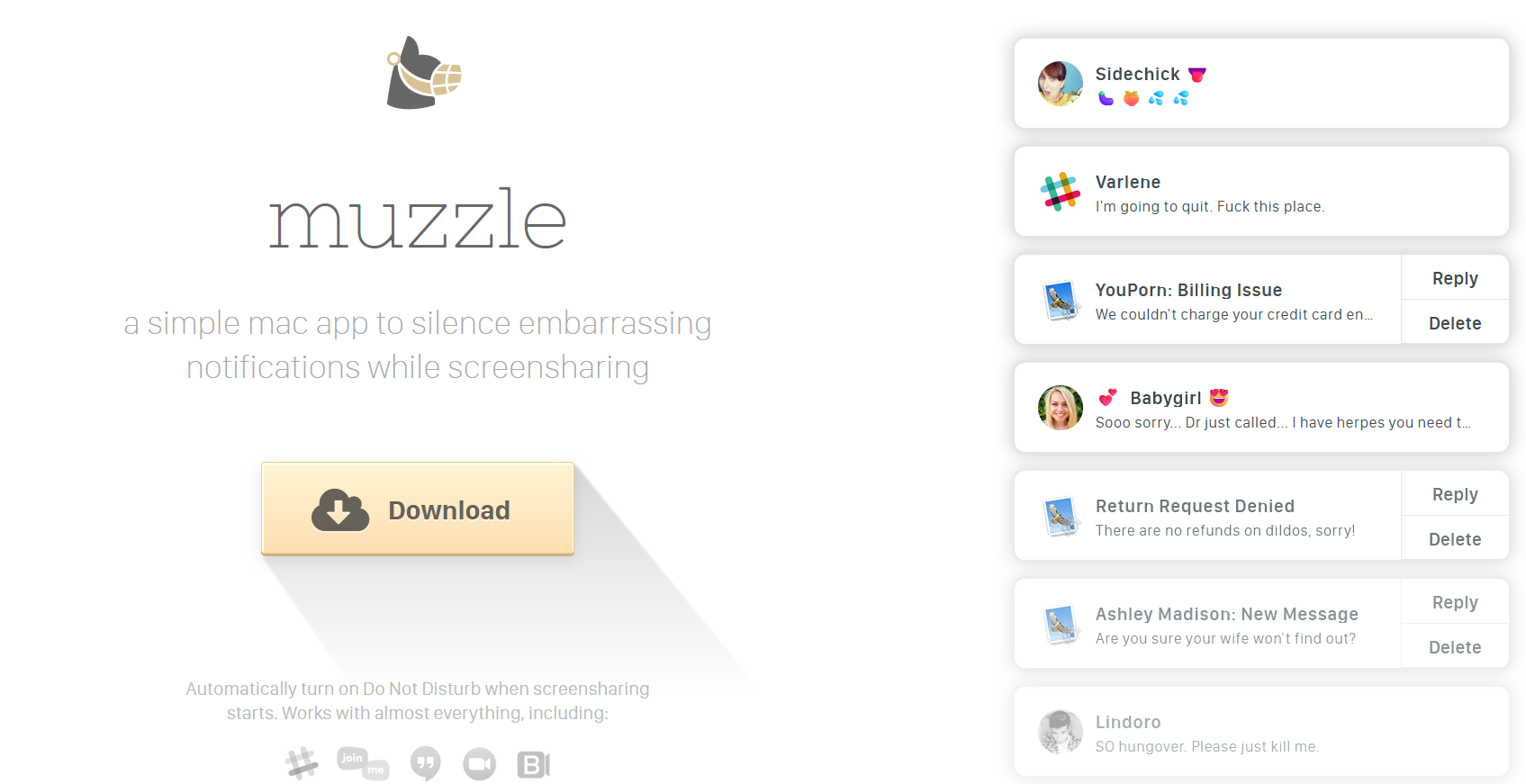
Muzzle shows what it can do through its landing page. Image via Muzzle
The landing page successfully communicated the problem it aims to solve with just a few words. Plus, it made potential customers laugh, which makes them more likely to remember Muzzle.
Squarespace: Make an Offer They Can’t Resist
Webpage builder and hosting company Squarespace partners with Colorlib for a landing page campaign.
The page effectively demonstrates what customers are getting with the help of Squarespace. Adding a minimalist website preview matched with a compelling copy, “Designed to Sell,” makes it easy for potential customers to visualize.
Squarespace also made an offer customers cannot resist, with an additional discount if they use a promo code upon purchase and an additional 14-day free trial.
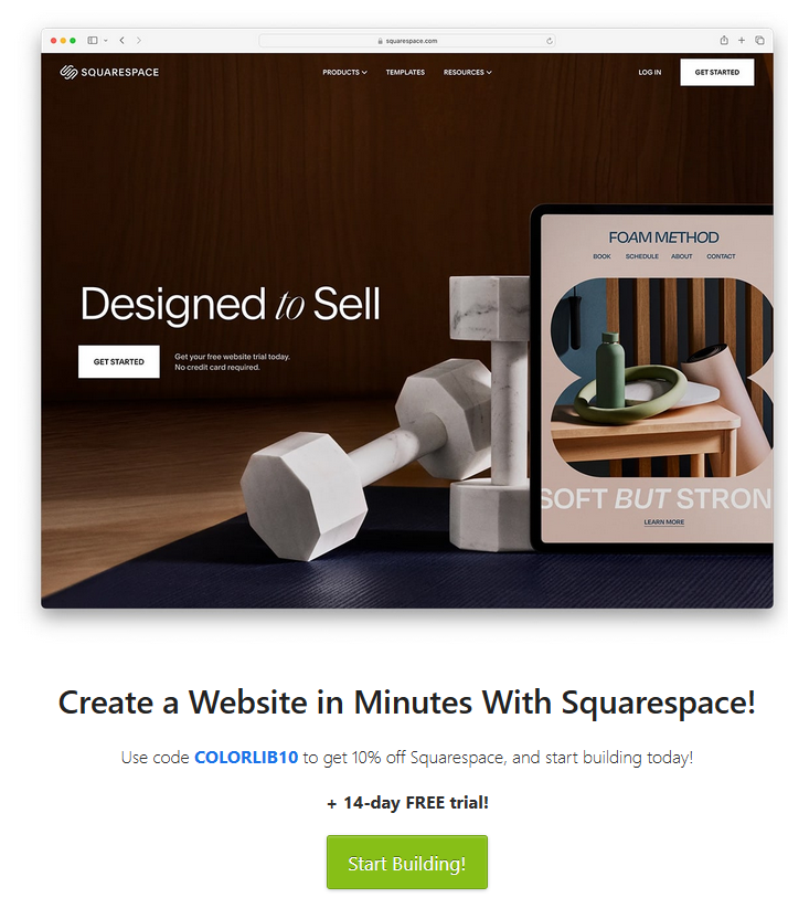
Squarespace offers discount and a product trial via Colorlib
Isabelle Grace: Add a Game!
Jewelry brand Isabelle Grace sure knows the way to the hearts of its shoppers: discounts and freebies!
The brand created a spin-the-wheel game in which site visitors can enter their email and contact info for exciting prizes. This is a clever and engaging way to generate leads, and it’s also an enticing offer for first-time visitors who love a good deal.
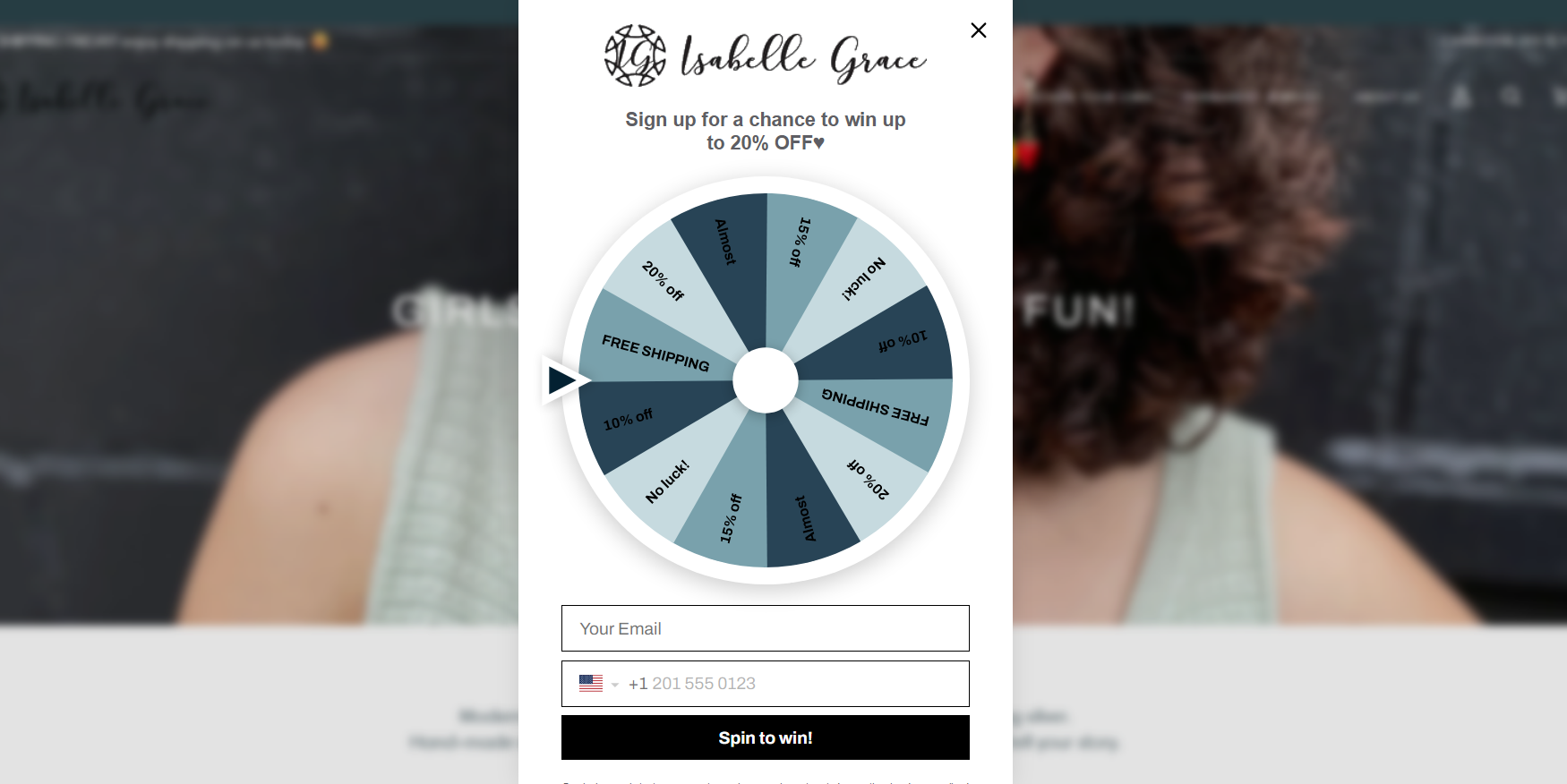
Isabelle Grace rewards visitors with prizes if they provide their email and contact number. Via Isabelle Grace
Check out our free resources to learn more about creating professional website pages that convert.
Jun 27, 2024
