Shaping your brand identity takes more than an eye-catching visual design. It requires consistency, which can ultimately help establish brand recognition and trust.
For instance, a quick search online provides options for customers, yet they gravitate towards popular brands rather than trying new ones. It’s because they trust brands with a strong identity. Over time, brand equity increases. For brands aiming to create the same level of consistency and recognition, working with a brand identity design firm can be the first step toward building a stronger identity.
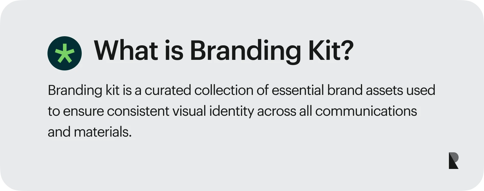
So, how can you ensure your brand identity is cohesive with your brand values, commitment, and message? Enhance your brand management efforts through a nifty tool called a branding kit.
In this article, we break the process into easy-to-follow steps so you can kickstart your branding kit and optimize your brand identity.
Branding Kit vs Brand Style Guide
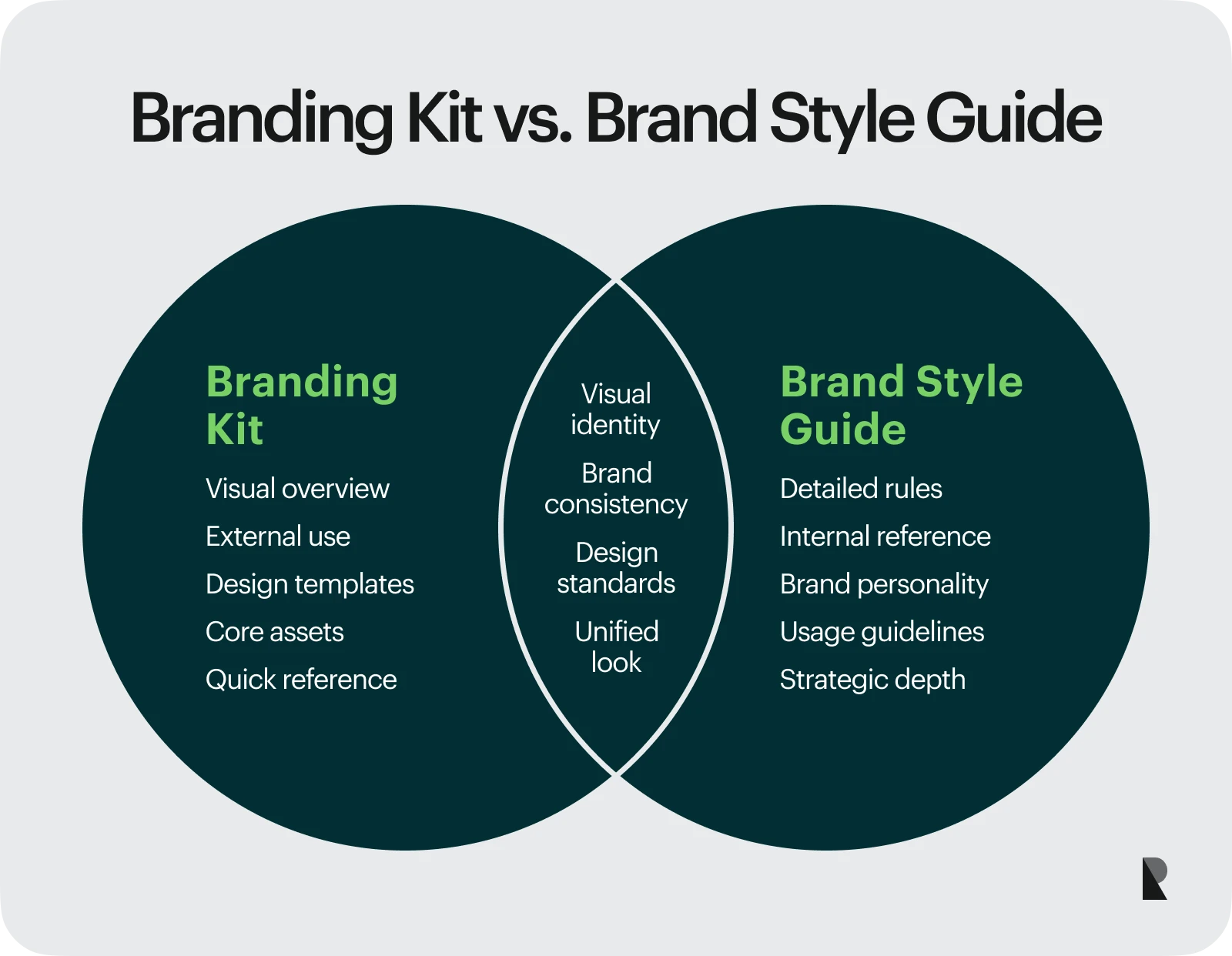
While branding kits and brand style guides help users remain consistent when using visual elements, they have slightly distinct scopes.
A branding kit is for users who need to implement brand identity. They could be your partners or vendors. If you’re hiring or partnering with an external studio to shape those assets, this overview of top companies for brand identity design can help you benchmark capabilities and collaboration models before you hand off execution. The brand style guide is for your internal team—design team and marketers— and clients.
That said, the branding kit is more of an overview of your brand elements, including your logo, color palette, and other design templates. On the flip side, the brand style guide has more robust information, encompassing rules and details that deep dive into your brand story, values, and personality.
Finally, the branding kit is a supporting component of the brand style guide integral to the brand identity system.
| FACTORS | BRANDING KIT | BRAND STYLE GUIDE |
|---|---|---|
| Users/audience | Partners and vendors | Internal team—designers and marketing team |
| Content | Logo variations, color palette, typography | Rules, charts, and settings when using visual elements |
| Scope | Overview of tangible visual elements | Detailed guidelines for using visual elements and implementing brand voice and personality |
Why is a Branding Kit Important?
A branding kit brings many advantages to startups and small businesses alike. It can enhance brand awareness, build customer trust, save time, and optimize marketing efforts. Here’s how.
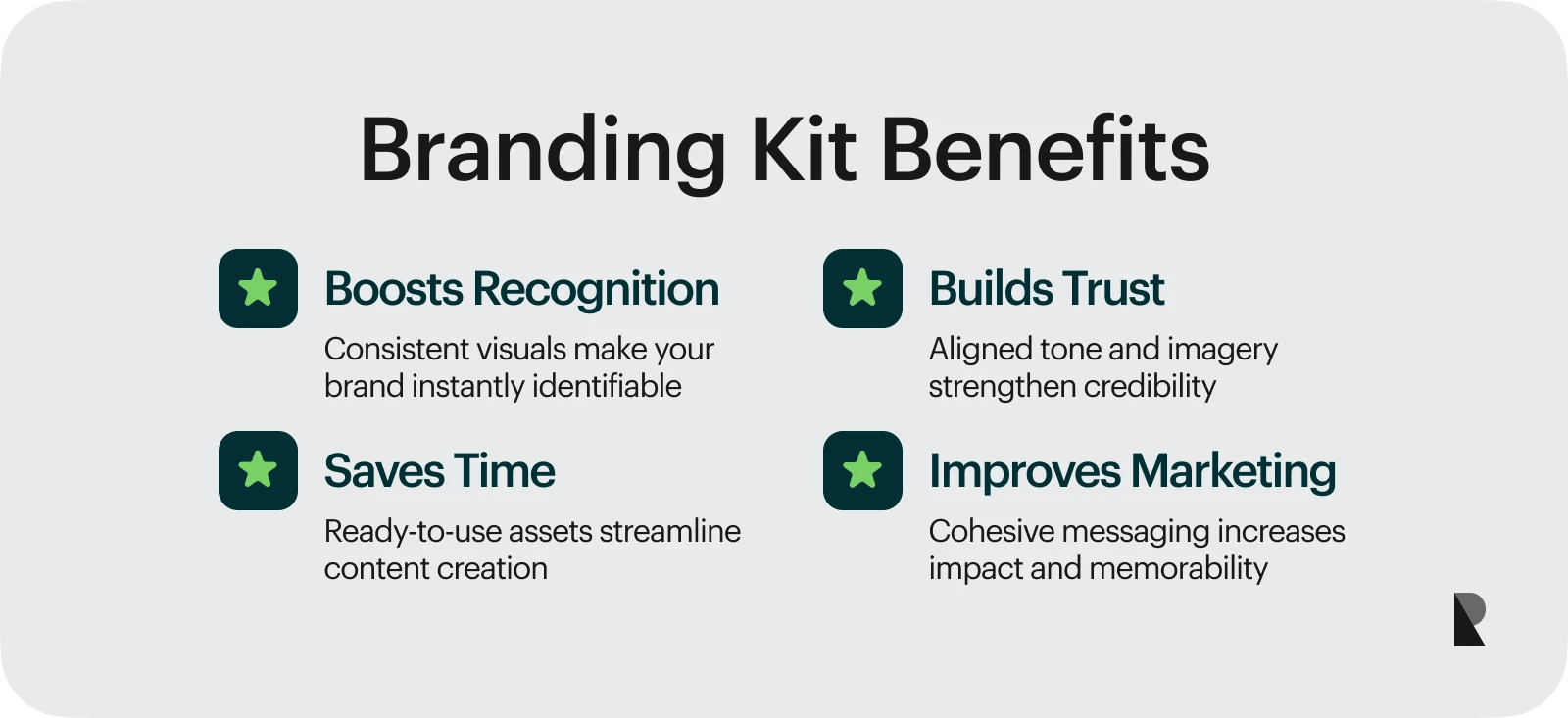
A Branding Kit Enhances Brand Awareness
The brand kit is crucial in assuring your visual elements are consistent. With cohesive representation, it is easier for customers to associate elements with your brand. For instance, the robin egg blue jewelry box makes people think of jewelry company Tiffany & Co. The color is enough to trigger recognition from people.
Branding Kit Builds Customer Trust
An effective brand kit can help communicate your company values and personality.
It enables you to observe brand guidelines to ensure each component—like your brand imagery and tone of voice—is well-aligned. These result in a stronger brand identity, forming the foundation of customer trust.
Branding Kit Saves Time
You don’t have to design your brand assets from scratch to fit your marketing materials. With a branding kit, you can leverage ready-to-use brand assets and templates to save time and effort! That said, organize your branding kit for maximum efficiency.
Branding Kit Optimizes Your Marketing Efforts
Your marketing efforts can be more effective if customer trust and brand awareness are established. And with brand assets working together, the brand kit allows you to do that and more. You can leverage it in communicating consistent messaging to achieve memorable branding that resonates with your target audience.
How to Create a Branding Kit in Four Steps
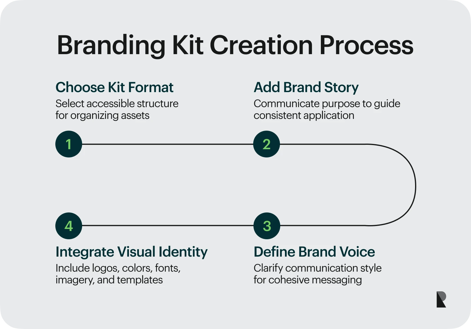
Creating a branding kit is not as simple as drag-and-drop. Read on as we explore the four essential steps to building a branding kit that optimizes your brand identity and brand consistency.
1. Choose a Format
Before you build a branding kit, decide on your format first which will serve as your canvas. For example, you can put your brand kit as a sub-category of your brand guideline online. Doing so centralizes information in one hub. You can also have a separate downloadable digital file containing only your brand kit.
Whatever you choose, make sure they are accessible to your intended audience and fit your brand needs. You can create your branding kit using online design platforms like Canva, Visme, and Adobe. They have built-in brand kit tools to organize and set up your brand assets accordingly.
2. Add Your Brand Story
By weaving your brand story in your branding kit, you can effectively communicate the importance of brand elements and usage rules to your audience. It also ensures conscious alignment with your brand values, mission, and goals as they implement your brand identity.
3. Identify and Integrate Your Brand Voice
Let your brand voice shine through your brand kit!
Your brand voice is the personality and style your communications embody, from tag lines and brochures to web content and social media posts. It’s one of the vital ingredients in creating a memorable brand.
An aesthetic presentation of your visual assets is not enough. With your brand voice in your brand kit, you create a more engaging and interactive experience for your audience. You can also drive intangible key points effectively, resulting in longer information retention.
4. Add Your Visual Identity Elements
Brand kits may differ from one company to another. But here are some key visual elements to have.
a. Logo Variations
Your logo will be present on several platforms and formats, online and offline. They can be on your branding site, mobile apps, documents, business cards, video ads, etc. That said, create variations that can adapt to your branding needs.
Brands often have primary and secondary logos. The primary logo contains the wordmark plus the brand symbol. The secondary logos can be your wordmark or brand symbol alone. Add a logo architecture with the logo size and clear spacing.
b. Color Palette
Aside from having psychological influence, your color palette can organize or highlight information and make elements stand out. In your brand kit, show how you can leverage primary and secondary colors to reflect your brand identity. When creating different swatches, use hex codes—a color code format— to make sure your audience uses the right brand color.
c. Typography
Like your brand voice, your choice of font accentuates the personality you want to project. And getting your typography right can be key to effectively conveying your brand to your audience.
Include your brand fonts with a short description of how they impact your brand identity. For example, explain how opting for a rounded sans-serif font evokes a friendly and modern vibe.
Get technical and include spacing, font size, and font weight. You can also detail which fonts to use on templates, like decks, social media posts, articles, ads, etc.
d. Photography and Graphic Design
Your photography or graphic design should align with your overall visual aesthetics. Consider the mood and tone representative of the brand image you want to establish.
Say you’re running a bridal fashion brand. You may prefer to work with models that your customers can resonate with with your brand photography. Take the lighting, symmetry, use of negative space, etc. into account as well. And when it comes to graphic illustrations, you may lean towards something minimalist with a touch of art deco.
e. Corporate Identity Templates
Customize corporate identity templates that your team can use in a jiff! Curate visual assets that you often use, like email templates, business cards, stationery, standard ad designs, and product packaging in your branding kit. This is great for maintaining consistency across your visual assets and making your brand look professional.
Brand Kit Examples to Inspire You Plus Tips
Let’s explore how branding kits showcase effective branding strategies in action. Learn how brands used iconic logos, versatile color palettes, and other visual assets to create a unique and memorable brand.
Hulu
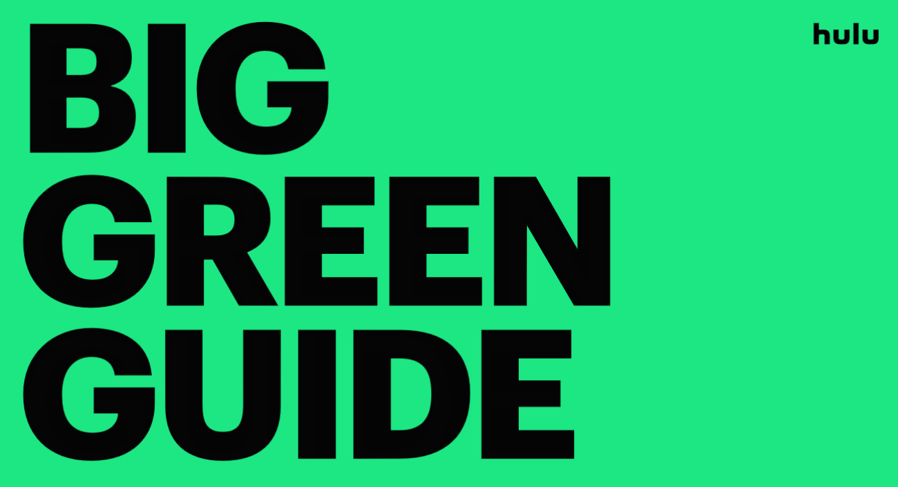
Bold text in black against a green background. Via Hulu
Hulu’s brand kit is striking, to say the least.
We are introduced to the brand kit’s name, “Big Green Guide,” in bold letters. There is a great emphasis on the roles of each branding element, like the colors and the logo, in communicating the brand's personality. The brand also added examples and use cases of playful illustrations and an excerpt of a witty copy that follows its writing style.
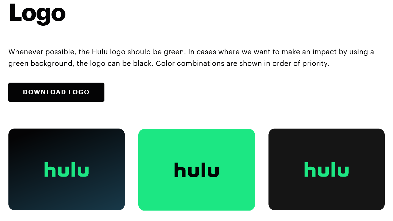
Logo variations via Hulu
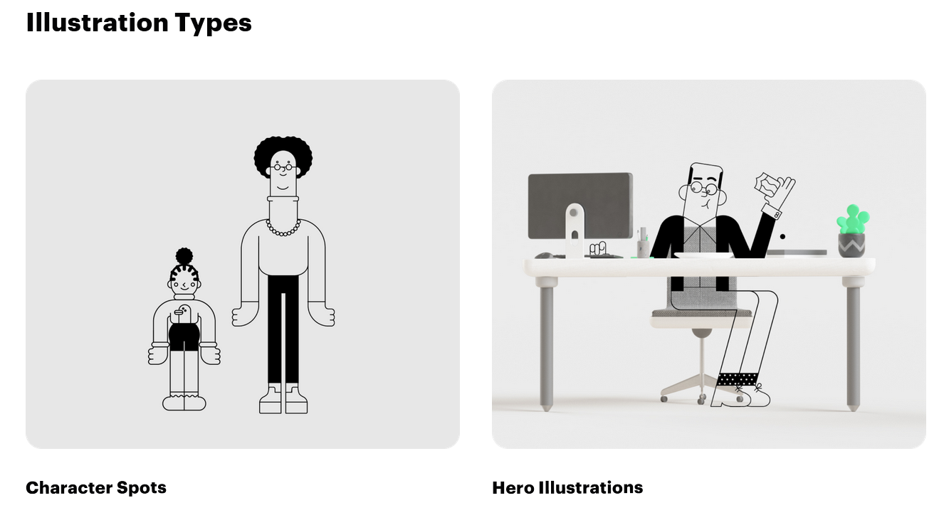
Playful illustration types via Hulu
Its creative approach is consistent with its need to be different, fun, innovative, and “delightfully human.” With a clear, flexible, and cohesive branding kit, designers and the branding team can easily find the resources they need to produce campaigns and other collaterals that reflect Hulu.
TIP: Recreate the branding experience you want to bring within your brand kit. Doing so helps designers get a feel of your brand's essence.
NASA
One glance at NASA’s brand kit, and you can get a serious and professional vibe. Being a government agency, NASA requires strict adherence when it comes to the use of its brand assets, especially its logo.
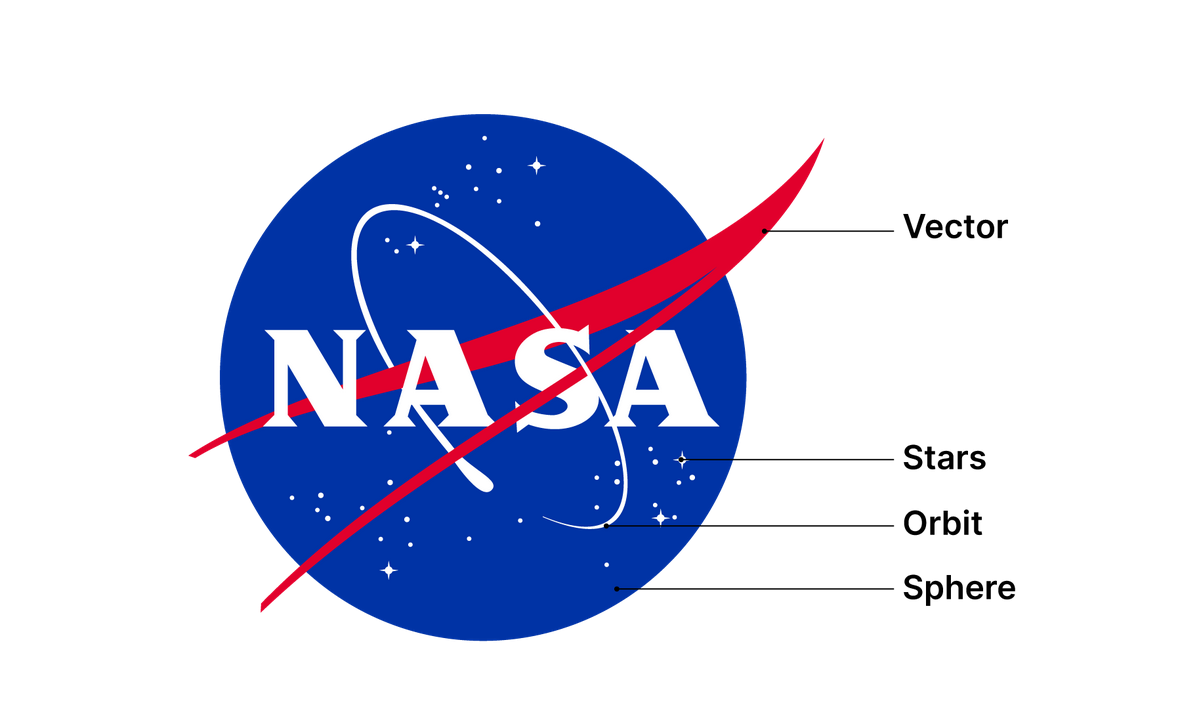
The ‘Meatball’ logo via NASA
To ensure cohesiveness, NASA has a dedicated brand kit page that outlines everything you need to know in great detail. Just take a look at its logo. NASA’s identity hinges on its iconic insignia or logo called the blue meatball. With more than 50 years of history, the logo encapsulates the soul of NASA.
The brand kit states, “The standards for the use of the NASA Insignia, the NASA Seal, and the NASA Logotype (Worm) are in accordance with the Code of Federal Regulations 14 CFR 1221 and the NASA Space Act of 1958 as amended.”
The high visibility of the logo takes priority when used. It cannot clash with other brand colors and a high contrast against various backgrounds must be maintained. The brand kit also details the ‘protected space’ of the insignia to avoid obstructions.
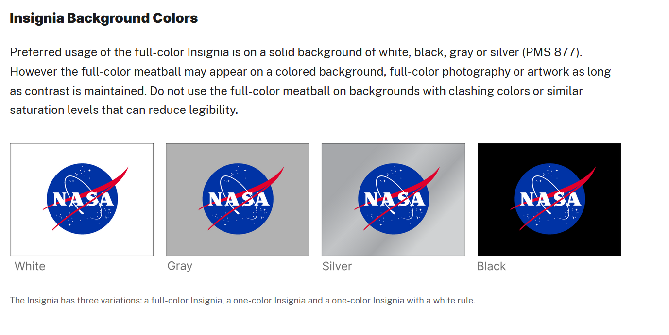
Demonstrate the flexibility of your logo. Via NASA
Additionally, you can find best practices and rules when configuring the logo. The kit has a full explanation of NASA’s typography and the role each font type plays in its overall visual identity.
TIP: Be detailed yet concise to avoid mistakes.
Shopify
Sometimes, less is more. And that’s exactly what Shopify shows in its brand kit. In just a few slides, the brand kit encompasses the correct usage of its primary and monotone logos.
It contains rules and guidelines about the Shopping Bag icon, especially in specific circumstances. For instance, it stresses how the S in the shopping bag icon must be in white font regardless of the background color.
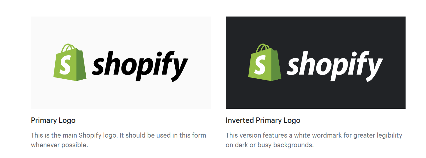
Create two versions of your logo for various purposes. Via Shopify
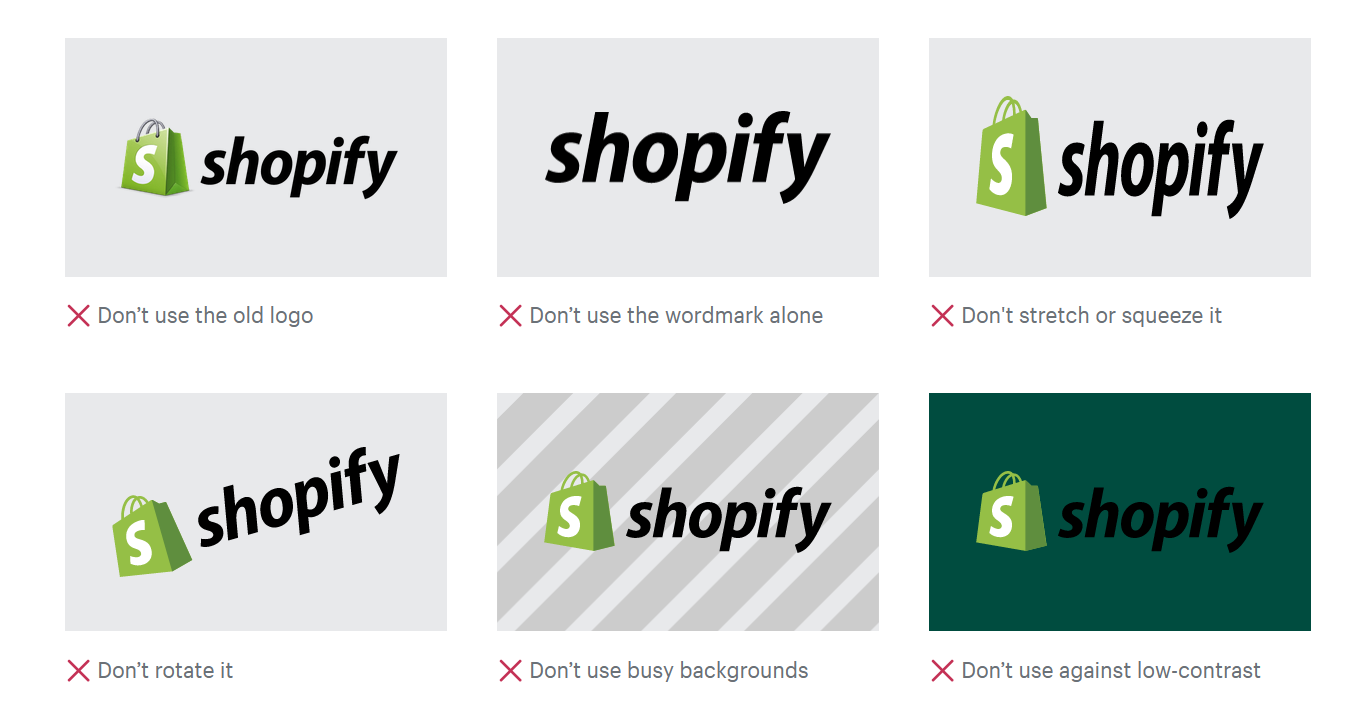
Add illustrations of brand asset do’s and don’ts to your brand kit. Via Shopify
What’s notable is how the brand kit served not only its purpose of guiding designers but also gaining leads with a nifty CTA at the bottom of the page. Shopify took the opportunity to offer a free trial for external users who might be browsing their brand kit.
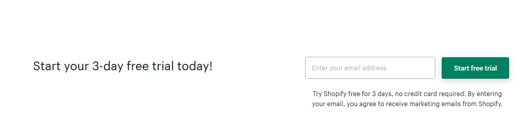
Maximize your brand kit by adding CTA links. Via Shopify
TIP: Maximize your brand kit! Aside from being a trusty handbook, it can also be great for lead generation. You can even link your social media to be in the loop for product updates.
Yelp
Yelp first rose to fame because of its restaurant review app. Staying true to its brand, it named its design system the ‘Cookbook’. Yelp named sections of its branding kit with terms you find in cookbooks.
For instance, the color palette and typography fall under the ingredients section. While the Recipes and Entrees section includes badges, buttons, and review ribbons.
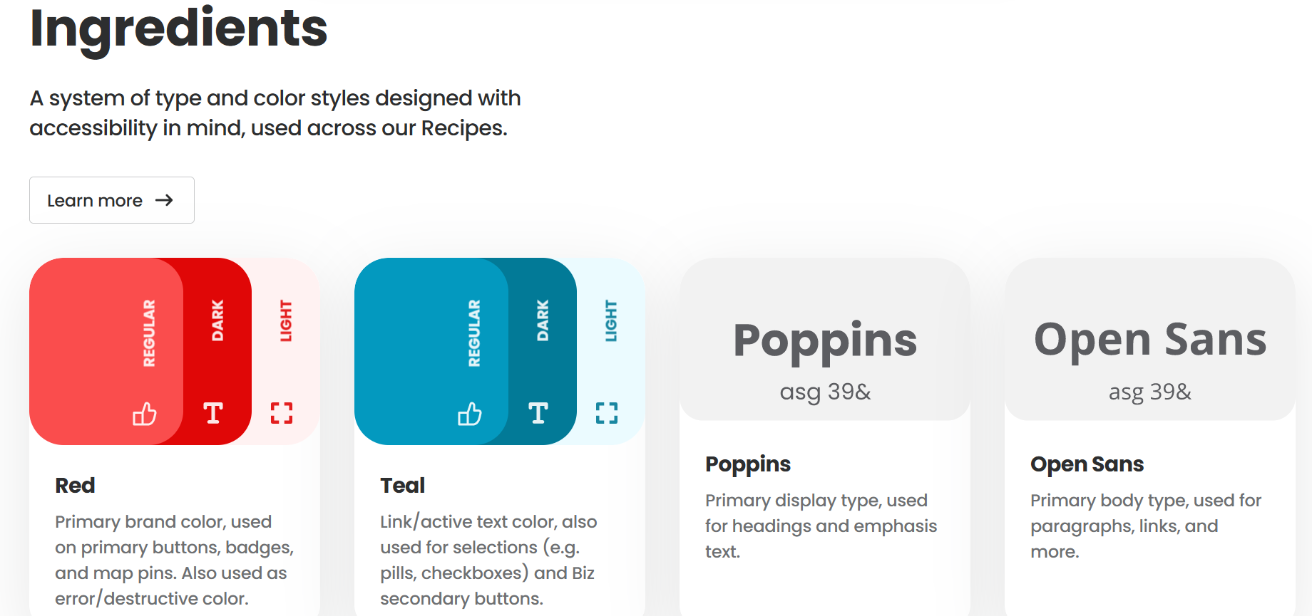
Be playful and add personality to your brand kit. Via Yelp
The copy is in the first person, showcasing the brand’s fun, energetic, and approachable personality. Just read the brand's design principles that say, “Don’t make me think”, “Make me feel understood,” and “Treat me like a person.”
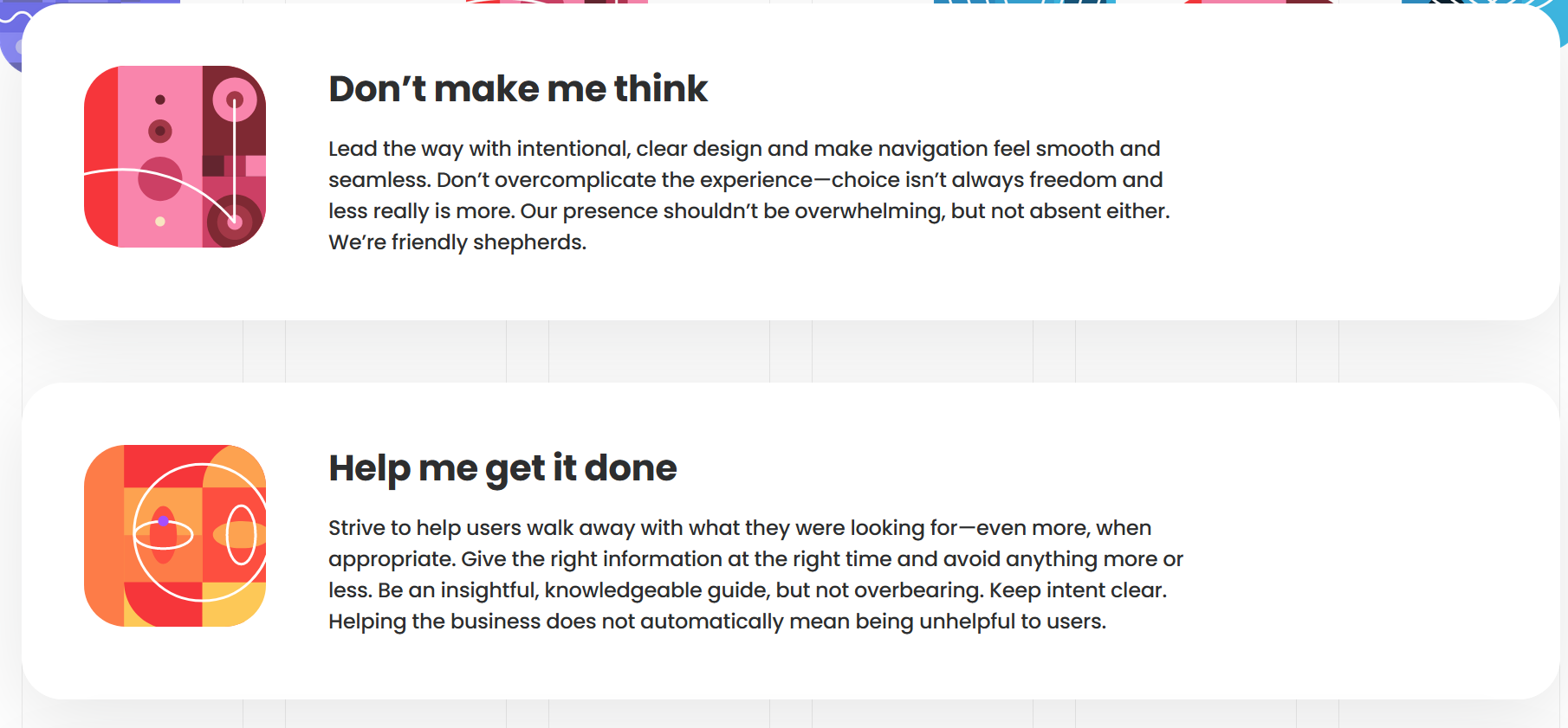
Showcase your brand voice in your copy. Via Yelp
The brand successfully communicated how its elements are versatile for branding and marketing purposes. It also highlights the importance of brand consistency across Yelp products.
TIP: Inject your brand personality and have fun to create an engaging brand kit!
Netflix
Iconic N logo via Netflix
Like McDonald’s big yellow M, Netflix has successfully taken ownership of the letter N in bold and red font. In its brand kit, Netflix shares, “There is power in owning a letter of the alphabet: it’s universal and instantly identifiable as shorthand for our brand.” Truly, the single-letter logo has been etched in the memories of millions of streamers worldwide.
In Netflix’s brand kit, designers can find clear illustrations and explanations of how to consistently and correctly use the correct red gradient and the logo. Doing so maintains the brand’s credibility and strengthens recognition. The brand also presented real-life examples of actual applications of the logo. This prevents misunderstanding and can even inspire your creative team.
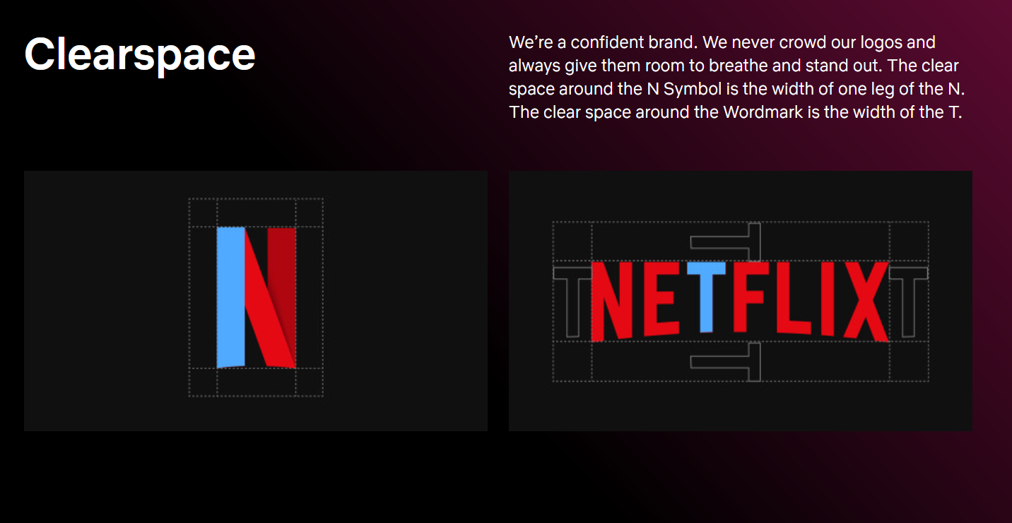
Indicate the clear space around the watermark. Via Netflix
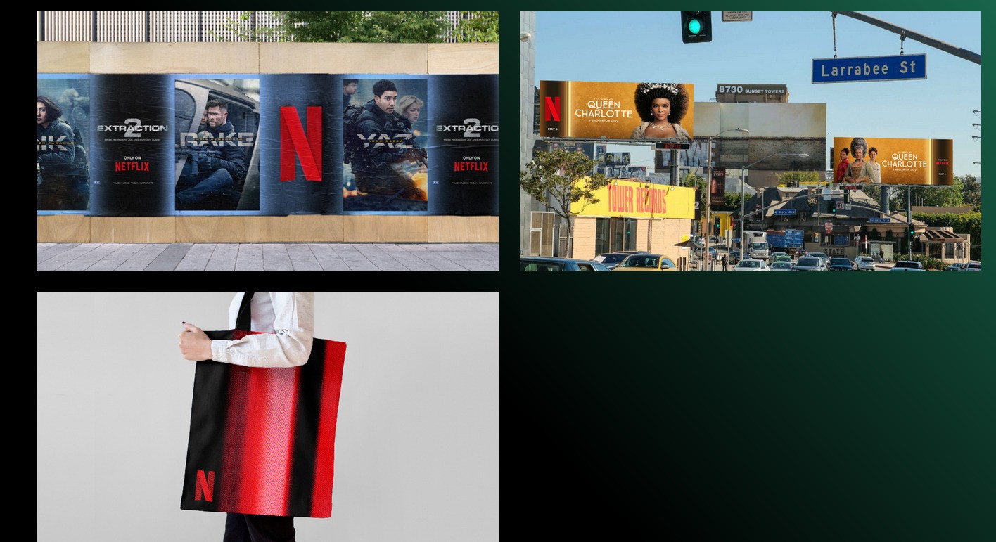
Demonstrate how to use your logo on actual billboards, display ads, etc. Via Netflix
TIP: Give real-life examples of brand identity elements on billboards, display ads, social media ads, print, mobile apps, etc. The more, the better!
Medium
The Medium brand kit starts by showcasing the logo anatomy, showing a distinction between its symbol and the wordmark. It includes rules like maintaining a 30px clear space around the logo to avoid a cluttered look when mixed with other brand assets and ensure maximum visibility.
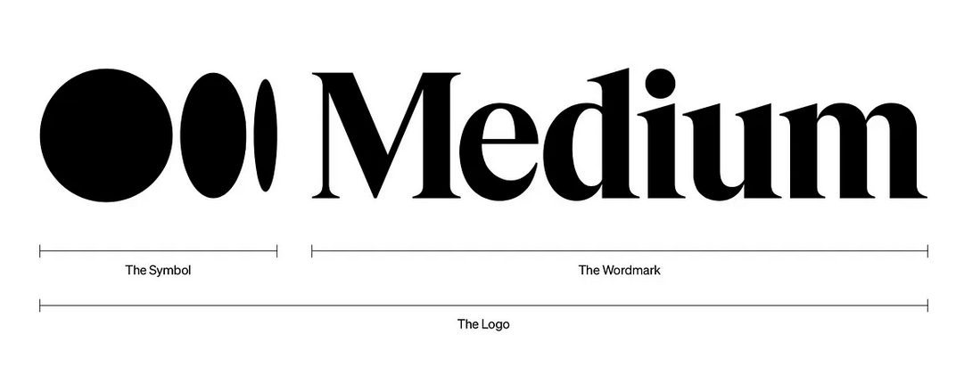
A logo is often made of a symbol or a mascot and a wordmark. via Medium
If the logo is not ideal for certain spaces, the brand kit specifies how to use the symbol or the wordmark instead. It also underscores the importance of adhering to Medium’s brand palette. For instance, the white logo version should only be used against vibrant backgrounds.
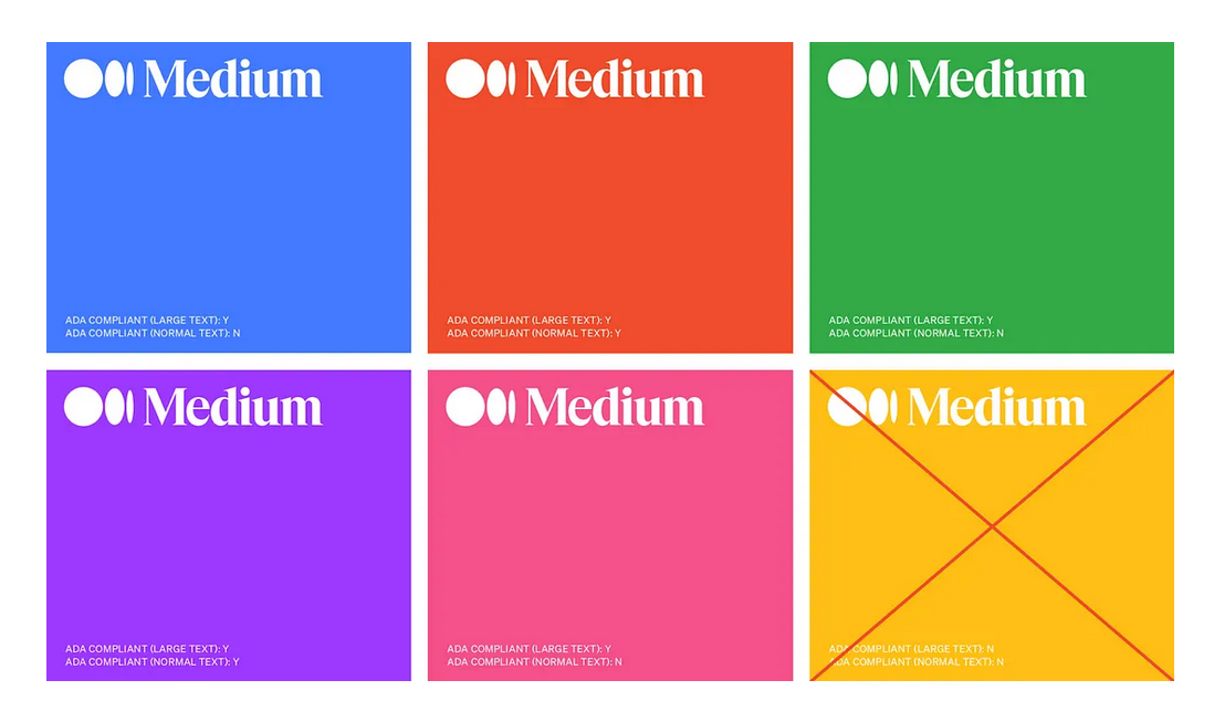
Create a logo version that is highly visible against busy and vibrant backgrounds. Via Medium
What we liked about Medium’s brand kit is how it simplified the rules with multiple illustrations of what to avoid when using the logo. The brand kit provided a clear explanation about the use of primary and secondary logos (wordmark and symbol).
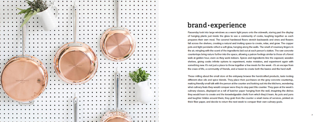
Herban Kitchen
Compared to other brand kits, Herban Kitchen took extra effort to make users understand the brand in-depth. It starts with a brand mantra that explains why the brand exists and what it aims to deliver to the community.
Tell a story with your brand kit. Via Herban Kitchen
The brand kit also goes deep into the brand experience, painting a picture of what it’s like to be in a place where diners can “escape from the craze of life, a community of friends, and a haven to create both the basics and the hard stuff.” Prefacing with these details makes the technical design aspects relatable and easy to understand.
The logo is split into two main components: symbol (in the form of a knife) and logotype. The brand kit furthers how to customize the logo to fit each restaurant location. This is followed by the color palette and logo usage, emphasizing how they draw from nature.
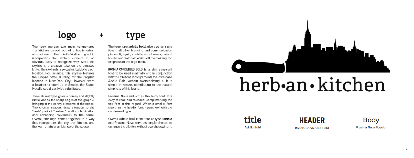
Logotype via Herban Kitchen
Is a Branding Kit Worth It?
Yes, a branding kit is worth it! In a survey done on 400 organizations in the US, 68 percent noted that brand consistency has increased their profitability by 10 to 20 percent. A consistent brand also builds consumer trust.
These are just a few proofs of the importance of brand consistency across all businesses, which can be achieved through branding tools like a branding kit. Moreover, a brand kit is vital in boosting your brand image, providing clarity on how to use visual assets, and improving communication.
May 23, 2024

Creates insightful, strategy-driven content that translates complex design and branding concepts into accessible knowledge, supporting Ramotion’s mission to elevate digital experiences.