Introduction
A strong visual identity can increase recognition, build trust, attract the right market, and elevate your brand in the sea of competitors. Studies show that businesses with a consistent brand image across all platforms see 23% more revenue growth than those without.
But it's not easy to make a lasting first impression. If you struggle with your brand's visual identity, you're in the right place. Let's begin by defining and understanding the importance of visual identity in branding.
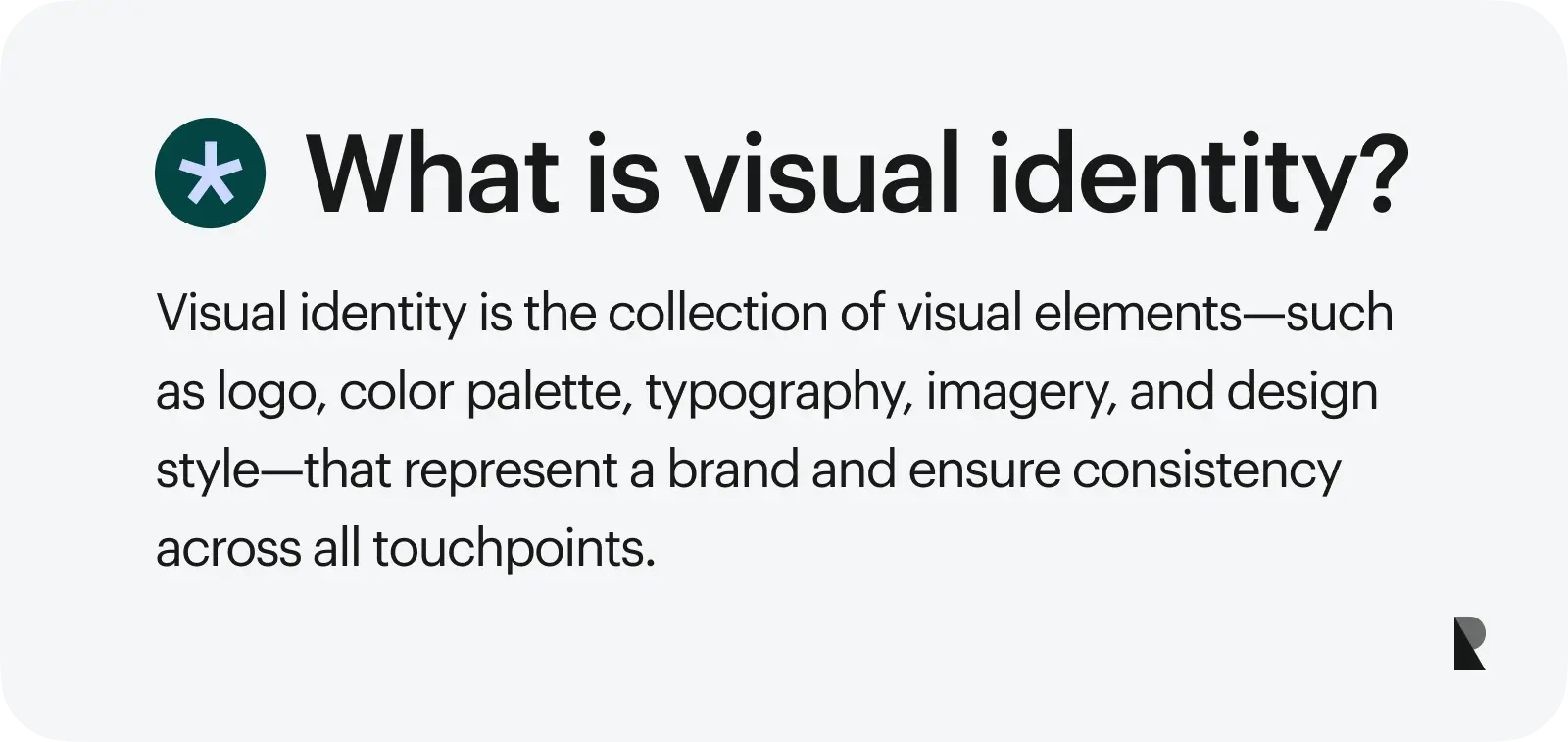
It incorporates a logo, color palette, typography, photography, and illustrations that reflect the brand's essence. This creates strong associations that help a brand stand out from the competition.
For example, the distinctive triangle-shaped Toblerone chocolate box is instantly recognizable. Toblerone's iconic visual identity has been central to its brand identity and has prevented competitors from successfully copying its design.
Now, how does visual identity relate to brand identity?
Visual identity vs. brand identity: understanding the difference
Visual identity and brand identity are two branding terms that are often interchanged. But it is essential to understand that visual identity is just one piece—a vital one! — of your brand identity.
Visual identity refers to the visual elements representing a brand, such as the logo, color palette, typography, and imagery. Meanwhile, brand identity encompasses a brand's broader attributes, including its values, mission, personality, messaging, voice, and emotional connection with its audience.
It's akin to a person's entire identity, of which their visual appearance is just one aspect. While visual identity allows others to gain insights into a brand's preferences and interests, the brand identity truly defines the brand and what it stands for.
| Aspects | Visual Identity | Brand Identity |
|---|---|---|
| Purpose | To represent your brand and increase recognition through well-designed visual elements | To convey the overall personality and core values of your brand |
| Elements |
|
|
| Internal vs. External | Prioritizes external appearance | Focuses on both internal and external aspects of the brand |
Why visual identity matters
Aside from making your brand look and feel good, your visual identity can influence every aspect of your brand.
Builds recognition
With distinct visual elements consistently executed across different channels and formats, this can lead to people recognizing your brand even from far away or without seeing your brand name. This recognition is instrumental in winning the hearts of your customers, especially in a saturated market.
Influences buyers’ decisions
Your brand's visual identity can significantly influence customer purchasing decisions. A polished, unique, and well-executed visual identity can justify your premium prices. And when teams need deeper strategic alignment between visuals and overarching brand meaning, collaborating with a specialized brand identity agency can help translate those insights into a cohesive system customers immediately recognize and trust.
Customers also seek relatability in a brand's visuals. Visuals that reflect and resonate with cultural traits and social values can convince buyers to engage as they demonstrate the brand's deep understanding of its target audience.
Sparks an emotional connection
Colors, pictures, fonts, and other visual elements can influence and inspire people's emotions. With an impressionable and consistent visual identity, people associate positive feelings with your brand.
Creates trust
A strong visual identity that uses elements evoking professionalism, authority, and trustworthiness eases consumers' minds. Hospitals and banks, for example, mostly use blue in their branding—a color that signifies security and reliability.=
Key attributes: what makes a successful visual identity?
A successful visual identity does not have a cookie-cutter look. For executive teams aligning identity work with positioning and operating cadence, reviewing top agencies for brand identity design can clarify which collaborators match your category context, stakeholder complexity, and governance needs. But here are the key attributes to look for.
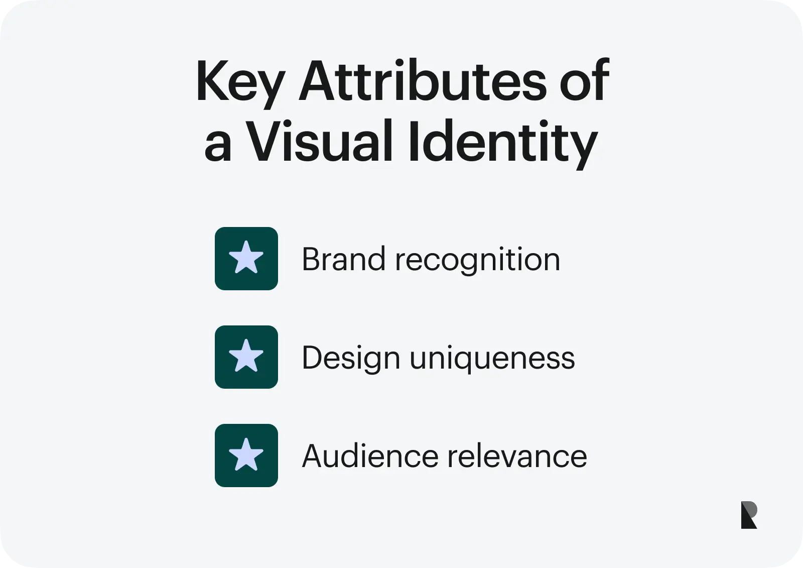
High recognition
Do your customers know your brand even if they only glance at your colors or packaging without your name?
A successful visual identity is easily recognizable. Think Scrub Daddy's smiley sponge or Walmart's blue color. Even without seeing the brand name, customers can already identify the brand. But recognition is not built overnight. It's a concerted effort that compounds over time and drives growth.
Uniqueness
A distinctive visual identity can help your brand thrive in a competitive market. You can easily differentiate yourself from the crowd by highlighting your unique qualities. This uniqueness can evoke emotions, enhance experiences, and persuade customers.
When your brand has a strong visual identity, more people will take notice and want to be associated with it. For instance, consumers often proudly display their purchases from luxury brands with powerful visual branding.
Audience relevance
Visual identity is more than just creating an attractive design. It must align with your target audience and brand positioning. For example, if your brand caters to luxury buyers, your visual identity should exude an elegant and sleek aesthetic. Conversely, a futuristic, fun, and edgy look would be more appropriate if you're targeting gamers.
Your visual identity should be striking, effectively communicate your brand's values, and resonate with your target customers.
The secret to a successful visual identity is consistency. You can confidently stand the test of time by presenting a unified visual identity that aligns with these attributes.
Four core elements of visual identity
There are many aspects and factors to consider when crafting a compelling visual identity. Below are the core elements you must develop and incorporate into your visual design process.
Logo and symbolism
A logo is an essential identifier of a brand. It's a symbolic representation that distills the brand's values and mission.
The logo symbolizes trust, innovation, and excellence as you enter your brand building. Craft a logo that is easily distinguishable, memorable, versatile, and relevant at a glance.
Say you're presented with two running shoes—one with a Nike logo and the other with an Xstep logo. You're more likely to go for Nike without the need to dive deep into its products, as it is a trusted brand.
Color palette
Your brand colors can bring your visual identity to life. They are also what people remember about your brand aside from your logo. Think red and white from Coca-Cola, royal green from Rolex, and Robin's egg blue from Tiffany & Co.
Aside from making your visuals pretty, colors make people feel strong emotions. For example, blue evokes calmness, yellow sparks joy, and red reflects excitement and can even stimulate hunger. When choosing your colors, ensure they align with your brand personality and tone of voice.
Typography and fonts
Did you know that your brand fonts can impact the perception of your audience? An experiment conducted by New York Times' Errol Morris involved testing different fonts on a two-part essay. The result? The essay printed using the Baskerville font elicited a more positive response from participants. The font's serif form and weight give texts an authoritative and professional look, making them easy to read and trustworthy.
For this reason, brands invest in customized typefaces that best match their personalities. Check out some examples below.
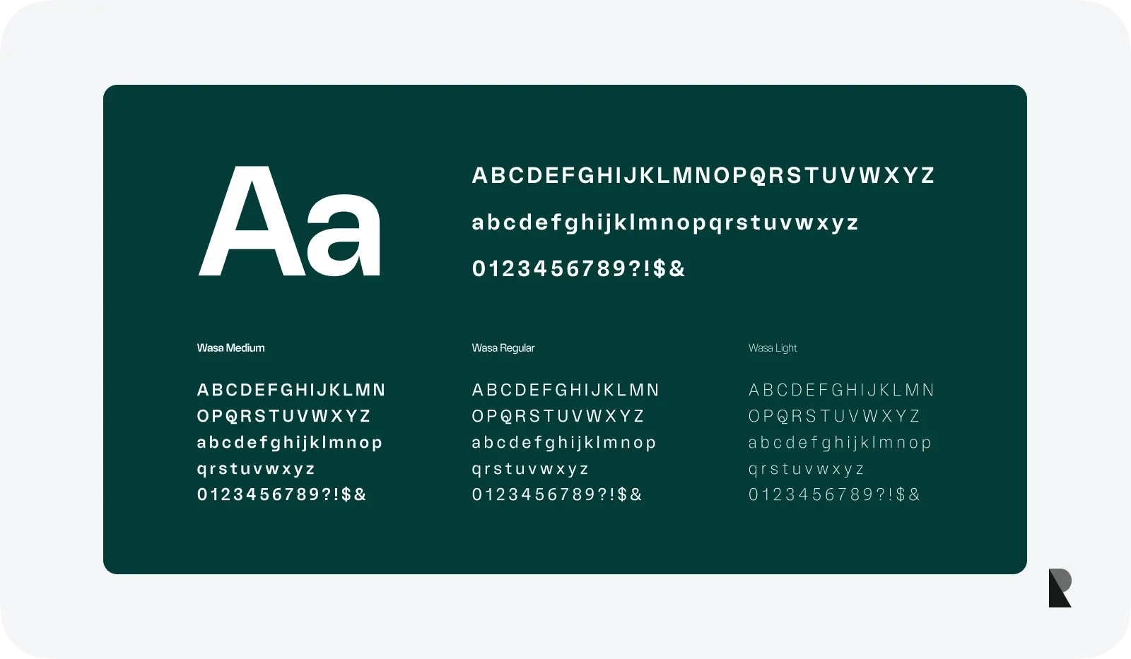
Choose typography and fonts according to your visual identity. They can increase the memorability of information, establish trust, and reflect your brand's personality.
Sans serif or rounded fonts are modern, approachable, and casual. Meanwhile, serif fonts or fonts with lines attached to their ends are perceived as professional and authoritative. They convey a more serious and luxurious feel, and the lines optimize the readability of texts. Other kinds of typefaces include decorative, geometric, and script fonts.
Imagery and iconography
Imagery refers to photos and illustrations, while iconography includes icons and symbols. Together, they create a visual language that relays information or messages at a glance.
These are crucial elements that can optimize the memorability of your visuals. People are faster at processing images than texts. They can simplify complex information and commands and evoke emotional responses. Finally, they tell your brand's story and values.
Steps to create a strong visual identity
So, how do you create a strong visual identity? Let’s start with the steps below.
Market and audience research
Understanding who you are designing for is the first step in crafting a strong visual identity. This process entails learning what customers want to see and their interests and motivations. Conduct surveys, interviews, and conversations to help unearth their concerns.
You must also know who you're up against by conducting market research on your competitors and the industry. Analyze what makes them unique and discover opportunities and weaknesses. This will guide you in creating a unique, eye-catching, relatable, and authentic visual identity.
Defining brand personality
Your brand personality adds character and humanizes your business. It makes your visual identity relatable and compelling in evoking positive emotions from your audience.
So, how do you shape the right personality for your brand?
If you're talking to kids, stick with vibrant colors, sans serif fonts, and other fun visuals. In the banking industry, leaning on visual elements to communicate security and trust.
You can also leverage your brand personality to stand out. For instance, a tech company can have a jovial personality to make the brand approachable, especially for customers who may have insecurities when discussing the technical side of your products and services.
Choosing and testing design elements
Your visual identity must do more than look aesthetically pleasing. It must effectively communicate your brand message, attract your target audience, build trust, and create a lasting impression.
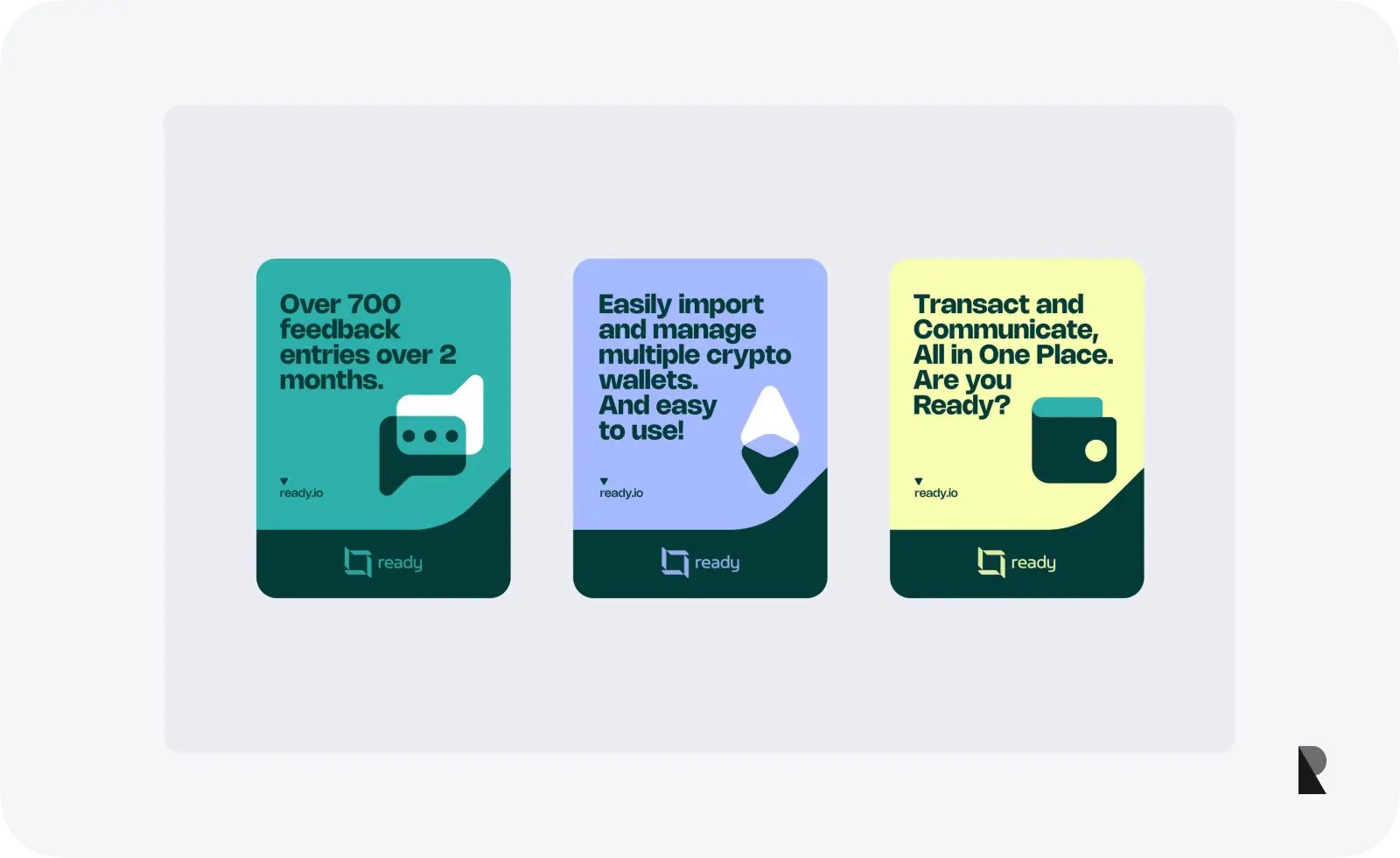
Once you have initial design ideas, present them to your internal team and customers and gather their feedback. Conduct A/B testing on emails, ads, and social media posts to identify which design elements resonate most with users.
Run social media polls, competitor comparisons, and other marketing metrics. You can also integrate eye-tracking tools on your digital platforms to detect which visual elements people are drawn to.
Best practices to strengthen visual identity
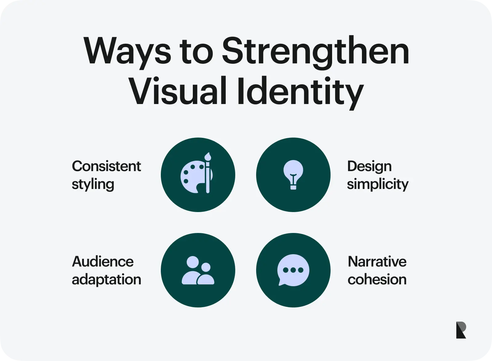
Use the same colors and fonts
Consistent use of the same colors and fonts across all touchpoints helps establish a faster association with a brand's visual identity. For example, seeing a green and yellow tractor immediately brings the John Deere brand to mind. Similarly, a chocolate bar in purple packaging instantly reminds us of Cadbury.
Keep it simple
A simple visual identity is a strategic design approach that optimizes your brand message. Simple visual elements are easier for people to process and remember. This allows for a flexible, adaptable design that works across platforms and formats, conveying a timeless look.
Make no mistake: a simple visual identity is not dull. Instead, it helps create an efficient, accessible, transparent brand presentation.
Tell a story
A strong brand narrative guides an effective visual identity. It conveys compelling stories demonstrating how the brand upholds its values and commitment to its audience.
This is visually expressed through typography, images, symbolism, and icons that align with the brand's core and resonate with its audience. For example, a logo can pay homage to the brand's origins.
A visual identity rooted in storytelling is more memorable, meaningful, and impactful.
Adapt to your audience
Successful global brands adapt to their local audiences. They integrate cultural context by incorporating local traditions and symbols into their visuals. This may involve transliterating their brand name, using images that resonate with locals, and developing products that cater to regional tastes.
When you select and design visual elements that align with your audience's preferences and expectations, brands become more effective. This also helps maintain the relevance of the visual identity, further strengthening the bond with customers.
Maintaining visual consistency through brand guidelines
A brand guideline is a tool that keeps everyone on the same page. It's a collection of rules and other information that help your team use visual assets correctly and maintain a consistent look and feel.
So, what's in a brand guideline?
- Brand background. A brand guideline starts by explaining your brand history, mission, values, and vision and how they are represented through your visual identity.
- Visual assets. Your visual assets are your logo, color palette, fonts, text styles, and images. They are organized in an asset library, where users can download them for all communications.
- Buyer personas. Buyer personas help your team visualize your potential customers by creating fictional representations that possess your target audience's personality, interests, needs, desires, and behaviors.
- Usage guidelines. Curate How-To guides and Dos and Don’ts to ensure every visual asset is used correctly. Be generous when giving visual examples.
Incorporate rules that encourage consistency when using visual assets yet leave enough room for adjustments. Finally, keep your brand guidelines updated.
Common pitfalls to avoid In your visual identity
Overcomplicating your designs
It’s easy to overcomplicate your visual design, especially when you want to say many things or remain trendy. However, this can be a slippery slope that leads to miscommunication and confusion among your consumers.
One way to address this is to set goals for your visual identity. For example, you can increase brand recognition, bring awareness to your unique features, and sow positive perception. Make sure they align with your brand identity to maintain consistency.
Forgetting about visual psychology
Every design decision you make can influence the minds of your target audience. Colors and pictures can make people feel joy, sadness, and excitement. They can also motivate and inspire actions. By leveraging design psychology, you can create a visual identity that resonates with your users and achieves your desired outcomes.
Neglecting mobile compatibility
People in the United States spend around four hours and 39 minutes on their mobile phones. Almost everyone relies on apps and other mobile tools to get through the day. Your visual identity is missing millions of users if it is not tailored to fit their mobile experience!
Here's how you can make your visual identity mobile-friendly.
- Make sure your visual elements, like logo, brand name, etc., look good on small screens.
- Optimize images so they do slow your app or website's loading time.
- Select fonts that are easy to read.
- Check how your brand visuals look on multiple mobile devices.
Examples of effective visual identities
Let’s take a closer look at big brands with effective visual identities.
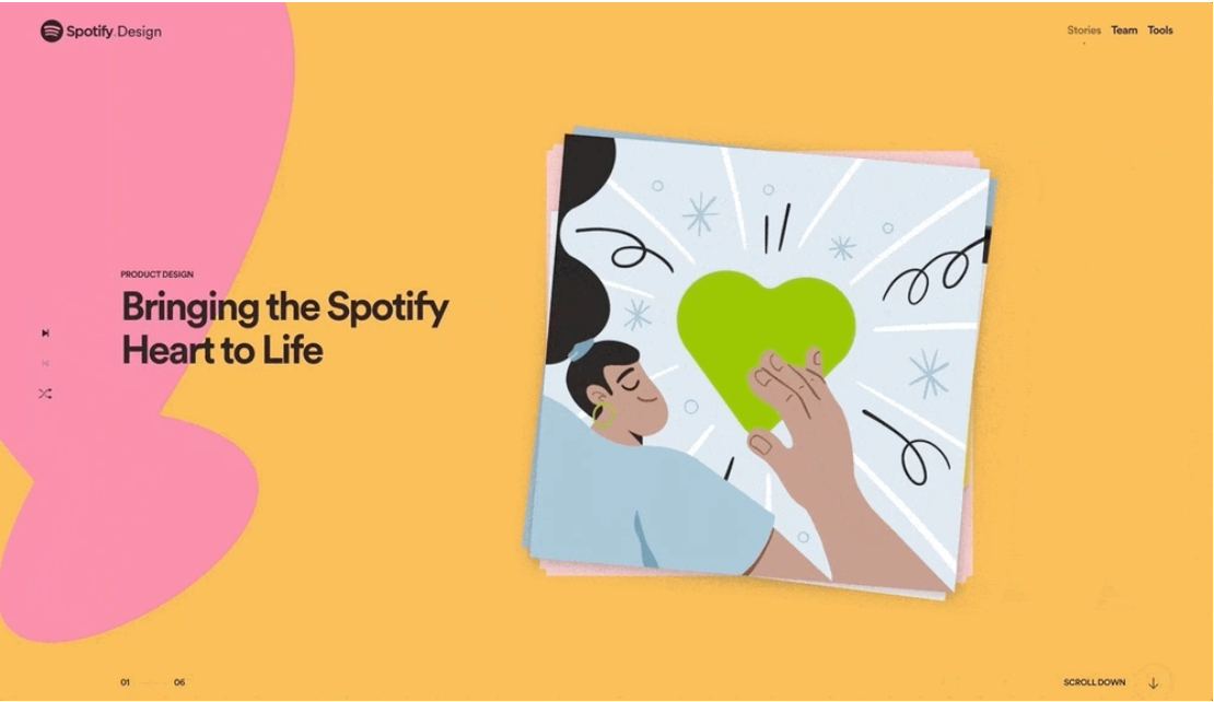
Spotify
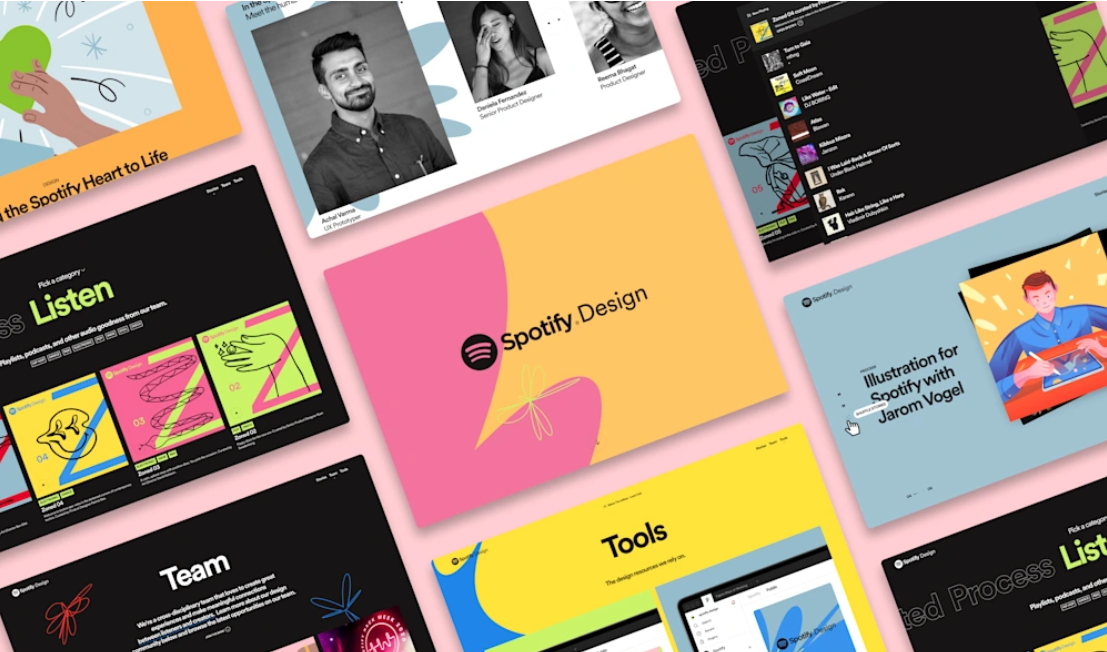
Spotify’s visual identity focuses on providing a fun and vibrant experience. Image via Spotify
User data and personalization drive Spotify's successful visual identity. One proof of this is its annual "Wrapped" campaign, visualizing users' listening habits through vibrant, customized infographics and playful animations. It embodies the Cocktail Party effect – consumers are drawn to information relevant to them despite the noise.
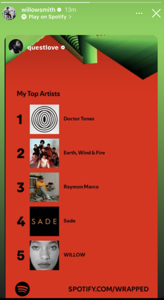
Willow Smith shares Quest Love’s Spotify Wrapped. Image via Spotify

Millie Bobby Brown shares her Spotify Wrapped. Image via Spotify
This design approach makes Spotify users feel valued as active participants. To complement its mobile-first, highly adaptable interface, Spotify's visual identity features hand-drawn illustrations, a custom sans-serif font, and quirky, colorful designs that convey a youthful, all-inclusive, and creative vibe.
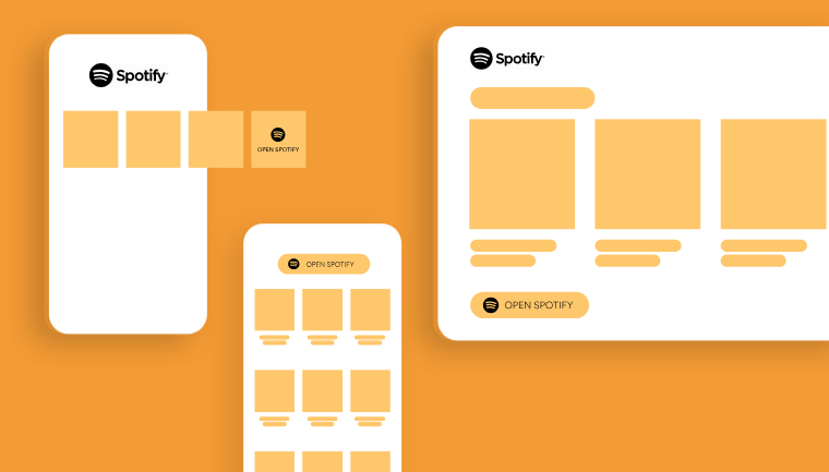
Preview of Spotify’s visual layout on desktop and mobile devices. Via Spotify
Spotify uses visual illustrations with a hand-drawn style for a more organic feel. Image via Spotify
Patagonia
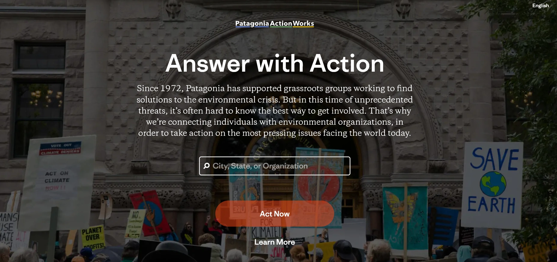
Patagonia's visual identity reflects its commitment to sustainability and environmental protection. The brand's neutral color palette and imagery of mountains, forests, and rivers evoke a strong connection to the natural world.
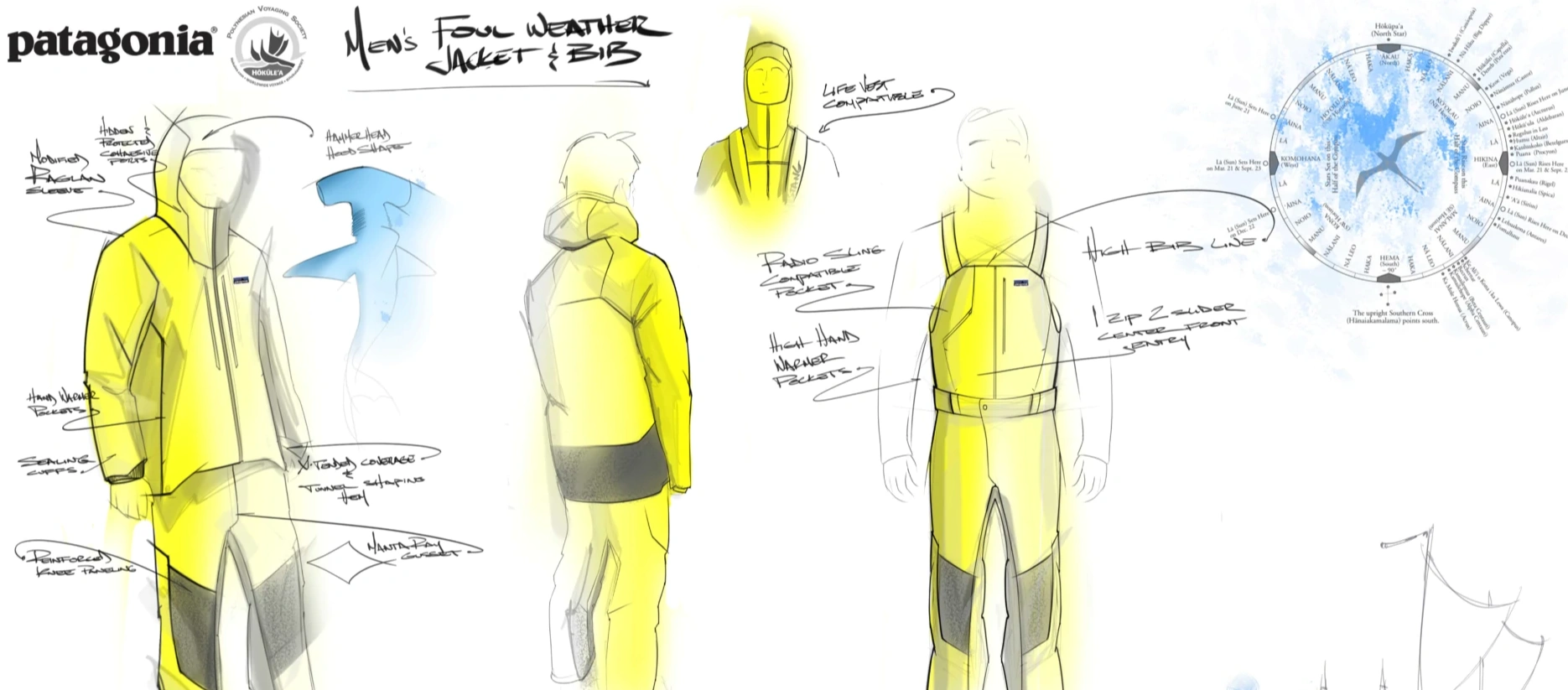
Patagonia uses images of people on real-life adventures. Image via Patagonia
Patagonia's visual storytelling also highlights the real-life experiences of adventure seekers, making the brand relatable and inspiring to those who share its values and beliefs. It also reinforces its dedication to ethical practices and brand authenticity by sharing images and videos of its production process, encouraging people to participate actively in its mission.
Finally, Patagonia's visual efforts showcase a welcoming community, highlighting inclusivity and diversity from everyday nature enthusiasts to professional climbers.
Show transparency by sharing behind-the-scenes information about your product development process. Image via Patagonia
Patagonia takes its commitments seriously by encouraging and influencing its community to take part. Image via Patagonia
MailChimp
MailChimp has carved a unique image in the often-perceived dull email marketing industry. Its visual branding balances playfulness and professionalism, instilling a sense of trust in users. The brand's iconic mascot, Freddie, a cheeky chimpanzee, is a key differentiator.
MailChimp’s brand mascot embodies its playful personality. Image via MailChimp
MailChimp's humorous personality is further reinforced through playful illustrations and vibrant colors. The brand's customized font amplifies its unique personality and message. These visual elements help users easily navigate the platform, mitigating the stress and tedium associated with email marketing.
Despite Intuit's brand acquisition in 2021, MailChimp remained consistent in its visual identity.
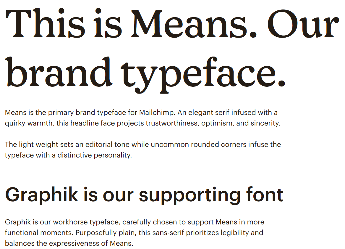
MailChimp customized its own typeface, which adds uniqueness to its visual identity. Image via MailChimp
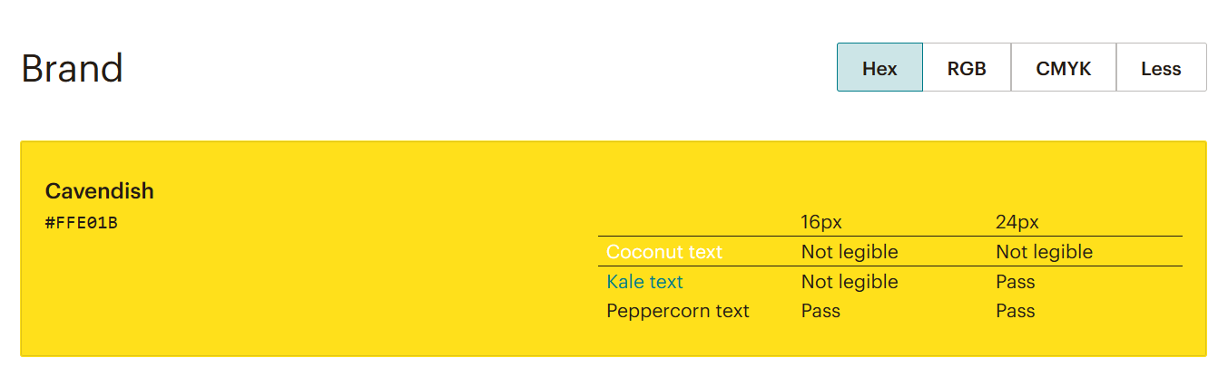
The vibrant yellow brand color of MailChimp adds contrast to its visuals. Image via MailChimp

A neat user interface with compelling copy that enables potential customers to understand what the brand offers at a glance. Image via MailChimp
Are you ready to take the next step in your branding journey? Let an expert branding agency lend you a hand and shape a strong visual identity for your brand.

Creates insightful, strategy-driven content that translates complex design and branding concepts into accessible knowledge, supporting Ramotion’s mission to elevate digital experiences.