Introduction
Fifty-four seconds. That’s the average time a person spends on a website. With so little time, you may wonder how to convince your users to peek at your website.
There are over 200 million active websites worldwide for just about any organization you can think of. That said, you need extra oomph to be unique and memorable. But beyond just being an information hub, your website is a tool that connects you with your audience on a deeper level.
While there are many creative ways to make an outstanding design, one that has proven to stand the test of time is visual storytelling. And it works. Just take a look at how picture storybooks or animations keep people—young and old—entertained and engaged.
Imagine what visual storytelling can do to your website! In a world where hundreds of millions of sites compete for the same attention, working with a creative web design company can help you build not just a nice-looking layout, but a brand experience that feels memorable, human, and worth exploring.
Ready to dig in and unleash your website’s full potential? Read on as we share how you can create an interactive and dynamic brand experience by weaving storytelling in your web design.
What is Visual Storytelling in Web Design?
Visual storytelling in web design is the process of conveying a story through creative effects, images, illustrations, videos, etc. Elevating brand stories takes more than just combining cool stuff, though.
On a deeper level, powerful visual storytelling can make your audience feel all the emotions you want them to associate with you. Aside from purchasing from you, your visuals can motivate and inspire them to be part of your community, too.
The result? You have a website that communicates your brand essence while leaving a lasting impression.
4 Key Principles of Storytelling You Should Know
It takes only a few seconds to build a first impression. So, make it count. Here are the key principles of brand storytelling you should know before implementing your web design.
1. Structure or Flow of Story
Like any engaging story, a website should have a beginning, a middle, and an end. It needs a hook to capture and sustain your visitor's attention. And it needs to convince them to keep exploring and make a purchase.
But this is easier said than done.
With a hierarchy of information or a good story flow, you can create a tight visual web design that checks all the boxes. Start by prioritizing information or stories by importance.
Ask yourself the following questions:
- What visual elements need to be bigger than others to attract the users' eyes?
- How should you format these elements so that you avoid confusing users?
- When users scroll through your page, what user interface design pattern should you implement?
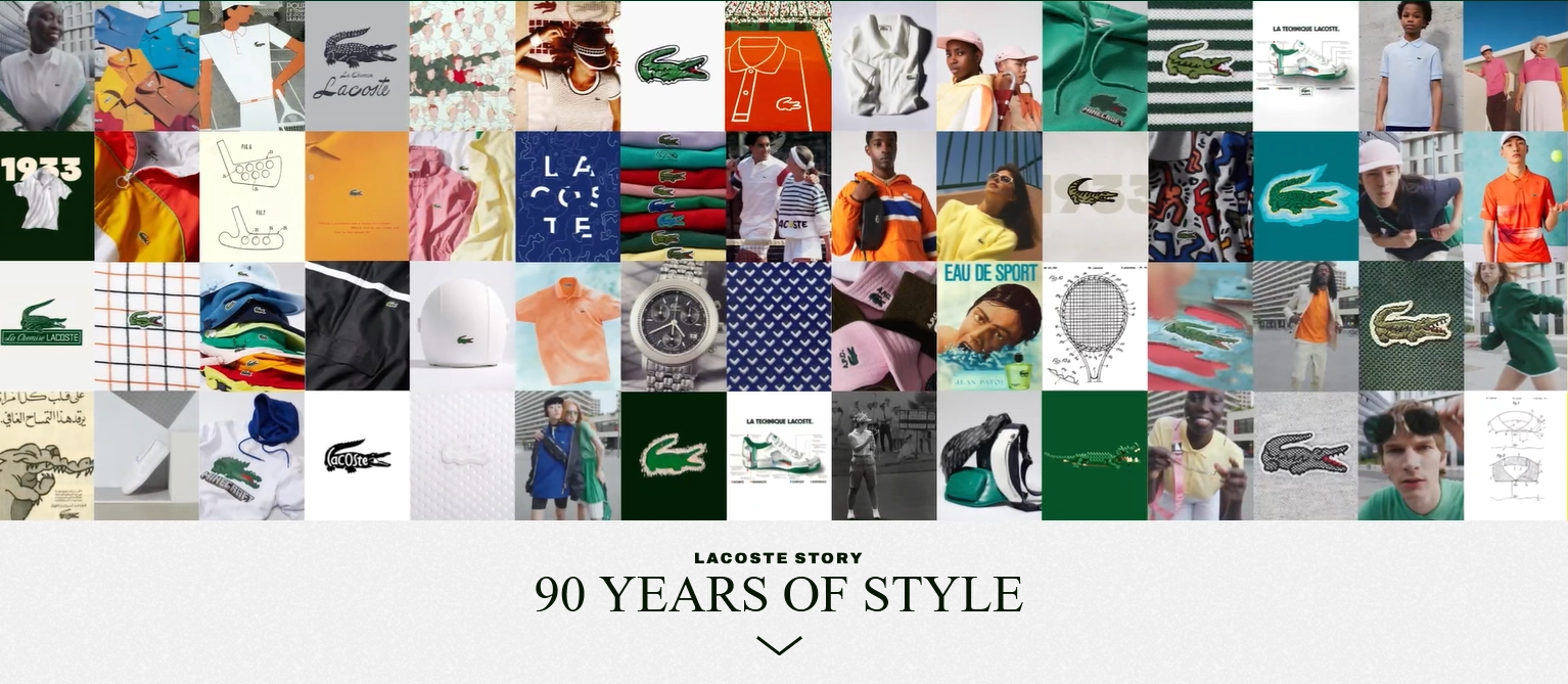
The web design naturally draws the eyes to the copy “90 Years of Style,” informing users of what they’re looking at right away. Screenshot via Lacoste
2. Design Thinking: Knowing Your Audience
Telling stories through design is a challenge if you are unsure what captivates your audience. This is why design thinking matters.
Design thinking is the process of creating ideas for your visuals based on your customers’ needs and personalities. With a comprehensive knowledge of what your audience likes, values, culture, and expectations, you can weave a story that resonates with them.
As you progress, select visual features and assets relevant to your visitors. While customer behavior and preference may change as the market evolves, try your best to be authentic!
3. Mood and Feels

An endearing image added to your web design can positively influence the mood of your users in an instant. Image by Vitolda Klein via Unsplash
Pictures and other visuals can make people feel at a glance. Visual storytelling in web design can influence your clients psychologically, too.
For example, your choice of colors can make a person calm, excited, happy, or fearful. Presenting customers with 10 choices versus five can make it harder for them to decide and may eventually lose interest. A good visual hierarchy can guide users’ eyes on where to look first, moving them forward in their journey with your brand.
When designing a website, think of how you can create the mood and feelings you want your users to experience. Successfully done, your website leaves a lasting impact. It may even give a sense of understanding and belongingness if they resonate with your audience.
4. Consistency in Brand Identity
Trends and behaviors change as time passes. And this can push brands to keep revising their design approach. Be careful, though! You might confuse your audience trying to stay current.
For web design to be effective, align all visual design elements with your brand identity. You can defer to your brand guidelines to ensure the correct usage of colors, fonts, and other visual elements.
Your website should also reflect your brand values and personality. And finally, remember to seek feedback and revise your brand identity as needed.
Tips and Tricks for a Compelling Visual Story
Ready to make your stories come to life? Create a memorable user experience with these tips and tricks from expert web designers.
1. Show More Than Tell
Weaving visual storytelling in web design allows you to say more with a few words and memorable visual design elements. And you can do this in multiple ways.
Play with diverse content using high-quality images, illustrations, animations, and short video clips to convey stories and emotions to your user. Break down complex ideas with infographics. And stir up emotions you want your audience to feel by choosing an on-brand color scheme for your website.
2. Be Practical When Creating an Interactive Experience
There are more ways than one to explore a website interactively. You can integrate dynamic cursors, animations, and videos. Or non-conventional scrolls like parallax scrolling, horizontal scrolling, and full-page scrolling, among others.
These effects trigger different responses—big and small—from users that encourage more engagement. But you need not use complex visual design features to create an immersive experience.
While you may want an immersive experience, avoid complex web design elements that may create a lag or limit accessibility. For instance, make your visual storytelling stand out by simply adding branded sounds or music in the background. Or create color changes when the mouse hovers over design elements. These simple features can make a huge impact.
3. Tell Your Brand Story
When you share your brand’s story, you show the human side of your business. And this is the foundation of the emotional connection between your brand and customers. Research has shown that people respond better to content that focuses on brand stories.
So, why not leverage visual storytelling as you pull back the curtain on how your business came to be? It’s a powerful way of communicating your vision, brand’s mission, values, and brand message.
4. Keep Your Stories Simple
Speaking of sharing your brand’s story, you don’t need an elaborate one. A simple yet meaningful and compelling story can leave a lasting impression when designing your website.
You can do this by focusing on what makes your business better than the competition. If you can, leverage the real-life experiences of your customers with your brand and the value that you bring to increase brand trust. In effect, you create a clear visual hierarchy and concise messaging that hits the spot.
Examples and Best Practices for Visual Storytelling in Web Design
Whatever your brand’s objectives are, visual storytelling in web design can elevate your business in many ways. We’ve compiled a list of brands with head-turning websites that keep you hooked with their stories from the start.
Mercedes Benz Norway
Instead of hiring commercial models, Mercedes Benz Norway takes it further by featuring real-life clients to demonstrate its latest compact SUV.
You are greeted by a family of three, with a child, bags, and a stroller in tow as they head to the car. Video clips of the family enjoying a relaxing ride with a picturesque view follows. Informative illustrations of the car model’s best features are at the bottom.
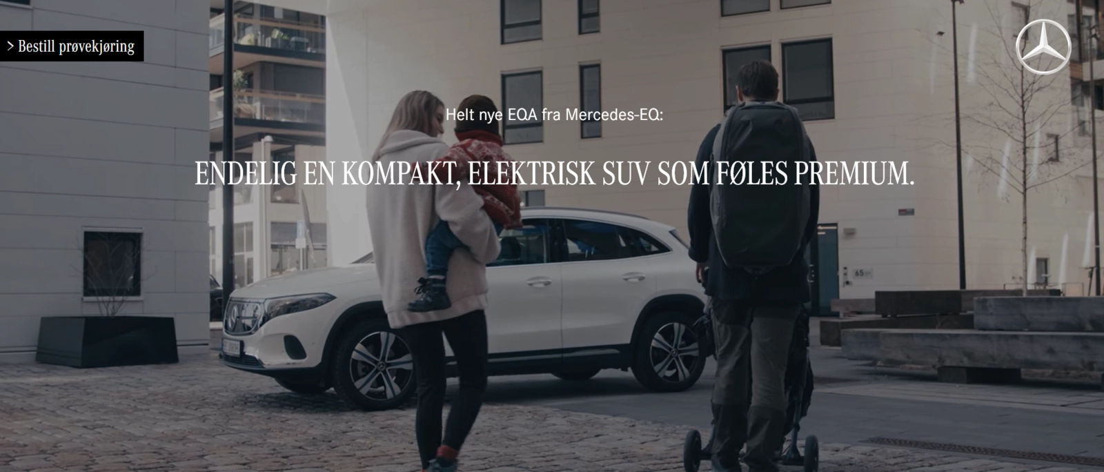
Mercedes features a family of three in their website. Screenshot via Mercedes Benz Norway
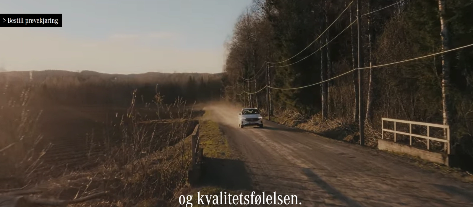
Mercedes Benz compact SUV demonstrates high performance and smooth driving experience even on less ideal roads. Screenshot via Mercedes Benz Norway
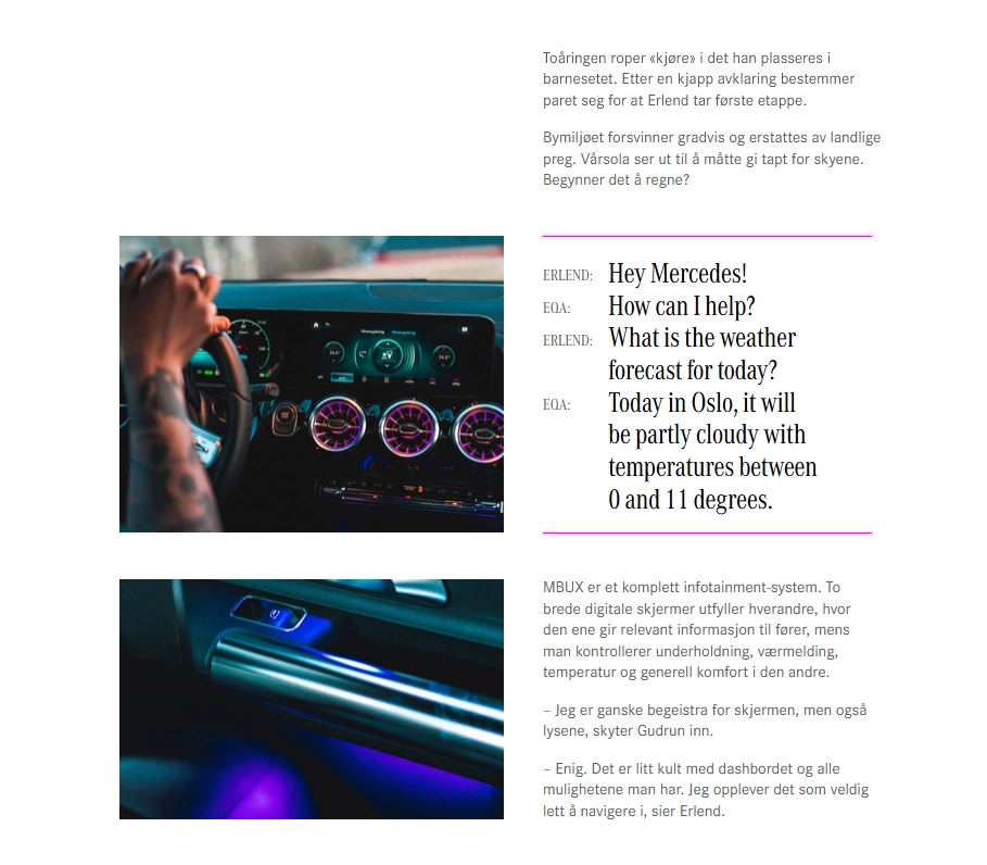
High-resolution images accompany texts explaining the features of the car. Screenshot via Mercedes Benz Norway
Why It Works: Mercedes Benz’s website connects with its audience by showing how its compact SUV addresses the primary needs of a family: convenience, safety, and comfort. It also breaks down complicated car terms by accompanying explainer texts with short demo clips.
At the bottom is a testimonial video of the family about the brand. It's akin to saying, "If you don't trust us, trust our customers." What better way to sell a product than a stamp of approval from actual paying customers?
Banco de Mexico
Who says banks need to be boring?
Just look at Banco de Mexico’s Mi Banxico, Banco de Mexico's website where people can learn about the history of money and banking in Mexico. It features a gamified user interface with interactive elements to keep visitors engaged and encourage them to explore the website further.
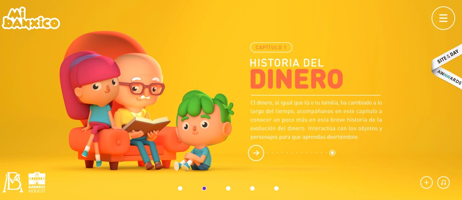
Banco de Mexico uses animation to entice young children to see what’s in store. Screenshot via Mi Banxico
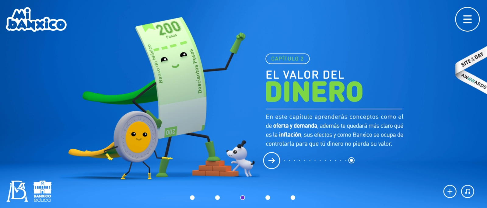
The bank also uses mascots in its illustrations, making the design child-friendly. Screenshot via Mi Banxico
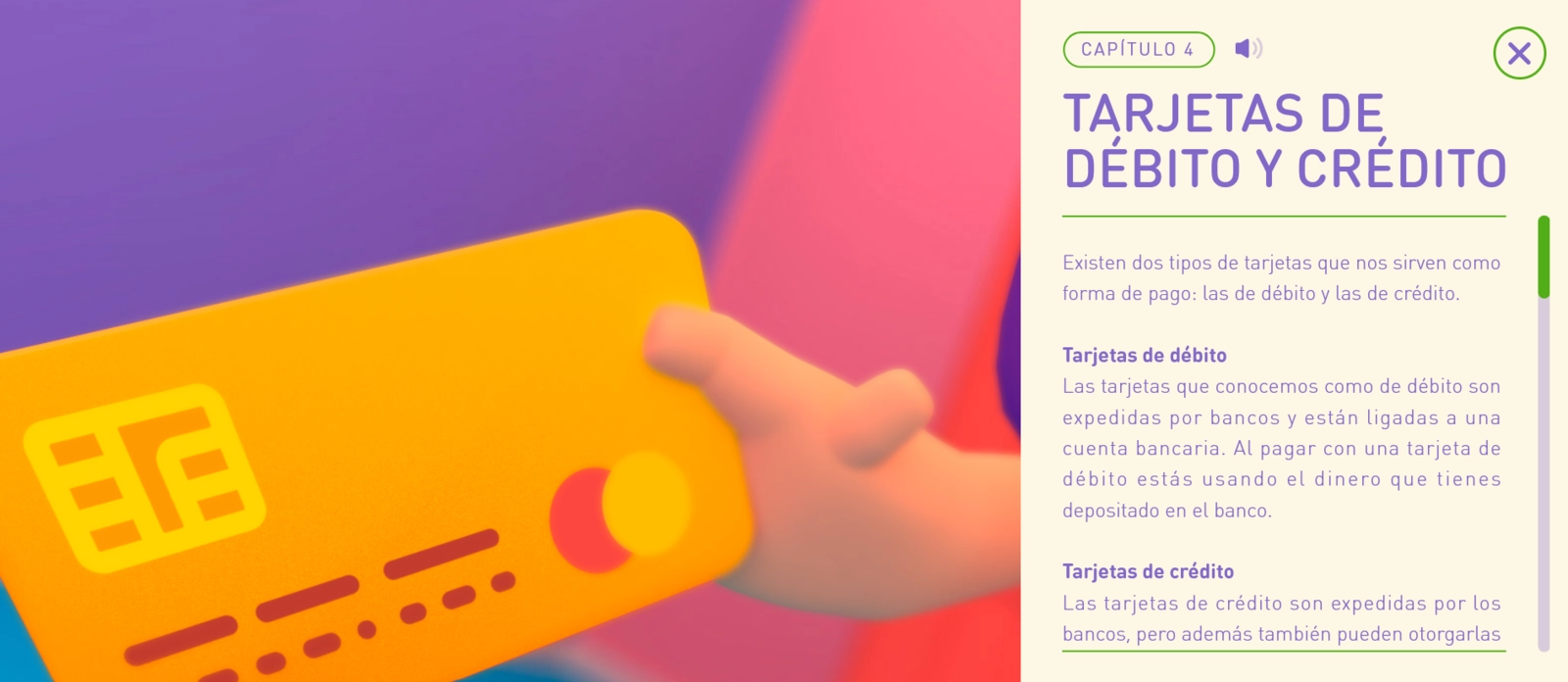
The website encourages users to click on buttons for more information for an interactive experience. Screenshot via Mi Banxico
Why It Works:
The Bank of Mexico tailored its website to fit its young audience with animated illustrations, use of vibrant colors, videos, and other interactive elements. It splits the history of banking into four chapters, making complex financing concepts easy to digest for each user.
Playful music is in the background to create a more dynamic user experience.
While the website is chock full of information, the brand managed to keep the overall web design clean and easy to follow, especially for kids.
Chaletbau Matti
Chaletbau Matti gets up close and personal by drawing the curtain on how it transformed from humble beginnings to an international luxurious real estate brand. It welcomes visitors with an awe-inspiring video that tells the story of how the brand blurs the line between traditional artistry and modern design.
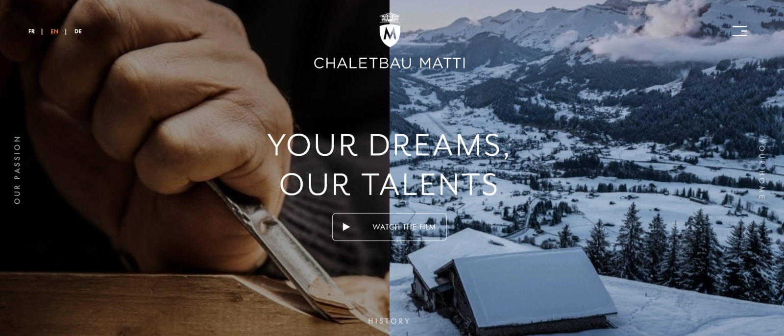
The website shares its passion for architecture and design through a short video. Via Chaletbau Matti
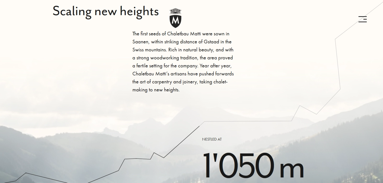
Integrating visual hierarchy to guide users as they read the web copy. Via Chaletbau Matti
From a simple family carpentry shop, it now boasts a team of over a hundred people building people’s dream chalets, primarily in Switzerland and different parts of the world. It also features beautiful and enticing landscapes across different seasons, giving a taste of life in the Swiss region.
Why It Works:
The brand created an aesthetic combination of raw, natural, and traditional visual design elements that capture attention and spark interest. Sure, the brand gives luxurious vibes. But, it remains respectful of its past by honoring the previous generations of chalet makers.
It’s authentic!
With horizontal scroll, behind-the-scene photos, and renders across a timeline, the website highlights milestones in the history of Chaletbau Matti. From the first generation to the third generation of owners, the brand gives a play-by-play of how it got to where it is, with over 200 chalets designed and built in Switzerland, France, and England.
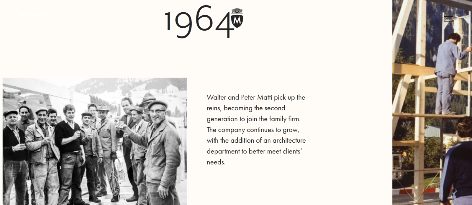
Decades of excellence spanning three generations. Via Chaletbau Matti
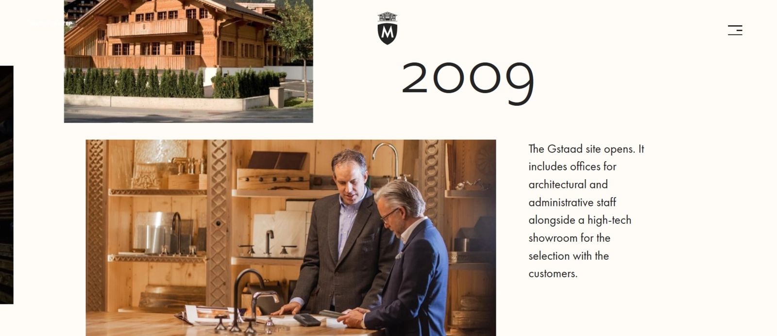
The web design successfully shows how the business transitioned from a family-owned shop to a full-fledged real estate company. Via Chaletbau Matti
Dryrobe
UK-based clothing brand Dryrobe makes changing robes for athletes of all ages. With a warm synthetic wool lining, it keeps customers dry as it quickly elevates their core temperature.
Right from the first page, Dryrobe shows how flexible its outdoor robes are in keeping customers warm — “any weather, anywhere” — as they enjoy an active lifestyle.
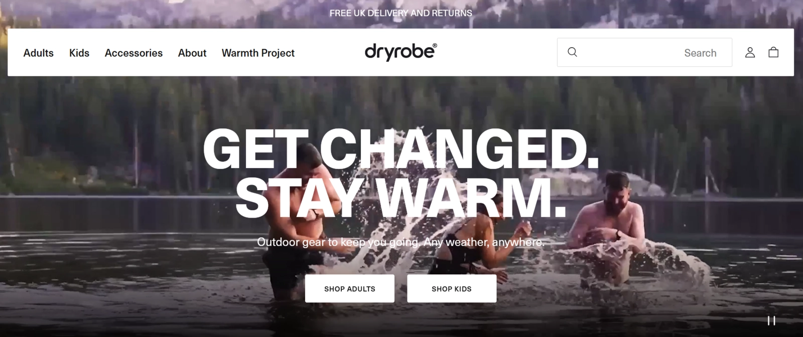
Dryrobe shows how its products are perfect for keeping warm in whatever condition. Via Dryrobe
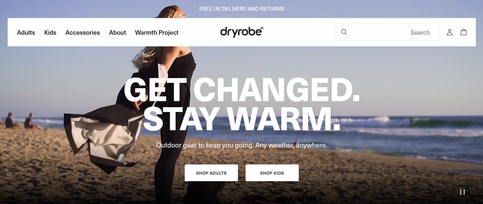
The website integrates videos of people having fun while using its products. Via Dryrobe
Why It Works:
The website cuts through the chase so a person new to the brand can understand the product at a glance. Dryrobe combines static images and video clips of people using its products in their adventures as its website background, creating a more dynamic look that keeps users interested.
The brand also did well in designing a comprehensive yet neat product listing page with easily found shopping buttons, product features, and FAQs.
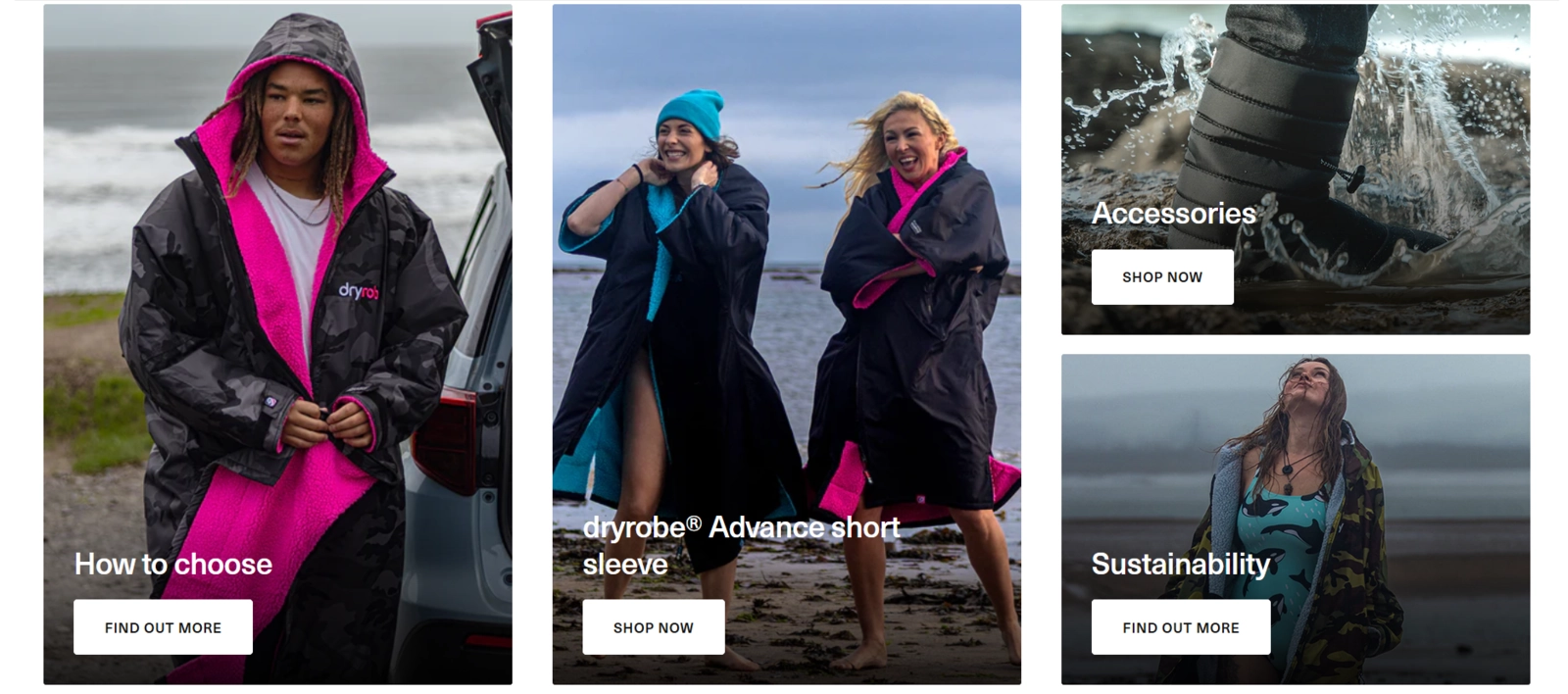
The website arranges brand information according to the buyer’s journey. Via Dryrobe
Conclusion
Do you have stories to tell but are unsure where and how to begin? You don't have to figure things out from scratch. Let a professional web design studio help you create a wonderful and on-brand visual tale through your website.
Mar 18, 2024
