Introduction
Scrolling effects are compelling website features that create visually engaging interactions. These effects allow elements to move at different speeds as users scroll, creating a sense of depth and interactive design.
Some of the most common scrolling effects include micro animations, parallax scrolling, and scroll-triggered animations, where elements actively respond to mouse movements – making web browsing engaging.
Keep reading to understand the best practices, types of scrolling effects, and how to use them. Learn how they work, their benefits for enhancing website performance, and steps to implement them on your site.
Defining scrolling effects in web design
What is the scrolling effect?
Scrolling effects are an interactive web design technique that combines visual animations and dynamic elements to enhance user engagement as they scroll through a website.
It creates a dynamic experience by utilizing website elements' speed, position, and depth, such as text, graphics, background color, or images. These elements are triggered by user actions, such as scrolling, to create interactive, immersive experiences. A scroll effect often features CSS3 transform and transition effects, including fading, scaling, and sliding, creating a multidimensional illusion.
The experience of having scrolling effects on a webpage is similar to sitting in a car, where nearby objects, such as trees or signposts, pass quickly. At the same time, the distant ones, like mountains or the horizon in the distance, appear to be moving slower.
This difference in speed creates an illusion of depth, similar to scroll effects in web design. These effects add realism to the user experience, provide a smooth interactive journey, emphasize vital website sections, and make dynamic visuals more engaging.
Impact of scrolling effects on UX and usability
Scrolling effects improve usability and user experience (UX) by creating interactive and visually appealing web designs. These effects help capture users' attention and guide them through the content intuitively, making browsing information more enjoyable and memorable.
For instance, a parallax effect can introduce 3D-like sliding visuals, drawing attention to key sections of a website and guiding users to the intended goal.
Parallax effects are highly beneficial for storytelling websites. They can utilize graphical elements, such as background or foreground images, and are programmed to move at a different speed. This increases user immersion and draws them deeper into the content.
By integrating the proper scrolling effects, you can create a forward thinking experience that impresses users. Careful implementation of these effects can inspire users to engage more with the website content.
How do scrolling effects work?
Scrolling effects work by tracking user scroll events and adjusting properties of web elements dynamically within a webpage structured using markup and style sheet language. HTML provides the design foundation for content and layout, while CSS controls the behavior of every element during scrolling. The position property in CSS plays a critical role, allowing elements to behave as static, relative, absolute, fixed, or sticky within the layout.
To create smooth animations, you must combine various CSS properties such as transform (for scaling, rotating, or translating elements) and transition (for smooth animations) in response to scrolling interactions. In addition, you may utilize CSS and JavaScript libraries, such as Animate.css, ScrollMagic, and GSAP, to control these effects and speed up the development instead of manually coding it from scratch.
Here is the lifecycle of how a website scrolling effect comes to life:
Phase 1: User scroll behavior
The browser detects when the user starts scrolling on the webpage. This action initiates the scrolling effect process.
Phase 2: Scroll position
The browser tracks the current scroll position using the viewport's vertical offset (scrollY) or horizontal offset (scrollX) about the content on the web page.
Phase 3: CSS properties dynamic alteration
Using Javascript, the browser now adjusts specific CSS properties based on the current scroll position. By this time, specific styles of IDs or classes of particular web elements are modified to display animations and transitions in response to the user's scroll.
Phase 4: Rendering animations
The browser finally renders the updated styles to display scrolling effects on the web page.
Phase 5: Monitoring continuous scroll activity
The browser continues to monitor user scrolls. When the user interacts with the web page, the scroll position and animations remain synchronized, and the cycle repeats until the user stops scrolling.
Types of scrolling effects and their applications
Below are the most common types of scrolling effects and their practical applications:
I. Parallax scrolling
Parallax has become the most popular scrolling effect in modern web design. Static and WordPress sites often use parallax to create scrolling effects in which the background moves at a speed different from the foreground elements.
Although parallax effects were initially used in the gaming industry, the concept has since been adapted to web design. This effect further contributes to depth and immersion by evoking a feeling of realism and multi-dimensionality in the user.
Parallax scrolling effects use varying speeds, depth, and motion to mimic a 3D-like experience. They give the illusion of three dimensions in a 2D space as they draw the user’s attention. Parallax effects are best suited for storytelling and portfolio websites because they enhance the scrolling experience.
This technique breaks down content into manageable chunks, making it easier for users to focus on the essential parts of the page, such as a call to action or forms.
Example:
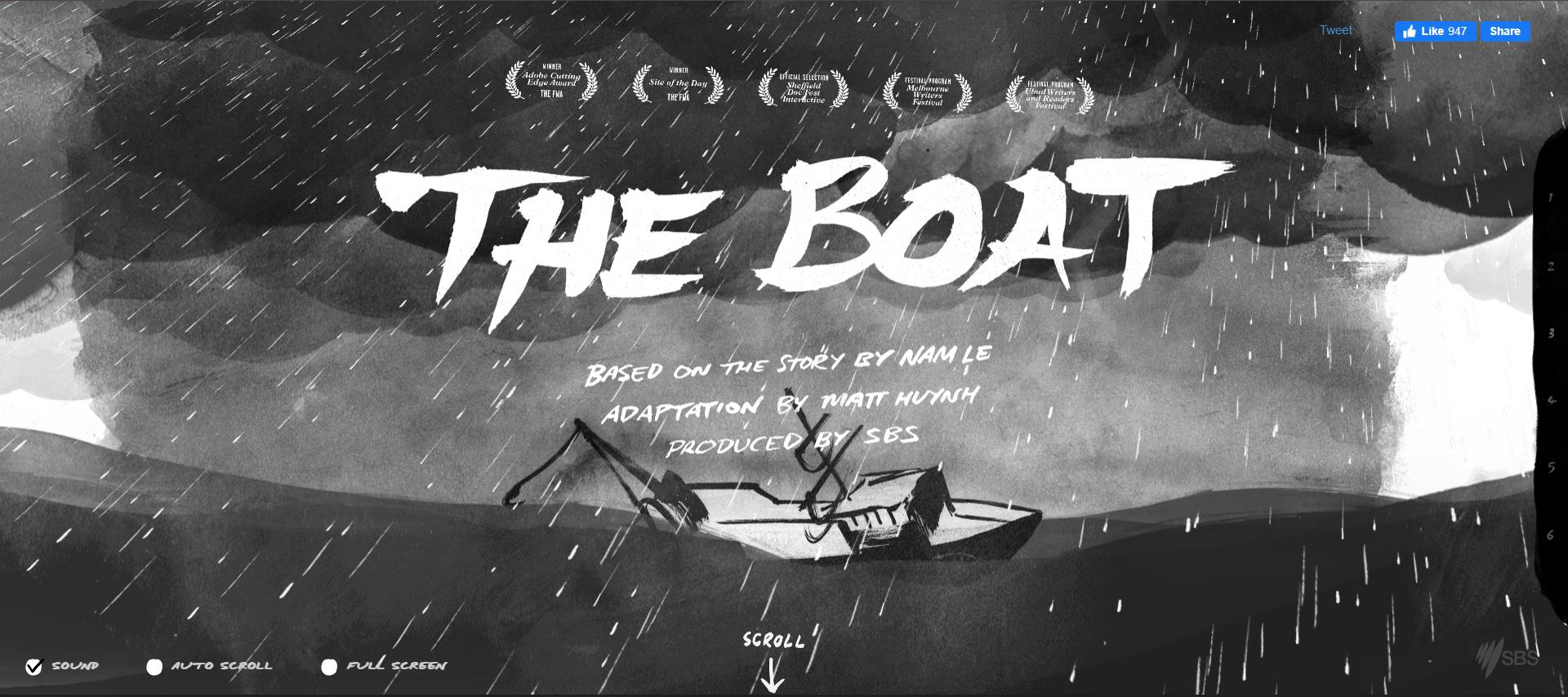
SBS - The Boat is one of the best examples of a website using parallax scrolling effects. It showcases an intricate and immersive parallax design to tell a powerful story of refugees escaping in the aftermath of the Vietnam War. (Image source)
"The Boat" is one of the most widely recognized websites using parallax effects. It uses a complex parallax design to showcase the phenomenal story of refugees fleeing after the Vietnam War. This web-based adaptation uses a boat as a central theme, with parallax effects moving side to side, incorporating the sounds of the boat for added effect. The design implies more substantial immersion for the user.
II. Fade-in and fade-out
Fade-in or fade-out effects are among web design's most straightforward scrolling effects. Unlike parallax effects, these focus on altering the visibility of specific elements or sections on the screen as users scroll.
A fade-in effect progressively makes an element appear, while a fade-out effect causes it to disappear. Both effects transition elements between transparent and visible states, creating smooth and subtle changes upon scrolling.
Example:
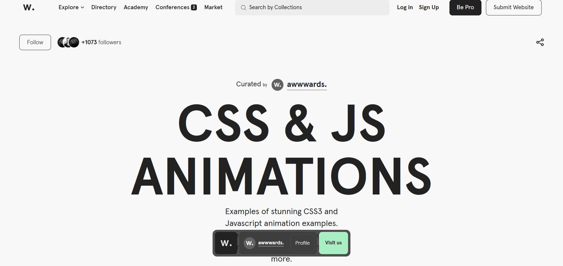
The Awwwards website showcases the best websites across various categories, featuring fade-in transitions for elements such as text, images, and interactive sections. (Image source)
The Awwwards website lists down the best websites by category while implementing smooth fade-in transitions for elements like text, images, and interactive sections.
III. Scroll-triggered animations
Scroll-triggered animations are scrolling effects that alter web elements, including background color, graphics, or even position or size, based on the scroll position.
Like parallax effects, these animations can highlight essential elements, such as calls to action or key sections. This effect is ideal for product pages, where one can add scrolling tempo, zoom in, or change background colors as they enter or exit the viewport to draw attention to essential website details.
Example:
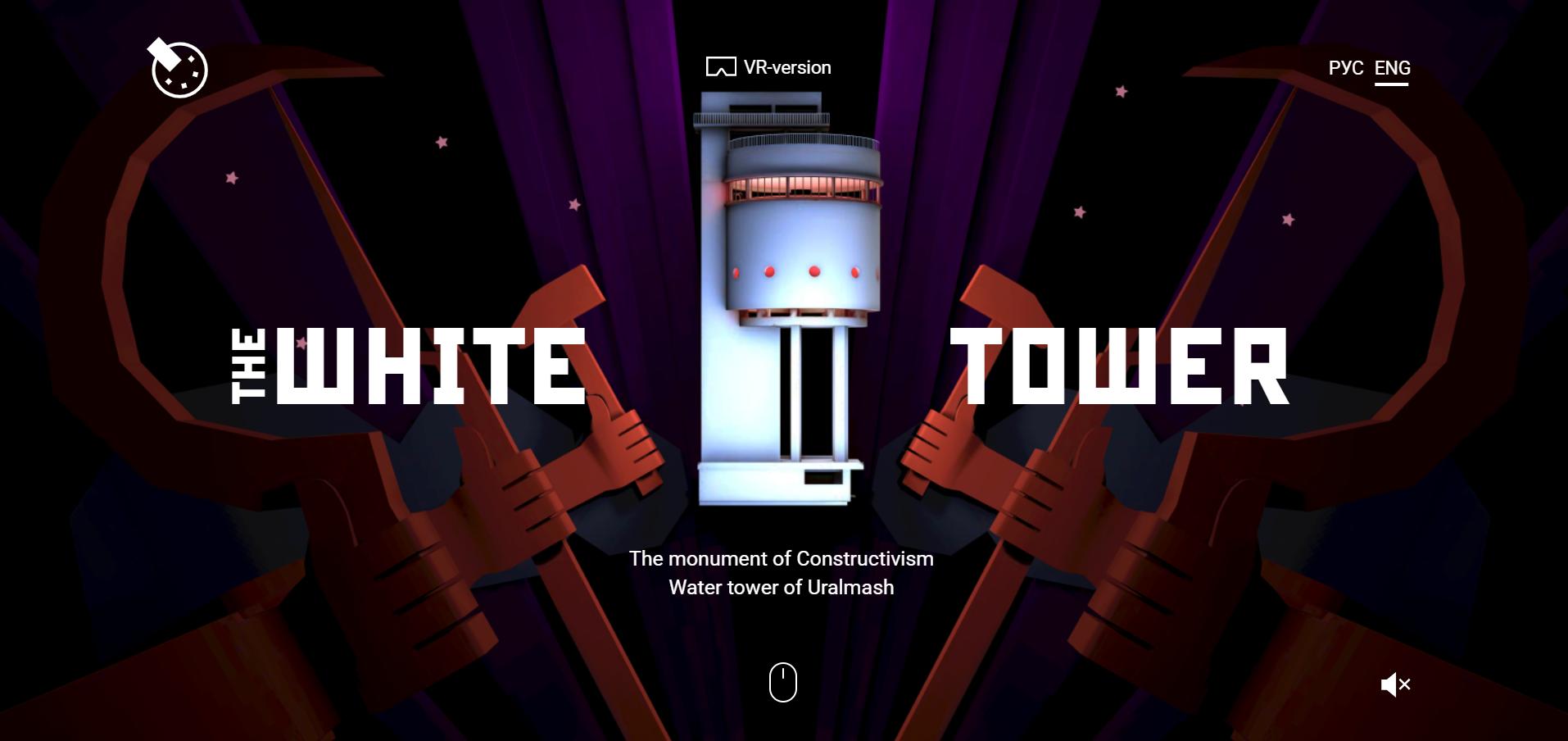
The Wtower website is a stunning example of storytelling through scroll-triggered animations, where each element connects like pieces of a puzzle to explore the history of the White Tower and its associated issues. (Image source)
The Wtower website, created by a Russian digital agency — JetsStyle, is a fantastic example of storytelling with scroll-triggered animations that fit together like puzzle pieces. While it use parallax effects, it primarily showcases a 3D experience that explores the origins of the White Tower and its associated issues.
IV. Sticky scrolling
Sticky scrolling is commonly used on websites for elements like menus, footers, or sidebars. This scrolling effect "sticks" these elements to a defined position on the screen, keeping them visible as the user scrolls down the page.
Example:
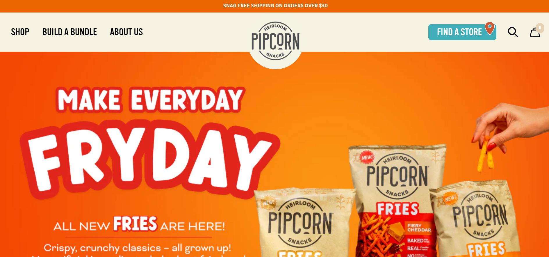
he Pipcorn Heirloom Snacks website contains a clean and user-friendly sticky navigation bar that remains fixed at the top of the page as users scroll. (Image Source)
The Pipcorn Heirloom Snacks features a simple sticky navigation bar at the top as users scroll down the page.
V. Zoom in or out
Zoom-in or zoom-out effects enable elements such as images and illustrations to increase or decrease in size relative to the user's scroll. This effect is usually combined with parallax effects to create smooth animations, emphasize key details, or draw attention to specific sections of a web page.
Example:

The Goonies website, inspired by the iconic 80s movie, combines parallax scrolling with zoom-in and zoom-out effects to create the illusion of peering through bushes, adding a layer of depth to the website design. (Image source)
The Goonies, an 80s movie-inspired website, incorporates a parallax combined with a zoom-in and zoom-out scrolling effect. This design creates the illusion of looking through bushes, which adds an adventurous feel to the experience. In addition, users also feature a skull silhouette that zooms in and out proportionately to how they scroll.
VI. Scrolling progress bars
Scrolling progress bars are commonly used on news websites, blogs, and sites with long-form content. They show the progress of how much content is displayed upon scrolling on a web page, which is typically displayed using a progress bar at the top of the screen or in the sidebar. This effect is efficient, especially for longer pieces of content, since it gives readers a clear sense of direction and completion.
Example:
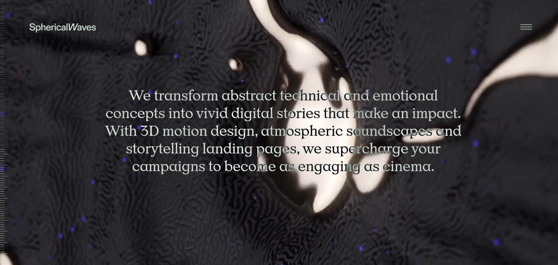
The Spherical Waves website showcases a captivating web design that combines a parallax scrolling effect with a dynamic progress bar on the sidebar to create a visually engaging and interactive user experience. (Image Source)
The Spherical Waves, a creative studio based in the Netherlands, features a website that incorporates a parallax effect with a scrolling progress bar on the sidebar complemented by spherical animations. The website progresses through various interactive scrolling effects and animations as users scroll, including fading and zooming.
VII. Multidirectional scrolling
The multidirectional scrolling effect is less commonly used due to its sophisticated navigation behavior. It allows users to scroll in various directions—both vertically and horizontally—depending on how they interact with the website.
While multidirectional scrolling can help communicate online portfolios, galleries, or other interactive content, careful planning is needed to avoid user confusion.
Example:
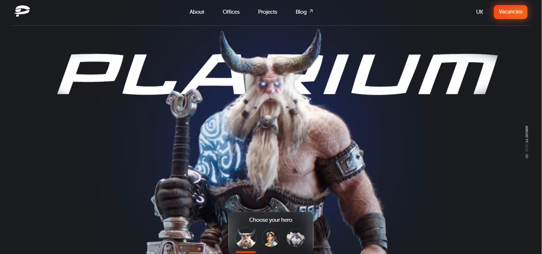
The Plarium Meet features a website with a unique combination of horizontal and vertical scrolling and dynamic animations. This innovative design provides users with interactive options to explore text, images, and video content by scrolling in multiple directions. (Image source)
The Plarium Meet, a game development company, showcases a horizontal and vertical scrolling website. This unique design offers users an interactive experience, allowing them to scroll in multiple directions to explore text, images, and video content.
Benefits of using scrolling effects in web design
When implemented properly, scrolling effects can guide users to essential information on a web page and encourage them to take actions like clicking on calls to action (CTAs) or filling out forms. They can also enhance navigation, storytelling, and interactivity.
Here are some of the main advantages of scrolling effects in web design:
1. Stunning visual interactive design
Visual interactive features like parallax and scroll-triggered animations, add dynamics to visual elements and creativity to your website. This makes the user experience more immersive than static designs while guiding users' attention to key sections and encouraging them to take desired actions.
2. Enhanced usability
Sticky scrolling and progress bars can make navigation intuitive and enhance website usability. Sticky navigation keeps essential elements, such as menus or buttons, always accessible. At the same time, progress bars provide a clear visual indication, showing users how much content they've consumed and how much is left. This produces a sense of direction, progress, and completion while browsing the website.
3. Dynamic storytelling experience
When your website has a narrative to share, scrolling effects can help guide users through the story and deliver the information more effectively. Integrating animations on graphics, videos, and other related elements delivers an engaging and immersive storytelling experience than simply putting out text and images on a website.
For example, a website development agency that works on a website might use a combination of a parallax effect and scroll-triggered animations to tell the story of its founding and the benefits of its products or services. As users scroll down the page, they can see impactful narratives, compelling statistics, and customer testimonials that are progressively revealed.
4. Longer user engagement
The Nielsen Norman Group research shows that 74% of visitors interact with content within the first two screen lengths.
This means that by adding dynamic animations like scrolling effects to your website, you can capture users' attention quickly and reduce bounce rates. Scrolling effects transform static pages into dynamic and immersive experiences, influencing users' behavior and encouraging them to explore the page more.
How to implement scrolling effects on your website?
There are many ways to add scrolling effects to your website. You can utilize HTML5, CSS3, and JavaScript to create animations and depth as users scroll through your site. If you’re weighing whether to staff this internally or collaborate with an external team, reviewing portfolios from top website design companies can help set a realistic bar for motion quality, performance, and cross-device reliability. While there are different types of scrolling effects, let's focus on a simple parallax effect.
The following guide explains how to implement a basic parallax effect.
Step 1: Set up the HTML structure
First, create a basic HTML structure with multiple sections to implement the parallax effect. Each <div> with the .parallax class serves as a container for a background image, while the .section-content class holds textual content. Each .parallax section is assigned a unique id to apply unique background images.
<!DOCTYPE html>
<html lang="en">
<head>
<meta name="viewport" content="width=device-width, initial-scale=1">
<link rel="stylesheet" href="https://cdnjs.cloudflare.com/ajax/libs/font-awesome/6.5.1/css/all.min.css"></link>
<style>
@import url('https://fonts.googleapis.com/css2?family=Merriweather:ital,wght@0,300;0,400;0,700;0,900;1,300;1,400;1,700;1,900&family=Poppins:ital,wght@0,100;0,200;0,300;0,400;0,500;0,600;0,700;0,800;0,900;1,100;1,200;1,300;1,400;1,500;1,600;1,700;1,800;1,900&display=swap');
</style>
</head>
<body>
<!-- Parallax Section 1 -->
<div class="parallax" id="section1">
<div class="content">
<h1>Parallax Scrolling Demo</h1>
<p>Scroll down to see the effect!</p>
<i class="fa-solid fa-circle-arrow-down fa-3x"></i>
</div>
</div>
<!-- Content Section 1 -->
<div class="section-content">
<h1>Content Section 1</h1>
<p>This is section no. 1, I hope you like it!.</p>
</div>
<!-- Parallax Section 2 -->
<div class="parallax" id="section2">
<div class="content">
<h1>Scroll Further</h1>
<p>Continue scrolling to see more parallax magic!</p>
</div>
</div>
<!-- Content Section 2 -->
<div class="section-content">
<h1>Content Section 2</h1>
<p>This is section no. 2. It has its text content too.</p>
</div>
<!-- Parallax Section 3 -->
<div class="parallax" id="section3">
<div class="content">
<h1>Almost There</h1>
<p>Keep scrolling for more parallax layers!</p>
</div>
</div>
<!-- Content Section 3 -->
<div class="section-content">
<h1>Content Section 3</h1>
<p>Another content section. This is content no. 3.</p>
</div>
<!-- Parallax Section 4 -->
<div class="parallax" id="section4">
<div class="content">
<h1>Keep Going</h1>
<p>The parallax effect continues as you scroll!</p>
</div>
</div>
<!-- Content Section 4 -->
<div class="section-content">
<h1>Content Section 4</h1>
<p>This is section no. 4. Hope you are enjoying the scrolling effect so far.</p>
</div>
<!-- Parallax Section 5 -->
<div class="parallax" id="section5">
<div class="content">
<h1>Almost Done</h1>
<p>The final parallax section. Enjoy!</p>
</div>
</div>
<!-- Content Section 5 -->
<div class="section-content">
<h1>Content Section 5</h1>
<p>Final content section. Hope you enjoyed the parallax scrolling effect!</p>
</div>
<!-- Parallax Section 6 -->
<div class="parallax" id="section6">
<div class="content">
<h1>Thanks for Scrolling</h1>
<p>We hope you enjoyed this parallax experience!</p>
</div>
</div>
<!-- Content Section 6 -->
<div class="section-content">
<h1>Content Section 6</h1>
<p>This is the last content section. The parallax scrolling effect has finished.</p>
</div>
<!-- Footer -->
<footer>
<p>© 2025 Parallax Scrolling. All Rights Reserved.</p>
</footer>
</body>
</html>Step 2: style the Parallax effect with CSS3
Next, add the following CSS rules to a .css file.
To keep background images fixed while scrolling. The background-attachment: fixed; rule ensures that the images remain fixed as users scroll. Meanwhile, the .section-content class styles improves the readability by adding an overlay effect to the text.
To enhance the effect, we will make the text fade in as it enters the viewport by setting opacity: 0;. This keeps the text hidden until JavaScript detects it later on. Lastly, for a smooth transition, add transition: opacity 1s ease; rule to create a fading effect.
body, html {
 margin: 0;
 padding: 0;
 height: 100%;
 font-family: 'Poppins', sans-serif;
 font-size: 16px;
 }

 /* Common styles for the sections */
 .parallax {
 position: relative;
 width: 100%;
 height: 100vh; /* Full height of the viewport */
 background-attachment: fixed;
 background-position: center;
 background-repeat: no-repeat;
 background-size: cover;
 }

 /* Parallax sections with different background images */
 #section1 {
 background-image: url('images/slide-1.jpg');
 }

 #section2 {
 background-image: url('images/slide-2.jpg');
 }

 #section3 {
 background-image: url('images/slide-3.jpg');
 }

 #section4 {
 background-image: url('images/slide-4.jpg');
 }

 #section5 {
 background-image: url('images/slide-5.jpg');
 }

 #section6 {
 background-image: url('images/slide-6.jpg');
 }

 /* Content styles */
 .content {
 position: absolute;
 top: 50%;
 left: 50%;
 transform: translate(-50%, -50%);
 text-align: center;
 color: white;
 z-index: 10;
 opacity: 0; /* Initially set opacity to 0 for fade-in effect */
 transition: opacity 1s ease; /* Fade-in transition */
 }

 .content h1{
 font-family: 'Merriweather', sans-serif;
 font-size: 3.5em;
 }

 .content p{
 font-size: 1.5em;
 }

 .section-content {
 padding: 80px 20px;
 text-align: center;
 color: white;
 background-color: rgba(0, 0, 0, 0.6); /* Slight dark overlay for text readability */
 }

 .section-content h1 {
 font-size: 3.5em;
 font-family: 'Merriweather', sans-serif;
 }

 .section-content p {
 font-size: 1.5em;
 }

 footer {
 background-color: #333;
 color: white;
 text-align: center;
 padding: 20px 0;
 }

 /* Add smooth scroll behavior */
 html {
 scroll-behavior: smooth;
 }
Step 3: use JavaScript to trigger the fade-in effect
Finally, add the following JavaScript code inside the <script> tag to detect when a section enters the viewport and fade in the text.
<script>
 window.addEventListener('scroll', function() {
 const contents = document.querySelectorAll('.content');
 const windowHeight = window.innerHeight;

 contents.forEach(content => {
 const contentTop = content.getBoundingClientRect().top;
 if (contentTop < windowHeight * 0.8) {
 content.style.opacity = 1; // Fade in the content
 }
 });
 });
</script>
The script above checks whether the elements with .content class appear on the screen and progressively makes them visible. The window.innerHeight method returns the height of the visible part of the screen while the content.getBoundingClientRect().top measures the distance of each .content class element from the top of the viewport.
When the element appears on the screen, the script changes the opacity to 1 to make a smooth fade-in effect.
You can check the demo here.
Effective use of scrolling effects in real websites
Below are some case studies and examples of scrolling effects, including parallax scrolling and scroll-triggered animations, and how they can be a great tool for creating visually appealing and interactive websites.
Parallax scrolling in storytelling
According to research conducted by Purdue University, participants concluded that websites that implement parallax scrolling are superior, noting increased engagement and lesser bounce rates. Most importantly, 70% of users concluded they were more likely to explore these user-friendly designs for extended periods due to their immersive narratives and dynamic visual elements.
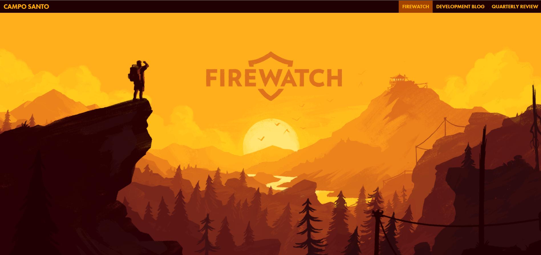
The Firewatch game website uses the parallax scrolling effect to highlight its storytelling and captivate users with its narrative. As users scroll, the background and foreground elements shift at different speeds while simultaneously promoting the game through available media such as text, images and videos. (Image source)
The official website for the game Firewatch uses parallax scrolling to create an engaging storytelling experience.
As users scroll down the web page, the background and foreground elements move simultaneously to showcase the narrative while promoting the product using text, images, and videos.
Key features of parallax scrolling:
- Multi-layer background and foreground images that create a 3D effect.
- Smooth transitions between scenes.
- Integration of text and visuals to guide the storytelling.
- Additional video content to demonstrate the gameplay.
Scroll-triggered animations for interactive content
Based on websitedesigners.com, a case study provided by a prominent UX design agency claims that micro animations on websites resulted in a 20% increase in engagement and a 15% reduction in bounce rates. These subtle animations boost interactivity and engage users in a website's content.
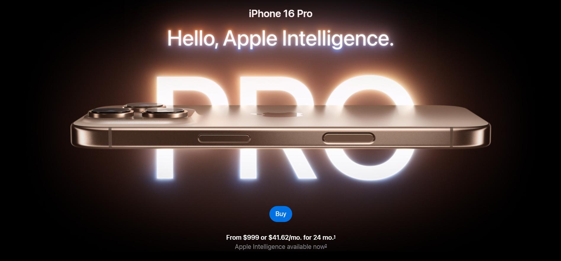
The iPhone Pro 16 product page features different animations to highlight its features, such as color options, display, battery life, and more. As users scroll, elements fade in, shift, or transform to give an engaging and interactive experience. (Image Source)
A good example of this study is Apple’s product pages, known for their effective use of scroll-triggered animations. For instance, users can see various animations on the iPhone Pro 16 product page when scrolling, showcasing colors, display, battery life, and more.
As users scroll, elements fade in, move, or transform to create an interactive user experience.
Key features of apple’s scroll-triggered animations:
- Animations triggered by both mouse click and scroll position.
- Smooth transitions between sections.
- Visual storytelling to emphasize product features.
- Video content to demonstrate the product features.
Conclusion
Scrolling effects are a dynamic way to create interactive and engaging websites. Understanding its benefits, best practices and proper implementation can enable website owners to provide powerful experiences that exceed conventional web layouts. These effects are efficient for storytelling and brand promotion.
Carefully selecting and implementing scrolling effects can create a standout UX that differentiates your website from competitors.
Feb 13, 2025

Creates insightful, strategy-driven content that translates complex design and branding concepts into accessible knowledge, supporting Ramotion’s mission to elevate digital experiences.