Introduction
Users access websites from various devices with different screen sizes and software technologies. For UI/UX professionals working on website design, it is essential to understand and meet the needs of all target audiences, irrespective of the devices they use to browse the internet.
For organizations to maintain a solid online presence, attracting a diverse group of users and keeping them engaged is critical. This is where thinking about different website design options comes into play. Collaborating with a professional responsive web design company helps organizations build adaptable, user-focused websites that perform seamlessly across devices and screen sizes.
In this article, we discuss the two critical—and popular—strategies of web design: responsive design and adaptive design. We introduce the basic concepts with real-world examples, followed by the pros and cons of each approach.
Read along as we discuss these exciting concepts that the design field often refers to regarding websites.
Understanding Responsive Design
Responsive design is one of the two popular website design and development approaches. Because responsive work often spans brand, content, and platform constraints, scanning how the best web design companies structure delivery (teams, process, and technical depth) can support a more confident build-vs-partner decision. The primary objective is to ensure that the users interact with the same responsive site irrespective of the device on which they are browsing the internet.
What is responsive design?
Responsive web design is a website design approach that adapts to users' needs, particularly the device on which they browse the internet. It aims to have the same appearance and usability regardless of the device it displays.
Responsive web design creates adaptable interfaces using fluid grids, CSS media queries, and flexible images. With these techniques, the designers and developers ensure that users have an optimal viewing experience whether viewing the website on a desktop or interacting with a mobile website.
The key to a good, responsive design is right there in the name of responsiveness. Websites created on this principle have a consistent design across all devices. A single version of the website is created that can mold itself—or be responsive—based on the device it is being displayed on.
Examples of Responsive Web Design
There are several remarkable examples of responsive sites. Leading organizations employ the utility of this approach to enhance the user experience.
Dribble
Dribble’s existing website is an excellent example of responsive design. One of the key elements used by Dribble is a flexible grid. The grid can expand or compress depending on the available screen size and space when viewed on different devices. This makes it easier for users to browse the content engagingly without causing any clutter.
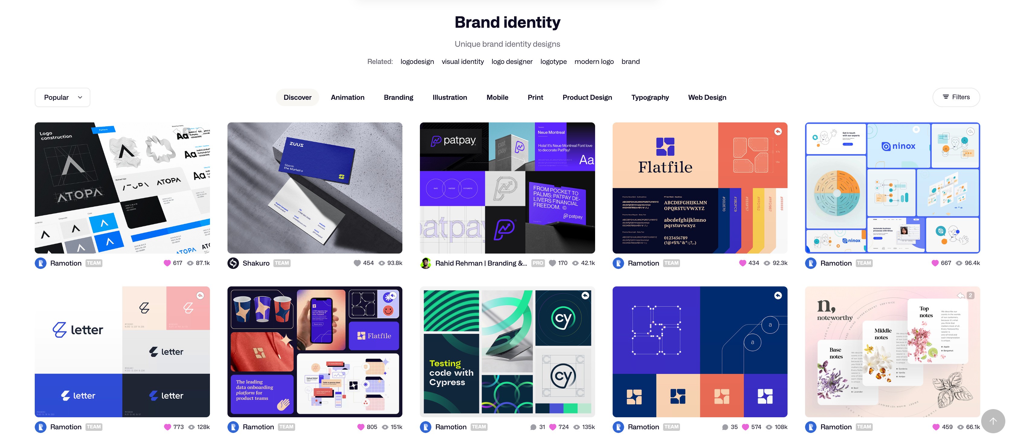
The Responsive Design of Dribble ((Image source) [https://dribbble.com/search/brand-identity)])
Apple
Apple presents another classic example of a responsive design where the design adjustment is seamless for a desktop or mobile site. When viewed on a desktop or laptop, Apple’s website displays high-resolution images with more elaborate navigation. The resolution and size of pictures and the navigation style change for mobile devices, easily suiting the smaller display without losing any details.
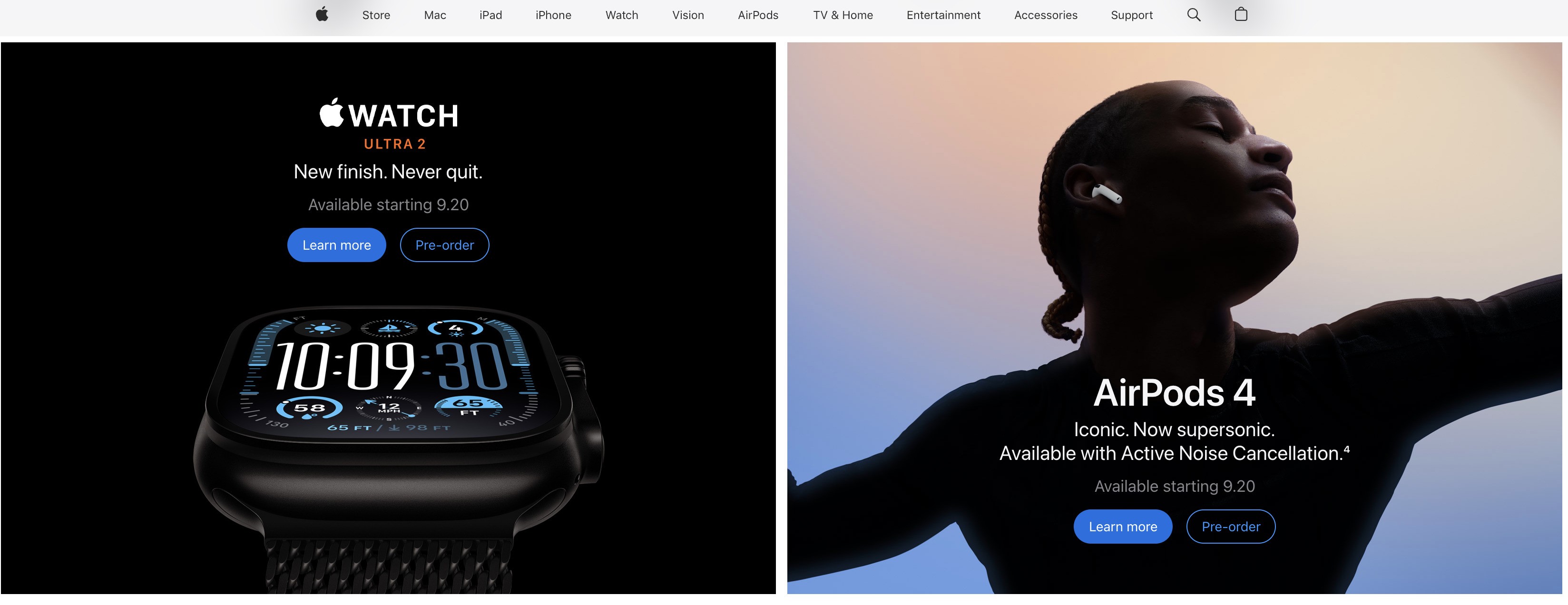
Apple’s Responsive Design ((Image source) [https://www.apple.com/)])
Understanding Adaptive Design
Adaptive web design is another popular approach to the design of modern and sophisticated websites. In adaptive design, the primary idea is to create different versions and layouts of the same website and display the one that is the most compatible with the user’s device.
What is adaptive design?
Adaptive web design is the approach where different versions of the same website are created to meet the needs of various devices. In this case, the goal is to pick the version appropriate for a device and then show it to the user.
Contrary to responsive design, where a website is flexible and adjusts to the device, adaptive design takes a status approach to design. Multiple website layouts are designed separately for predefined screen sizes. Therefore, the appropriate version is loaded and displayed once the user's device is detected.
Adaptive design is beneficial as it ensures correct optimization based on the user’s needs and gives more flexibility and control over the design.
Examples of Adaptive Web Design
Some of the best examples of adaptive sites are discussed below.
Amazon
Amazon is a unique example of adaptive site design. The website adheres to the principles of responsive design. However, the mobile application relies on adaptive design techniques. The interface for Amazon’s mobile application is quite different but highly engaging. It is mainly designed to use the touch and swipe features with ease.

The Adaptive Design of Amazon ((Image source) [https://www.amazon.com/)])
Zillow
When it comes to creating adaptive sites, Zillow does an excellent job. However, the nature and presentation of information in the desktop and mobile versions of Zillow differ significantly.
For instance, the desktop version has detailed maps, while the mobile version has condensed navigation and fewer details. The overall experience takes priority regardless of the device being used.

Zillow’s Adaptive Design ((Image source) [https://www.zillow.com/)])
Pros and Cons of Responsive Design
Responsive web design has several advantages when it comes to enhancing the user experience and creating improved versions of websites. However, this approach has its shortcomings as well.
Benefits of Responsive Design
Responsive web design provides seamless adjustment between different devices, ensuring consistency in user experience. Below are some of the most essential benefits of responsive web design.
Better user experience
With responsive websites, the overall user experience is significantly improved. The consistency of design across all devices and the seamless adjustment based on screen size make responsive design popular for designers who focus on enhancing user experience.
Cost-effectiveness
Since the developers do not have to create multiple versions and different layouts of the same website, responsive web design is cost-effective. Additionally, the website's overall maintenance cost is reduced as only one version requires attention. Therefore, this approach to web design saves time, money, and resources.
Increased reach and accessibility
With the help of responsive design, the overall reach and accessibility of the website are increased. The website can adjust for different devices with varying requirements and different screen sizes, thus reaching a broad audience base. Similarly, a responsive website is more accessible to people with disabilities and special needs, adjusting to technologies such as screen readers for every device.
Long-term solution
Responsive design is a flexible approach to website design and development. As new screen sizes appear, a responsive site can adjust to those, making it a suitable long-term solution.
Drawbacks of Responsive Design
Despite its usefulness and improvement in the user experience, responsive web design has several drawbacks. Some important ones are as follows.
Increased load times
One significant issue with responsive designs is that they take a long time to load. Responsive websites' page load speed is slower than that of adaptive alternatives. The primary reason behind this slower performance is that duplicate files and assets are loaded for all devices with all screen sizes. Therefore, devices with slower processing times, such as mobile devices, take longer to load responsive websites.
Complex development
Creating responsive websites is a complicated process compared to adaptive ones. This is because developers must ensure that all devices' requirements, such as resolutions and screen widths, are incorporated into a single version. So, on the one hand, a responsive website can save on maintenance costs, but, on the other hand, the development costs can rise.
Limited control over design
The layout is less controlled in responsive web design. Since the design must adjust to the screen size dynamically, the developers must be careful with the website's customizations and features. The development process, therefore, requires attention to detail and high-level expertise.
Pros and Cons of Adaptive Design
Adaptive web design is an excellent way to create optimized versions of a website, thus meeting the needs of various devices. With the help of adaptive design, developers can create the exact layouts that would work best for different screen sizes, dimensions, widths, and resolutions. However, there are several drawbacks, including high maintenance costs and rigidity in design.
Benefits of Adaptive Design
When users interact with adaptive design, they get an optimized experience based on the device they are browsing the internet. This is one of the critical advantages of adaptive web design, which positively impacts the overall user experience.
Optimized performance
Adaptive web design focuses on creating an optimized experience for desktop and mobile phones and other possible versions. Optimizing content and creating an appropriate layout are essential aspects of this approach. This is why, with the help of adaptive websites, it is easier to create desktop—and mobile-friendly versions of the same websites, ensuring optimized performance.
Greater control over design
The developers work with precise screen sizes, resolution specifications, and other device-specific requirements regarding adaptive web design. This information makes it easy to create better versions of websites. Additionally, as the developers create multiple versions of websites and do not use a single website to serve all devices, there is greater control over—and more flexibility with—the design.
Faster loading times
In adaptive web design, developers create different versions of the same website for various devices. This means all the elements, such as images and other media content, are optimized for these versions, significantly improving the loading times on these devices.
Tailored marketing campaigns
Adaptive websites help designers and developers run tailored marketing and advertising campaigns for different devices. For example, the mobile device audience can see different advertisements and calls to action than the desktop audience, thus giving them more control over marketing.
Drawbacks of Adaptive Design
Though adaptive web design has many benefits, it also has some drawbacks, making it challenging to meet the needs of every organization and website. Some of the key disadvantages of adaptive web design are as follows.
High development costs
It is important to note that developers create multiple versions and layouts when developing adaptive websites. Therefore, the development cost is significantly increased. In addition to the financial aspect, the overall time and resources required to create different website versions are also higher.
Complex maintenance
Adaptive websites are more rigid, and their maintenance is more complicated. All changes made to the design and updates in the functionality need to be applied across multiple versions to ensure consistency and a better experience. The problem gets more complex when there are some significant changes, such as rebranding.
Long-term customization limitations
With technological advancements and new devices emerging, adaptive websites find it challenging to keep up with the changes. A solution for long-term design requires that websites be robust and flexible. The rigid nature of adaptive sites needs to meet this, posing a challenge to designers.
Choosing Between Responsive and Adaptive Design
Now that we know about the utility of adaptive and responsive design in creating efficient and user-friendly websites let's address the all-important question: Which design strategy is better, and how can developers make this choice?
It is important to note that designers and developers must agree on the need for modern designs with better user experience. This means the aesthetic requirements must be balanced with the technical limitations. Additionally, it is critical to keep an eye on the overall business needs and goals.
Factors to Consider
Designers and developers must consider several factors when deciding between responsive and adaptive design. Some of the critical factors are discussed below.
Target audience and devices
When choosing a web design approach, it is always important to consider the target audience. Simple questions about the devices the target audience will use to interact with your website can help you understand the type of design you need. A quick user research and needs analysis will also help you make this decision.
Budget and resources
Cost is always an essential factor when choosing the type of web design. Along with the financial concern, it is also essential to consider other resources such as time, tools, and personnel. Depending on the business needs and availability of resources, designers, and developers can make an informed decision.
User experience control
Another essential thing to remember when designing a website and choosing between adaptive and responsive approaches is the level of control you need over the layout and user experience. Depending on the preference of user experience control, you can choose the approach that best meets your needs.
SEO implications
It is critical to consider SEO for your business to perform well. If your website's search engine optimization is up to the mark, it will perform better and attract more visitors. Adaptive and responsive websites offer different ways to handle SEO, and it is essential to be aware of this concern.
Maintenance and scalability
Your long-term business goals and overall business and content strategies are also essential factors to consider when choosing the website design approach. Your plans for the website also make you think about the maintenance question, which is where the design choice becomes even more critical.
Summary of Key Factors
The table below summarizes the key factors when choosing between adaptive and responsive website design.
| Factor | Responsive Web Design | Adaptive Web Design |
|---|---|---|
| Target audience and devices | If your target audience is using a variety of devices with different requirements, responsive design is a better choice. | If your target audience is using some specific devices and there is little variety, adaptive design is preferred. |
| Budget and resources | The development and maintenance of responsive websites are less costly but more complex. However, it will require more time to create such websites. | The development and maintenance of adaptive websites are more costly as you’re creating and maintaining multiple versions of the same website. |
| User experience control | Responsive websites provide a more consistent experience across all devices, but the control over smaller elements is limited. | Adaptive websites provide granular control over elements but this can impact the consistency across all devices. |
| SEO implications | Google recommends responsive websites for better SEO. It is also easy to manage SEO as you’re only dealing with one version. | Good optimization of adaptive websites is possible but it requires more time and effort as you’re working on multiple versions. |
| Maintenance and scalability | Responsive websites are easy to maintain and work as a better long-term solution. | Scalability with adaptive websites can be a little challenging as you might have to create new versions. |
Conclusion
UX designers and developers have several options for designing and developing high-quality websites. Responsive and adaptive web design are two popular approaches with advantages and disadvantages.
This article presented a picture of responsive vs adaptive web design. We provided a comprehensive overview of these approaches followed by their comparison. To pick what is right for your business, you must first understand your audience, business goals, and the nature of the content. This will help you make an informed decision about the design approach.
It is essential to pick the right approach for your website, as this is critical in attracting and engaging the right audience. Efficient websites always significantly impact an organization's overall performance.
Oct 7, 2024

Creates insightful, strategy-driven content that translates complex design and branding concepts into accessible knowledge, supporting Ramotion’s mission to elevate digital experiences.