Introduction
The best and most effective designs in branding, graphic design, or user interfaces are rarely (if ever) accidental. They rely completely on a set of foundational design principles to convey balance, cohesion, and impact. Modern-day designers use these principles to guide users, build emotions, and communicate messages. Without them, designs risk feeling chaotic, overwhelming, and ineffective.
These principles of design help set a universal structure for creating visuals that don’t just look good but actually work as intended, too. Understanding these principles means understanding how to guide a user, balance visual weight, and emphasize the most important elements of your work.
The core principles of design
Ask any designer and they’ll tell you: Design principles are the bedrock of any compelling visual communication. They provide the crucial framework for creating designs that are aesthetically pleasing, purposeful, and effective.
These principles really are your best friend when creating purpose-built designs that also attempt to resonate with your audience. And this is a package deal: While each principle plays its own crucially unique role in guiding your user’s eye, establishing balance, and emphasizing key elements — they’re best used together.
Let’s start by exploring what we consider to be the eight core principles of design — balance, contrast, emphasis, repetition, proportion, movement, white space, and unity. No matter if you’re working on a website, branding materials, or a user interface; understanding these principles will bring your designs to completely new levels.
1. Balance
What is balance?
In design, balance refers to the distribution of visual weight across a composition. It helps create strength and harmony while also making sure that no aspect of the design feels “too much,” needless, or forgotten. Balance is a fundamental principle that determines how your audience interprets a calm and organized a design.
How balance can affect designs
Balanced designs are recognized by their visual stability, allowing users to navigate through content without strain. When a design lacks balance, it can seem chaotic or even unfinished.
3 different types of balance
- Symmetrical balance is when elements are evenly arranged across a central axis, bringing order and formality to your designs. Think about wedding invitations or corporate logos—they often use symmetrical balance to create a sense of stability and structure.
- Asymmetrical balance: This happens when different elements balance each other through visual weight, building a sense of energy and movement often seen in modern web design layouts. A common example is a bold hero image on the left side of your website, which balances some smaller, lighter text and white space on its right.
- Radial balance: In this case, design elements radiate out from a central point of reference, just like ripples in water or the design of mandalas.
Practical example: The layout of a software company’s home page (let’s take Salesforce as an example) might use asymmetrical balance. A large, bold image or video sits on one side and is counterbalanced by negative space and smaller supporting text on the other. This creates a modern, dynamic feel while also maintaining balance.
2. Contrast
What is contrast?
Contrast is essentially the difference between elements in a design. Things like color, shape, size, or texture. It highlights the key components and creates a visual hierarchy that helps users focus on what’s important.
So why is contrast important?
Designs without contrast look flat, boring, and unengaging. Contrast highlights the main focal points, increases readability, and guides the user through the visual.
How to get good contrast
- Color: Adding a bright color on top of muted ones instantly builds attention.
- Size: Bigger elements dominate the smaller ones, making them more distinct.
- Typography: Mixing bold headers with thin body text, for example, creates a hierarchy.
Real-world applications: Well-designed websites often use contrast to help call-to-action (CTA) buttons stand out. In branding, contrasting fonts and colors can establish a brand's personality—bold for young and cool brands and low-key for luxury brands.
3. Emphasis
What is emphasis?
Emphasis is a technique often used to highlight the most crucial element of your design. It allows the viewer’s attention to be drawn to your preferred focal point.
Techniques for creating emphasis
- Color: A smear of bright or contrasting colors can emphasize a particular element.
- Size: You can make an element a lot larger than surrounding components.
- Placement: Positioning an object centrally or within white space can build emphasis.
Practical example: If we look at things like poster designs, the headline is typically larger, brighter, and placed at the very top to draw attention. Supporting elements are kept smaller.
4. Repetition
What is repetition?
Repetition uses consistent design elements like shapes, colors, and fonts to establish continuity and harmony. This creates a sense of cohesion across the design.
Why is repetition effective?
Repetition is one of the cornerstones of building familiarity, improving brand recognition, and providing design structure. It helps the design feel unified rather than disjointed.
Example: The consistent use of blue and white in Facebook’s visual branding across web pages, apps, and ads strengthens its visual identity over time.
Repetition is especially useful in website navigation or product packaging, where consistency really helps build familiarity. In editorial layouts such as blogs or print, repeating certain typefaces, column widths, and other graphic symbols helps the content feel uniform and professional.
5. Proportion
What is proportion?
Proportion refers to the link between the size and the scale of the different elements in your design. It determines the visual hierarchy and guides the user’s attention to the most valuable components.
How scale and size can change perceptions
When one element is larger than another, it naturally commands more attention. By tweaking proportions, designers can control the flow and focus of a visual.
Example: With printed media, a large headline at the top of a page sets its importance. Supporting images or more minor subheadings show the user where its eyes should go next, creating a natural flow.
Bonus example: The golden ratio (roughly 1:1.618) is a recurring example of famous proportions used in design. This ratio — found in nature and art — creates visually pleasing and harmonious designs. Designers often use it to create grid systems in web design or to determine the perfect placement of elements in branding materials.
6. Movement
What is movement?
Movement in design is not about video or GIFs but how the user’s eye moves through a composition. It’s generally created using lines, shapes, and colors arranged naturally to guide attention toward key visual elements.
3 techniques for creating movement
- Lines and arrows: Directional lines or recognizable shapes help guide the eye.
- Positioning: Arranging elements in Z-patterns or F-patterns is a great way to keep users engaged.
- Color: You can also use gradients or bright colors to move the eye naturally across a design.
Example: Movement is paramount in UI and web design. Take the classic Z-pattern as an example. It starts with a bold headline at the top left of the page, moves to an image in the center, and ends with a CTA button in the bottom right. This pattern mirrors natural eye movement and helps improve user experience.
7. White space (negative space)
What is White Space?
White space, also called negative space, is the empty area in a design. This space helps separate content, reduce clutter, and create a sober, focused visual.
Why white space matters
White space is an incredible tool for improving readability, allowing different visual elements to breathe, and highlighting the most essential design parts. It’s also designers’ favorite weapon in the fight against visual overcrowding.
Example: Apple’s designs are known for their extreme use of white space. By isolating key visuals and content, their product becomes the design hero, creating a sense of elegance, luxury, and simplicity.
8. Unity
What is Unity?
Unity in design is all about the harmony of elements within a composition. It’s about ensuring that every part of the design works together, creating a polished and professional style.
Three tips for achieving unity
- Consistency: Always use the same color palette, typography, and spacing. Consistency is key.
- Alignment: Make sure to align elements to support structure and connection.
- Repetition: Try to repeat patterns, shapes, or colors to unify the design experience.
Example: A great brand identity system achieves unity by staying consistent across all platforms, from logos and business cards to social media posts and customer interactions. The always-occurring (but still relevant) example is Coca-Cola’s red-and-white color scheme and typography, forever unifying its global branding and keeping the sugary soda top-of-mind.
How to combine design principles?
The magic of design principles comes to life when they work together. Combining things like contrast, balance, emphasis, or any other principles will enhance a design's visual appeal and functionality and make the message more transparent, engaging, and impactful. When well-crafted design principles are intentionally combined, they create a harmony that turns good designs into extraordinary ones.
Why combining principles is so beneficial
Each design principle has a distinct and vital function that has an unthinkable power when combined. Balance provides visual stability, contrast adds a splash of energy, and movement takes the user on a journey. These elements create a seamless user experience, aesthetic appeal, and functional success when holding hands.
Tips for combining principles effectively
- Start with a focal point: Identify the aspect you want to emphasize, then use contrast and proportion to draw extra attention to it.
- Use white space to complement the balance: Make sure any busy area of your design is counterbalanced with some negative space to maintain that sweet harmony.
- Maintain a visual hierarchy: Combine proportion and emphasis principles to guide the user’s attention logically through the design, from the most important elements to the least.
- Apply repetition with variety: Consistently repeat colors, fonts, and patterns while adding just a pinch of variation to keep it interesting.
Example: A modern website’s home page often combines contrast, movement, and emphasis to deliver an in-your-face type UX. A hero banner probably uses bright colors and large text for direct impact, while movement through a Z-pattern layout helps the user’s eye flow unobstructed from the headline to the image and to the CTA.
Another bonus example: Logos are often based on multiple principles, too. Take the FedEx logo as an example: It cleverly combines negative space with emphasis and balance to create a hidden arrow that symbolizes speed and precision.
Real-world application
- It’s common to see a restaurant menu use balance to organize items into clear sections, contrast to highlight specialty dishes, and white space to avoid visual clutter.
- Packaging design tends to combine the repetition of branding colors with proportion to emphasize the product name and USPs.
How to apply design principles across disciplines?
It’s important to remember that these principles don’t belong to any one design principle. They’re versatile and can be applied across various fields, including graphic design, web design, UI/UX, and branding. Every discipline can adapt its principles to meet unique goals and challenges, demonstrating their universal importance.
| Discipline | Some Key Principles in Action |
|---|---|
| Graphic Design | Balance, contrast, and emphasis help you create visually appealing posters, logos, and ads. |
| Web Design | White space, contrast, and proportion are key to enhance navigation and overall readability. |
| UI/UX Design | Movement, emphasis, and hierarchy let’s you improve user flow and interactivity. |
| Branding | Unity, repetition, and contrast help maintain consistent, memorable brand identities. |
Graphic design
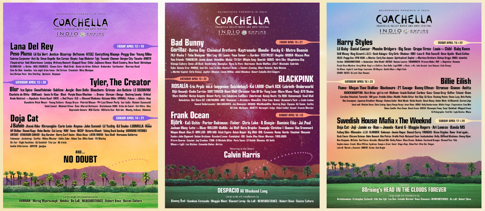
Principles like contrast, proportion, and emphasis are used widely in graphic design to create eye-catching visuals. Music festivals, for example, use posters with large, bold titles (emphasis) and bright colors (contrast) to grab your attention. Balance and white space then help the supporting elements like artists or sponsors to pop without overwhelming the main message.
Example: Magazine covers use proportion and contrast to draw attention to their main headline, often pairing bold typography with an attention-grabbing image. Supporting text, like article teasers, is arranged with balance and white space to sustain clarity and avoid overcrowding the design. This approach makes the reader’s eye immediately move to the focal points while still engaging the user with the secondary content.
Web design
For web designers, the UX heavily depends on principles like balance, movement, and negative space. A nice, clean layout with sufficient white space improves readability and reduces cognitive load. Buttons and CTAs are often emphasized using contrast and proportion to ensure users engage with the page in the intended way.
Example: Like its product visuals, Apple’s website uses much white space, clear hierarchy, and balanced imagery to highlight its products and seamlessly guide users toward purchase decisions.
UI/UX design
In UI/UX design, movement, alignment, and hierarchy are critical for business. Interactive interfaces guide users through an app or website in the most logical way possible. Subtle animations, like a smooth dropdown menu or hover effects, create movement to direct the user’s attention.
Example: Mobile banking apps use movement to assist the user in transitioning smoothly between pages, while hierarchy highlights the critical information (like account balances or transaction buttons), making it more prominent.
Branding
In branding, unity and repetition are the be-all and end-all. A strong brand identity system repeats design elements like logos, colors, and typography across platforms to create consistency and brand trust if all goes to plan.
Example: In Sacramento or Shanghai? Starbucks uses the same green-and-white logo and typography consistently throughout their global stores, packaging, and advertising — that way, they achieve instant recognition and can build brand loyalty.
Five common mistakes when using design principles
Mistakes can happen. And when it happens, it can result in designs that feel cluttered, confusing, ineffective, or straight-out offensive. So let’s learn from a few common errors so we don’t all repeat them:
1. Overusing contrast
| Mistake | An excessive use of contrast can overwhelm users and create chaos rather than focus. |
| Solution | Tone down the contrast by limiting it to key areas (headlines or CTAs), which will help maintain harmony in the rest of the design. Use muted tones or consistent fonts for supporting content. |
| Example | A poster with too much stuff going on can confuse users. Instead: Make sure to prioritize one bold color or font to highlight the key message. |
2. Forgetting balance
| Mistake | Unbalanced designs feel unstable and might just distract the user. |
| Solution | Use grid systems, natural alignment, and proportional spacing to create balance. |
| Example | Websites with all elements pushed to one side can feel unfinished. By adding white space or counterbalancing with images, you can restore the visual harmony. |
3. Cluttered Layout
| Mistake | Overloading a design with elements creates visual mayhem and reduces user comprehension. |
| Solution | Keep it simple. Less elements, and more white space — providing breathing room. |
| Example | A non-designer might want to pack every piece of information into a single brochure, which can feel quite overwhelming. A designer, however, would try to space the sections out to improve readability. |
4. Inconsistent Repetition
| Mistake | Relying too heavily on repetition can make a design feel monotonous and boring. |
| Solution | Try to introduce some variety within a consistent theme instead. This will keep it consistent while maintaining visual interest. |
| Example | A website that’s using identical headings throughout can feel quite flat. Alternating font weights or just adding some color variations can help break the monotony. |
5. Ignoring Proportion
| Mistake | Scaling elements the wrong way messes with the hierarchy of information. |
| Solution | Make sure that larger elements emphasize the key messages, while smaller ones just support the overall flow. |
| Example | A massive block of text overshadowing an image can throw users off. Adjusting the proportions to highlight the image first, followed by the text, can improve the impression. |
Conclusion
Truly understanding and applying the principles of design is a great first step in creating visuals that are both attractive and functional. As you start combining key principles like balance, contrast, emphasis, and white space thoughtfully, you can guide your users effortlessly and deliver strong and memorable messages.
Try to start applying these principles to your next project, whether that’s a website, branding campaign, or work on your UI. If you’re looking for help in getting this topic off the ground for your business, partnering with a brand design agency guarantees that these principles are applied the right way, driving impactful results now and in the future.


