Do you know that it only takes about 0.05 seconds to form an opinion about the website? Recent studies showed that people make snap judgments. Due to market oversaturation and intense social media activity, 50ms is enough for them to determine whether they will stay or leave. This means brands have just a tiny fraction of the time to make an excellent first impression with their websites.
How can they do that? Simple – they need well-thought-out visuals. Why? 75% of the people who visit your website will rate your credibility based on web design. According to the study, during these 0.05 seconds, people do not read or scan: they just get the picture by comprehending colors and shapes. This forms the first impression and opinion about the web project and brand.
Because that first visual impression is doing the talking for you, business should rely on a professional web design firm to shape a look and feel that signals trust, authority, and relevance before the visitor even reads a single line.
There is more. The context of the visual alone cannot do this job properly. Size and location also play a massive role in making the right impression during 0.05ms.
While the first criterion is apparent: if you want to make the first impression, the visual needs to meet the audience immediately, it is the second one that causes confusion because professional web agencies that offer web design services stick to less is more.
However, in the digital World, there are some exceptions, and the bigger size of the visual on the front, the better. There is a simple explanation. An object that is bigger than other things around will be the first thing that people will look at. From a psychological point of view, size is often a metaphor for power: we are awed by it and respond to it quickly because something big can be dangerous. Therefore, it matters the most for us.
So, where does that leave companies? This leaves companies with a hero image trend because it implies the utilization of a big header area - a much-needed tool to make the most out of this little friction of time.
Hero Image in Web Design

Having a colossal power to seize users' attention and deliver vital information in no time, this concept has slowly but surely migrated into digital expanses. Today it is a crucial element of almost every web interface. Not only is it used to get the most out of users' short attention span, but it also fulfills several crucial purposes:
- It gives users a sense of what to expect from the rest of a website.
- It establishes a foundation for building a strong brand.
- It brings value to the target audience right away.
- It directs attention to crucial elements.
- It makes a dramatic entrance.
- It clarifies the message of the website.
- It reflects the authenticity of the brand.
- It portrays emotions that trigger the desired action.
- It adds visual interest and makes the site look appealing.
- It shows off the brand's style.
- It sets the right tone and atmosphere.
What Is a Hero Image in Web design?
Initially, a hero image is a term from print media. It is a large, prominent visual in magazines, newspapers, and even store windows used as a graphical introduction to the article or any other piece of information. It can be a full-page advertisement, two-page spreads before the main article, or a larger-than-life-sized poster.
In web design, a hero image is a photo, illustration, or composition located in the above-the-fold zone of the landing page. It can be below the top header or right at the top. Depending on the goal and purpose, it might include a call-to-action button, video, typography, copy and even form. As a rule, the hero header takes up almost all pre-scroll full-width space on the page. However, there are some exceptions. Consider these scenarios:
- Usability principles for some niches may require crucial details to be included on the first screen. For example, booking websites always sacrifice full width hero image to have a booking form.
- Marketing campaigns may require separate spaces for CTAs, lead magnets, or forms.
- Small screens (cellphones and tablets) require web design assistance to avoid full-screen images for a comfortable user experience.
Importance of Hero Images in Website Design
They say you never get a second chance to make a first impression.
The first impression matters whatever niche you are working in and whatever audience you serve. From the moment you approach a customer, your behavior, attitude, and personal presentation will influence the customer's decision to proceed with your brand and buy from you. For some brands, this first impression is the only impression their target audience will have about the business. Therefore, the hero area in website design that stands behind the first impression and gives the company a chance to tell a story is crucial.
What Size Should a Hero Image Be On a Website?
With a myriad of screen sizes, there is no one-size-fits-all answer to this question. However, there are some good recommendations and practices that companies should stick to:
- Start with the banner area that is 1,200 pixels wide with a 16:9 aspect ratio.
- To address huge monitors, employ 1600 x 500 pixels dimension. You can size up to 1,800 pixels to see whether the target audience responds to it better.
- To address small screens, start with 800 x 1,200 pixels and slowly size down.
- Consider the aspect ratio: for phones, it is 4:3; for smart devices, it is 3:2; and for tablets and laptops, it is 16:9.
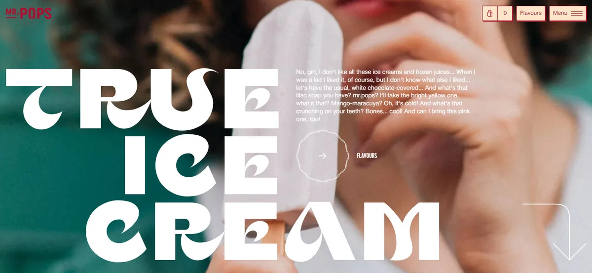
There is more. The hero area is also the first factor that influences a visitor's opinion of the company and plays a vital role in developing trust among visitors. It is a time-proven way to add a personal touch that immediately builds credibility and trust. In addition, a well-chosen hero design provides an immediate context that eradicates any lengthy and confusing written explanations and gets straight to the point, minimizing the user's efforts to understand the message.
Another good reason why a hero image is critical is that it can naturally arrest visitors' attention. In the World where users' attention span is increasingly low (according to recent studies, marketers only have less than 8 seconds to grab the visual attention of their prospect), this ability comes of enormous importance.
Last but not least, when well-done, a hero illustration or image serves as a foothold for running marketing campaigns. With the help of hyper-personalized experiences, marketing teams drive engagement, lure visitors into the sales funnel, maximize campaigns, and implement a strategy fully.
Benefits of Great Hero Image
Encompassing a company's mission, status, and values, without words, a hero image comes of huge importance for creating a successful website and achieving marketing and brand goals. However, that is not all. It also offers profound benefits that give businesses a solid chance to stay tall in the niche. Consider things that it can do:
- It grabs overall attention. According to multiple studies, hero image design is the first thing that users see when they open the website; therefore, it naturally steals glances.
- It guides an eye downward and compels online visitors to explore the project. When well done, the hero header drums up interest, drives engagement, and entices readers to explore the site further.
- It brings value right away. When the hero area is made with the company's vision and mission, it delivers the right message.
- It drives conversions. People "eat" with their eyes. A beautiful picture of the product at the top of the page may quickly push customers down the sales funnel and generate conversions.
- It strengthens brand identity. A unique, branded hero area creates a positive impression of the company and reinforces its general picture.
- It establishes a solid foundation for developing strong customer relationships and cements them during the user's lifecycle.
- It compels visitors to take a particular action. This can be done through a well-placed CTA button or sign-up form that promotes a service trial.
- It gives an e-commerce edge by helping the product stand out in the crowded list.
- It gets clicks that can be translated into leads.
- It spotlights information that matters most to consumers. The hero area is an excellent place to showcase the product's features that will compel visitors to take a closer look or motivate a purchase.
- It builds a strong brand reputation.
- It establishes credibility and provides much-needed legitimacy.
- It improves the consumer experience by bringing value to users through the hyper-personalized experience.
- It saves time in delivering the message.
- It provides a stunning introduction to a product, service, or company, winning over new clients and turning visitors into the brand's evangelists.
- It makes a dramatic entrance and leaves a powerful, long-lasting impression.
- It evokes some initial reaction or emotion out of viewers that help to manipulate their decisions.
Using an image at the top of the homepage has some strong positives that can be translated into actual revenue, a good reputation, and a strong brand identity.

Cons of Using Hero Image
The hero image is a powerful instrument. However, it also comes with some shortcomings that need to be carefully considered since some of them, when not addressed, may bring massive damage to the website's performance and brand's reputation. Consider these scenarios:
- Hero image may drastically slow the load time because the image is not well-optimized.
- Hero image may ruin the reading flow in some browsers because the image is not mobile-friendly or responsive.
- Hero image might not load because the host can experience downtime or blackout, leaving online readers with blank space.
- Hero image may "eat" visitors' data allowance because it is too big and heavy.
- Hero image may crop and distort and ipso facto incorrectly displayed because of lousy image-editing algorithms
As you may have noticed, the majority of shortcomings have to do with serving pictures or illustrations. Therefore, adapt these small yet practical tips to minify or even eliminate these flaws:
- Use services to optimize visuals.
- Choose a reliable hosting provider.
- Meet web standards, including accessibility principles.
- Ensure images are lightweight as possible.
- Test hero area across browsers and devices.
5 Crucial Elements of Good Hero Image
A good hero image is defined by some crucial qualities rooted in the goals and purposes it should fulfill. For instance, if the hero area is made to introduce the brand in all its glory, it must be simple, relevant, authentic, accessible, responsive, and stylish. If it is created to pursue some marketing goals, then it needs to evoke a gamut of emotions like curiosity or excitement to drive engagement.
However, several essential qualities are common in creating a high quality hero image. Let's consider them closely.
Simplicity
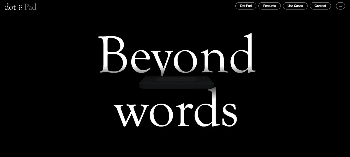
Simplicity is a core pillar of a great user experience. It stands behind the user's ability to understand a website and move along the reading flow. It minifies the learning curve and lets the target audience understand the context and message quickly and effortlessly.
At a minimum, the hero image needs to be straightforward, self-explanatory and deprived of excessive details.
Relevance
Relevant information is what your target audience is up to. No one likes outdated designs and content – this kills trust and credibility. Like it or not, the hero image needs to be up-to-date. At a minimum, the hero image should convey the most recent message, follow trends, and employ modern stylistic options.
Authenticity
The hero image is the face of your company that tells a story behind a brand or product during the first seconds of acquaintance. Staying authentic allows it to convey the brand personality, charisma, and passion that shape values and beliefs, identify competency and experience, and build trust and confidence.
Quality
Quality is an integral attribute of every hero image area. By using visuals without pixelation, blurriness, faded colors, low contrast, or distracting backgrounds, digital branding agency achieves several crucial goals:
- it makes the website look professional,
- it enhances the brand's reputation,
- it increases efficiency,
- it proves that the product is good and the brand is trustworthy.
Emotions
The emotional connection is a significant determinant in the choices made by consumers. The hero image, which naturally evokes emotions, shapes decisions via the depth of thought.
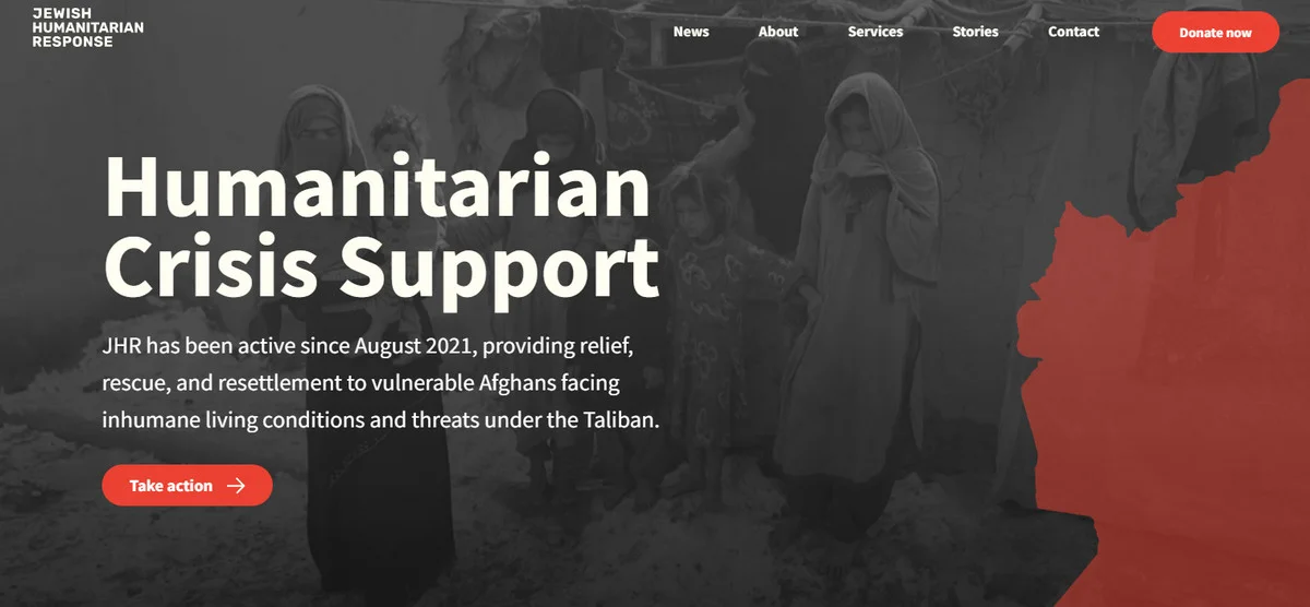
Depending on the goal, the hero area may generate a positive or negative gamut – either can be good for the company. For example, charity organizations regularly benefit from the feeling of sorrow because it evokes compassion and sympathy. Whereas businesses in the SaaS niche get an advantage of a positive range by demonstrating care for the client.
Responsiveness
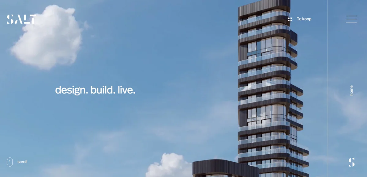
If a business wants to be successful, it needs the capability to adjust to every change. First of all, this means adaptation to all screen devices, which involves creating hero image CSS styles based on breakpoints. Second, it involves choosing an image that keeps its meaning and context safe regardless of manipulations.
Best Practices of Using Hero Images on Webpage
The hero image is not just a simple picture featured above the fold - it is a powerful communication, marketing, and branding tool. When done well, it may easily take the web presence to the next level, skillfully representing the essence of your company's identity. Consider these best practices shared by professional web designers that show how to create the perfect hero image:
- Find the image that is engaging, unique, on-brand, emotional, authentic, and modern. It should also deliver the message and generate a suitable gamut of emotions.
- Define the proper aspect ratio. Every hero image needs to scale to fit the space. Therefore, it is vital to find the correct aspect ratio that allows the picture to change without losing its value, meaning, and quality.
- Avoid generic-looking options at all costs; instead, get help from a professional photographer, illustrator, or web designer.
- Do not ignore the mobile experience. With small gadgets prevailing across the Globe, making a hero image look good on small dimensions is a top priority. It needs to fit perfectly in a vertical orientation on the phone and a horizontal orientation on the tablet.
- Use hero images instead of the video on small devices. Ensure it represents the same meaning as the video.
- Compress the hero image. The rule of thumb is that everything more significant than 1 MB is considered too big for the web platform, especially for cell phones and tablets. Use desktop applications like Adobe Photoshop or online services like TinyJPG to resolve this issue.
- Follow trends in photography and design. This will give you better ideas on implementing an impressive yet informative hero image and show ways to improve the existing option, thereby providing your company with a competitive advantage over others.
- Show the benefits and features of your product in all its glory if you need to promote your goods. Alternatively, you may show how it works in a real setting or give people a taste of what they can expect from your product, thereby raising credibility.
- Bake emotions into the image, making the hero section emotionally persuasive.
- Create positive emotional stimuli, thereby generating inspiration and reinforcing the feeling you are up to.
- Use high-quality full screen hero images across all sizes.
- Spice hero image with interactivity, dynamic effects, or parallax. When in doubt, stick to a proper visual style to create a nice animated hero image.
- Replace the image with a custom hero illustration. For instance, cartoonish hero illustration easily breaks the ice in conversation and adds a "warm" personal touch to the "cold" digital web interface.
- Strike contrast between background and foreground to help text or call to action button stand out.
- Meet the standards of the company.
- Use animated hero images.
- Comply with the brand's vision, mission, and identity.
- Align images with the content to create a seamless experience. Hero image should correlate to the contents and layout elements of the website and, at the same time, be in sync with the brand's mission.
- Show real people if you want to connect with your clients on a personal level. Avoid generic overused photos of models since they harm more often than improve the user experience.
- A/B test images to determine what option works best for the target audience.
Last but not least, when making the final decision about the hero area, ensure it meets these criteria:
- It is relevant to keywords.
- It clarifies the purpose, goal, and brand's mission.
- It supports design.
- It adds value to the web presence.
- It brings value to the target audience.
- It evokes the right emotions.
- It represents your brand reliably and authentically.
- It turns the customer into a hero once equipped with the company's product.
Great Examples of Website Hero images
Hero image website is a popular choice among business owners. Therefore, the web is teeming with this solution. Let's consider five fantastic examples.
1. Apple
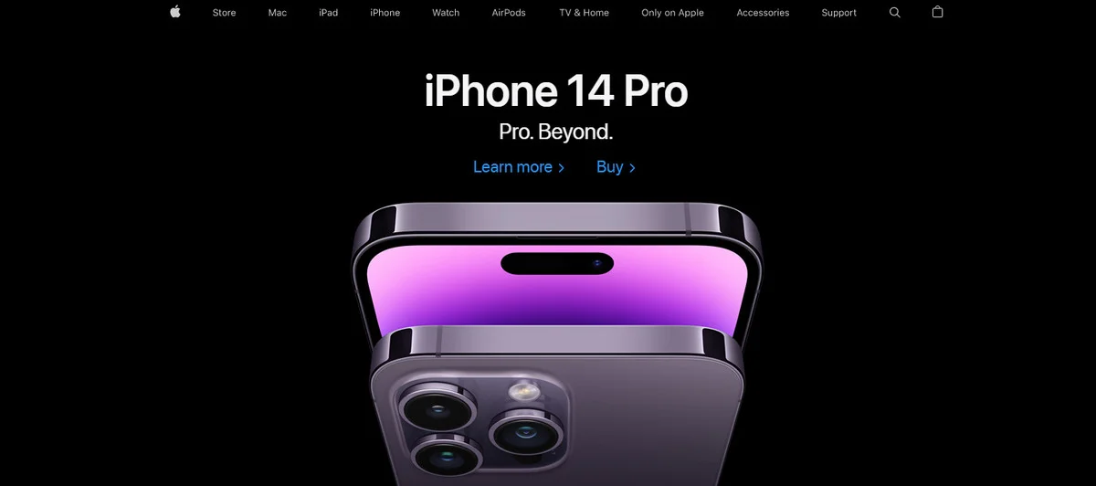
We will start with Apple, whose creative team has championed this approach. They have been using it for a decade to support their brand identity, drive engagement and generate conversions.
So, what is their secret? The company always welcomes online visitors with an impressive hero image that depicts the latest product in their unique way. Let's break it into pieces:
- First and foremost, the team sticks to its authentic style with minimalism set at the core. There is always a clean, monotone background that naturally elevates the foreground elements. As for the elements on the fore, there is always only one product.
- Second, they feature a highly polished product from an unusual perspective. This ignites interest, drives engagement, and lures visitors in.
- Third, the hero area evokes strong emotions that compel visitors to explore the new model.
- Finally, their hero images have a distinct artificial sense. This produces a powerful high-tech feeling that supports overall content and strengthens brand identity.
2. Davel Creative
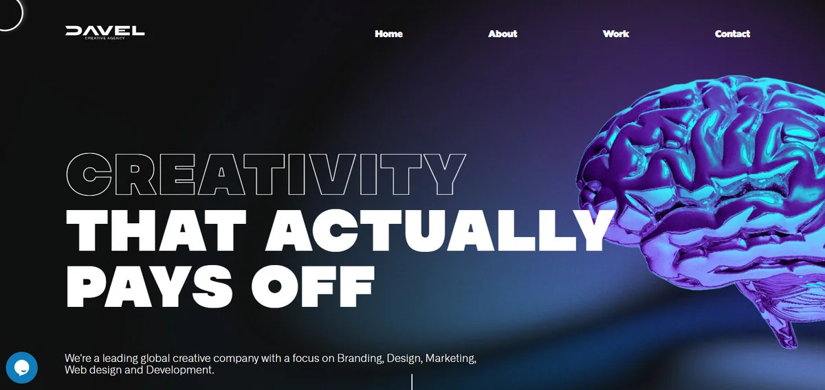
Davel Creative is a great hero image example of an ultra-modern approach that makes the most out of high-end techniques and stylish solutions. Much like Apple, the team takes their unique way by creating a digital picture that fulfills some crucial tasks effortlessly:
- First, it makes a powerful first impression.
- Second, it aligns with the brand's mission, vision, and values.
- Third, it supports the prime message.
- Fourth, it evokes positive emotions that entice visitors.
- Finally, it has an interactive mouse cursor that adds a cutting-edge feel to the composition.
3. Personal Portfolio of Alexander Romanovsky
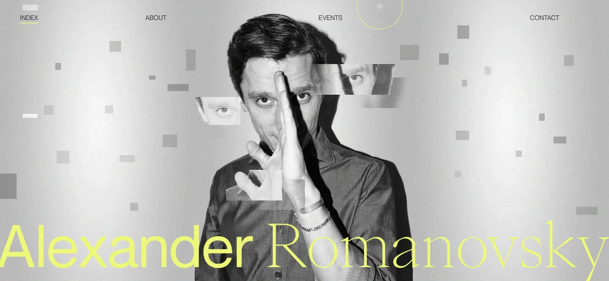
Demonstrating real people in the website's header is one of the best practices for personal portfolios. The deal is, when establishing yourself online, this is the best way to break the ice and start communication on the right note. The official website of Alexander Romanovsky (a talented pianist from Italy) is a case in point.
The personal portfolio of Alexander Romanovsky has a strong start - its partially animated hero image features the great personality of the artist. It capitalizes on both static and dynamic details that present solid composition with a powerful appeal. It conveys creativity and reflects the skills and charisma of the artist. As a result, the hero header makes a strong statement and promotes the artist as a brand.
4. Flowerdose
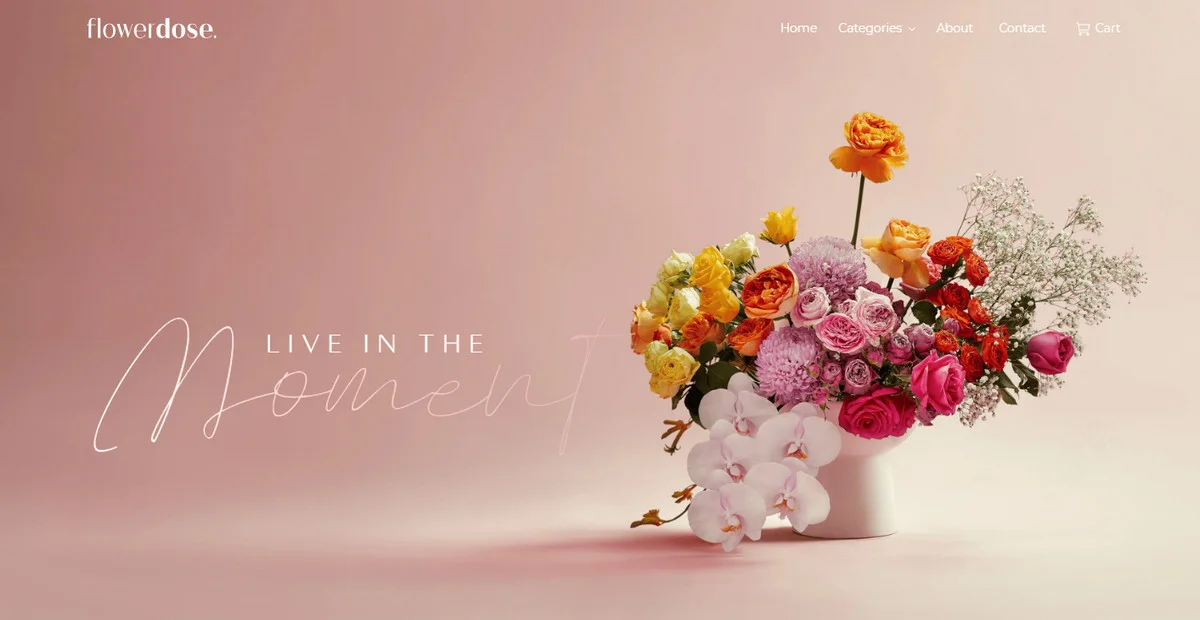
Flowerdose generates positive emotions from the doorstep. Belonging to a highly skilled Melbourne-based florist, it maximizes on a beautiful hero image with floral motifs. This choice is so well-thought-out that not only does it impress visitors, but it also informs them about the professional abilities of the artist, serving as vivid proof of skills, experience, and creativity.
There are several crucial details to note:
- The hero area features a traditional static image. Nevertheless, it does its job perfectly: it still draws widespread attention and produces a strong first impression.
- The image establishes a proper atmosphere meeting brand's mission.
- The image perfectly echoes the rest of the design, giving a great introduction to the website and brand.
- The image and text are well-balanced, making the message strong.
5. A Dellaporta
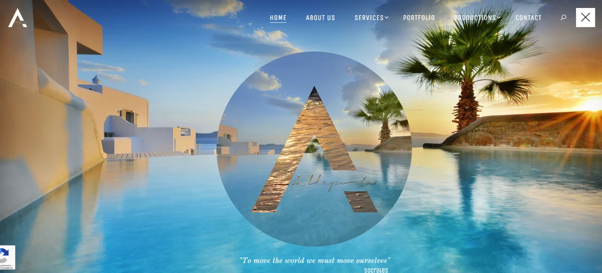
A Dellaporta is a great example taken from the Travel category. Though the niche does not need an introduction – it is evident thanks to a well-thought-out hero image. The latter features a beautiful seascape that instantly reminds summer holidays in Greece.
Like the majority mentioned examples, the hero area employs modern tricks to stand out from the crowd. To be more precise, here, visitors can see overlapping techniques and cinemograph that make a strong entrance and add a professional feel to the web platform.
As a result, the hero area does its job perfectly: it promotes the brand, makes a statement, and lures visitors in, leaving a long-lasting impression.
Conclusion
Today the written word is not nearly enough to entice and attract an audience with a goldfish's attention span. Well-chosen visuals make a real difference in communicating a message and delivering information on a website these days. Although you cannot completely rely on them, yet without their support, reaching out to the crowd and bringing home the right message will be much more challenging.
Therefore, it comes as no surprise that visuals are used throughout a website, with the hero section coming as a central pillar of every successful web platform. It does so much good that it is unbelievable. For instance, hero image makes the first impression counts, delivers the message, sets the right atmosphere, advocates the brand's personality, generates engagement, and compels visitors to explore the website.
Indeed, it has a lot of weight for one piece of visual content. To unlock its potential, it is crucial to exercise caution because there are some flaws that need to be mitigated. On top of that, it is highly recommended to follow the best practices and employ the latest solutions and techniques.
Sep 29, 2022
