Introduction
Are you looking for new talents? Or you have a great idea but need an investor to bring it to life. In the business, everything is possible if you know how and who to ask professionally.
Whether you are a solopreneur or a well-established company, whatever intentions concerning your company you have, you need a brand deck. Consider a brand identity design agency to translate your vision into a focused deck that feels professional and consistent from slide one. It is a powerful brand-building instrument that underpins all marketing efforts and activities and communicates ideas and intentions to the right person using the correct language, content, and visual material.
As a powerful presentation tool, it gathers all vital details, tells the story behind the brand, and, most importantly, delivers the key message to the target audience, sounding professional.
This guide will explore the brand deck concept, its importance, and fundamental blocks. It will also demonstrate pitch deck examples and uncover best practices.
Defining Brand Deck
It has a presentation form with slides enriched with assorted content. The brand deck serves multiple purposes. For example, it is used to introduce the brand succinctly during onboarding and training to help employees integrate with the departments. Another good example of using a brand deck is demonstrating the short and long-term strategy behind a brand strategy to impress potential investors and raise funds. Finally, it can be used to get all departments on the same page to channel overall efforts in the right direction.
Brand Deck vs. Branding Kit vs. Style Guide?
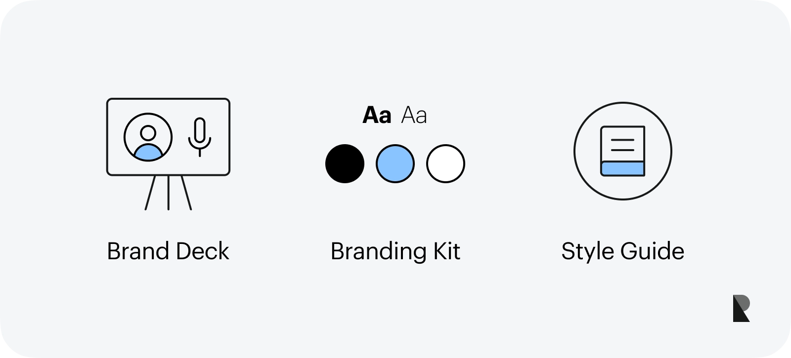
As a visual instrument, the brand deck needs to be clarified with a branding kit and style guide. When leadership teams are deciding what to handle internally versus with external partners, a quick scan of established brand design firms can help benchmark which deliverable should own which decisions. Let's highlight the critical differences among these concepts to understand them better.
The brand deck is a presentation tool that showcases information about the company and its ideas crucial to delivering the message to the target audience.
A branding kit is a set of core brand identity elements for maintaining a consistent company presence across distribution and communication channels. It speaks more to visual identity and includes templates and guidelines for colors, fonts, logo variations, slogans, language, and tone.
A style guide is a manual that provides standards, guides, and requirements to present a brand from both a graphic and language perspective. Much like a branding kit, it ensures consistency in the visual company's presentation across multiple documents and touchpoints.
What Is the Importance of Brand Decks?
Startups and long-standing players require a brand deck to empower the brand's development and growth. For many reasons, it is vital for companies regardless of their niche and age.
First, the brand deck is a universal and flexible tool relevant to various stakeholders. For instance, it can be used to onboard new employees or fetch investors.
Second, it is a powerful visual presentation tool that includes imagery, videos, and infographics that make understanding of the concept and brand's key points better. It efficiently delivers the message to any audience company needs.
Third, it is reusable. The brand deck can be quickly assembled with templates and guidelines, saving the company time, effort, and human resources.
Fourth, it is a reliable instrument that underpins a solid foundation for all marketing efforts.
Finally, it ensures brand consistency across different channels and aligns departments' efforts with the company's overall strategy.
Brand Deck Gathering
The goal of the deck presentation can be different. However, it always showcases the most important and relevant aspects of your brand's existence and what is in it for the target audience. Compiling all necessary information, including textual and visual material, is the fundamental preparation. Consider the basic steps of this stage.
Start with defining the audience since the latter determines what content to demonstrate. As a rule, there are several primary groups: clients, new employees, existing team members, stakeholders, and investors. Which one should you serve the content? Should it be an investor pitch deck or an onboarding presentation?
Choose brand colors, typography, a slogan, and a logo variation to align the deck and brand and meet customers' preferences.
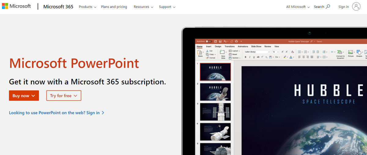
Then, select the right design creation software. Brand decks can be done on multiple platforms: PowerPoint, Keynote, Photoshop, Illustrator, InDesign, and Canva, to name a few. Choose a variant within the team's capabilities and the company's budget.
Afterward, craft deck outline. It will help organize ideas and key points to deliver the message effectively. When you are ready, move from outline to draft. Go into crucial details to make the point and define brand uniqueness and key features.
Next, format the textual part. It would help incorporate bullet points and brief paragraphs to create a pleasant reading experience.
Finally, visualize the brand narrative with multimedia. It will enrich the overall experience and reinforce the key message.
Elements of a Brand Deck
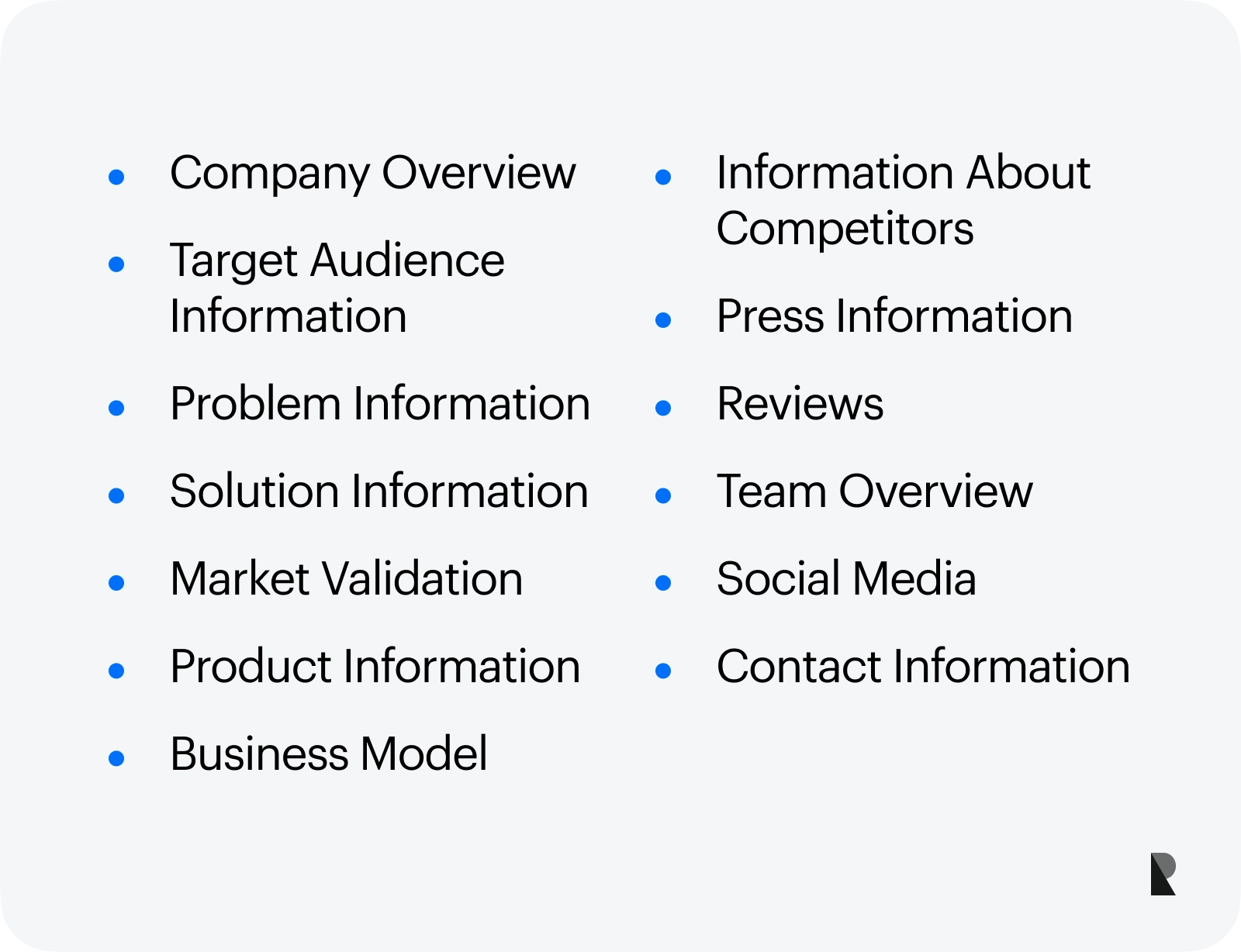
The brand deck takes different forms depending on the goal and target audience. Here is a list of fundamental building blocks you can mix and match to showcase the company's identity and effectively communicate the message.
Company Overview
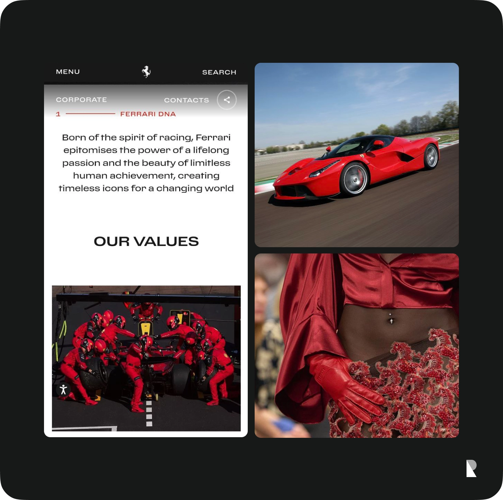
The overview describes the company's personality, vision, mission, and values. It may feature critical points in its development, including sale or brand recognition metrics, briefly describe history, highlight achievements, and stress out objectives.
As a rule, this part is a must-have of any brand deck. Its mission is to introduce the company and bridge the gap between the brand and target audience or refresh the viewer's memory of the company. Choose information that makes up the core of your business and critical pillars that demonstrate its growth and development.
Target Audience Information
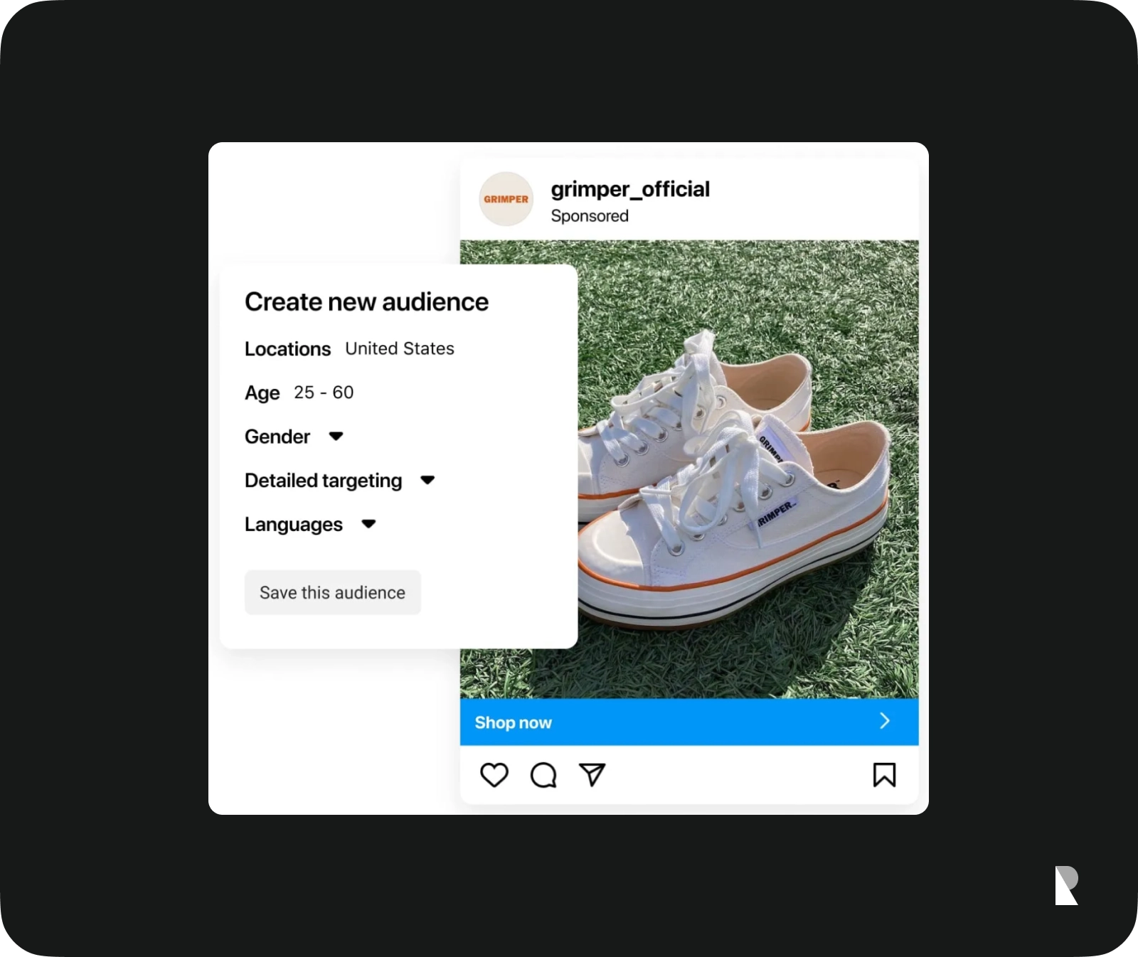
The company must thoroughly analyze its target audience by inspecting age, gender, income level, geographical location, current needs, preferences, and expectations.
The end of this stage expects the company to draw a clear customer profile that provides accurate information on delivering the message and producing a necessary impact.
Problem Information

Defining the right problem, which your target audience has, gives companies a solid chance to meet their needs with the right solution. A company should accurately define the market area where its product fits best.
Knowing the issue that must be addressed, the company stresses out information that helps the audience better understand the product's or service's benefits.
Solution Information

Solution information explains how a brand and its product service resolves the problem identified at the previous stage. It provides much-needed clarity in the brand deck that helps the target audience connect the product and their needs.
Much like problem information, this fundamental brick of presentation is essential for many purposes, whether pitching to investors or onboarding new employees. It can be omitted, but as a rule, it is a core element that underlies the message that must be delivered.
Market Validation

Market validation evaluates whether the product is viable in the target market. By conducting thorough research on the market's response to your product and brand, companies can better understand where a place for their solution is. As a rule, a brand deck includes only results demonstrating market acceptance and success. This part increases the trustworthiness and credibility of the company. It serves as a seal of approval that compels the audience to follow the lead.
Product Information
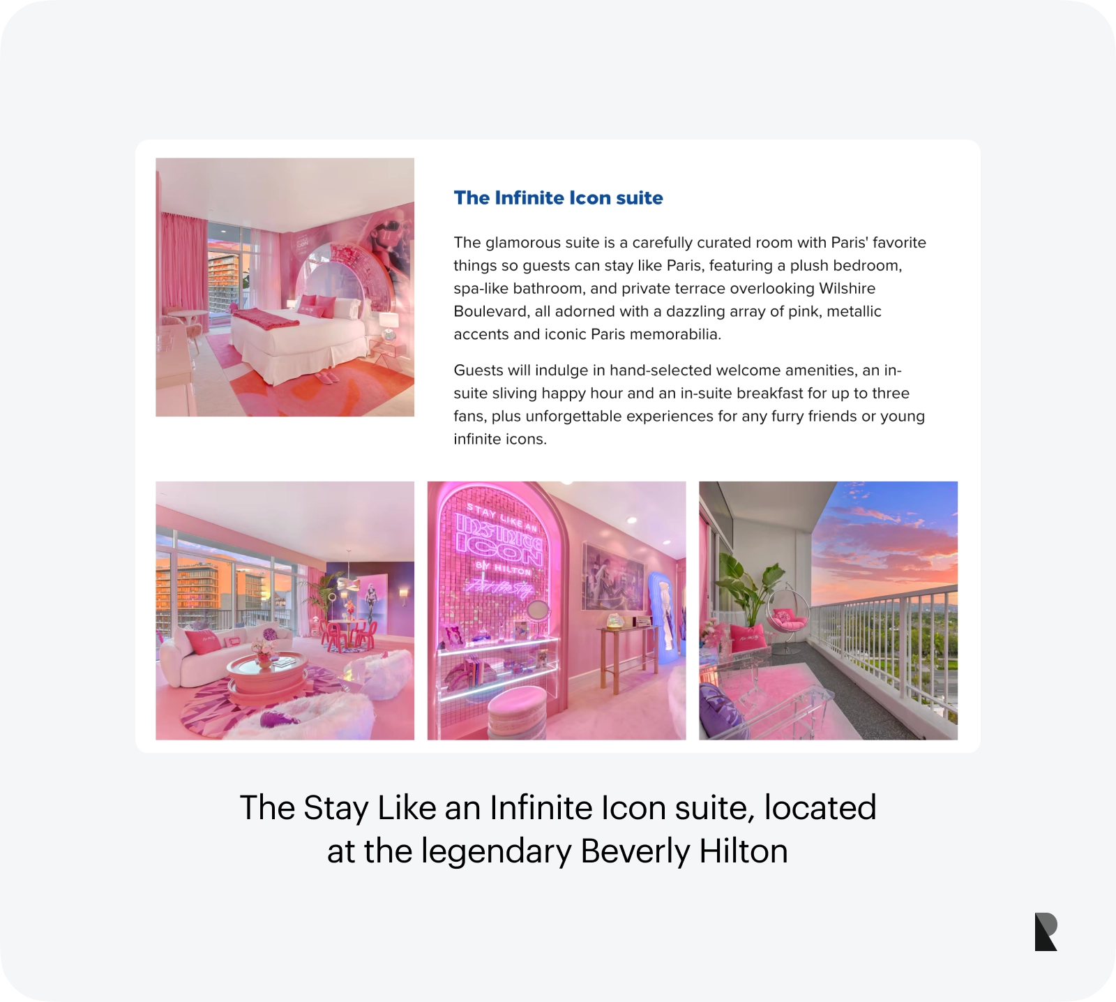
Since the solution to the target audience problem lies in the company's product, it is only logical to include the product information in the slide deck. Even when you create the presentation for inner departments for education, this section is vital because it highlights the brand's mission.
The company may showcase one product or the whole range, depending on the target audience. It is highly recommended to detail product features and unique selling points and be more specific about the benefits of the product and the way it addresses an issue.
Business Model
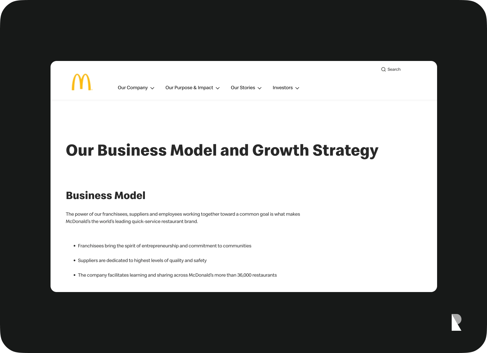
The business model is a core element of any brand. It helps startups attract investment, recruit talent, and motivate management and staff. Well-established organizations rely on it to anticipate trends and challenges ahead.
Unlike the product information section, the company may skip in-depth details since this technical information can be exhausted. Instead, it should focus on its relevant business model and describe revenue streams and approaches for growth that underlie development and marketing strategies standing behind revenue.
Information About Competitors
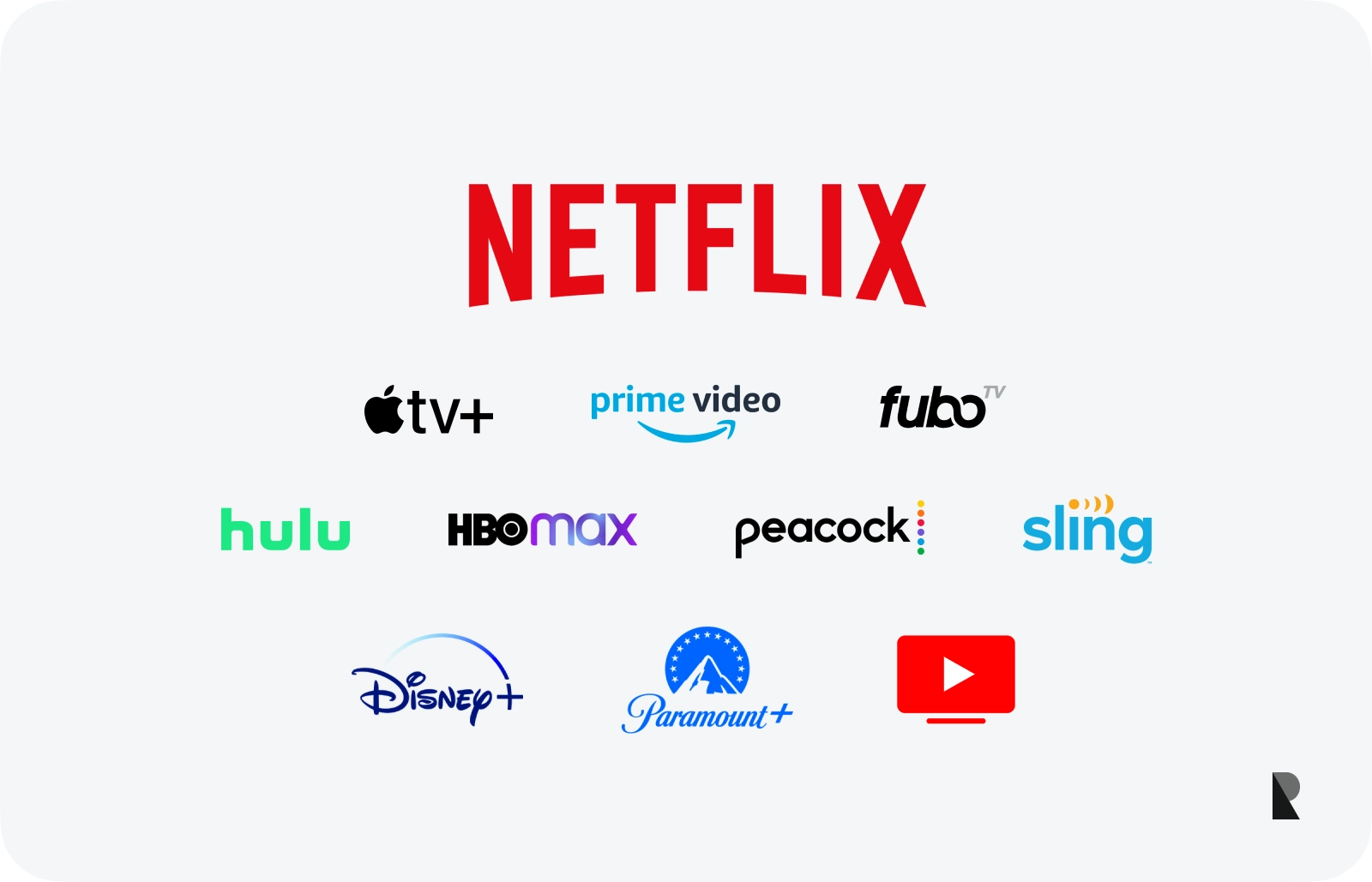
Information about competitors is vital to show the audience how the company fills the gap in the market, stands out from the crowd, and how its products or services supersede others.
This section is dedicated to the company's strengths and advantages that secure its position in the market and generate conversions and revenue. Companies may demonstrate numerous niche representatives or only several primary competitors.
Press Information
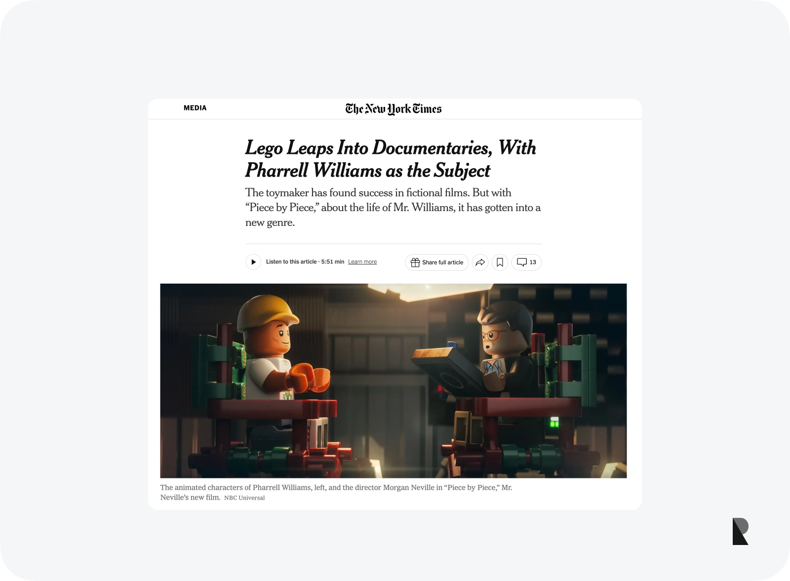
Press publications are a part of the content marketing strategy. It shows how good the company is. Plus, it demonstrates how others perceive the brand and its value on the market. This slide of the brand deck builds trust, increases the company's credibility, and reinforces the key takeaway.
When creating this section, doing just what is necessary is vital. Stay modest and list only notable media mentions and publications.
Reviews
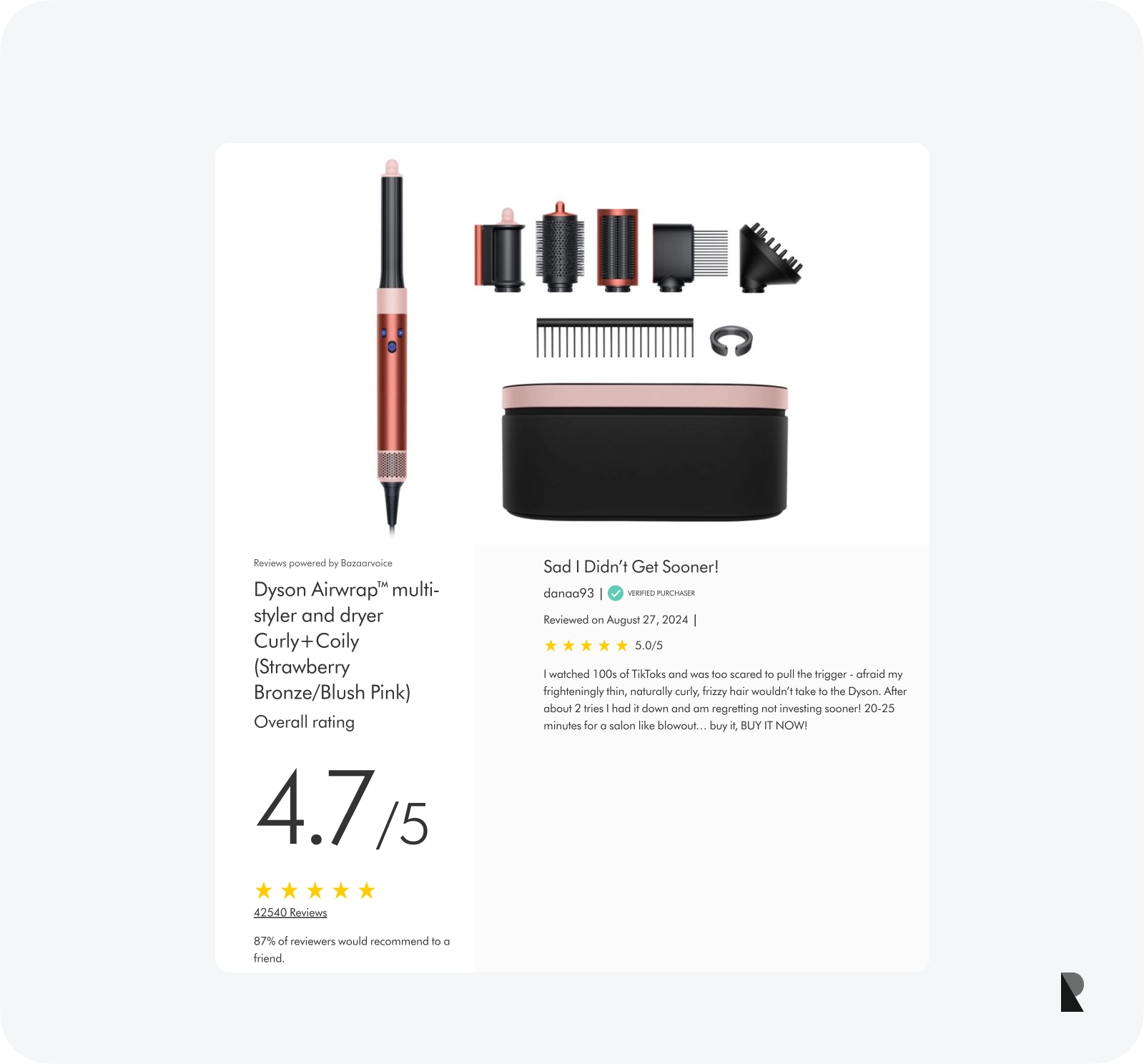
Press publications impact the target audience's perception of the brand and message; however, they do not compare with positive customer feedback. The latter proves clients have positive connotations with the company and direct their good experience back at it.
It also gives insight into customer satisfaction levels. It demonstrates how customers perceive the brand, the actual value of the product, and most importantly, what feature makes the product stand out from the others.
Choose reviews that praise your company and product from different angles. You may add positive feedback on customer support, product features, and the company's place in the community.
Team Overview
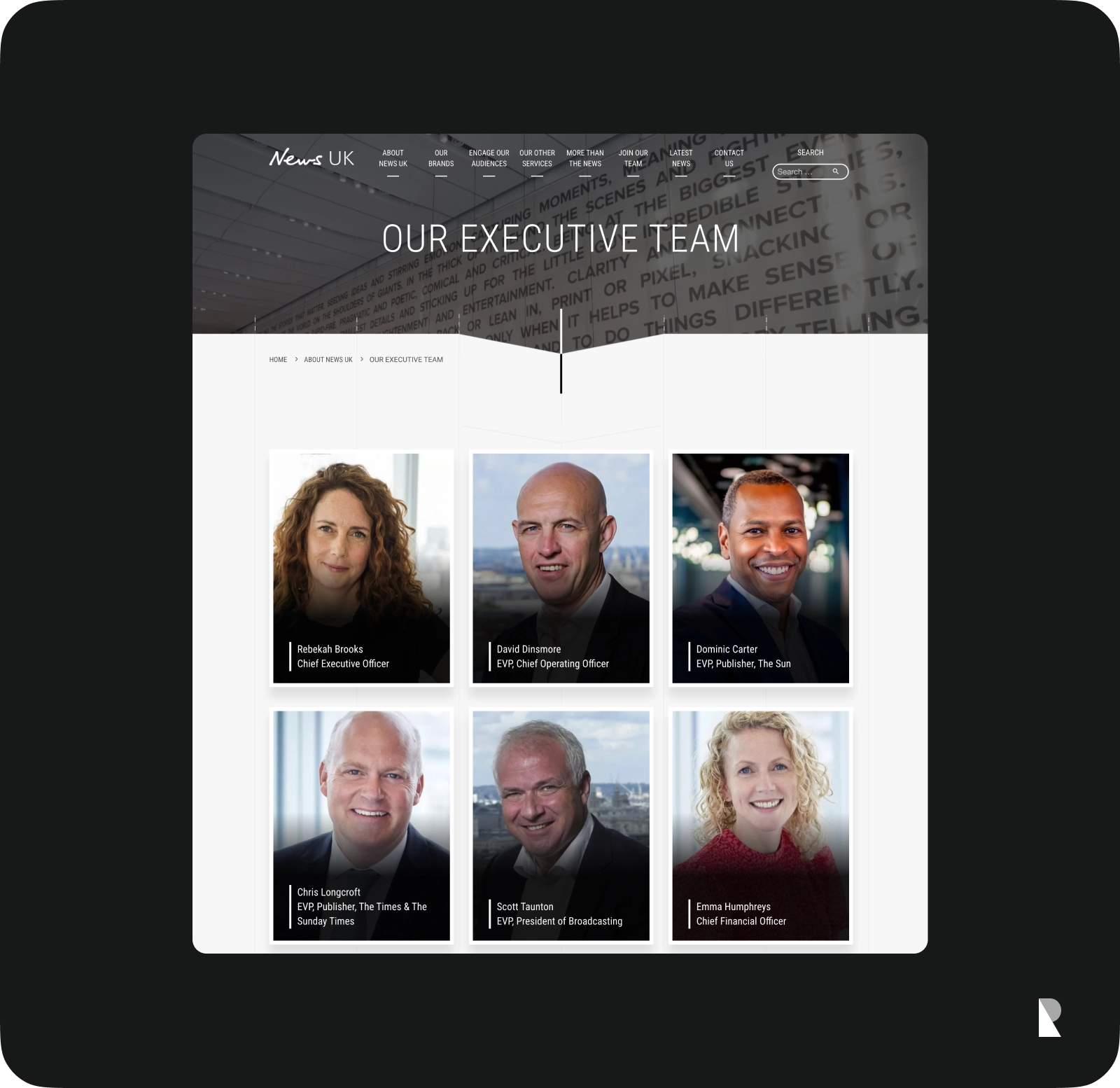
Introducing key team members is essential for many reasons. First, it demonstrates the company's potential to pull off tasks and follow its strategy. Second, it hints about the company's working culture that underlies productivity. Third, it adds company credentials. Finally, it makes the company look trustworthy and reliable.
When creating this slide, it is crucial to prioritize key team members and their accolades, skills, knowledge, and experience. Do not be shy to brag about your staff. After all, it is the lifeblood of the whole mechanism.
Social Media
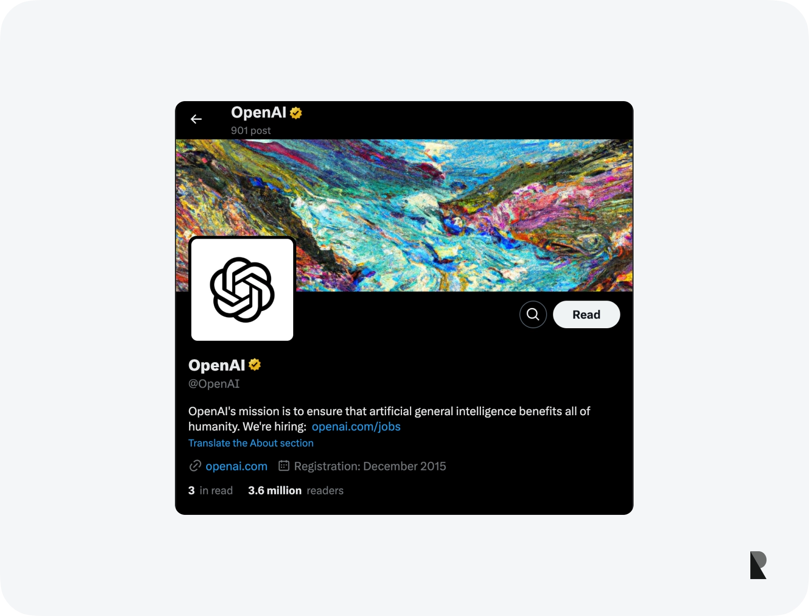
One of the ways to influence your key message perception in a brand deck and compel the target audience to do what you want them to do is to demonstrate social proof. It is a highly effective tool for bringing people around and changing their minds.
Remember that social media proof demonstrates public compliance and private acceptance when creating this section. Therefore, play smart with this gentle and fragile science of persuasion.
Contact Information
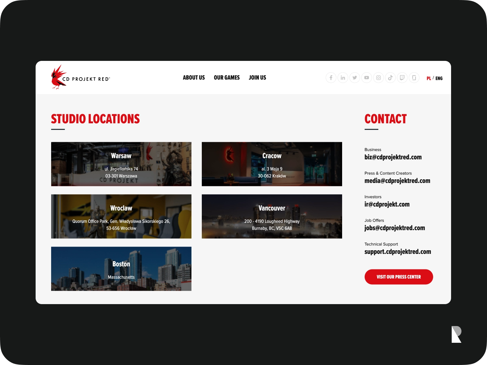
Slides with contact information make the brand look reliable, trustworthy, credible, and, most importantly, easily accessible. Staying open to your target audience is one of the best ways to make them consider your offer or message seriously and feel appreciated at the end of the event.
This section should feature precise contact details for follow-up. Consider your target audience's preferences to communicate with your brand. Make sure your readers have various options when contacting you.
At a minimum, add these details: the physical address of the company, telephone number, email address, and social media pages.
Nuances that Make a Good Deck
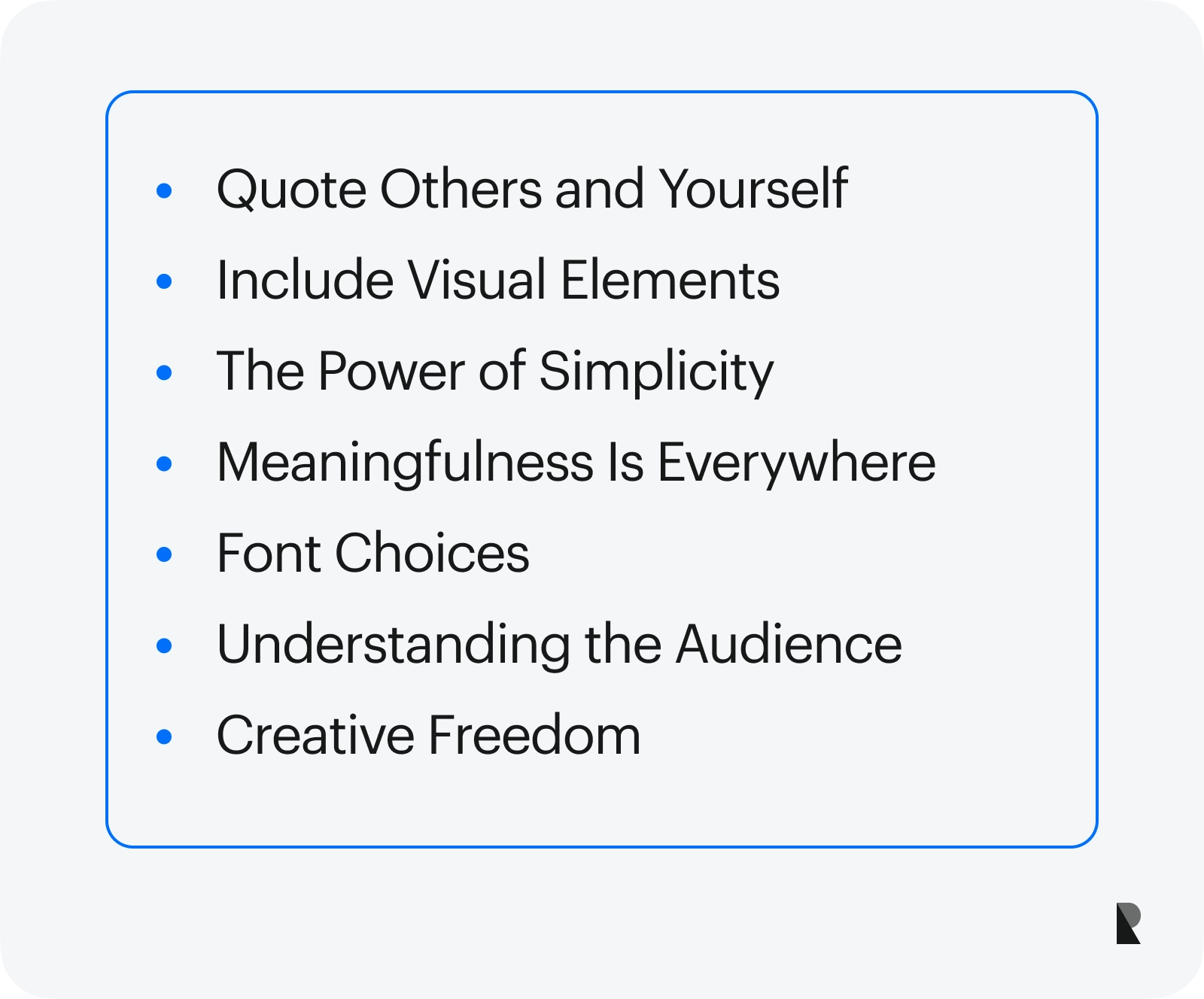
The Power of Simplicity
Simplicity is a powerful thing that goes a long way. It provides clarity and helps readers understand the message better and quicker, avoiding irritation and disappointment that may push them away.
Regarding the brand deck, simplicity should be seen in all critical details, including language, structure, information hierarchy, and visual material.
Meaningfulness Is Everywhere
Making sense to everyone during a presentation is a goal of any company; otherwise, all efforts will be in vain. To ensure success, add meaningfulness to each slide; this way, the overall brand deck will be purposeful, relevant, and valuable.
Ensure each slide has a clear purpose and message. Ditch all clutter and décor and prioritize only those things that add meaning to your words and visuals.
Font Choices
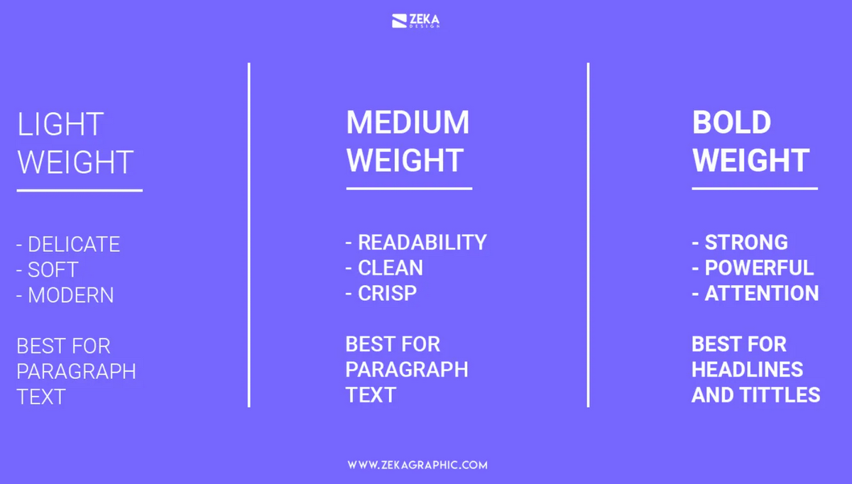
As a visual instrument, typeface has a huge potential to deliver the message effectively. It unobtrusively influences the way that viewers think and read. It elicits the tone of voice and overall purpose of the brand. It generates emotions and may set everyone in a mood appropriate for the brand's presentation.
However, you need to dive into typeface psychology. In that case, the only thing you must ensure with typeface is that it creates an optimal readability level so every word is easily discernable across all media and screen sizes.
Understanding the Audience
Understanding the audience's profile, needs, and expectations allows the company to amplify the efficacy of the brand deck by implementing engaging, useful, valuable, and meaningful content. It helps determine what messages people care about and builds a much-needed connection with the audience.
On top of that, this knowledge gives real insights into how to organize the presentation, what visuals to employ, and how to present the main content.
Creative Freedom
The more creative and original the pitch deck is, the more effective it will be in achieving the goals. It is crucial to embrace creative freedom because it allows the company to find its authentic voice, unlock its unique personality, and make the presentation meaningful, personal, and inspirational.
However, please do just what is necessary. Companies must exercise caution and balance innovation and expertise to look professional.
Examples of the Best Brand Deck
Consider these two excellent examples to understand better the brand deck and how it might look.
Copper Cow Coffee
The coffee shop niche is one of the toughest in the market. Entering it is only possible if you have a convincing startup pitch presentation that secures angel investors who give a helping hand during a rough first year. The team behind the Copper Cow Coffee brand knows how to do it, providing us with a great example. Their presentation unveils their unique approach to the business and demonstrates their potential to fight competition and generate revenue.

Reflect
The deck example of Reflect, a small company that wants to transform mental health therapy, is rich in stats. However, it is not dull. On the contrary, visual aid enriches the reading experience, reinforces the key message, and justifies the company's ability to secure its spot in the niche.

If you need more insights, check out the best pitch decks at Slideshare.
Conclusion
The brand deck is an indispensable tool in brand building. It underpins the company's successful development and growth by communicating critical aspects of business identity and product benefits to different target groups.
It is used to onboard new employees, strengthen the company's inner culture, increase productivity by putting employees on the same page, forward sales and marketing pitches, and obtain investors.
Depending on the goal, the brand deck varies, but its success mainly relies on how well the company does its homework. This implies conducting an in-depth analysis of the target audience to understand what content to show, using appropriate coloring and typography that ensure optimal readability, adopting friendly language, tone, and voice, and enhancing presentation with visual aids.
Follow the best practices and find an excellent example from the leading company to get insight for improving your presentation from various aspects.
FAQ
What is the recommended length of a brand deck?
The recommended length of a brand deck is between 10 and 15 pages long. This is the length of a 5-minute speech. Since people have a short attention span, it is crucial to stay within this range and keep your answers to a single slide.
What are the components of a brand deck?
The fundamental blocks of the brand deck are company overview, value proposition, target audience information, problem information, solution information, product information, information about competitors, social media, reviews, press information, team overview, business model, market validation, and contact information.
Why is this brand deck called a deck?
The term comes from old technology when marketers used slide projectors facing a wall. The slides were piled up as cards, just like a deck of cards.
Nov 30, 2023
