Introduction
Many businesses, big and small, rely heavily on websites to increase their visibility online and engage with their audience. Websites are also a great platform for converting marketing leads into buying customers. A website can give brands a competitive advantage.
But, creating and maintaining a website is fraught with challenges and pitfalls. These are unavoidable and can affect the user experience and interface design; hence, it is best to be prepared by adding and customizing pages like the 404 page.
Web links and pages can stop working for various reasons. When this happens, a 404 page typically loads to inform the user that the website is no longer active or that an error prevents the page from loading.
A 404 page is more than just a notice, though. With a dash of creativity, you can transform this nifty page into something fun, engaging, and memorable. But before we get into the hows of an effective 404 page, first—what is it, and why do you need one?
What is a 404 Page?
A 404 page is a landing page that tells users the content they are trying to access is no longer on the server.
A typo, a broken link, or the website owner may cause it. The page may have changed, but the URL must be updated.
A traditional 404 page usually contains a short apology when things go wrong, followed by suggestions to resolve the problem. Some 404 error pages redirect users back to the main page. But sometimes, these efforts could be more adequate, leading to unsatisfied website visitors and, eventually, lost sales.
On the contrary, a fully functional and innovative 404 page customized to your goals can reap the following benefits:
- reduces bounce rate,
- improves SEO, and
- prevents you from losing customers.
With these tips and tricks for optimizing your 404 page and overall website performance if you're ready to advance your journey and create a seamless 404 error page for your users, partner with a reliable website design agency.
Why Does 404 Page Matter?
Reduces the Bounce Rate
The bounce rate is a crucial indicator of the number of visitors leaving the website early instead of exploring further. If you think of 404s as a ‘micro-funnel’ moment, partnering with one of website design and development companies for periodic UX/SEO reviews can help convert dead ends into guided next steps. The higher the bounce rate, the lower your website ranks on search engines. With a 404 page in place, you can mitigate the likelihood of visitors leaving by engaging them through helpful links.
Improves SEO
With millions of websites to compete with, visibility is vital to every business. That's why SEO, or search engine optimization, ensures online users can find your content through keywords, searches, etc.
Optimizing your 404 page by including links to other sections and relevant content on your website can improve your SEO ranking.
Prevents You From Losing Customers
An engaging 404 page can keep visitors around, allowing you to convert them into customers. You can redirect them to your product page, offer exclusive discounts, or connect them with your team for additional support.
Enhances UX and UI
UX (user experience) and UI (user interface) design are critical to creating an effective website. By striking a balance between functionality, aesthetics, and the overall feel of the design, you are likely to satisfy users' needs and expectations.
A well-designed 404 page helps boost your UX and UI by turning a frustrating situation into an opportunity to indulge your users and present them with better options. There are many ways to do this, which we will discuss later.
Top 20 Creative 404 Page Examples
So, what do creative 404 pages look like? Have a look at these examples to find your next inspiration!
Pixar
Pixar knows how to appeal to its users with adorable error 404 pages. How can you be upset when you have Anxiety from the movie Inside Out telling you not to worry?
Using much-loved animated movie characters is sure to melt hearts and amuse users. It's also a strategic way to create a memorable impression through popular Pixar characters.
Example: https://www.pixar.com/404
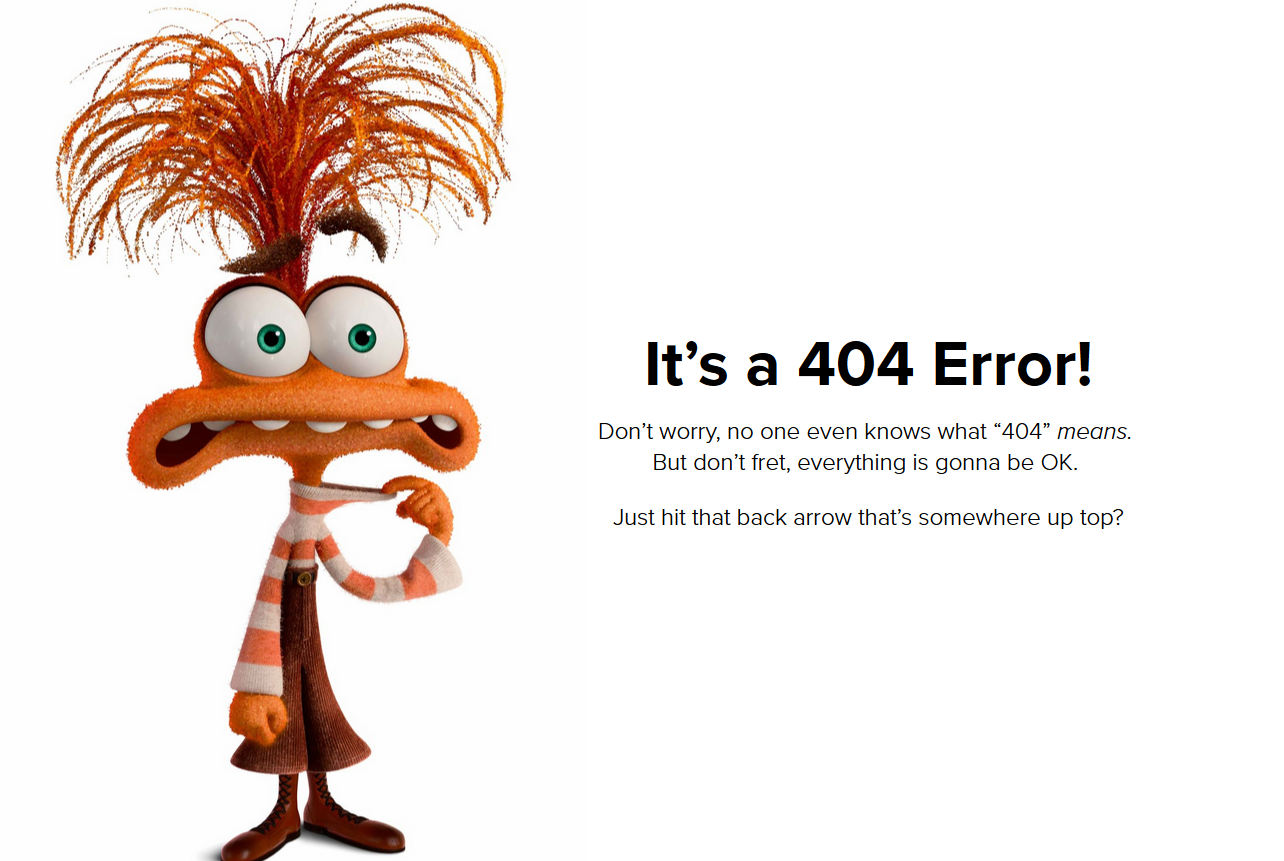
nside-Out characters grace the 404 page to apologize to users for the error. Image via Pixar
Airbnb
Homestay app Airbnb understands how frustrating it is when you can't access a link or content online. It's as disappointing as accidentally dropping an ice cream on the ground that you've been looking forward to enjoying on a hot day. And the brand's 404 error page perfectly encapsulated this feeling.
Example: https://www.airbnb.com/234
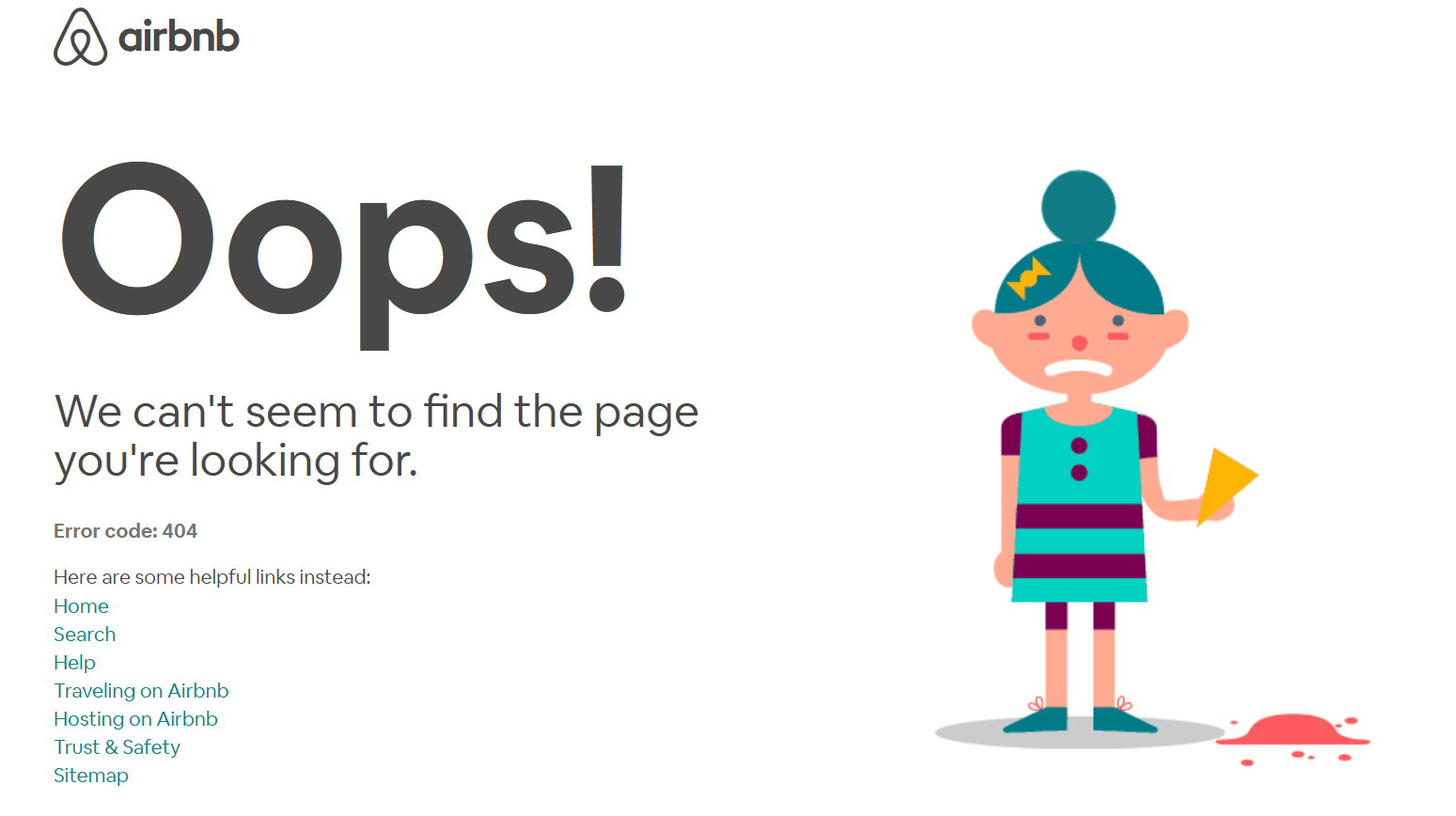
Airbnb perfectly captures the frustrating feeling of a 404 error. Via Airbnb
In addition to apologizing to the user, Airbnb provides helpful related links. The page's design and touch of humor ease the situation and improve the experience by presenting several options.
GitHub
When designing a 404 page, you need to be clear and direct. Look at GitHub, which displays 404 error messages so users can easily understand what's wrong. The page also includes search functionality and navigation options, enabling people to explore without leaving the website.
Example: https://github.com/expl2ore
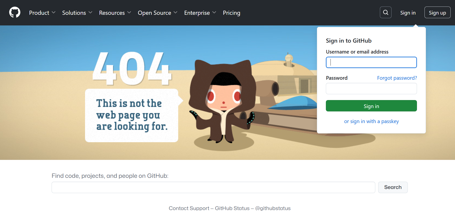
Add a search bar to your 404 page for easy navigation. Image via GitHub
Nike
Nike's 404 error page is a brilliant example of what retail shops can do to appease users. Aside from apologizing for the inconvenience, Nike sneaks in a discount code for customers to use. At the bottom of the page is a carousel of products that will pique anyone's interest.
Finally, the brand's 404 error page keeps its branding elements by incorporating its logo and color scheme. These strategies are a great way to turn a negative experience around and convert leads!
Example: https://www.nike.com/h2elp/
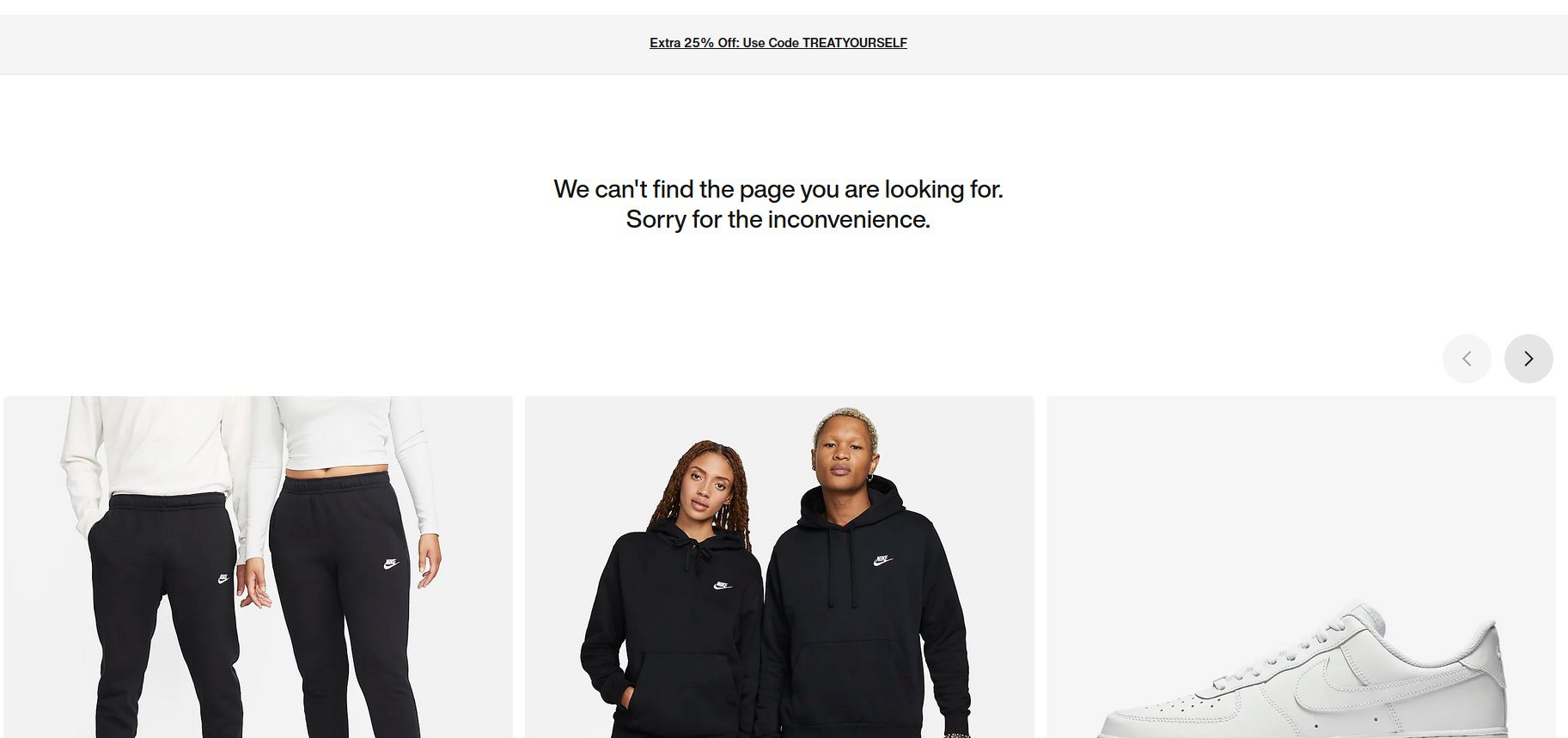
Nike says sorry by offering a discount code. Image via Nike
Marvel
Speaking of staying on brand, Marvel did well with its 404 page by featuring one of its well-loved superheroes, Ironman. Only this time, users see a broken and sad version of him. This tactic maintains brand identity and immediately establishes a connection between Marvel and its loyal fans. The page also weaves interactive features like the rain, making it visually engaging and attractive.
Example: https://www.marvel.com/comaics
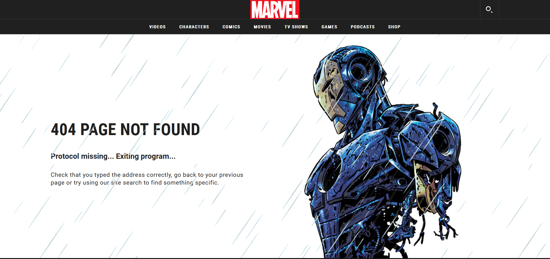
Marvel features its beloved Ironman on its 404 page. Image via Marvel
Mailchimp
Mailchimp apologizes with a humorous and literal take on losing a page. On its 404 page, a curious-looking creature is seen with its head deep down a hole, searching for something.
Most users would wonder what it is and click on it, leading them to a game similar to Nokia's Snake. Those uninterested can, of course, click the Mailchimp Home button to return to the main page. Mailchimp's love for playful graphics is evident with its use of weird cartoon characters, funny music, and silly games. You can't help but turn that frown into a smile!
Example: https://mailchimp.com/pricing/marketing/567/
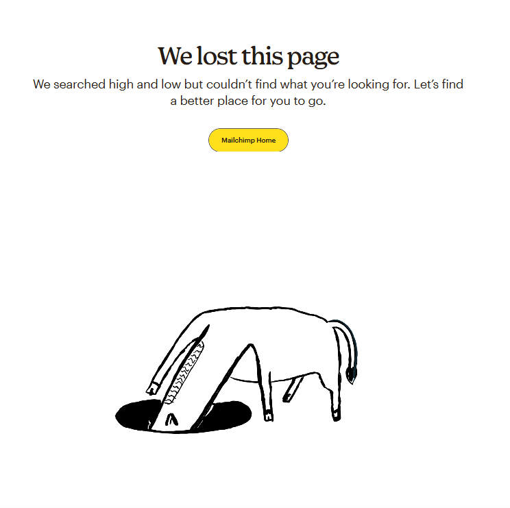
Mailchimp wins users with its humorous 404 page. Image via Mailchimp

Mailchimp invites visitors to play a game to ease frustration. Image via Mailchimp
LEGO
What greets users on LEGO's error page is its popular Minifigures, seemingly throwing their hands up in defeat. Such a humorous tactic displays brand alignment, making it relatable and more accessible for users to take the bad news.
Notably, the page includes a Customer Service button, which leads users to Sophia for virtual assistance. LEGO also provides resources such as Help Topics and Device Guides to direct users to what they may be looking for.
Example: https://www.lego.com/en-us/service/buildinginstruc45tions/
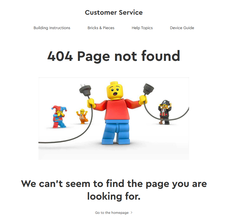
Integrate your brand identity in your 404 page. Image via LEGO
Blizzard Entertainment
Blizzard Entertainment is known for creating popular video games like Warcraft, StarCraft, Overwatch, and Diablo. True to its branding, Blizzard Entertainment sends in a Murloc (or a gmmmlmrmrgmg, one of the characters in World of Warcraft) to rescue users.
Wowpedia says a Murloc is intelligent, with "excellent underwater vision and can see in almost pitch blackness." This makes it a perfect navigator!
Example: https://www.blizzard.com/en-us/2980
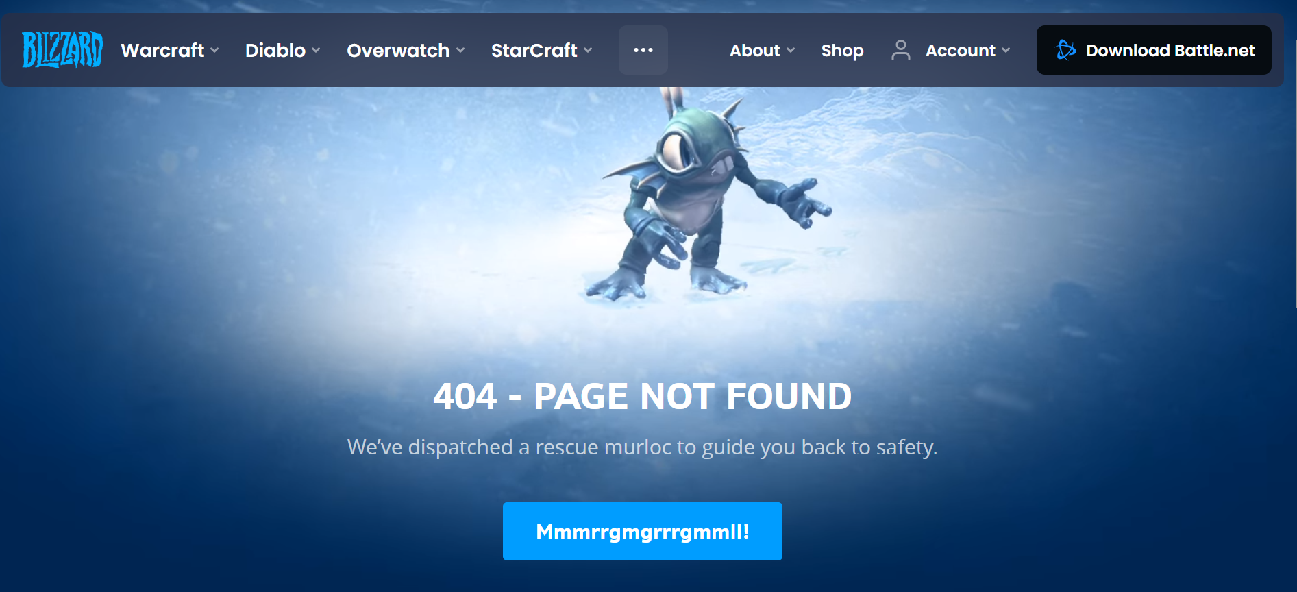
Display the playful side of your brand even when delivering bad news. Image via Blizzard
Users can click the blue "Mmmrrgmgrrrgmmll!" button on the brand's home page. They can also use the menu above to go to a specific page.
Slack
Slack is a productivity platform businesses worldwide use to streamline communications and manage work between different departments. The brand's expertise in managing inconveniences is seen on its 404 error page.
The page prominently displays an error message explaining what users can do to mitigate the problem. But what catches the eye is its animated scenic background of cute pigs and chickens strolling in a lush forest.
Additionally, the page employs a scroll-on hover effect, allowing users to "take a scenic walk" when they hover left and right. This interactive 404 page is akin to telling users to relax and enjoy the view while they figure out their next move.
Example: https://slack.com/enterprise/225
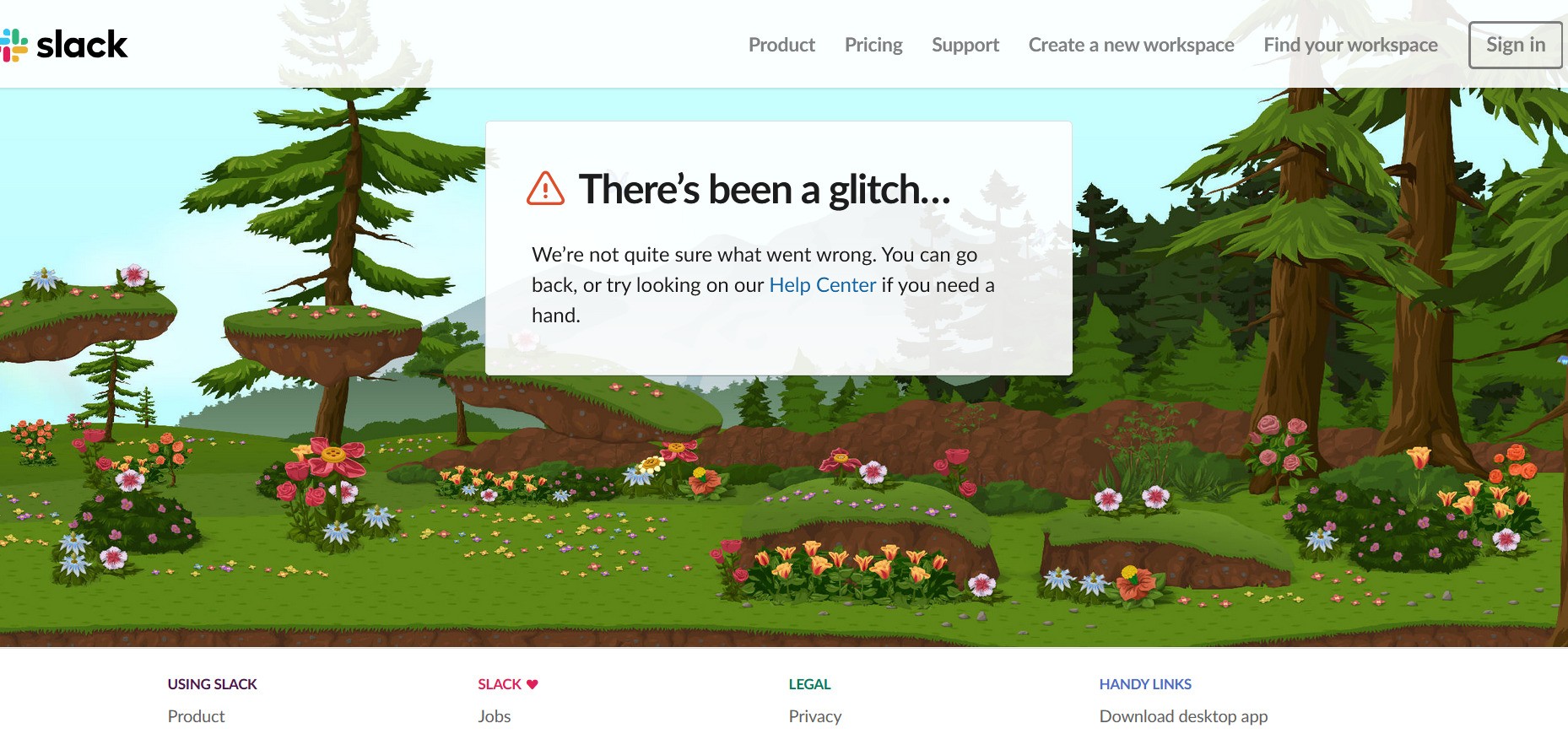
Slack takes visitors on a scenic and relaxing virtual walk. Image via Slack
Walmart
Walmart is guided by its customer-first philosophy, which focuses on personalizing the brand experience to help them live better. As such, the brand understands that while the 404 page can redirect users to other useful links or pages, it's also great for gaining feedback! Adding a feedback feature on the 404 page unearths improvement opportunities and communicates how Walmart values its customers.
Example: https://www.walmart.com/cp/7622289165
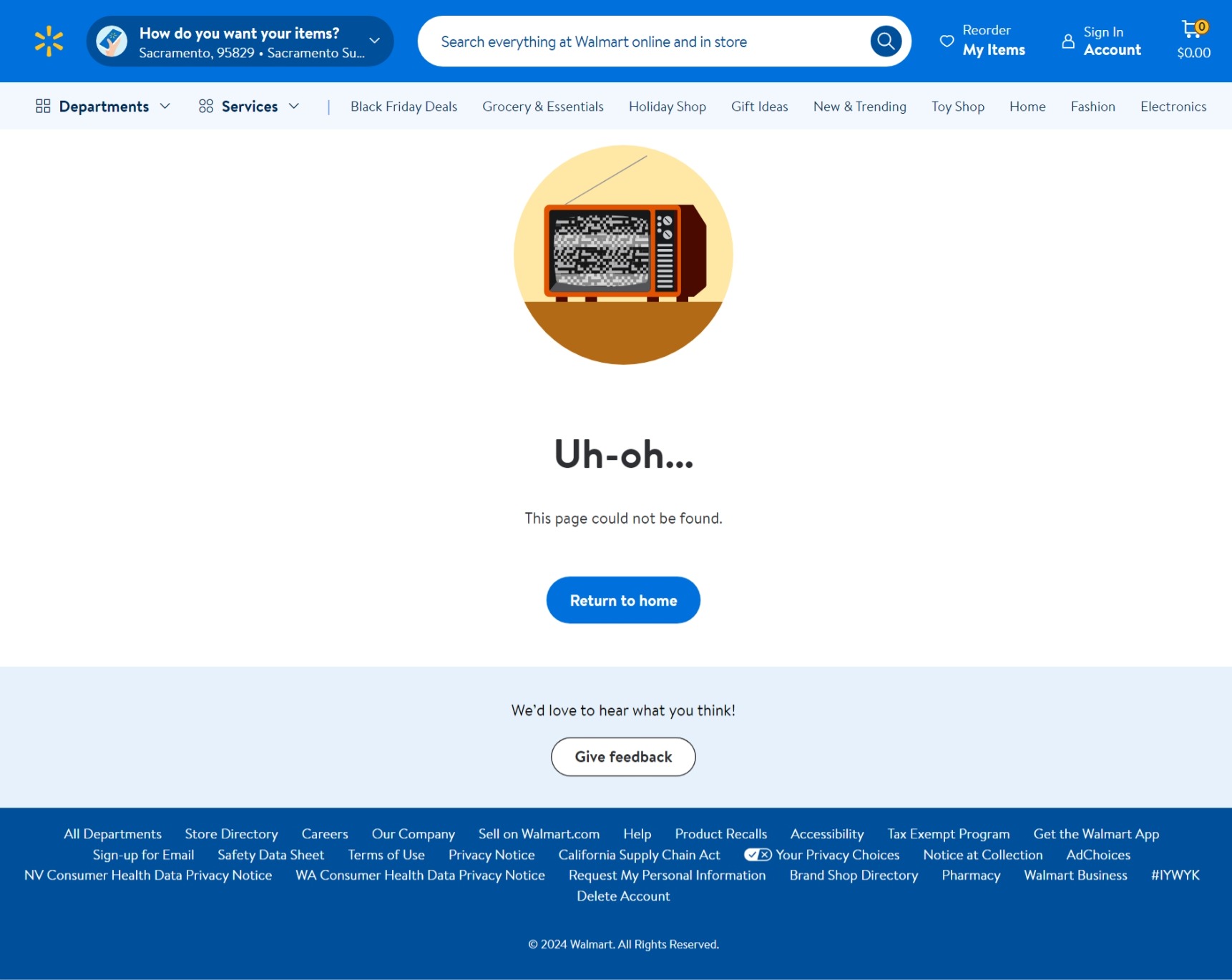
Take the opportunity to ask for feedback using your 404 page. Image via Walmart
Dropbox
Dropbox's 404 error page is minimalist and straightforward. Dropbox acknowledges the user's frustration by stating what's wrong and providing links. This ensures users can find information without being overwhelmed by visual elements.
Example: https://www.dropbox.com/business/sol342utions/sales
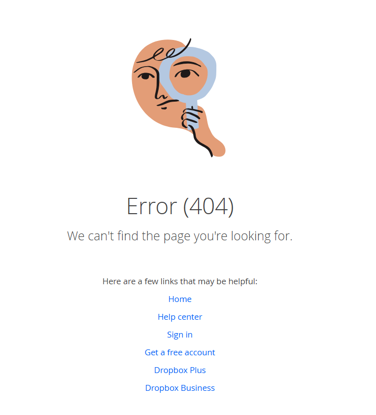
Sometimes less is more when designing a 404 page. Image via Dropbox
Starbucks
Known for its coffee, Starbucks playfully uses an image of a spilled cup of coffee to express the brand's feelings about the error. Starbucks also invites visitors to mop the spilled coffee by hovering the mouse to reveal a secret message: "Java nice day!"
This creative and amusing touch—lighthearted copy and interactive design—reflects the playful side of Starbucks' brand identity.
Example: https://www.starbucks.com/menu/539
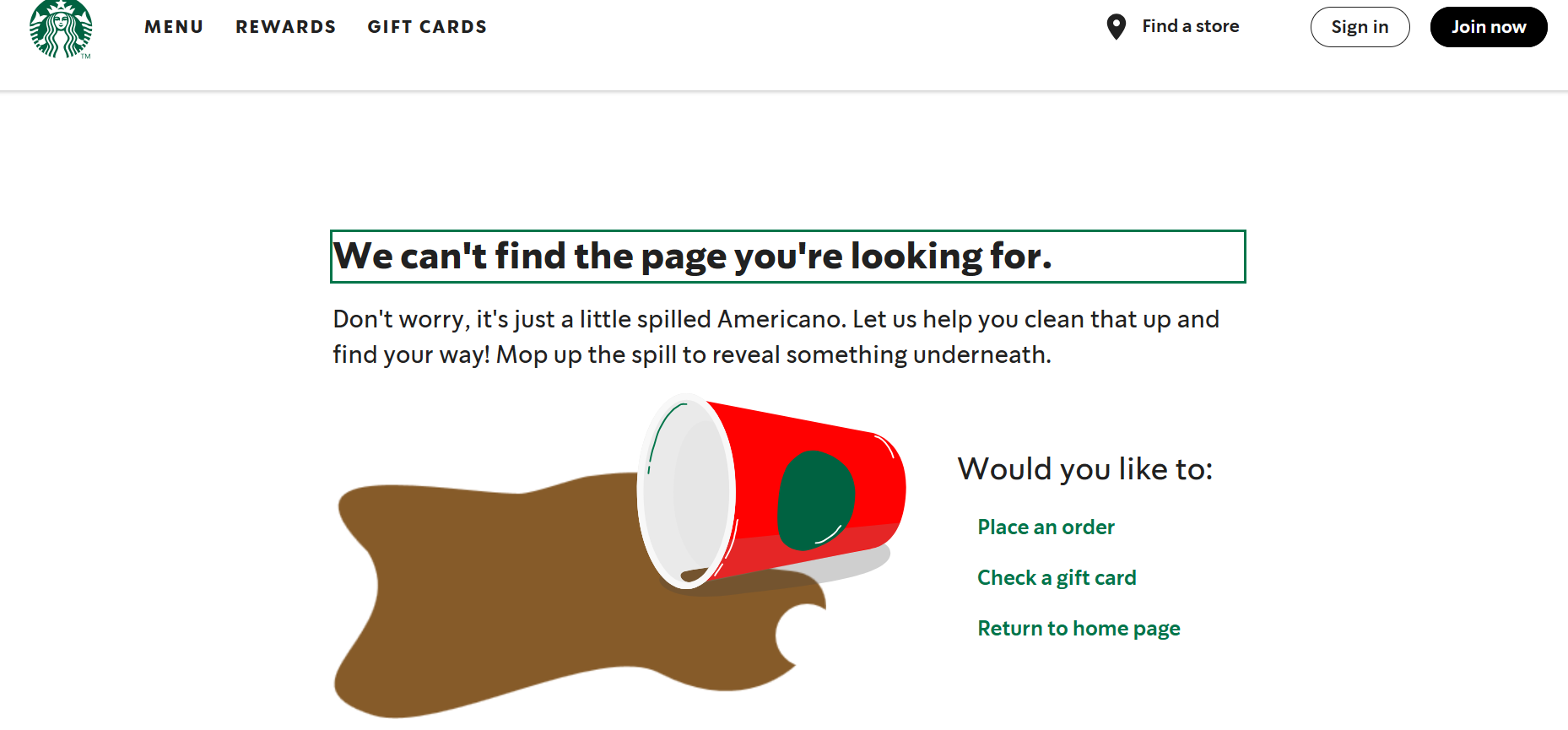
Add interactive features to your 404 page design to keep your users engaged. Image via Starbucks
LEGO Education
LEGO Education is a subsidiary of LEGO that creates products and toys for schools and other educational institutions. To help users navigate its website, the company presents options leading to its primary offerings.
The page also allows users to set up a meeting should they need to connect with someone from the company. In line with its brand image, LEGO Education includes vibrant elements and its products in its design.
Example: https://education.lego.com/en-us/not-found/
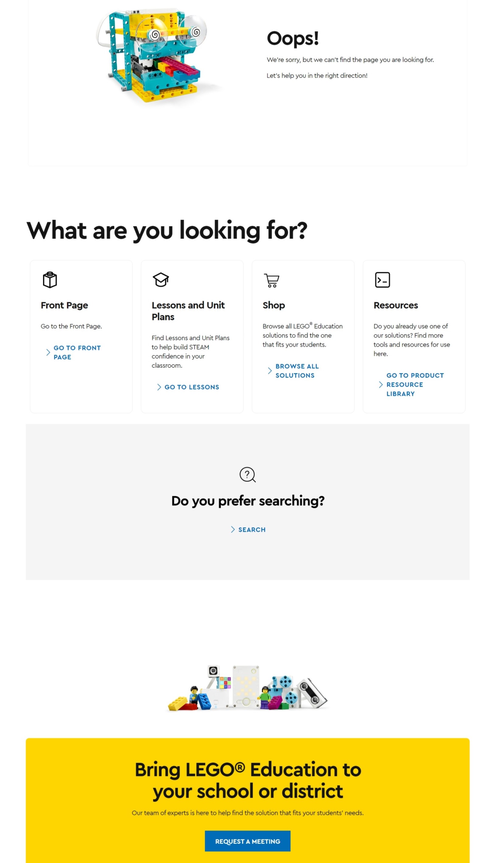
Be as helpful as possible when creating a 404 page. Image via Lego Education
IMDB
Please leave it to IMDB to create witty quips based on movie lines for its 404 page! For example, the page references The Fugitive's most famous line, "The guy did a Peter Pan right off of this dam, right here," alleging that the page the website visitor is looking for has jumped off and flown away.
The brand values bold yet simple design. It uses an eye-catching yellow speech bubble and a link back to the homepage. If the movie title piques users' interest, they can click on it.
Example: https://www.imdb.com/chart10864/top/
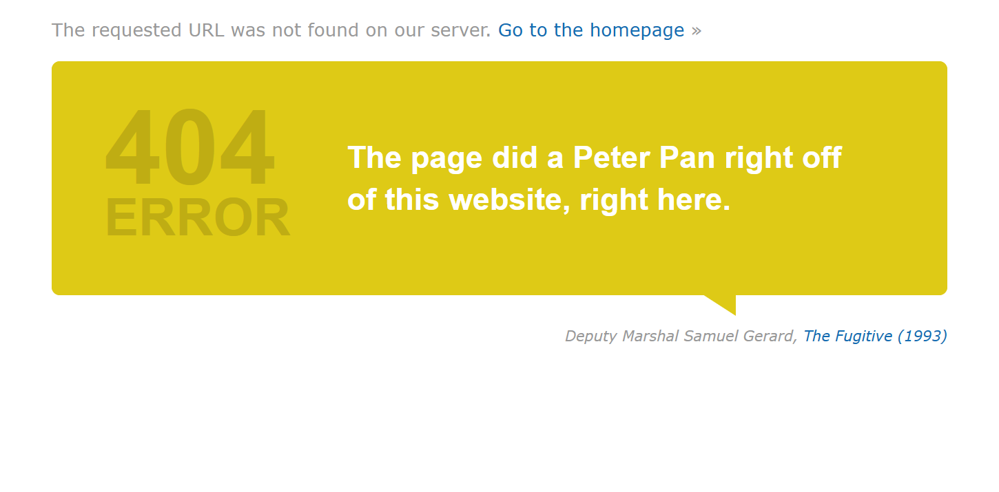
Witty quips and funny lines can pique the interest of your visitors. Image via IMDB
Bitly
Bitly visitors are greeted by a woman in a meditative pose, encouraging calmness. This is followed by simply explaining why the website detected an error. It claims responsibility by mentioning that the brand's links can be case-sensitive to encourage users to check.
Example: https://bitly.com/page555s/pricing
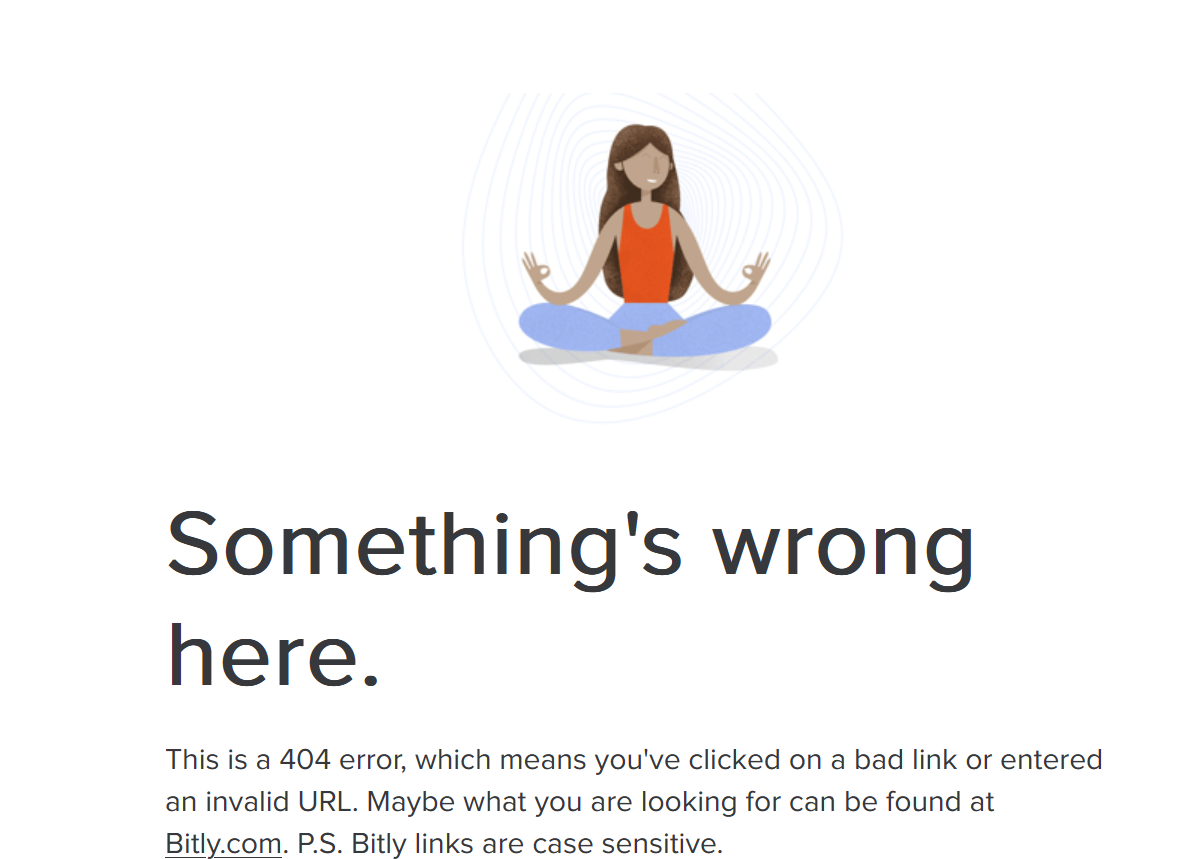
Offer users tips on troubleshooting errors. Image via Bitly
Dribbble
Dribbble is a popular platform for designers and other creatives to showcase their work and find inspiration. Reflecting the brand's nature, it incorporated a color slider at the bottom of the 404 page. The website redirects users to design portfolios when they click on the photo tile.
Users can also search for specific designs and designers through the search or navigation bar. In addition to informing users about errors, Dribbble utilizes the page as a launching pad for users to explore exciting works in the community.
Example: https://dribbble.com/sh1036ots/popular
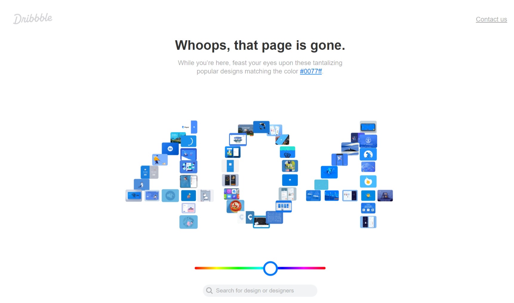
Dribbble adds a color slider that curates color-themed designs. Image via Dribbble
YouTube
YouTube keeps it simple with a button that leads to the home page and a search bar below the 404-page message. The page also features a comical monkey holding a magnifying glass, a cheeky reflection of the brand's fun side.
Example: https://www.youtube.com/543987027
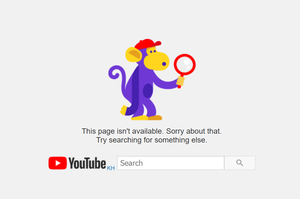
Keep your users on your website by directing them back to the home page or the search bar. Image via YouTube
The New York Times
The New York Times keeps its visitors engaged by suggesting articles. But these are not any other articles. These are high-value pages that are beneficial for search engine ranking. Regarding visual appeal, The New York Times maintains a neat aesthetic that reflects its brand identity.
Example: https://archive.nytimes.com/www.nytimes.com/inte231rnational/
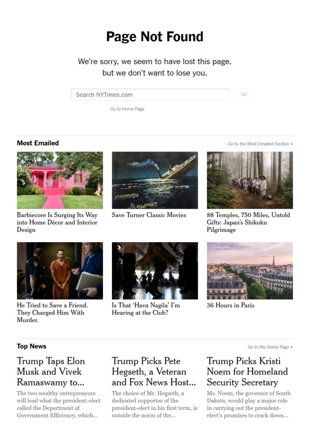
Include high-value links to boost your SEO ranking. Image via The New York Times
Netflix
Netflix leverages the 404 page to promote one of its TV series streaming on the platform. As its title suggests, the series includes a scene of a rover lost on an unknown planet.
This tongue-in-cheek humor on the 404 page will surely make users smile and even pique the curiosity of those unfamiliar with the TV series. The page includes a home button should the users explore other shows instead.
Example: https://www.netflix.com/NotFound?prev=https%3A%2F%2Fwww.netflix.com%2Fkhafs
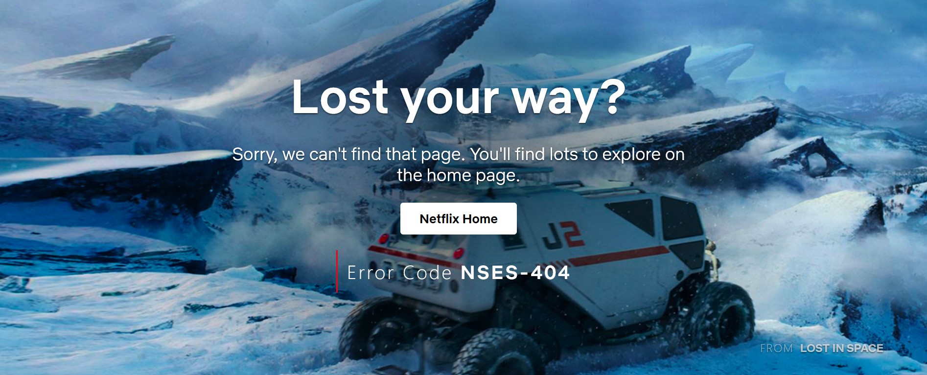
Netflix references a TV series in its 404 page. Image via Netflix
HubSpot
HubSpot veers from the conventional by having this "heartbroken"-themed page. Instead of a vast 404 code, it has the message "We're heartbroken we missed you" at the top of the page.
In the tone of a hopeful person wishing to rekindle a connection, the page enumerates several benefits users can take advantage of if they keep engaging with the website. The page links blogs, courses, and other relevant websites to kickstart the journey.
Example: https://www.hubspot.com/0186r768
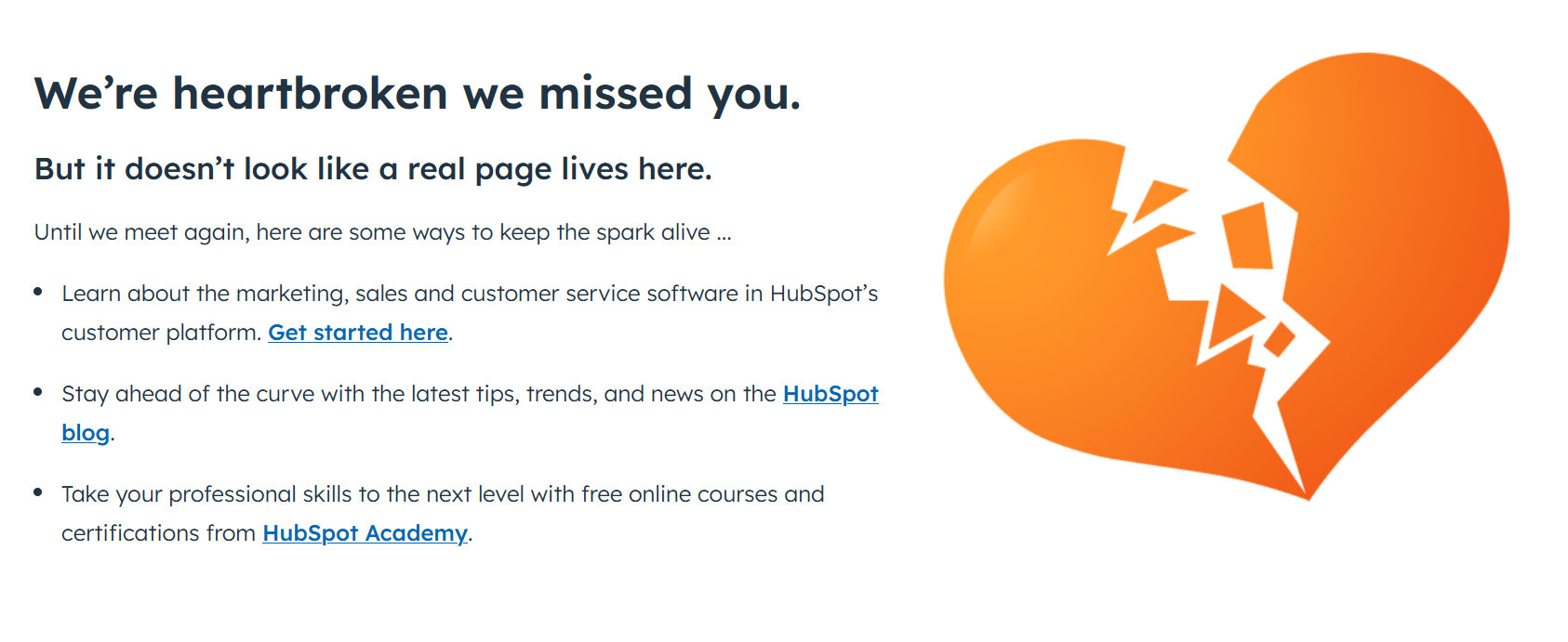
Don’t be afraid to show your emotions as they express sincerity. Image via HubSpot
Best Practices for Designing a 404 Page
1. Create a User-Friendly Navigation
User-friendly navigation can improve customer experience and boost conversion rates. This entails ensuring buttons and menus are easy to locate, texts are explicit, and the overall layout is intuitive.
Ideally, a 404 page should be aesthetically pleasing, using the brand's color palette and white space in a balanced way. It should also be responsive to multiple device screens, such as mobiles, and quickly load time.
Ultimately, market research helps you zero in on your consumers' behavior, browsing trends, and other expectations. This information can be valuable in optimizing your 404 page.
2. Inject Fun and Creativity
A broken link or missing pages can easily ruin your audience's brand perception. But despite the inconveniences, there are ways to end happily.
Take the 404 page as an opportunity to have fun with your visitors. As we have seen from the examples of 404 pages, some brands resorted to adding games and funny 404 messages to lighten the mood. Others like Pixar and Marvel have leveraged popular characters that their fans love.
Aside from turning an upsetting situation around, injecting fun and creativity into your 404 page increases Brand recognition.
3. Integrate Branding Elements
Every web page, including the 404 page, should reflect your brand identity. That said, ensure alignment when integrating branding elements.
Use your logo, fonts, images, and illustrations. Play with your color palette and consider your brand personality when designing visual elements. By staying consistent, you can reinforce your brand in the minds of your visitors.
4. Offer Useful Links
In addition to providing a link to your homepage, explore other resources and sections to which you can redirect your users. For example, you can include frequently visited pages and contact pages. Another invaluable tool is integrating a feedback page to gather suggestions and insights on the visitor's experience.
Winning Customers Amid Errors
A 404 page may seem unimportant when looking at the totality of a website. As such, it is often disregarded or briefly glossed over. However, doing so can be costly and may ruin your brand image.
People tend to remember negative experiences because of the emotions they can evoke—sadness, frustration, and disappointment, to name a few. Hence, brands must maximize their 404 pages to apologize and leave a positive impression.
FAQ’s
What should be on a 404 page?
A 404 page should contain a straightforward message, like "404 Not Found" or "This page is not available," acknowledging the error encountered by the user. It also has a 404 status code, indicating the type of error to technical users.
In addition to these fundamental elements, the website owner can add navigational elements like a home button, a search bar, or other sections. Finally, it should contain contact information if users want to contact the technical support team.
How do I optimize my 404 page?
You can optimize the 404 page in many ways, including links to the home page, support center, or site map. Adding a search bar helps users navigate specific pages or content without returning to the homepage.
A call to action, like claiming a discount code, placing an order, or signing up for a newsletter, can turn upset users into customers. Finally, humor can go a long way toward creating a positive interaction despite the inconvenience.
Remember that a 404 page can serve many purposes besides flashing a "Page Not Found" message. It can keep your users engaged and even convert leads into customers.
How do you design a good 404 page?
Designing a good and effective 404 page involves communicating clearly to avoid confusion and using simple language instead of technical language to explain the problem encountered.
Visibility and ease of navigation are also important. Visual elements, especially call-to-actions, can easily be seen and understood by users, inspiring them to engage further.
Moreover, remember to incorporate your brand design. This can be done by remaining consistent with your colors and visual styles and observing your brand tone when crafting messages. Following these design guidelines can create a memorable and engaging experience despite a potentially harmful situation.
Why do I need a custom 404 page?
A custom 404 page is a great way to reduce user frustration and turn it into a positive experience through helpful links and a search bar. Some brands incorporate humor, games, discounts, and other promos to keep visitors on-site and reduce bounce rates. More importantly, a 404 page is an opportunity to reinforce brand identity by weaving in personality and style.
On the data side, a custom 404 page allows brands to integrate tools that can provide valuable analytics. These track customer behavior and search patterns so brands can optimize sites accordingly. Overall, it can be an effective tool to optimize the user experience and user interface design.
